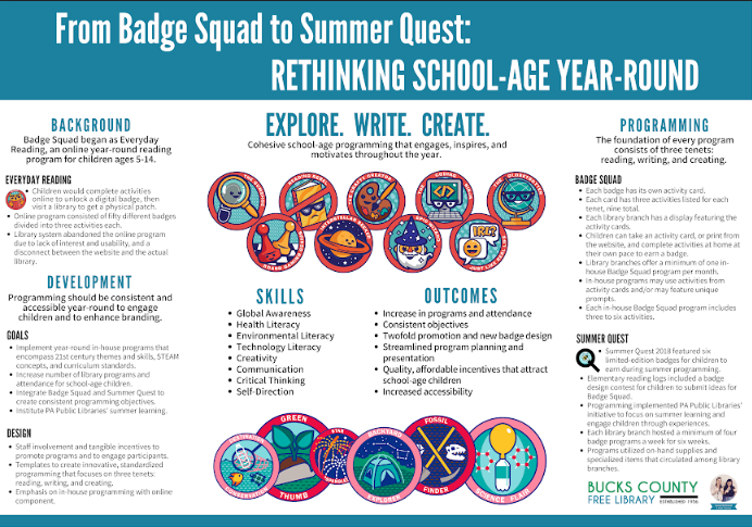
I personally love creative projects that build upon one another. That’s one of the reasons that this poster from Jessica Richmond and Kate Transue of the Bucks County Free Library is so cool – digital designs became patches became a great poster presentation at the 2018 Pennsylvania Library Association conference.

The library contracted a graphic designer to custom create the digital badges and the utilized The/Studio to print them on fabric. But they weren’t done utilizing the designs! Jessica wrote,
Our poster introduced how our library system successfully revamped an online program to create year-round in-house programs. We already had graphics that were used to create fabric patches as incentives for the programs, so we knew these would be a focal point. We also wanted to use one of our library’s branding colors to create a clean, consistent design, so we chose blue to complement the graphics. Using a tri-fold layout helped us organize the information. The center panel became the conversation starter and featured the basic concept of the programs, the graphics, and the skills & outcomes while the two side panels went into detail about the background, development, and specifics of the programming. Instead of signing the poster with just our names and titles, we included a photo of us giving a thumbs-up next to our library’s logo. Not everyone noticed this detail, but we definitely saw smiles from those who did!
Jessica and Kate utilized Canva to make their poster. They described the experience as “user-friendly” and “modern.” Jessica and Kate utilized a few Canva features to create this clean design. The first feature they highlighted was the ability to create custom dimensions in order to fit their tri-fold display. They also mentioned that their library has saved their branding colors as a palette within Canva and so color selection became even easier. Jessica and Kate were happy with their Canva experience. However they noted,
Our only complaint was the lack of a ruler and/or gridlines to see exactly where everything lined up. We did end up downloading the poster a few times and pasting it into Publisher to make sure the panels would be exactly centered. Otherwise, we were very happy with the choice to use Canva, and even happier with the result. The print itself also turned out incredibly clear because we were able to use the custom dimensions.
Kate and Jessica’s design story demonstrates the techniques that we often use to accommodate our tools or abilities. When your design desires overcome your capabilities, it may be a good option to ask for help! Their library’s investment in great graphic designs provided great reward.
Jessica and Kate’s design can be found on our Google drive. Remember, all submitted work will be published on this site under a Creative Commons Attribution-NonCommercial-ShareAlike 3.0 Unported license.


Leave a comment