Search

Librarian Design Share

inspiration for library creatives

Month

November 2014

Hand Lettering on Sidewalk Chalkboard Signs

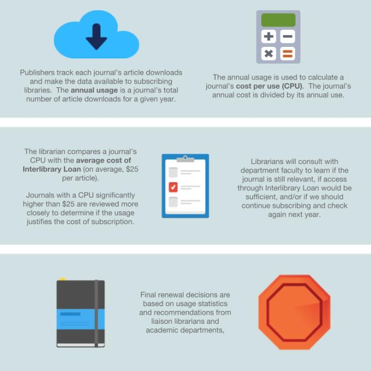
I almost ate it and went with a pun for this blog post. Thankfully, I decided to bury “Chalk it up to good design” and focus on the great hand-lettering-style fonts on this poster. Like Nono’s chalkboard-style conference poster, today’s featured design makes good use of old school chalkboard cool to create a poster that’s sure to catch students’ attention.

Remember to Return Your Books to the Carl B.

Solveig Lund, Instruction and Reference Librarian at the Carl B. Ylvisaker Library at Concordia College created this poster using Microsoft Publisher.

The circulation manager asked me to create a 24×36 poster to place outside on a main campus sidewalk at the end of the semester to remind students to return their books to the library.  There are many collections of chalkboard fonts and sample designs available on Pinterest that I used for inspiration. I used Microsoft Publisher to create the sign and downloaded free fonts/wingdings from dafont, including:

I don’t know about you, but I’m a little bit obsessed with the Chalk Hand Lettering pack right now. You can download and adapt Solveig’s original Microsoft Publisher file, which is available on the Librarian Design Share Google Drive folder.

Beautifying Journal Reviews

Journal reviews are serious business at academic libraries. If any of you have been through a systematic departmental or subject review of your academic journal holdings you’ll know that faculty are very protective of these materials. If you utter the word “cut” or “cancel” with no context to a room full of academics you are pretty much guaranteed loud-talking, moderate to wild gesticulation, the stink-eye, and laments about the glory of the library in graduate school. It’s a touchy topic.

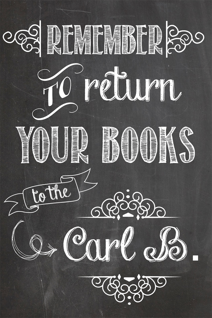
Enter my colleague at St. Mary’s College of Maryland, Alana Verminski. In addition to the usual subject librarian trifecta of instruction, reference and collection development, Alana is also tasked with managing our library’s e-resources. Given rising serial costs and flat budgets, she’s recently developed a plan for us to be much more intentional and systematic about our journal subscription renewal decisions. To accompany this new review process, she created two designs for our website that will also be adapted into handouts for faculty in departments undergoing a journal review.

1. The Journal Review Process

The Journal Review Process

2. All About Usage Statistics

All About Usage StatisticsHere’s what Alana had to say about her designs:

These designs will be part of a series of web pages intended to inform faculty of the new journal review process. Unfortunately, journal usage statistics can be a dry topic for non-librarian audiences and like most statistics, can easily become overwhelming. In this design, I wanted something that was uncluttered and colorful – two ideas not usually associated with statistics. Keeping the audience and format in mind, I focused on using more images than text and for the usage statistics in particular, described each item as part of a larger process so viewers could see both the individual steps and the bigger picture. I used Google Drawings for the designs and found the icons on IconFinder.

I think this a great example of taking a complex library topic and creating a graphic that explains it well to non-librarians. You can find copies of the original Google Drawings Alana created in the Librarian Design Share Google Drive folder. If you have questions about the designs or about the journal review process we’re adopting at St. Mary’s, email Alana Verminski.

Create a free website or blog at WordPress.com.

Up ↑

%d bloggers like this: