Search

Librarian Design Share

inspiration for library creatives

Tag

publisher

Signs About Sound

A couple of weeks ago we asked for submissions about sound, and you delivered! We received three sound-specific submissions, all of which take a different design approach. It’s worth noting that in spite of these differences, the first two of our featured submissions make use of the red, yellow, green color scheme to denote acceptable noise levels within the library. The last, designed for digital signage, uses large eye-catching text and simple icons to get the message across.

The first submission is from Brenda Sevigny-Killen at the Bennett D. Katz Library – University of Maine at Augusta.

Sign that reads "Silent Zone" in a library.

Brenda had this to say about her signs:

After our library greatly deaccessioned our reference materials, we opened up space for collaborative study areas with rolling whiteboards, chairs & tables, and comfort seating.  To encourage collaborative use of this new space, staff designed signs to promote the new area.  We also designed a sign for the quiet area since the multiple tables for 6 falsely encouraged noisy collaboration. There are times when we have to redirect groups to the collaborative zone so this space remains sacred for silent study. This project has been hugely successful and we now find we need much more collaborative space as more and more students find sanctity and camaraderie within the library walls.  Another happy side effect is getting to know more of our students and subtly infusing a atmosphere of support, care, and staff dedication which we hope contributes to their success.

IMG_2201

Brenda’s posters were designed in Publisher and are available in our Google Drive.

___

Erin McCoy at Massasoit Community College in Brockton, Massachusetts submitted designs that she created in Canva.

I was inspired by a recent conversation on a list serve to take a look at signs for “sound expectations” – I like the one in the google drive, so I decided to riff on it in Canva for those of us without Adobes or Publisher skills.

Our library is one big room, that is square, so it’s hard to place signage and to communicate where the different zones are, so we’ll see how this goes!


Kudos to Erin for tackling the challenge of signage for the one-room library layout! You can find the complete set of Erin’s signage on the Librarian Design Share Google Drive.

___

Our final submission is from Lauri Miller at the Paul & Harriett Mack Library in Bethlehem, PA. Lauri created her sign through Google Slides and used icons from one of my favorite resources, The Noun Project.

Here is my submission about sound levels in the library. I created it in Google Slides which feeds the digital sign in our lobby. The sign flips between slides, so I tried to keep it brief, understandable, and eye catching the foot traffic in and out of the library.  The cell phone icon is by Creative Stall, and the earbud icon is by Erman Tutan. Both are from nounproject.com.

cell phones on silent signage

Thanks to Brenda, Erin, and Lauri for their submissions. Remember, you can submit your own work to feature or request feedback at any time. All submitted work will be published on this site under a Creative Commons Attribution-NonCommercial-ShareAlike 3.0 Unported license.

Flyers: Our Bread and Butter

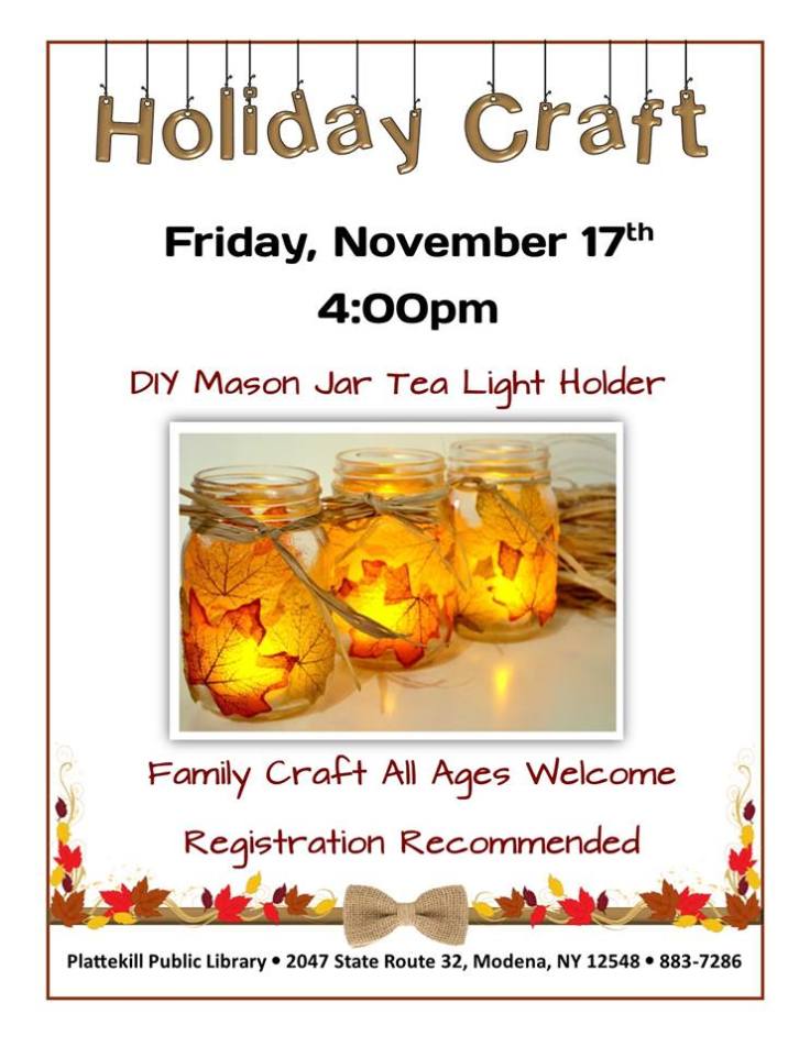
April and I started our foray into graphic design for libraries designing humble flyers. We wanted to share information with our community about library events, hours, policies, and practices. Today’s post, the final Librarian Design Share post, brings us back to where it all began. Here are some lovely flyers to close out our site.

nov holiday craft.jpg
Created by Marisol Gerena from Plattekill Public Library using Microsoft Publisher
StudyPaws
Created by Christine Seliga, Library Services Specialist at Pima Community College – West Campus using Microsoft Publisher and Canva to advertise therapy dog study break.
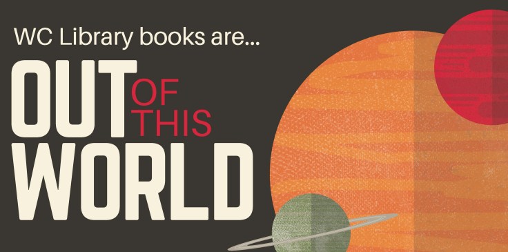
IT'S COSMIC.jpg
Created by Christine Seliga, Library Services Specialist at Pima Community College – West Campus Library for a book display celebrating the solar eclipse. Created using Canva, Microsoft Publisher and Microsoft Paint.

Year in Review

Once upon a time, libraries didn’t keep numbers and stats; or, if we did, we quietly kept them to ourselves.  However, a recent trend in libraries is to publicize our annual numbers so that stakeholders can understand the importance of a library’s existence.

Library Specialist KC Frankenburger at the Parham Road Campus Library location at Reynolds Community College explains the infographic she designed with Canva:

Continue reading “Year in Review”

Overdue! Beer and Libraries!

There are a lot of commonalities between libraries and breweries. We both want to provide for the public; we have products people need; we are both experiencing a surge in popularity…oh, who am I kidding?  This post is about librarians who like to drink beer.

Continue reading “Overdue! Beer and Libraries!”

Reference Help Options

There are so many different ways in which libraries offer reference and research assistance, but it can often be a challenge to make sure that the people in our communities know about them all. Alex Ferguson, Reference Assistant at the Texas Tech Law Library created an all-in-one advertisement for all of the library’s reference help services.

Continue reading “Reference Help Options”

Honey Badger vs. Grumpy Cat

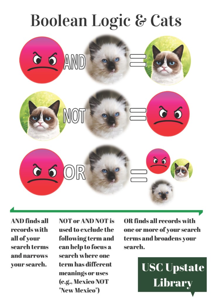
We live in a world of fickle and fast preferences.  Virginia Alexander, a Reference Librarian at The University of South Carolina Upstate, had previously used the honey badger meme featured here on Librarian Design Share to teach her classes Boolean logic, but recently found that her students either didn’t recognize the badger, or had tired of it. So, Virginia gave the meme an update using pictures from Creative Commons and Microsoft Publisher and Canva.com:

booleancats (1)


Here’s just hoping her students don’t say this next…

If Honey badger Don't Care You Think I Should? - If Honey badger Don't Care You Think I Should?  Grumpy Cat

image 

If you want to adapt Virginia’s Grumpy Cat meme to use at your own institution, contact her for the original files, or find them here in Librarian Design Share’s Google Drive.  If you do alter this meme, consider submitting to us…we can make this a recurring post!

Holiday Hours

Like many libraries out there, my library has reduced hours during the holidays.  This creates quite a bit of confusion for patrons, and it’s compounded when our signage looks like this:

hours before

Sure, all the information you need is right there, but it’s so hard to read.  I made this schedule to hang outside the library, and after printing it, I realized how bad it was. I took the same information and rearranged it into a calendar format:

hours after

Way better, right?  It’s so much clearer when we’re open and when we close early.  The color and graphics make the sign just a bit friendlier too.  It literally took 5 additional minutes to insert a table into Publisher and find the snowflake clip art than it did to make the block of text from the first sign.  I’d say it’s worth the effort!

We’d love to see examples of revised signage you all have tackled.  Submit your designs here!

Happy Medical Librarians Month (a little late)

October was National Medical Librarians month.  I realize that’s in the rear-view mirror now, but still wanted to share what we did to celebrate in my library this year.

I was inspired by a trip that Veronica and I took to the local Portland library while we were there for a conference.  The Multnomah County Library had a great display on their counter of colorful business cards with simple, effective icons and messages like the one below (I know, I should have collected them all!):

cardfront

I liked the idea that patrons could easily pick up the card to learn more about and learn more about the library’s services.  I wanted to implement this somehow at my own library. After brainstorming with staff, we decided to use the five weeks of October, which is National Medical Librarians Month, to celebrate our services. However, with our limited resources (read: me printing on cardstock on the staff machine and then using the paper cutter), we decided to make our takeaways just a bit bigger into the shape of bookmarks that we already are used to cutting and displaying.

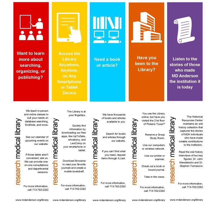
Below are the five features we decided to highlight and the Publisher bookmarks (fronts on the top row and backs on the bottom) that I created:

bkmks

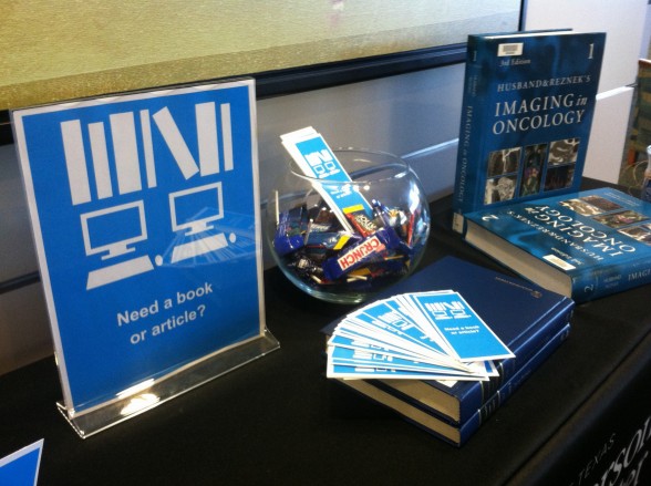
We were happy with the candy-colored printed bookmarks and thought that it would be really cool if these giveaways could coordinate with colors of REAL candy.  This involved a carefully planned trip to the grocery (thank goodness it was near Halloween with lots of candies to choose from), and some masterful exhibit making involving colored books, journals, and all the containers we could find in the library.  Here’s how it turned out week-by-week…please excuse the amateur photography:

Our library as a physical space:

orange


Our mobile resources:

IMG_1111

Our collections:

b1photo

Our educational offerings:

rml

Our archives:

photo purple2


Our patrons loved the changing displays and anticipated the colors, candies, and services they would see the next week.  Of course, more than anything, they liked the candy, but lots of good conversations were sparked in the month of October.

Do you celebrate months or certain days in your library?  We’d love to see your pics and materials if you do!  If you would like a PDF or the original Publisher document for the bookmarks, you can download them for adaption from the Librarian Design Share Google Drive.

Hand Lettering on Sidewalk Chalkboard Signs

I almost ate it and went with a pun for this blog post. Thankfully, I decided to bury “Chalk it up to good design” and focus on the great hand-lettering-style fonts on this poster. Like Nono’s chalkboard-style conference poster, today’s featured design makes good use of old school chalkboard cool to create a poster that’s sure to catch students’ attention.

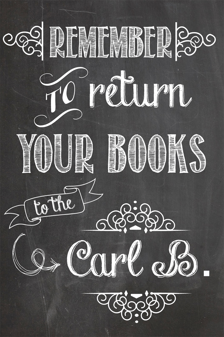
Remember to Return Your Books to the Carl B.

Solveig Lund, Instruction and Reference Librarian at the Carl B. Ylvisaker Library at Concordia College created this poster using Microsoft Publisher.

The circulation manager asked me to create a 24×36 poster to place outside on a main campus sidewalk at the end of the semester to remind students to return their books to the library.  There are many collections of chalkboard fonts and sample designs available on Pinterest that I used for inspiration. I used Microsoft Publisher to create the sign and downloaded free fonts/wingdings from dafont, including:

I don’t know about you, but I’m a little bit obsessed with the Chalk Hand Lettering pack right now. You can download and adapt Solveig’s original Microsoft Publisher file, which is available on the Librarian Design Share Google Drive folder.

Blog at WordPress.com.

Up ↑