Search

Librarian Design Share

inspiration for library creatives

Category

Informational

Designing for Accessibility

As librarians and designers, our users should always be at the forefront what we create. Sometimes this means tailoring our creations to a specific audience, like students in a university setting or teens in a public library, but often our users are anyone who comes into the library space. When you create those fliers or infographics to post on your LibGuide, are you also designing for the population of users that have a vision impairment or use assistive technology? Can those users get the same information from your design as someone without a disability?

To me, that question is what is at the heart of accessibility.

I know, the A-word can be intimidating. Everyone is talking about it, and there are laws and guidelines and a lot of work goes into making something accessible and don’t we already have enough on our plates? I get it y’all, trust me. Addressing accessibility is a whole Thing, which is why Jess and I have decided to dedicate several posts specifically to the topic. Because really, accessibility* is not out of reach for any us.

It should come as no surprise that there is a panoply of online resources to help you create accessible documents and (thankfully) most of the are free! But in an effort to not overwhelm you with information, I’ll leave you with one resource that I have bookmarked and use every time I design something new: WebAIM’s Color Contrast Checker.

While all of WebAIM’s resources are great, I especially love the Color Contrast Checker because it not only tells me if the colors I’m using pass or fail Web Content Accessibility Guidelines (WCAG) standards, but it gives the ratio of how close to passing/failing I am. All you have to do is plug in a color in hexadecimal format (or hex code) for foreground and background, and voila! You have your report.
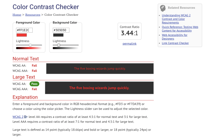
screenshot of WebAIM color contrast checker

If you don’t know the hex code for the colors you’re testing on and it’s within your browser, you can use an extension like ColorZilla to pick the color from a webpage. If it’s something you created and want to test, you can always use something like Image Color Picker to upload and grab the color.

Testing the color contrast of your text and images can help you create documents that are accessible for all sighted users, including those with vision impairments. Although it may not seem like much, it is a critical part of designing for accessibility.

Stay tuned for the next post in our Designing for Accessibility series and if you have an accessibility related topic or design you’d like to share, let us know!


*Footnote: The term accessibility can be applied to many things, but for the most part we’ll use it specifically with web and document accessibility in mind.

Bookmark Your Library

Today’s design is a great example of sharing basic, essential library information with a clean, attractive design. Erin McCoy, Reference and Instruction Librarian at Massasoit Community College, created this great bookmark in Canva.

The goal of the bookmark is to communicate the basics: where we are, our hours, and how to contact us. We send this to distance/online students, and hand it out when students come in to register their library card.

Does your library have a similar bookmark or giveaway? If so, consider submitting to us here at Librarian Design Share. We’d love to feature your work!

Promoting Services

Librarians are always looking for creative ways to reach people and to inform our public about our services. I’m constantly changing up my brochures and handouts to look more modern and to contain more concise, relevant information.

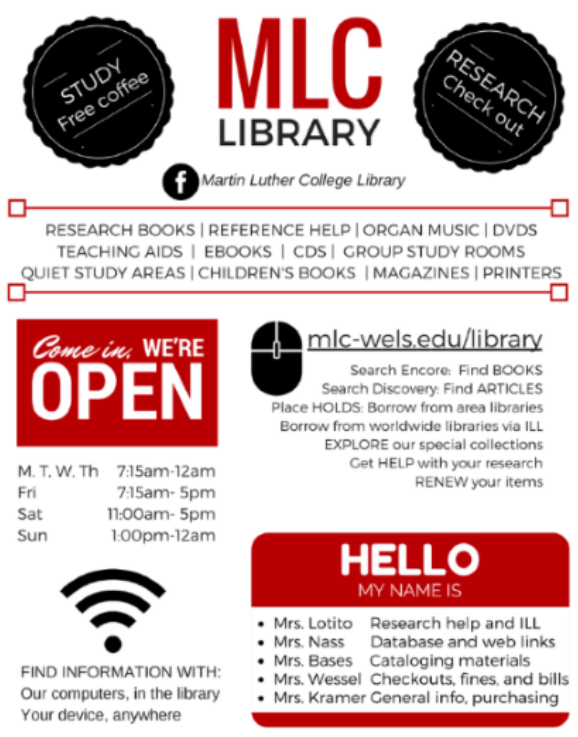
Linda Kramer, Library Director at Martin Luther College has designed a poster in Canva using simple colors and friendly, familiar graphics to attract the eye and promote her library’s services, hours, and people who can help. About this design, Linda says, “while being a resource for students, this was also handy as a basic information sheet for new faculty on campus.” Mission accomplished!

Jet Stream of Creativity

Some of us are lucky to have a library name that’s just made to aid in marketing. I work at the Bryan Wildenthal Memorial Library at Sul Ross State University, so I am not one of these people! However, Susan Bloom, Associate Librarian, Head of Instructional Services at the James E. Tobin (JET) Library at Molloy College definitely is!   Susan has made numerous marketing designs for her library, but some of the best play off the JET theme:

tour-flyer

The above services for patrons in the style of an airline departure board is immediately familiar and clever, as is the air-mail themed pizza party invitation below:

2014-pizza-party


Susan explains her process and reactions from others about her designs:

All work was created by me using Photoshop CS6. I always get some emails from people saying how much they like them. I really love creating the fliers, it is very different from the other work I do and it allows me to flex some creative muscle. I always use Photoshop. I have tried using some other programs but they don’t give me the flexibility Photoshop does.

Susan has produced lots more library-related designs, and you can view those here. If you are interested in modifying Susan’s designs for your use, contact her directly. What about you guys? Has the name or a feature of your library inspired you in creation of designs? We’d love to feature them if so

Year in Review

Once upon a time, libraries didn’t keep numbers and stats; or, if we did, we quietly kept them to ourselves.  However, a recent trend in libraries is to publicize our annual numbers so that stakeholders can understand the importance of a library’s existence.

Library Specialist KC Frankenburger at the Parham Road Campus Library location at Reynolds Community College explains the infographic she designed with Canva:

Continue reading “Year in Review”

Colorful Student Guide

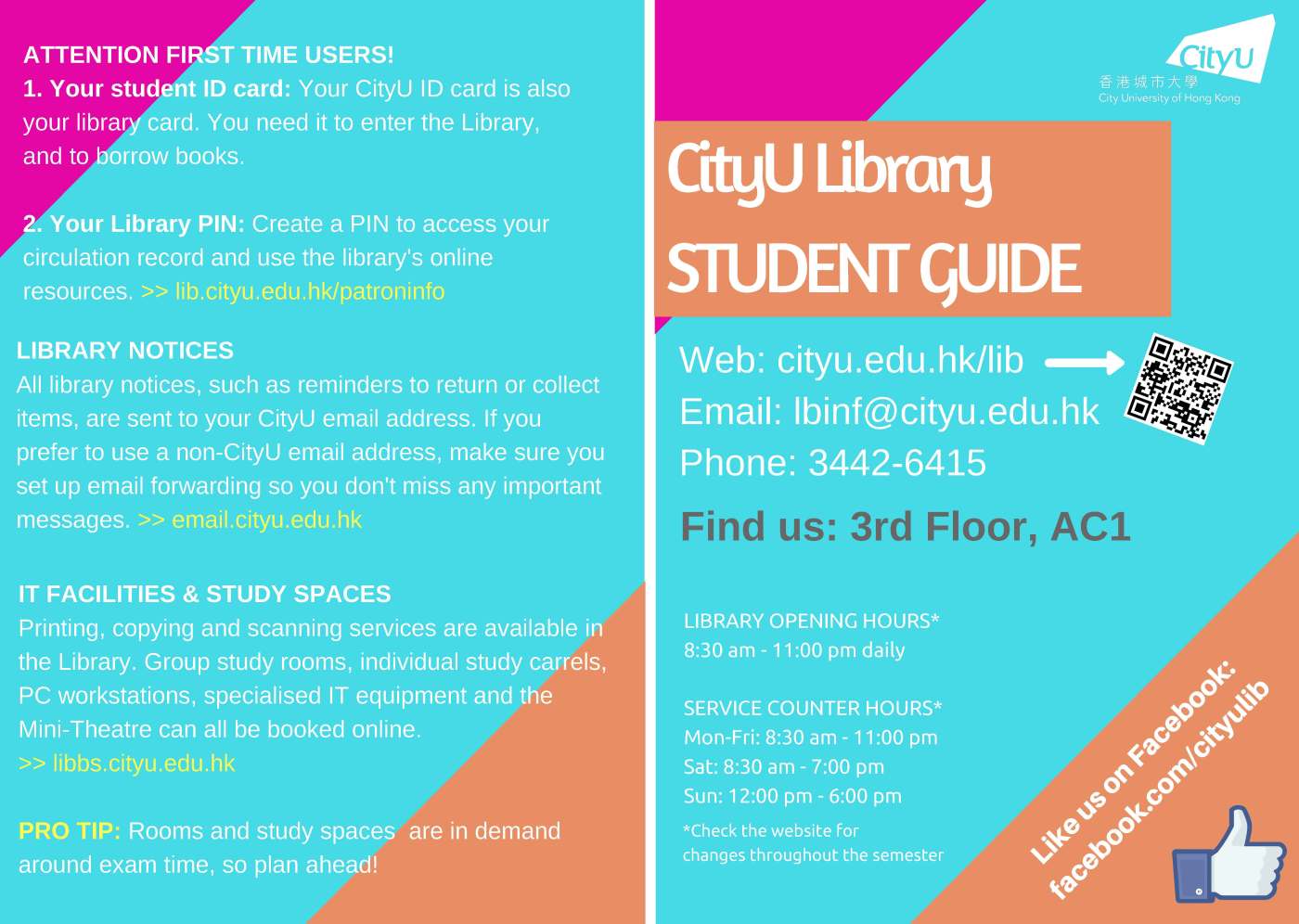
Academic and school librarians are finally beginning to settle into the fall semester, and many of us are able to relax (or just stop running in circles) due to the efforts we put in during the summer to prepare for this school year.  Joanna Hare, a Subject Librarian at the Run Run Shaw Library at the City University of Hong Kong, recently updated a guide to assist students in using the library.

Continue reading “Colorful Student Guide”

Quick Fixes

Dan Vinson, the Coordinator of User Services and Library Assessment at Haggerty Library & Learning Commons at Mount Mary University, is an expert at making clear, concise tools to help simplify library business to students.  If there is any doubt to that statement, be sure to check out his Dewey signs that he submitted to Librarian Design Share about a year ago, which he created with Easel.ly.  Dan’s most recent designs, however, make use of every librarian’s new fave: Canva.

Where to start_NEW_Page_1

Dan created these latest designs, which he plans to link to from the library’s homepage, in direct response to his latest user survey. He explains more below.

What is what ad_Page_1

We conduct a user survey every semester on rotating topics, and afterwards, we try to make “quick fixes” which we can then market. In our Spring survey, multiple students mentioned how difficult it was to figure out what tools to use when, and how to distinguish our request options.

In addition to retooling our library instruction marketing to faculty, I created this handout series from a Canva presentation template, each of which we will link directly to from our home page. I feel like they condense and organize the different points pretty well.

ILL details ad

Not only is it an awesome idea to respond to the issues students are having, it’s so great to do it so beautifully, but also so plainly.  I know you’re going to want to modify these for your own libraries, so you can find PDFs of Dan’s “quick fix” web designs on the Librarian Design Share Google Drive.  You can also check out Dan’s prolific collection of library-related Canva designs here.  And, if you have any specific design questions, drop Dan a line.

Library Data

These days, most universities are moving towards learning management systems and libraries are moving towards online resources.  However, we often overlook the fact that many students don’t have a reliable internet connection at home. Librarians at the San Juan College Library recognized this major issue and took action. Librarian Kim Lowe explains:

Continue reading “Library Data”

Coloring Our History

Houston, Texas is rich with culture, and the Houston Area Digital Archives division of the Houston Public Library works hard to capture the city’s history and make it accessible to all. In that spirit, HPL Cataloging and Metadata Services Librarian Jeanette Sewell recently submitted the digital archival coloring books designs she created.

Picture1
Jeanette describes her process in creating the covers and pages for the online books:

Continue reading “Coloring Our History”

Blog at WordPress.com.

Up ↑