We’ve featured a few different book displays on Librarian Design Share since our blog began, and I have to admit they’re my secret favorite thing to post. I don’t really get the opportunity to create displays for my library, so I think posting other people’s displays is my way of filling a personal design void.
This fantastic display comes to us from Leanne Mobley, MLS Candidate at Indiana University and the Center Supervisor at the Willkie Library, Indiana University Residential Programs & Services Libraries.
 Here’s Leanne in her own words:
For the month of April, I put together a “Read the Rainbow” display to highlight our fiction collection. The display is an homage to the classic Pantone paint swatches. I rounded up a handful of books with vibrant covers and then used the eyedropper tool in Illustrator to select the main color featured.
I also ransacked the paint swatches at our local hardware store and covered our bulletin board. We mostly circulate DVDs and music, but our patrons are really enjoying the display and seem to be taking notice of our fiction collection.
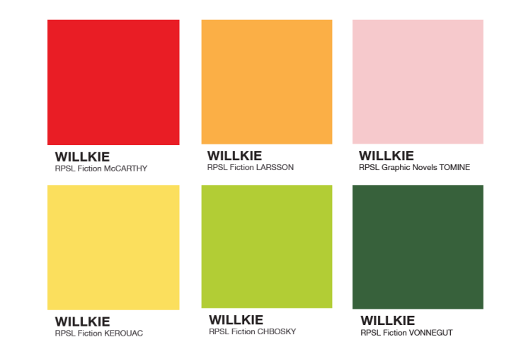
April and I both love classic look of Pantone color swatches and can easily see this display replicated in academic, school, and public libraries. Really any library with a fiction collection would be able to do this!
If you have questions about the display, leave a comment. For the Illustrator files that accompany this display, contact Leanne directly.