A few months back, I went to a resource fair in my institution, and another department had an interesting giveaway that I hadn’t seen before: an iPad cleaner. Of course, this is really nothing more than a large eyeglasses shammy, but by putting it into the trendy context of an iPad or a tablet cleaner, it became THE swag to snag.
So, of course, I decided that my library needed to get in on this and make our own cleaner for the next opportunity we have to give things away. I started with a simple, basic design, like the one that I picked up, but before long, I realized that we could use a design that was already in circulation…our tablet handout. The iPad layout fits perfectly to the 5 1/2 x 7″ size of cloth. The only change I needed to make to the design was to include our tablet site’s web address and QR code at the bottom so that patrons could find the site we were advertising (the tablet handout was two-sided with that information on the back, and the cleaning cloth can only be printed on one side).
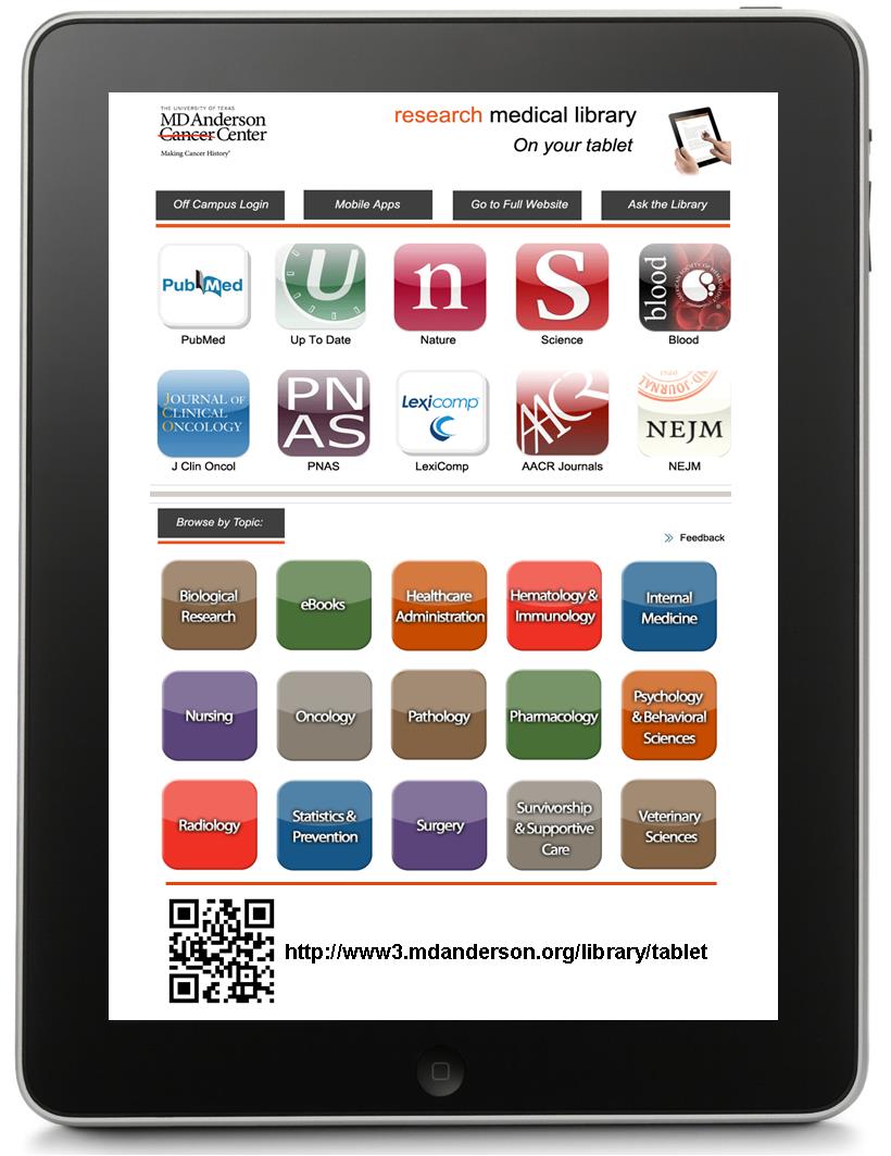
You may notice that our tablet site’s image changed a bit since the last post, but we have committed to keeping this design for at least a year, so we ordered 500 of these babies at about $1.50 a piece through our institution’s vendor, and we think they’ll be a big hit!
What are you guys giving out to patrons this fall?
Contact me if you want the original Publisher file for this design.