Search

Librarian Design Share

inspiration for library creatives

Category

Displays

We have PRIDE!

June is LGBT+ Pride Month, and I am so happy to see libraries participating.  One particular display caught my eye because of its inclusive use of the pride flags.  IMG_6403.jpegAndrea Georgic of the Northland Public Library in Pittsburgh, Pennsylvania shares,

For pride month this year, I wanted to create a more visible and inclusive display for our patrons. We’ve hung banners and pendants across the top of this display before, and since so many people in the LGBTQ+ community have created colorful flags to express their identities, I figured what better decoration than that. Representation is important, and I wanted to reflect as many people as possible, so I did some searching and chose as many flags as I could comfortably fit above the display. I also wanted to create an opportunity for conversation and learning by representing groups that are often forgotten or unknown. We’ve already had a number of patrons ask about the different flags or tell us they looked one up that they weren’t familiar with. I also chose the larger display this year for visibility and to showcase as many of our LGBTQ+ books as possible.

Andrea used Power Point to make the flags, and Canva for this flyer:

celebratepride.PNG

At Muhlenberg College, we utilized a pride banner on our website, in-person display, and for button give-aways.

Trexler-Pride-for-web.jpg

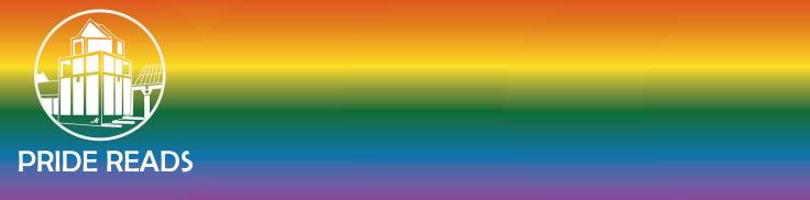
I made this in Adobe Illustrator, taking the traditional pride flag (after a lot of uncertainty after seeing all of the varieties!) and blending the colors for some added fun.  I agree with Andrea, representation is important.  I’m now inspired to include more flags in upcoming celebrations of pride.  Thank you for sharing, Andrea!

All of these materials are available on the Librarian Design Share drive under a Creative Commons Attribution-NonCommercial-ShareAlike 3.0 Unported license.

Did you do something to celebrate?  We would love to see examples of your library’s pride!

Check Out These Audio Books

I am a huge fan of audio books.  I listen to them in my car constantly.  I don’t need any encouragement to try another.  However if I did need encouragement, I would certainly stop by this display by Katrina Spencer at Middlebury College’s Davis Family Library.

audiobooks display.PNG

Katrina says,

 In the fall of 2018, I launched an effort to diversify my library’s audio book collection hosted by OverDrive. Previously, it almost exclusively featured white authors. However, it wasn’t enough to place works by authors of color on our platform. We needed additional types of diversity to be represented; users needed to know that dozens of new acquisitions had just been made; and a culture of their use needed to be developed. So, I initiated a multi-platform campaign to inform patrons on how to use the technology and to inform them of our wares. In a display set up in a high traffic zone adjacent to the Research Desk, about 15 “book dummies” or wooden blocks were covered with book cover art to display new titles in our collection. I used two mannequins, dressed in popular attire, to represent students who might use the audio books, and I dressed them in popular clothing, adorning their ears with headphones. Along the border of the display, handouts were made available with 5-step instructions on how to use the audio books. What was most effective in making this display a success was when I staffed the desk and personally invited passersby to take a handout.

The display isn’t the only thing that Katrina created:

In a continued effort to promote use of our audio book collection, I developed two slides that would be in rotation on a television screen at the Circulation Desk, another high traffic zone. The slides include book cover art for two works in our audio book collection, Everything’s Trash, But It’s Okay by Phoebe Robinson and Less by Andrew Sean Green. These titles were intentionally selected not only because they display beautiful cover art, but also because they represent at least two genders and at least two races, a small and simultaneously significant nod to the diversity of audio book users to whom I was marketing the collection. Beside the images are step-by-step instructions for how to use the audio book platform and images of headphones and smartphones, modern technologies that reinforce that the promoted materials are mobile and for listening. While the corresponding, physical display for audio books was taken down after about a month so as to reclaim the Research Desk’s space, the slides can remain in rotation indefinitely.

pp.PNG

These displays are engaging, clear, and informative – and I love the personal touch to encourage people to listen.  Katrina made the flyer for the display in Adobe Illustrator and the digital display in Power Point.  Both are available on the Librarian Design Share under a Creative Commons Attribution-NonCommercial-ShareAlike 3.0 Unported license.  Thank you for sharing, Katrina!

Designing Displays on a Budget

Ah, the time honored librarian tradition of book displays. Even for a well-funded library, creating a display that’s eye-catching and well designed can be a tall order. What’s a librarian to do? Well, sometimes you just work with what you’ve got.

Ella Hassett from Arup Library has this to say about her International Women’s Day book display:

This is the International Women’s Day (IWD) book display, which was launched in our library space on 8th March 2018. As is evident from the image below, the space available for book displays is narrow and sits in front of staff desks, so it is difficult to work with, as any display cannot block the area behind. It is also restricted as there is no wall or board to display information behind the display, so this has to be done using the units underneath instead. As this was my first display, it was very much an exercise in frugal creativity.

This book display was created with zero budget and utilised whatever stationery was available from the cupboard. It shows what can be done with access to office supplies! The books on display are a collection of titles about significant women working in the built environment and books about gender equality in the workplace. The display encompassed upright Venus signs made of paper cups with the motif glued to them, which were visible when approaching the library space. Some of the books were also standing upright to attract attention, with others laid flat for people to browse. I designed a simple sign to indicate what the display was for and used the same red colour as the IWD firm campaign, of which we included some posters on the unit underneath, as this created consistency. The stars were leftover Christmas decorations that added some sparkle to the display.

Although it was a small display, I am proud of the results, as the majority of the books were checked out over the course of International Women’s Week. Going forward, I will continue to utilise this display space to promote our collections and engage with our users.

photo of an international women's day book display in an academic library

Ella used Adobe Photoshop CS5 to create the signs for the display. Nice work Ella!

Seasonal Signage

It’s nearly that time of the year again! School and academic librarians, your libraries are about to get a lot busier, and filled with those beginning-of-the-semester questions (Where can I get coffee? How do I print? Do you have my textbook?). For public librarians, it’s time to wave goodbye to summer programming and embrace the fall.

Whatever type of library you are in, this is the perfect season for signage. This call for submissions is focused on designs that signal change – a new beginning and the start of something good.

So whether you’re welcoming new or returning students, or just saying hello to the fall season, send us your signs! If you haven’t made any yet, don’t worry! We’ll be featuring these posts through the end of August.

Photo of the University of Massachusetts Amherst campus in the fall

Combine Display and Flyer Design

Here is an interesting design from Rainer Rees-Mertins, who works at Lib4RI-Library for the Research Institutes within the ETH Domain: Eawag, Empa, PSI & WSL in Switzerland.

survey

Rainer created the flyer in order to get community feedback on the library’s services. The flyer contains a QR code that leads directly to a survey and survey information on the back.  Community members were encouraged to take the flyer directly from the display.  I think that this is a cool, interactive display idea!

Rainer says,

…the flyer consists in Indesign of four swatches in standard postcard format, into which the print version was then cut. We placed the four flyers next to each other so patrons could read “Survey” already from pretty far away and they could take a flyer nonetheless. However, we also used the flyer as a whole for online materials to advertise the survey.

Rainer was also intentional about the colors that they used when designing the display.

The colours in the background are an enlarged version of our logo (see back of the flyer for the logo). I try to use these colours as often as possible for designs I make, because of the recognition value. What I liked especially about the flyer was the shift in the font colour from white to black in the “U”.

Thanks to Rainer, you are able to find this design on our Google drive.  All submitted work will be published on this site under a Creative Commons Attribution-NonCommercial-ShareAlike 3.0 Unported license.


Happy Poetry Month

Libraries have the special opportunity to generate excitement about poetry every April.

My colleague Stephanie Hanni of Muhlenberg College in Allentown, Pennsylvania made a display in the style of blackout poetry.

library display with books, poster in the style of blackout poetry

She also created buttons!


She shares her thoughts:

In my head, I envisioned an image of an older poet with a gnarly beard and was elated when I found one! I used several overlays to create the look of a picture created from words and then I created the title of the poster to mimic the “blackout poetry” using Photoshop to construct the words. It was a lot of fun to create!
Pictures used in the poster were from creativecommons.org
Fonts used in this poster: Traveling Typewriter, creator: Carl Krull. 

I work right down the hall from this display and there was a lot of buzz from our community members about these buttons.


Thanks to Stephanie for her work on the display and for sharing it with Librarian Design Share!  We would love to see your National Poetry Month displays – submit your own work to show our community how you generated excitement about sonnets, limericks, or haiku.  All submitted work will be published on this site under a Creative Commons Attribution-NonCommercial-ShareAlike 3.0 Unported license.


Coloring Our History

Houston, Texas is rich with culture, and the Houston Area Digital Archives division of the Houston Public Library works hard to capture the city’s history and make it accessible to all. In that spirit, HPL Cataloging and Metadata Services Librarian Jeanette Sewell recently submitted the digital archival coloring books designs she created.

Picture1
Jeanette describes her process in creating the covers and pages for the online books:

Continue reading “Coloring Our History”

Reference Collection in Need of a Boost

If your library’s reference collection is anything like ours, it’s likely:

  • underused
  • overlooked
  • full of fantastic info that makes librarians drool

My fantastic colleague, Amanda VerMeulen, recently created a series of shelf signs to try to draw attention to our in-need-of-more-than-a-little-love reference collection.

Continue reading “Reference Collection in Need of a Boost”

Visualizing the ACRL Framework for Students

We can’t really call the ACRL Framework for Information Literacy in Higher Education new anymore, but lots of us still need help in understanding what it all means.  And if we librarians need help, imagine how our students are feeling about the whole thing! The librarians at the Ellen Clarke Bertrand Library at Bucknell University are working to make this easier on all of us with a series of posters about each frame.

Continue reading “Visualizing the ACRL Framework for Students”

Blog at WordPress.com.

Up ↑