Search

Librarian Design Share

inspiration for library creatives

Tag

word

Coloring Our History

Houston, Texas is rich with culture, and the Houston Area Digital Archives division of the Houston Public Library works hard to capture the city’s history and make it accessible to all. In that spirit, HPL Cataloging and Metadata Services Librarian Jeanette Sewell recently submitted the digital archival coloring books designs she created.

Picture1
Jeanette describes her process in creating the covers and pages for the online books:

Continue reading “Coloring Our History”

It’s All in the Tone

All libraries have rules and policies; it’s how we maintain a sort of organized chaos at our dynamic, community-serving organizations. However, expressing those rules to library users can present a bit of a public relations challenge: We want to be friendly, yet firm; accommodating, but not so laissez-faire that we no longer have a purpose and mission. We often communicate our library’s policies through some sort of sign or poster, but are we thinking about the tone we are setting with the design of those posters? Our message might be saying one thing, but the way it’s visually displayed and organized may be communicating a very different meaning.

Continue reading “It’s All in the Tone”

Teaching Handouts Need Love Too

Very early in my library teaching career, I created a lot of handouts. Lots. Oodles. Bunches. Boatloads. I think it was kind of a security blanket: If I don’t teach everyone everything they could ever need to know then at least they will have this handout to guide them from now until eternity!

More often than not, my handouts ended up in the recycling bin.

Continue reading “Teaching Handouts Need Love Too”

Holiday Hours

Like many libraries out there, my library has reduced hours during the holidays.  This creates quite a bit of confusion for patrons, and it’s compounded when our signage looks like this:

hours before

Sure, all the information you need is right there, but it’s so hard to read.  I made this schedule to hang outside the library, and after printing it, I realized how bad it was. I took the same information and rearranged it into a calendar format:

hours after

Way better, right?  It’s so much clearer when we’re open and when we close early.  The color and graphics make the sign just a bit friendlier too.  It literally took 5 additional minutes to insert a table into Publisher and find the snowflake clip art than it did to make the block of text from the first sign.  I’d say it’s worth the effort!

We’d love to see examples of revised signage you all have tackled.  Submit your designs here!

Odds and Ends Need Publicity Too

If a student has thought to ask for it, chances are it’s available to borrow at an academic library’s circulation desk. My own library loans dry erase markers, color pencils, laptop chargers, extension cords and floppy disc drives (YES, REALLY), among so many other miscellaneous items. They aren’t expensive and the students are so appreciative to borrow them when we have them.

Stephanie Davidson, Interim Director of the Library at the University of Illinois College of Law, created two fun signs to tell students about all of the different things her library has available to loan.

Forgot Something? Charging Cables

Forgot Something? UmbrellasThese posters/signs were created using MS Word. You can download them for adaption from the Librarian Design Share Google Drive.

Readers’ Advisory in Horoscope Form

Readers' Advisory Horoscopes

Our latest design comes to us from Christina Gehring, Adult and Teen Services Librarian at the Hennepin County Library in Minneapolis, Minnesota. In it, Christina proves that the long arm of readers’ advisory knows no bounds!

I know plenty of friends and patrons who regularly read their horoscopes. As I was looking at some new astrology board books one day, it occurred to me that horoscopes might be a great place to insert some library propaganda.  I have a revolving monthly display in front of the reference desk, and it took just a few hours to make these for an astrology book display.

I used the website eAstrolog to find monthly horoscopes, and took out and rewrote some predictions that I thought might lend themselves to book recommendations.  I found the images for the bookmarks by limiting a Google search with “labeled for reuse.”  My reading suggestions only point to genres, library programs, and services rather than titles to allow the reader to tailor the suggestion to their taste. Sometimes I added that they could ask their librarian for a more specific suggestion. My coworker had the great idea of adding famous literary characters and authors at the bottom, which ended up being one of the most frequently commented on aspects of the bookmarks.

The bookmarks were put out at desks at libraries across my library system, as well as shared on social media.

You can download the original Microsoft Office document with all of Christina’s literary horoscopes or contact her for greater detail about her designs.

Library Therapy

Miyo Davis at St. Francis College Library wanted to host a Library Study Break for students during finals, but didn’t have the budget for a huge event.  Inspired by this post on Librarian Design Share and an idea she got from a talk at an ACRL conference about librarians as research therapists who are available to assist with issues patrons have while researching, Miyo demonstrates that chocolate is always the best medicine.
Miyo describes her design process below: 
We have a ton of leftover Demco® Processing Circulation Label Sets 1-5/8″ x 2-9/10 (SLB spine labels) so my first prototype was a result of just typing up our contact information into the OCLC Label Program.  It was an effective way of getting out our contact info but didn’t really have any personality.  I then downloaded a Microsoft Word template from DEMCO’s website.  Working in Microsoft Word gave me a lot more flexibility with font size, style, color and allowed me to add pictures. For my second prototype I experimented with incorporating our school logo.  This looked nice, but again, I felt like I could take the design a step further.
prototypes
 
Going with this theme [library therapy], I thought it would be funny if the labels on the candy looked like the labels on prescription bottles.  With a little personalization, I turned the library into a pharmacy and the chocolate became “Prescription Chocolate” and “Emergency Chocolate.”  They were a big hit and the students appreciated the joke.
Prescription
These are fun and very timely.  If you are interested in the original Word file to create your own library therapy chocolate, contact Miyo.

When Bad Things Happen

There aren’t many things more tragic in a library than a flood.  When our ceiling gave way last week to a giant black waterfall over our bound journals and public area, we could hardly believe our eyes.  We’re still assessing the damage, but in the meantime, we have plastic sheeting hiding more than half of the library, loud noises, and confused patrons.  It was time to present a unified message to ease the communication about what happened.

I wanted to keep the feeling of these signs in tune with our overall aesthetic and color scheme, and I wanted every person who enters the library to see them.  I used the water droplet for the obvious reason that it graphically represents the gallons of water that flooded us, but I can also see it as a tear, and there were certainly a few of those as we sloshed through the mess last week.

I placed these half-sheet signs on all of the tables we have available.  The message is light, helpful, and thankful.

flood2

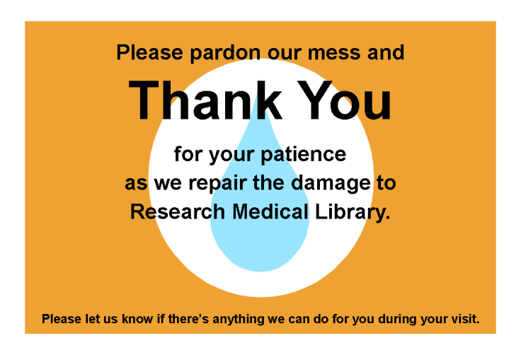
On the front desk, I placed this larger sign to explain things a little more in details and to help our staff with the right words to say to patrons.

flood1

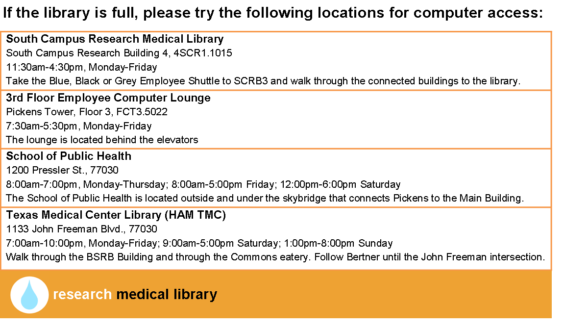
Finally, we are because we quickly realized that our limited space is not enough to fill the needs of our patrons (a nice problem because it illustrates our usefulness),  I created this quick half-page handout to point out other computer areas nearby:

flood3

Of course this design doesn’t do much to make us feel better about what is happening in our library, but it does serve an important role, and does it better than a hastily printed sign might.

I hope you don’t ever have a need for these signs, but if you do, email me for the original files.

Advertising Ebooks

My library is currently taking part in a demand-driven acquisition ebook pilot project through Proquest’s EBL and our state college and university library consortia. The challenge: advertise that mouthful to our students, faculty and staff. The solution: A mix of attention getting posters, slides for our website image carousel, as well as pamphlets and an accompanying libguide that go into more detail about the program and give our users instructions on how to access and download these ebooks.

ebook dda pilot poster advertisement

After struggling to coming up with an interesting, non-cheesy way to visually represent ebooks, I found the photo above on Flicker, and thanks to its creator Johan Larsson’s generous CC 2.0 Attribution license, I was able to build a design around it. I cut out most of the background, layered it on a black background and used Cicle font to create a slogan that is (I hope) intriguing but still meaningful. I decided against including a QR code because previous efforts at including them in signs for my library showed that none of the students were using them. The posters will be placed on bulletin boards in various academic buildings around campus.

I then adapted the poster design to a smaller scale: our website’s image carousel:

ebook pilot image carousel slideThis slide links out to a libguide about the ebook pilot project. Created by my colleague, Alana Verminski, the libguide offers more detail about the program and gives detailed instructions for users to locate, access, and download or print portions of the ebooks. Alana also did a fantastic job of creating a tri-fold brochure about the ebook pilot project which we’re sharing at our library’s information desk for those who want to take away information about it.

Ebook Brochure Inside Ebook Brochure OutsideThe poster and image carousel slide were created using Photoshop and the tri-fold brochure was created using Word. For the original files of any of these designs, please email Veronica Arellano Douglas.

Create a free website or blog at WordPress.com.

Up ↑