Search

Librarian Design Share

inspiration for library creatives

Category

Logos

Love for Logos

Some of my favorite design inspiration comes from logo design. I love following logo design boards on Pinterest and discovering interesting typography, color combinations, and unique layouts. Today’s design is a great logo from Kelsey Jordan and Mandy Swygart-Hobaugh at the Georgia State University Library.

Data in the ATL is a speaker series that brings in members of the Atlanta data science community to share their experiences and demonstrate how they use data analysis to improve the city of Atlanta and create innovative models for change. This is the first time the Georgia State University Library has run this series, and we needed a logo to identify the events and help them stand out among our other workshop offerings on the library calendar. My fellow librarian Mandy Swygart-Hobaugh came up with the original idea for the type set against the Atlanta skyline, but we needed to tweak the text spacing and replace the previous skyline .jpeg image with cleaner, more detailed linework. I used Adobe Photoshop to redesign the skyline, with the help of reference images and Google Earth to find the perfect perspective of the city’s most prominent buildings.

I love the color combination of orange and aqua–it’s definitely one I’ve used in the past–and the type choice of Gill Sans MT. The words look great against the dark grey skyline.

You can find the original, adaptable Photoshop file of this logo on the Librarian Design Share Google Drive.

Jet Stream of Creativity

Some of us are lucky to have a library name that’s just made to aid in marketing. I work at the Bryan Wildenthal Memorial Library at Sul Ross State University, so I am not one of these people! However, Susan Bloom, Associate Librarian, Head of Instructional Services at the James E. Tobin (JET) Library at Molloy College definitely is!   Susan has made numerous marketing designs for her library, but some of the best play off the JET theme:

tour-flyer

The above services for patrons in the style of an airline departure board is immediately familiar and clever, as is the air-mail themed pizza party invitation below:

2014-pizza-party


Susan explains her process and reactions from others about her designs:

All work was created by me using Photoshop CS6. I always get some emails from people saying how much they like them. I really love creating the fliers, it is very different from the other work I do and it allows me to flex some creative muscle. I always use Photoshop. I have tried using some other programs but they don’t give me the flexibility Photoshop does.

Susan has produced lots more library-related designs, and you can view those here. If you are interested in modifying Susan’s designs for your use, contact her directly. What about you guys? Has the name or a feature of your library inspired you in creation of designs? We’d love to feature them if so

Flood of Information

Sometimes when bad things happen, you brush them under the rug and pretend they never happened. Other times, you have to address them, embrace them, and then celebrate them. I’m so happy that our library did the latter after our leak last year. We were lucky to have the institution’s full support to repair our space. Once we did that, we decided to throw a party to recognize those who helped us and to welcome back our patrons.

rmlcelebrate

When designing the invitations (above) for our celebration, our library felt that it was important to keep the theme very similar to that of the leak communications. As a group, we brainstormed ideas that would go with the droplet, and we came up with the idea of using an umbrella. It’s a protection device, and that’s what our role was during the leak–protecting both our collection and our patrons from harm. I presented the following designs to the library to vote on:

umbrellas

I used clipart umbrellas from Microsoft Word, filling some with colors and changing the outline colors.  I combined the umbrella image with multiple clipart rain droplets that I previously used.  This design was OK, but it felt like the library had endured more of a flood than just a few drops of water…so I used the curvy line drawing feature in Publisher to insert a “flood” that runs to the umbrella.  Our staff overwhelmingly voted for the flood rather than the drops, and they liked the simpler umbrella best, so we had an icon for our party invitation and publicity efforts.

This design opened a floodgate of ideas (sorry for the pun, but get ready for a lot more to come!).  We decided our party would include a self-guided “Flood of Information” tour, which would highlight the different spots in the library that were affected, as well as connect those spots to a fact about our services.  Each station, named after songs that we thought exemplified the experience, was an exhibit: we had a tape line that showed how far the water flooded; we displayed damaged books; we had pictures and videos from the leak; and we showed a video about disaster recovery.  The five stations were easily found with a map that was coordinated to blue paper droplets taped to the floor.  Below is the two-sided map we distributed to our guests (and I won’t even go into the boring details of making the map, although it probably took longer than any other part of the design!).

floodofinfotour

To make our party even more personalized, after the tour, we invited guests to enjoy homemade cookies that all of us on staff had baked.  It was a warm welcome back for our patrons and a real celebration of our successful recovery.

If you are interested in any of the designs above to modify for your own recovery or celebration, let me know.

Branding Your Library

We librarians tend to make a lot of help sheets and signage to assist patrons as they use our resources.  That’s really what Librarian Design Share is about, right?  But even with best intentions, we don’t always fully think about the way our publications as a whole look and feel to our patrons.

I think Librarian Design Share would be remiss if we didn’t talk standardizing the look of your library’s publications, or branding, if you will.  Brands can highlight something unique about your community (perhaps it’s near water or you’re known for an historical event), your library (maybe you have an awesome stained-glass window or a spiral staircase), or it can be based on something more abstract, like colors, shapes, or even text.  We based our library branding on the pretty rainbow of colors our bound journals make on the shelves.  Everyone has bound journals on their shelves, but there’s something about the color arrangement and the mass amount of them that make the way they look in our large, light-filled space memorable. Here’s our general publication header that can be copied to any document:

new brand

Whatever standardization you decide upon should happen across the board–from all the pieces of paper that a patron might see in your library to your web presence. This is our website’s look:

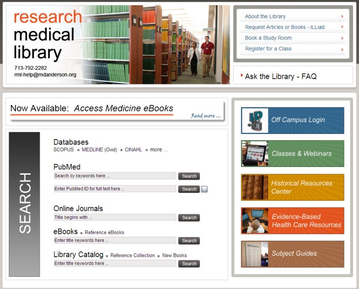
8-6-2013 12-10-59 PM

I thought my library was well on the way to doing this, but a quick audit of our documents online and on our slat wall exposed at least three previous brands that are still in use on our handouts.

old brands

Yikes, you know what my new project is…

Think about it terms of your favorite store: their shopping bags have the same look as their store signage as their website, right? So should our libraries.  It’s about making things more consistent in the minds of our users. More simply, it’s about showing our users that we care enough to keep things updated, neat, professional, and easy for them to digest.

If you have great examples of a branding campaign you’ve created and implemented at your library, we’d love to see them! Consider submitting them to our site and sharing them with your colleagues.

An Icon for Library Mobile Apps

Library, bookstackFrom Michael Schofield, at the Alvin Sherman Library, Research, and Information Technology Center at Nova Southeastern University:

Our university has an iOS and Android app called iShark. So, the library originally had zero presence within that hub, which essentially was linked out to the websites for Athletics and Dining and Parking, etc.(even though ours was the only responsive website university-wide [but I digress …]). Eventually, things came together and I had to create a graphic that was immediately identifiable as a button smaller than the average thumb. This is what I did. I figured that since we had no need to include our library’s full name, this graphic is widely applicable and I wanted to share.

Thanks for sharing your design, Michael. This is a great graphic for anyone looking for a mobile icon for their library. For the original Photoshop file, email Michael Schofield.


Work-in-Progress: Library Logo

SMCM Library Logo AttemptAfter undergoing a redesign this summer, our library’s website continues to be in a state of flux. Our current header design is not my favorite and I’m trying to come up with a new logo and header design for the library’s website. The above image is my first attempt but I feel like the bird alone doesn’t convey “library.” (Note: Our college’s mascot is the seahawk, hence the water-bird outline). Any suggestions?

Email Veronica Arellano Douglas for the Photoshop file of the logo or the Illustrator file of the bird.

Create a free website or blog at WordPress.com.

Up ↑