Search

Librarian Design Share

inspiration for library creatives

Librarian Design Share at TxLA 2021

Jess and I were delighted to present on behalf of Librarian Design Share at the Texas Library Association Annual Conference this year!

Our presentation, Creative and Inclusive Wayfinding for can be found on the Librarian Design Share Google Drive.

We talk about ways to create wayfinding material that is accessible and inclusive for all audiences, no matter the type of library you are in. We hope you enjoy it!

Call for Submissions

Hello readers, and welcome to our first post of 2021! The world sure looks different than it did a year ago, doesn’t it? Wherever the last whirlwind of a year has taken you, no doubt some adjustments to your work have been made. Many of us are working from home, teaching remotely, or having to rethink the way we approach our work. In some cases, this may mean relying more heavily on eye-catching materials in order to capture the attention of your students.

Our first call for submissions of the year is for design-centered instruction handouts and related materials. We’ll be compiling several of these into one post so if you don’t see it posted right away, don’t worry!

Since its been a while (and some of you might be new readers), here’s a refresher of what we require upon submission:

  • your name
  • your email address
  • your library
  • a photo, file or link to your work online
  • the software used to create your design (if applicable)
  • a brief description of your design (see previous posts for examples)
  • If you are submitting designs made in Canva, please note that we will follow up with you for information on additional characteristics and considerations made when creating your design. And to stay true to the spirit of Librarian Design Share, we are also requiring that you share a link to an editable copy of your design.
  • All work will be published on this site under a Creative Commons Attribution-NonCommercial-ShareAlike 3.0 Unported license.

As always, we are accepting all kinds of submissions. Find more information on our page on Submitting Your Design.

A Note to our Readers

Dear readers,

Naomi and I want to say hello and give some insight into our significant pause in sharing your work through Librarian Design Share.  

We are both located in the United States and are with you in experiencing the collective trauma of the COVID-19 pandemic and failed political leadership.  We are also mourning the death of George Floyd, Breonna Taylor, and others at the hands of the police and are using this moment to build momentum in the fight for justice for Black, Indigenous people of color.  In Allentown, Pennsylvania, my home, a man was brutalized by police just a few weeks after George Floyd was killed.  We are organizing as a community and calling for reform within our local police department – the fight is far from over.  

Librarian Design Share was created as a community resource to strengthen each of our work. This site demonstrates what we know about communities who join together in this way- we are able to amplify each other’s voices, sustain the work, and produce results more quickly.  We are temporarily turning towards other communities and hope that you are as well. 

Wishing you health, rest, and justice.

Be well,

Jess

Honoring the Class of 2020

Whew. It’s been a year, and we are only halfway through it. There is so much to say, but we’ll keep it simple: we hope you all are staying safe and being careful.

It’s been a while since we’ve received any submissions, so we were delighted to receive an email from Emily Robinson from the Trexler Library at Muhlenberg College. Acknowledging that things have changed, Emily put together a special social media campaign for her library’s senior student workers set to graduate this spring.

These posts were created and managed through Hootsuite.

Here’s what Emily had to say:

These posts were part of a small social media campaign (Instagram and Facebook) that I put together to honor our library’s senior student workers as they prepared to graduate during and into an unprecedented situation. At the end of a typical spring semester, we would be able to honor our seniors with an in-person celebration, but this semester was atypical in every sense. With that in mind, this series of posts was an effort to make sure these students still felt celebrated and connected to the library after their many semesters of dedicated hard work. Participation was completely optional and 7 of our 13 seniors excitedly submitted reflections on their time with us. Students, library staff, and the greater College community alike enjoyed reading about our seniors and helped us recognize the very unique Class of 2020 through their shares and comments!


Many thanks to Emily for sending us these beautiful posts!

Surviving (and Celebrating!) Finals

I am happy to share a super fun submission, just in time for the end of the year sprint leading into finals.  Laura Sider of the Bass Library at Yale University sent us encouraging pull-tab flyers, explaining:

 I have a few standards I use semester to semester (like the school mascot) and then I try to create new ones that are a little trendier. I place them in high-traffic areas throughout the library (i.e., entrances and exits, by printers, on bathroom doors, in major study spaces). The hope is that these tabs will make students feel empowered or motivated or, at the very least, laugh. They’ve been extremely popular. We went through about 50 sheets in the first two days of exams, and a total of about 80-90 over the course of the week. The only cost is printing and the time putting them up and replacing them.

These were created in Excel and are available for you to use or modify on our Google Drive!  May you also find encouragement and inspiration as you slay all day.


Creating with Canva

Over the past couple of years, we’ve seen more designs than ever being created with Canva. The reason? Canva is easy to use and with built-in templates, it removes some of the trepidation that comes most design work. How will this look? Where do I put this text? What could I do to fill this white space? Canva answers these questions with relative ease and and all the drag-and-drop options you could hope for.

We’ve seen some great submissions that have used Canva so when Jess and I received the following from Adrienne, a reference librarian at Campbell University School of Law in North Carolina, we were glad that she addressed a commonly shared concern with Canva.

Here are Adrienne’s submissions, one that includes some eye-catching text for a legal research contest and the other, a colorful promotion for a bike sharing program that includes a quote by Albert Einstein:

Bigfoot and the Law to post

_I thought of that while riding my bike._

In her email to us, Adrienne mentioned that she usually uses Photoshop but will also use Canva when the occasion calls for it. When asked about her experience with Canva, Adrienne said

I like Canva for the free vector elements and ease of design. It’s also really useful for choosing font pairings. Canva’s drag and drop technology is so much easier than photoshop’s layers and masks. Unfortunately, like everything in this world, free Canva is getting less and less free. Once it goes completely paywalled, I’ll stop using it all together. But until then I’ll keep using it for my quick and easy projects.

While we do love a good quick and easy option, Jess and I have often talked about the complications using Canva presents, namely access.

As most of you are aware, the files of designs that are submitted to Librarian Design Share are included in our Google Drive under a Creative Commons license so that other librarians can change them up and reuse them. This is easy with designs made in Publisher, Photoshop, Word, PowerPoint and other mediums. But how to do the same with designs made in Canva? Moving forward, what we’re doing is asking that each Canva submission also include a link to an editable copy of the design. It’s very important that the link go to an editable copy, otherwise you could lose the original design. Keep in mind that you have to have a Canva account and be logged in in order to access these files, which is free for now.

Here are Adrienne’s shared copies of Bigfoot and the Law and Bike Sharing at Campbell Law.

And with fall around the corner, we’d love to see what you’ve come up with for the season. If you have any fall-themed marketing materials or seasonally appropriate signs, please visit our Submission Page for our list of requirements and submit your design to librariandesignshare@gmail.com.

Library Website Redesign: An Interview

This isn’t a common Librarian Design Share topic, but one of the biggest design projects a library can undergo is the redesign of their website.  I am fortunate to work with two individuals who recently led redesign efforts at the Muhlenberg College Trexler Library, and I met them to discuss their process, priorities, challenges, and advice for other library’s attempting this endeavor.

Introducing

DSC_4331_5 (1).jpg
Brittany Robertson, Library Technology and Digital Experiences Librarian
Cunningham_Staff_Headshot (1).jpg
Nicholas Cunningham, Public Services Assistant


What inspired the website redesign?

Brittany shared that the redesign was inspired by assessment of the user experience.

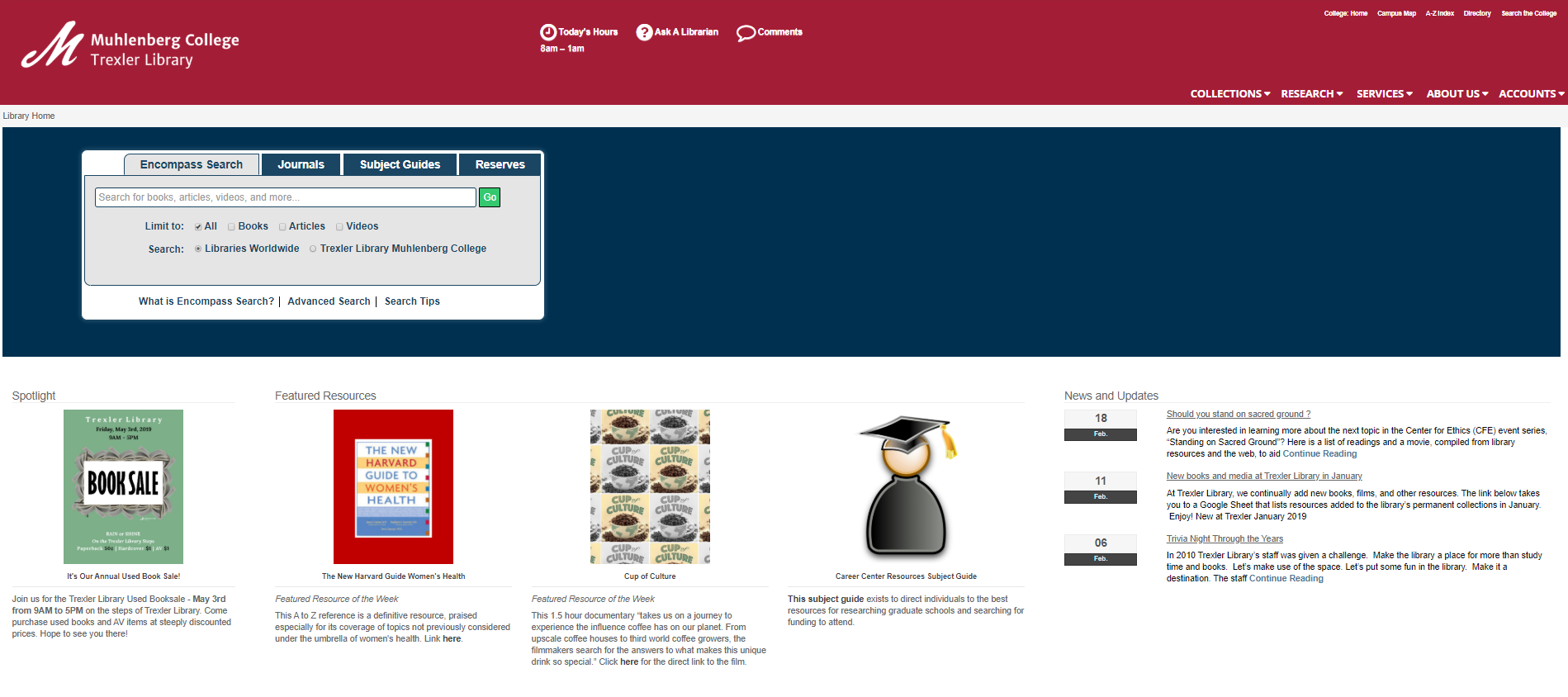
“We knew that our site was difficult to navigate based on information from surveys and interactions with staff and faculty.  Our site was also dated, and we needed to update the underlying infrastructure. We could see from Google Analytics that most of our pages weren’t getting a lot of traffic.”

old website.PNG

Brittany and Nicholas shared with me the steps that they took to redesign the website, which, by the way, took 1 year from start to finish and “I’m not sorry that the full redesign is over,” Brittany said, “but it’s important to see the website as an ongoing project, needing continuous improvements.”

What was your process?

  1. The library’s web applications team initially decided to do the website redesign – it consists of several  individuals from each library department. However we created a design subcommittee (4 people, one from each department) so that design conversations were inclusive but the work could progress forward.
  2. The web applications team participated in an initial brainstorm about “what we wanted to accomplish with the new site.”
  3. By considering the needs of different types of patrons “the subcommittee came up with a couple of ideas for layouts, and engaged in a couple of rounds of feedback and editing.”  Layouts were shared with the full web team and then each department.
  4. A design was chosen and each member of the library staff helped to organize and review content.  “It’s a big site, and we’ve come up with the plans of a maintenance schedule so that all the content is reviewed annually.”
  5. We completed one round of assessment with students.  The assessment process (a series of tasks to be completed by the student) was reviewed by the IRB.  Changes were made to the website if students had consistent trouble locating information.

What were the main changes to the site?

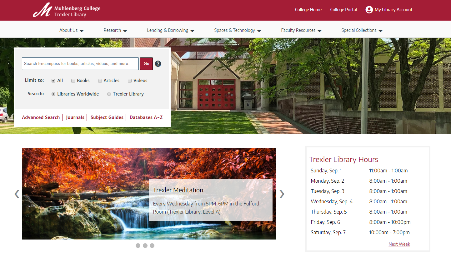
Brittany and Nicholas described the changes they made to navigation, which was their first priority.  They determined that about seven menu items is ideal for successful navigation in order to “get patrons to where an item might be.”  They hope that if a patron can intuit where a piece of information would be based on headings then they would find it successfully. They altered site navigation design so that it resembled the design of other library platforms, including OCLC discovery and EBSCOhost databases, making navigation familiar and easier to use.  Similarly, consistent use of color scheme helped to tie all library interfaces together.

How did you stay organized?

They used agendas, taking minutes during meetings, and spreadsheets of tasks that they checked off as they were completed.  The hardest part? “Remembering what decisions were made and why,” Brittany said, “…we did struggle with that a bit.”

The final result – and the future

The website is visually appealing and ready for another round of user experience assessment, which will be completed later this year.  You can take a closer look at the navigation and content by exploring trexler.muhlenberg.edu.

new-website.png

Brittany is currently thinking seriously about accessibility – and implementing the accessibility changes that she’s already worked hard to design.  She recommended consulting W3 for accessibility guidelines and noted that she does want to test the final result with a screen reader.  She has worked hard to make sure that users of all abilities can navigate the site successfully with techniques such as shortcuts to skip navigation so that the entire menu isn’t read before the user can move on to the main page content.

Advice for Others 

When I asked them for advice they might give to others seeking to redesign their library website, Brittany and Nicholas emphasized flexibility and communication.

“Don’t get tied down to one idea” – Nick

“Get anyone who wants to come up with an idea to do it– but it is really hard to get people to come up with ideas.” –Brittany

“Whatever plan you set for the redesign process, chances are you’ll have to modify it/make it longer and there is nothing wrong about that.” – Brittany

“Creativity is a challenge” – Nick

And finally…

“Have a set date to go live.  Otherwise projects tend to drag on endlessly. “ –Brittany

We have PRIDE!

June is LGBT+ Pride Month, and I am so happy to see libraries participating.  One particular display caught my eye because of its inclusive use of the pride flags.  IMG_6403.jpegAndrea Georgic of the Northland Public Library in Pittsburgh, Pennsylvania shares,

For pride month this year, I wanted to create a more visible and inclusive display for our patrons. We’ve hung banners and pendants across the top of this display before, and since so many people in the LGBTQ+ community have created colorful flags to express their identities, I figured what better decoration than that. Representation is important, and I wanted to reflect as many people as possible, so I did some searching and chose as many flags as I could comfortably fit above the display. I also wanted to create an opportunity for conversation and learning by representing groups that are often forgotten or unknown. We’ve already had a number of patrons ask about the different flags or tell us they looked one up that they weren’t familiar with. I also chose the larger display this year for visibility and to showcase as many of our LGBTQ+ books as possible.

Andrea used Power Point to make the flags, and Canva for this flyer:

celebratepride.PNG

At Muhlenberg College, we utilized a pride banner on our website, in-person display, and for button give-aways.

Trexler-Pride-for-web.jpg

I made this in Adobe Illustrator, taking the traditional pride flag (after a lot of uncertainty after seeing all of the varieties!) and blending the colors for some added fun.  I agree with Andrea, representation is important.  I’m now inspired to include more flags in upcoming celebrations of pride.  Thank you for sharing, Andrea!

All of these materials are available on the Librarian Design Share drive under a Creative Commons Attribution-NonCommercial-ShareAlike 3.0 Unported license.

Did you do something to celebrate?  We would love to see examples of your library’s pride!

Humanizing Outreach Services and Marketing

Every once in a while, I see a library outreach campaign that challenges the traditional boundaries of library service.  Here’s the brief summary of the reason I’m writing today:  In August 2012, Doug Campbell, University of North Texas Research and Instructional Services Librarian, moved into Kerr Hall, the largest residence hall, as Faculty-In-Residence.   Campbell provided reference services on site and took students out for coffee on Saturdays.  To read the details of the work, read Campbell’s reflection.

These services were supported by an amazing marketing campaign, complete with swag, yard signs, a video, and flyers.  Housing Marketing Coordinator Mark McLeod worked as Art Director for the project and provided feedback to student designer Eric Richter.

text is: "Doug goes where Google can't. Thousands of resources that Google won't find. Need library help? Ask Doug." with a cartoon image of a face profile with brown hair, glasses, and beard.text is: "need library help? ask Doug. It's okay to ask." with a cartoon image of a face profile with brown hair, glasses, and beard.

McLeod shared with us:

As far as the process goes, the idea was that Doug was the “face” of the library in the residence halls (dorms), and since he has (or at least had) a distinctive beard, we used a combination of his face, mostly the beard and glasses, as an icon along with text page text to convey the librarian idea.

The artwork was pencil sketched and scanned into Adobe Illustrator.

We probably spent more time concepting the idea than actually doing the artwork. There were a lot of sketches we did for ideas that didn’t really convey the meaning. The “Doug face” idea was fairly simplistic, which was a good thing since the message conveyed really fast.

I think that utilizing Doug’s distinctive beard as a prominent feature in this marketing campaign logo is a fun way to help students recognize the librarian who lives just around the corner!   Would you consider being the “face” of your library?

Create a free website or blog at WordPress.com.

Up ↑