Search

Librarian Design Share

inspiration for library creatives

Simplifying Support Services

Occasionally in my eagerness to let someone know about a resource or service, I provide way too much information. I go above and beyond what that person asked about because I want them to feel like they know all of their options. Sound familiar?

More often than not, this tendency to provide as much information as possible is also apparent in my designs. I find myself revisiting my creations periodically in an effort to pare down and streamline the information included. In my time as a librarian, I’ve learned that I am not alone in this experience.

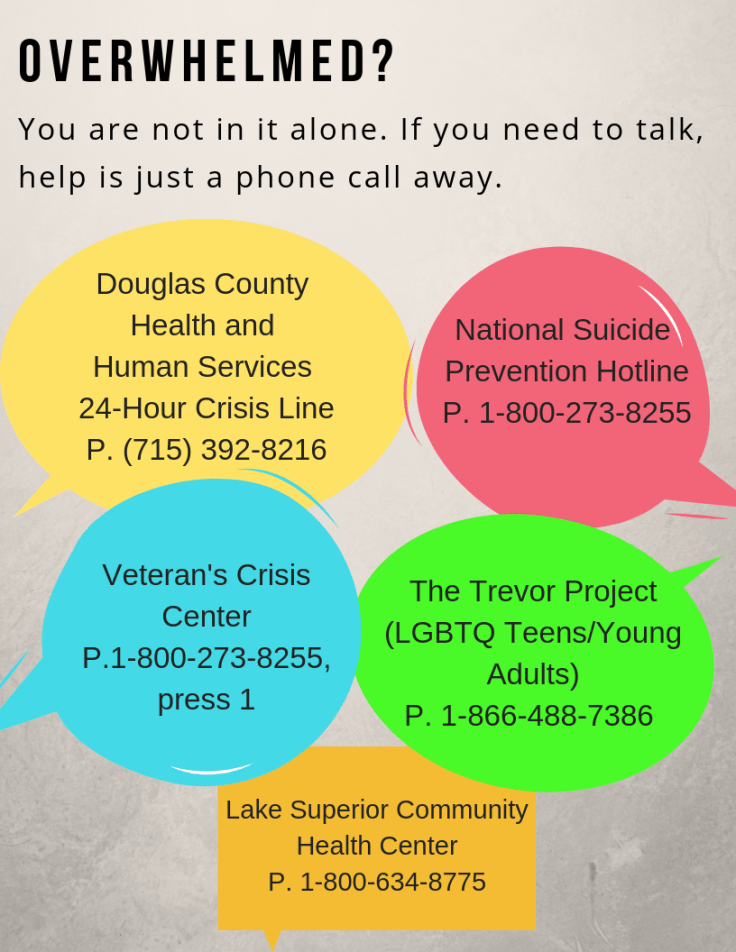
Stephanie Warden at the Jim Dan Hill Library at the University of Wisconsin, Superior sent us a design for mental health resources that strips away the noise and provides users with the most pertinent info.

Flyer with 5 speech bubbles that have mental health resource info in each bubble

Here’s what Stephanie had to say about her design:

While our institution offers flyers advertising support for student mental health services, we found that the material was a little too text-dense and left out resources available to our community patrons. Using services gathered by the rest of the staff I put together this 8.5 x 11 flyer that we have placed strategically throughout the library.

Stephanie used Canva to create her design. And like other librarians we’ve talked to about Canva, she had good things to say about the process. When we asked why she chose to use Canva over other tools, she told us:

The free version of Canva has an amazing number of options available, especially if you aren’t afraid to get in there and experiment with colors and features. That it also allows us to upload our own pictures and pictures from other appropriate sources really makes it a favorite of mine. It also doesn’t hurt that I can peruse their library for inspiration when I find myself stumped.

Thanks for your submission Stephanie!

Check Out These Audio Books

I am a huge fan of audio books.  I listen to them in my car constantly.  I don’t need any encouragement to try another.  However if I did need encouragement, I would certainly stop by this display by Katrina Spencer at Middlebury College’s Davis Family Library.

audiobooks display.PNG

Katrina says,

 In the fall of 2018, I launched an effort to diversify my library’s audio book collection hosted by OverDrive. Previously, it almost exclusively featured white authors. However, it wasn’t enough to place works by authors of color on our platform. We needed additional types of diversity to be represented; users needed to know that dozens of new acquisitions had just been made; and a culture of their use needed to be developed. So, I initiated a multi-platform campaign to inform patrons on how to use the technology and to inform them of our wares. In a display set up in a high traffic zone adjacent to the Research Desk, about 15 “book dummies” or wooden blocks were covered with book cover art to display new titles in our collection. I used two mannequins, dressed in popular attire, to represent students who might use the audio books, and I dressed them in popular clothing, adorning their ears with headphones. Along the border of the display, handouts were made available with 5-step instructions on how to use the audio books. What was most effective in making this display a success was when I staffed the desk and personally invited passersby to take a handout.

The display isn’t the only thing that Katrina created:

In a continued effort to promote use of our audio book collection, I developed two slides that would be in rotation on a television screen at the Circulation Desk, another high traffic zone. The slides include book cover art for two works in our audio book collection, Everything’s Trash, But It’s Okay by Phoebe Robinson and Less by Andrew Sean Green. These titles were intentionally selected not only because they display beautiful cover art, but also because they represent at least two genders and at least two races, a small and simultaneously significant nod to the diversity of audio book users to whom I was marketing the collection. Beside the images are step-by-step instructions for how to use the audio book platform and images of headphones and smartphones, modern technologies that reinforce that the promoted materials are mobile and for listening. While the corresponding, physical display for audio books was taken down after about a month so as to reclaim the Research Desk’s space, the slides can remain in rotation indefinitely.

pp.PNG

These displays are engaging, clear, and informative – and I love the personal touch to encourage people to listen.  Katrina made the flyer for the display in Adobe Illustrator and the digital display in Power Point.  Both are available on the Librarian Design Share under a Creative Commons Attribution-NonCommercial-ShareAlike 3.0 Unported license.  Thank you for sharing, Katrina!

Read the Text

This semester has been a blur – instead of regularly posting on LDS (my apologies!), I’ve been writing, teaching, and rushing through a website user experience assessment.  We’re updating our website and need some student feedback and fast!  After completing the IRB application, I jumped on outreach in order to draw student attention, which resulted in the following poster – I love the alignment of text, emphasis, and the fact that it came together so quickly.

web ux.PNG

I used Adobe Illustrator to alter the spacing between lines of text (leading) and between characters (kerning) in order to make the text easier to read and attractive to view.  Muhlenberg College students enjoyed the opportunity and a few days later we had the feedback we needed!

As always, the original file is shared on the Librarian Design Share google drive under a Creative Commons Attribution-NonCommercial-ShareAlike 3.0 Unported license.

When Design Begets Design

I personally love creative projects that build upon one another.  That’s one of the reasons that this poster from Jessica Richmond and Kate Transue of the Bucks County Free Library is so cool – digital designs became patches became a great poster presentation at the 2018 Pennsylvania Library Association conference.

badge squad

The library contracted a graphic designer to custom create the digital badges and the utilized The/Studio to print them on fabric.  But they weren’t done utilizing the designs!  Jessica wrote,

Our poster introduced how our library system successfully revamped an online program to create year-round in-house programs.  We already had graphics that were used to create fabric patches as incentives for the programs, so we knew these would be a focal point.  We also wanted to use one of our library’s branding colors to create a clean, consistent design, so we chose blue to complement the graphics.  Using a tri-fold layout helped us organize the information.  The center panel became the conversation starter and featured the basic concept of the programs, the graphics, and the skills & outcomes while the two side panels went into detail about the background, development, and specifics of the programming.  Instead of signing the poster with just our names and titles, we included a photo of us giving a thumbs-up next to our library’s logo.  Not everyone noticed this detail, but we definitely saw smiles from those who did!

Jessica and Kate utilized Canva to make their poster.  They described the experience as “user-friendly” and “modern.”  Jessica and Kate utilized a few Canva features to create this clean design.  The first feature they highlighted was the ability to create custom dimensions in order to fit their tri-fold display.  They also mentioned that their library has saved their branding colors as a palette within Canva and so color selection became even easier.  Jessica and Kate were happy with their Canva experience.  However they noted,

Our only complaint was the lack of a ruler and/or gridlines to see exactly where everything lined up. We did end up downloading the poster a few times and pasting it into Publisher to make sure the panels would be exactly centered. Otherwise, we were very happy with the choice to use Canva, and even happier with the result. The print itself also turned out incredibly clear because we were able to use the custom dimensions.

Kate and Jessica’s design story demonstrates the techniques that we often use to accommodate our tools or abilities.  When your design desires overcome your capabilities, it may be a good option to ask for help!  Their library’s investment in great graphic designs provided great reward.

Jessica and Kate’s design can be found on our Google drive.  Remember, all submitted work will be published on this site under a Creative Commons Attribution-NonCommercial-ShareAlike 3.0 Unported license.

Design for Accessibility: Writing your content

One important principle of web accessibility is also a lesson I learned from my mom:  use your words.    Thanks, Mom!  In web accessibility, this principle applies to the writing of web content and in the description of images through the use of alt text.

Think about the difference in these two sentences:

  1. Librarian Design Share is doing a series on accessibility. Read our first post here!
  2. Librarian Design Share is doing a series on accessibility. Our first post outlines the importance of checking the accessibility of colors for flyer and web design.

All I tried to change was the language to which I attached a link.  Instead of using an ambiguous “here,” I used language that describes the landing page.  This way, users do not have to guess what resources are available to them by context clues.   I think that abiding by this principle also results in more interesting content!

Similarly, when using images in your web content, it is important to fill in that alt text field.  Alt text is the content that assistive technologies will read to users, and by ignoring that field you are, in essence, excluding those people.  It is important that the alt text is descriptive of the image, and highlights the important pieces of information contained within.

a screenshot of alt text editor

You might try and argue that the images you include in your web content are just for decoration.  By failing to fill out the alt text field in these circumstances you are denying people your expression of playfulness, beauty, nuance.  However, there are other situations where failing to include alt text would decrease the important information available to your readers.  For example, how often do you upload a .jpg of a flyer with event descriptions, dates, and times?  Without including this information in another place on the page or within the alt text, this information would be lost on the visually impaired.

So remember my mom (or yours!) next time you’re creating web content and use your words!

Designing Displays on a Budget

Ah, the time honored librarian tradition of book displays. Even for a well-funded library, creating a display that’s eye-catching and well designed can be a tall order. What’s a librarian to do? Well, sometimes you just work with what you’ve got.

Ella Hassett from Arup Library has this to say about her International Women’s Day book display:

This is the International Women’s Day (IWD) book display, which was launched in our library space on 8th March 2018. As is evident from the image below, the space available for book displays is narrow and sits in front of staff desks, so it is difficult to work with, as any display cannot block the area behind. It is also restricted as there is no wall or board to display information behind the display, so this has to be done using the units underneath instead. As this was my first display, it was very much an exercise in frugal creativity.

This book display was created with zero budget and utilised whatever stationery was available from the cupboard. It shows what can be done with access to office supplies! The books on display are a collection of titles about significant women working in the built environment and books about gender equality in the workplace. The display encompassed upright Venus signs made of paper cups with the motif glued to them, which were visible when approaching the library space. Some of the books were also standing upright to attract attention, with others laid flat for people to browse. I designed a simple sign to indicate what the display was for and used the same red colour as the IWD firm campaign, of which we included some posters on the unit underneath, as this created consistency. The stars were leftover Christmas decorations that added some sparkle to the display.

Although it was a small display, I am proud of the results, as the majority of the books were checked out over the course of International Women’s Week. Going forward, I will continue to utilise this display space to promote our collections and engage with our users.

photo of an international women's day book display in an academic library

Ella used Adobe Photoshop CS5 to create the signs for the display. Nice work Ella!

Design for Accessibility: LibGuides

Library resources can be hard to locate, but all of the university libraries I have worked at have used Springshare libguides, called help or subject guides, to make resources more visible to the public.  Perhaps yours does too!  If this is true, I have one tip for great libguides:  design for accessibility.  If you design for accessibility, your guides will be better for everyone.

While the intention of libguides is to make resources more easily found, they can still be a significant hurdle to individuals with sight impairments or literacy challenges.  Thanks to Springshare, the solution is actually quite simple:  use the information structures available to you.  First, create boxes with names that help students identify what information will be found within.  Using headings like “Finding background Information” and “Finding scholarly articles” will help students identify where to find the information they need.  Then, within these boxes, choose the correct information type or structure.  If you are including a link, use the “link” structure – the same goes for “database” or “book from the catalog.”

Why is this useful?  Because assistive learning technologies, like Kurzweil, utilize the hierarchy of data structures to allow users to skip from one to the next quickly.  Therefore, if a user is interested in finding scholarly journal articles they can easily skip past the box labeled “Finding background information” and go to the box titled “Finding scholarly articles.”  If they know they want to search in Worldwide Political Science Abstracts they can easily skip through the other databases listed.  The alternative to this quick hop through information resources is a comparatively slow process of listening to a lot of text in order to find the desired resource.  I’ve seen this many times – librarians commonly select to use the “Rich Text/HTML” structure, which allows you to include text, and links, at will.  The lack of structure in this kind of content makes it inaccessible and unwieldy.

One of the nicest information types to use is “book from the catalog.”  By allowing users to paste the ISBN number for a book into the proper field, Springshare automates and standardizes the rest of the bibliographic information included in the recommendation.  This is also important for accessibility – individuals can learn a significant amount of information without having to leave the page and the standardization allows users to anticipate what information to expect on the page. Utilizing this information structure also makes your guide look nice!  The cover of the book can easily be included, and the visual element breaks up the text-heavy guide.

accessible libguides

Revising libguides to abide by this accessibility principle provides great value to the library’s user community.  If your library uses another application to direct students to resources, take a look at the structures available or be sure to utilize the correct html element in your guide creation process.  Leveraging the hierarchy of guide design and descriptive elements of html can make a huge difference for the access of individuals with differing needs.


Designing for Accessibility

As librarians and designers, our users should always be at the forefront what we create. Sometimes this means tailoring our creations to a specific audience, like students in a university setting or teens in a public library, but often our users are anyone who comes into the library space. When you create those fliers or infographics to post on your LibGuide, are you also designing for the population of users that have a vision impairment or use assistive technology? Can those users get the same information from your design as someone without a disability?

To me, that question is what is at the heart of accessibility.

I know, the A-word can be intimidating. Everyone is talking about it, and there are laws and guidelines and a lot of work goes into making something accessible and don’t we already have enough on our plates? I get it y’all, trust me. Addressing accessibility is a whole Thing, which is why Jess and I have decided to dedicate several posts specifically to the topic. Because really, accessibility* is not out of reach for any us.

It should come as no surprise that there is a panoply of online resources to help you create accessible documents and (thankfully) most of the are free! But in an effort to not overwhelm you with information, I’ll leave you with one resource that I have bookmarked and use every time I design something new: WebAIM’s Color Contrast Checker.

While all of WebAIM’s resources are great, I especially love the Color Contrast Checker because it not only tells me if the colors I’m using pass or fail Web Content Accessibility Guidelines (WCAG) standards, but it gives the ratio of how close to passing/failing I am. All you have to do is plug in a color in hexadecimal format (or hex code) for foreground and background, and voila! You have your report.

screenshot of WebAIM color contrast checker

If you don’t know the hex code for the colors you’re testing on and it’s within your browser, you can use an extension like ColorZilla to pick the color from a webpage. If it’s something you created and want to test, you can always use something like Image Color Picker to upload and grab the color.

Testing the color contrast of your text and images can help you create documents that are accessible for all sighted users, including those with vision impairments. Although it may not seem like much, it is a critical part of designing for accessibility.

Stay tuned for the next post in our Designing for Accessibility series and if you have an accessibility related topic or design you’d like to share, let us know!


*Footnote: The term accessibility can be applied to many things, but for the most part we’ll use it specifically with web and document accessibility in mind.

Opera Talks and Classic Design

While we always love receiving submissions that show off impressive feats of Photoshop prowess, we also appreciate the simple things in (library)life. Today’s post, featuring Gaetano Abbondanza from the Glendora Public Library in Glendora, California, is a digital flyer that employs a solid, classic design.

We host a program series titled “Opera Talks”, in which speakers from the Los Angeles Opera Speakers Bureau give presentations about the world of opera, as well as detailed information about whatever opera is currently on stage.

I designed this flyer to display on our LCD screen, which is positioned about the circulation desk. The screen runs a PowerPoint presentation of upcoming programs.

This program featured a talk about the opera “Nabucco”. I used a still shot from the production for the main photo. Since the scene is pretty dark, I used white lettering on a black background to create a seamless, blended feel. Publisher is my go-to program for creating flyers- it’s simple to learn and use, and provides a high degree of flexibility.

Flyer for Opera Talks Event

Creating flyers for digital display can be tricky; you want to  make something eye-catching but also easy enough to read before the screen changes. And oftentimes the color on the final product looks different on the big screen than it did when you made it. Gaetano’s flyer includes an intriguing image from the show it’s advertising and has all the need-to-know information in one spot. The contrast of white on black also eliminates most color distortion issues and ensures that any users with visual impairments will be able to read the sign.

This flyer was created with Microsoft Publisher and the file is available for download on our Google Drive. As always, all submitted work will be published on this site under a Creative Commons Attribution-NonCommercial-ShareAlike 3.0 Unported license.

Create a free website or blog at WordPress.com.

Up ↑