
One important principle of web accessibility is also a lesson I learned from my mom: use your words. Thanks, Mom! In web accessibility, this principle applies to the writing of web content and in the description of images through the use of alt text.
Think about the difference in these two sentences:
- Librarian Design Share is doing a series on accessibility. Read our first post here!
- Librarian Design Share is doing a series on accessibility. Our first post outlines the importance of checking the accessibility of colors for flyer and web design.
All I tried to change was the language to which I attached a link. Instead of using an ambiguous “here,” I used language that describes the landing page. This way, users do not have to guess what resources are available to them by context clues. I think that abiding by this principle also results in more interesting content!
Similarly, when using images in your web content, it is important to fill in that alt text field. Alt text is the content that assistive technologies will read to users, and by ignoring that field you are, in essence, excluding those people. It is important that the alt text is descriptive of the image, and highlights the important pieces of information contained within.
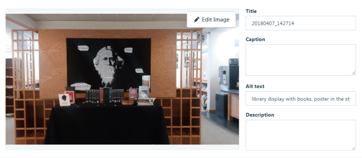
You might try and argue that the images you include in your web content are just for decoration. By failing to fill out the alt text field in these circumstances you are denying people your expression of playfulness, beauty, nuance. However, there are other situations where failing to include alt text would decrease the important information available to your readers. For example, how often do you upload a .jpg of a flyer with event descriptions, dates, and times? Without including this information in another place on the page or within the alt text, this information would be lost on the visually impaired.
So remember my mom (or yours!) next time you’re creating web content and use your words!

Leave a comment