Search

Librarian Design Share

inspiration for library creatives

Category

Web Design

Library Website Redesign: An Interview

This isn’t a common Librarian Design Share topic, but one of the biggest design projects a library can undergo is the redesign of their website.  I am fortunate to work with two individuals who recently led redesign efforts at the Muhlenberg College Trexler Library, and I met them to discuss their process, priorities, challenges, and advice for other library’s attempting this endeavor.

Introducing

DSC_4331_5 (1).jpg
Brittany Robertson, Library Technology and Digital Experiences Librarian
Cunningham_Staff_Headshot (1).jpg
Nicholas Cunningham, Public Services Assistant


What inspired the website redesign?

Brittany shared that the redesign was inspired by assessment of the user experience.

“We knew that our site was difficult to navigate based on information from surveys and interactions with staff and faculty.  Our site was also dated, and we needed to update the underlying infrastructure. We could see from Google Analytics that most of our pages weren’t getting a lot of traffic.”

old website.PNG

Brittany and Nicholas shared with me the steps that they took to redesign the website, which, by the way, took 1 year from start to finish and “I’m not sorry that the full redesign is over,” Brittany said, “but it’s important to see the website as an ongoing project, needing continuous improvements.”

What was your process?

  1. The library’s web applications team initially decided to do the website redesign – it consists of several  individuals from each library department. However we created a design subcommittee (4 people, one from each department) so that design conversations were inclusive but the work could progress forward.
  2. The web applications team participated in an initial brainstorm about “what we wanted to accomplish with the new site.”
  3. By considering the needs of different types of patrons “the subcommittee came up with a couple of ideas for layouts, and engaged in a couple of rounds of feedback and editing.”  Layouts were shared with the full web team and then each department.
  4. A design was chosen and each member of the library staff helped to organize and review content.  “It’s a big site, and we’ve come up with the plans of a maintenance schedule so that all the content is reviewed annually.”
  5. We completed one round of assessment with students.  The assessment process (a series of tasks to be completed by the student) was reviewed by the IRB.  Changes were made to the website if students had consistent trouble locating information.

What were the main changes to the site?

Brittany and Nicholas described the changes they made to navigation, which was their first priority.  They determined that about seven menu items is ideal for successful navigation in order to “get patrons to where an item might be.”  They hope that if a patron can intuit where a piece of information would be based on headings then they would find it successfully. They altered site navigation design so that it resembled the design of other library platforms, including OCLC discovery and EBSCOhost databases, making navigation familiar and easier to use.  Similarly, consistent use of color scheme helped to tie all library interfaces together.

How did you stay organized?

They used agendas, taking minutes during meetings, and spreadsheets of tasks that they checked off as they were completed.  The hardest part? “Remembering what decisions were made and why,” Brittany said, “…we did struggle with that a bit.”

The final result – and the future

The website is visually appealing and ready for another round of user experience assessment, which will be completed later this year.  You can take a closer look at the navigation and content by exploring trexler.muhlenberg.edu.

new-website.png

Brittany is currently thinking seriously about accessibility – and implementing the accessibility changes that she’s already worked hard to design.  She recommended consulting W3 for accessibility guidelines and noted that she does want to test the final result with a screen reader.  She has worked hard to make sure that users of all abilities can navigate the site successfully with techniques such as shortcuts to skip navigation so that the entire menu isn’t read before the user can move on to the main page content.

Advice for Others 

When I asked them for advice they might give to others seeking to redesign their library website, Brittany and Nicholas emphasized flexibility and communication.

“Don’t get tied down to one idea” – Nick

“Get anyone who wants to come up with an idea to do it– but it is really hard to get people to come up with ideas.” –Brittany

“Whatever plan you set for the redesign process, chances are you’ll have to modify it/make it longer and there is nothing wrong about that.” – Brittany

“Creativity is a challenge” – Nick

And finally…

“Have a set date to go live.  Otherwise projects tend to drag on endlessly. “ –Brittany

Design for Accessibility: Writing your content

One important principle of web accessibility is also a lesson I learned from my mom:  use your words.    Thanks, Mom!  In web accessibility, this principle applies to the writing of web content and in the description of images through the use of alt text.

Think about the difference in these two sentences:

  1. Librarian Design Share is doing a series on accessibility. Read our first post here!
  2. Librarian Design Share is doing a series on accessibility. Our first post outlines the importance of checking the accessibility of colors for flyer and web design.

All I tried to change was the language to which I attached a link.  Instead of using an ambiguous “here,” I used language that describes the landing page.  This way, users do not have to guess what resources are available to them by context clues.   I think that abiding by this principle also results in more interesting content!

Similarly, when using images in your web content, it is important to fill in that alt text field.  Alt text is the content that assistive technologies will read to users, and by ignoring that field you are, in essence, excluding those people.  It is important that the alt text is descriptive of the image, and highlights the important pieces of information contained within.

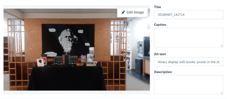
a screenshot of alt text editor

You might try and argue that the images you include in your web content are just for decoration.  By failing to fill out the alt text field in these circumstances you are denying people your expression of playfulness, beauty, nuance.  However, there are other situations where failing to include alt text would decrease the important information available to your readers.  For example, how often do you upload a .jpg of a flyer with event descriptions, dates, and times?  Without including this information in another place on the page or within the alt text, this information would be lost on the visually impaired.

So remember my mom (or yours!) next time you’re creating web content and use your words!

Design for Accessibility: LibGuides

Library resources can be hard to locate, but all of the university libraries I have worked at have used Springshare libguides, called help or subject guides, to make resources more visible to the public.  Perhaps yours does too!  If this is true, I have one tip for great libguides:  design for accessibility.  If you design for accessibility, your guides will be better for everyone.

While the intention of libguides is to make resources more easily found, they can still be a significant hurdle to individuals with sight impairments or literacy challenges.  Thanks to Springshare, the solution is actually quite simple:  use the information structures available to you.  First, create boxes with names that help students identify what information will be found within.  Using headings like “Finding background Information” and “Finding scholarly articles” will help students identify where to find the information they need.  Then, within these boxes, choose the correct information type or structure.  If you are including a link, use the “link” structure – the same goes for “database” or “book from the catalog.”

Why is this useful?  Because assistive learning technologies, like Kurzweil, utilize the hierarchy of data structures to allow users to skip from one to the next quickly.  Therefore, if a user is interested in finding scholarly journal articles they can easily skip past the box labeled “Finding background information” and go to the box titled “Finding scholarly articles.”  If they know they want to search in Worldwide Political Science Abstracts they can easily skip through the other databases listed.  The alternative to this quick hop through information resources is a comparatively slow process of listening to a lot of text in order to find the desired resource.  I’ve seen this many times – librarians commonly select to use the “Rich Text/HTML” structure, which allows you to include text, and links, at will.  The lack of structure in this kind of content makes it inaccessible and unwieldy.

One of the nicest information types to use is “book from the catalog.”  By allowing users to paste the ISBN number for a book into the proper field, Springshare automates and standardizes the rest of the bibliographic information included in the recommendation.  This is also important for accessibility – individuals can learn a significant amount of information without having to leave the page and the standardization allows users to anticipate what information to expect on the page. Utilizing this information structure also makes your guide look nice!  The cover of the book can easily be included, and the visual element breaks up the text-heavy guide.

accessible libguides

Revising libguides to abide by this accessibility principle provides great value to the library’s user community.  If your library uses another application to direct students to resources, take a look at the structures available or be sure to utilize the correct html element in your guide creation process.  Leveraging the hierarchy of guide design and descriptive elements of html can make a huge difference for the access of individuals with differing needs.


Research Guides with Style

Springshare’s Libguides have become an integral part of our work as librarians, and although we’ve all come to accept certain best practices in their creation, there’s still the matter of making well-presented information look good. Miyo Sandlin, Digital Services and Instruction Librarian at St. Francis College, recently revamped the library’s APA Style research guide with an eye towards usability, aesthetics, and style.

Continue reading “Research Guides with Style”

Publicizing Social Media Accounts

Follow the Michigan Tech Archives on Social Media - bookmark side twoLike so many libraries and archives, the Michigan Technological University Archives was trying to publicize their Twitter account to their campus community. Their solution? A web advertisement on the library homepage and a great bookmark. Sawyer Newman, Communications and Research Assistant at Michigan Tech’s J. Robert Van Pelt and John & Ruanne Opie Library, created the bookmark to publicize the Archive’s new Twitter account and remind patrons of their other social media accounts.

Side one of the bookmark (above) is also a digital slide within the library and on the library’s homepage. Side two (left) includes all of the Archive’s social media accounts for the community to follow.

You can find the PDF version of this bookmark along with the original Photoshop and Illustrator files on the Librarian Design Share Google Drive.

Quick Fixes

Dan Vinson, the Coordinator of User Services and Library Assessment at Haggerty Library & Learning Commons at Mount Mary University, is an expert at making clear, concise tools to help simplify library business to students.  If there is any doubt to that statement, be sure to check out his Dewey signs that he submitted to Librarian Design Share about a year ago, which he created with Easel.ly.  Dan’s most recent designs, however, make use of every librarian’s new fave: Canva.

Where to start_NEW_Page_1

Dan created these latest designs, which he plans to link to from the library’s homepage, in direct response to his latest user survey. He explains more below.

What is what ad_Page_1

We conduct a user survey every semester on rotating topics, and afterwards, we try to make “quick fixes” which we can then market. In our Spring survey, multiple students mentioned how difficult it was to figure out what tools to use when, and how to distinguish our request options.

In addition to retooling our library instruction marketing to faculty, I created this handout series from a Canva presentation template, each of which we will link directly to from our home page. I feel like they condense and organize the different points pretty well.

ILL details ad

Not only is it an awesome idea to respond to the issues students are having, it’s so great to do it so beautifully, but also so plainly.  I know you’re going to want to modify these for your own libraries, so you can find PDFs of Dan’s “quick fix” web designs on the Librarian Design Share Google Drive.  You can also check out Dan’s prolific collection of library-related Canva designs here.  And, if you have any specific design questions, drop Dan a line.

A One Button Studio How-To

Penn State University has created an game-changing resource for educators and students interested in creating high-quality videos: One Button Studio. This studio room + tech app set-up has been replicated at several colleges, universities, and libraries, including the University of Notre Dame’s Hesburgh Library. Today’s post features One Button Studio instructional handouts/flyers by Randal Sean Harrison, Emerging Technologies Librarian at the Hesburgh Library. Created using Adobe Illustrator, Randal’s flyer design and accompanying LibGuide are extremely helpful to libraries and institutions building or contemplating a One Button Studio installation.

Continue reading “A One Button Studio How-To”

Coloring Our History

Houston, Texas is rich with culture, and the Houston Area Digital Archives division of the Houston Public Library works hard to capture the city’s history and make it accessible to all. In that spirit, HPL Cataloging and Metadata Services Librarian Jeanette Sewell recently submitted the digital archival coloring books designs she created.

Picture1
Jeanette describes her process in creating the covers and pages for the online books:

Continue reading “Coloring Our History”

Our Love Affair with Canva Continues…

Create a free website or blog at WordPress.com.

Up ↑