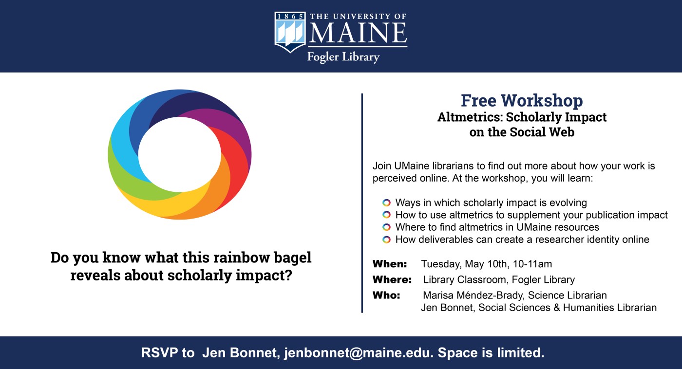
University of Maine Social Sciences and Humanities Librarian Jen Bonnet recently submitted designs that she and her colleagues at the Raymond H. Fogler Library created to introduce faculty and grad students to the idea of altmetrics, or non-traditional metrics usually measured by downloads, social media mentions, saves, and citations. Jen explains:

It seems like this year, more than ever, librarians have truly responded to students’ needs during finals with extended hours, programming, and tips and tricks to survive the stress.
Every spring semester at the MGH Institute of Health Professions, the library co-sponsors activities for students to take study breaks. Librarian Amanda Tarbet created the flyer below using Canva to remind students of library events during finals:
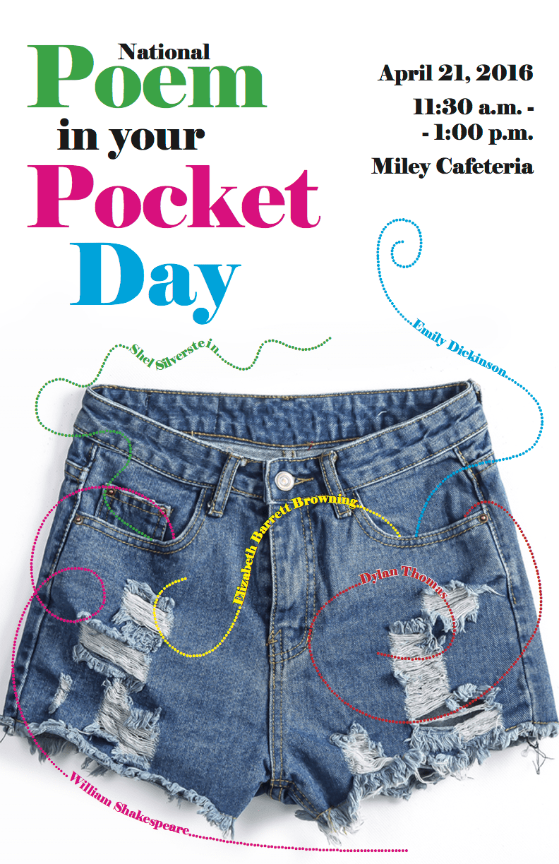
Every April the Academy of American Poets promotes Poem in Your Pocket Day, which is pretty much what it sounds like: “People celebrate by selecting a poem, carrying it with them, and sharing it with others throughout the day at schools, bookstores, libraries, parks, workplaces, and on Twitter using the hashtag #pocketpoem” (Poem in Your Pocket Day 2016). The librarians at McKillop Library at Salve Regina University have a special fondness for poetry, and use National Poem in Your Pocket Day to connect with students, faculty, and staff. Beth Blycker Koll, Evening Circulation Supervisor created this poster to promote the day and their event. Here’s Beth discussing her design:
It’s cold in the Mid-Atlantic y’all. I’m trying to unfreeze my fingers by typing this morning, and what better way to warm up my joints than by sharing designs that tackle an issue we all wrestle with in our respective libraries: Noise. The best of libraries are filled with people reading and chatting, studying and collaborating, and this dual use can often pose a problem when some of our patrons want to converse and others want extended silence. I’ve found myself at either end of this spectrum (as I’m sure we’ve all been). I’ve been shushed and gotten the stink-eye from students for talking too loudly, and I’ve had to ask students to turn down their beats because everyone in their section of the library can hear the tunes blasting from their headphones.
Designating certain areas of the library as different noise level zones can help alleviate some of these noise conflicts, but good signage is key. Patrons need to be aware of the noise level preferred in different parts of the library, which is why I like this great submission by Michael Hughes, Instruction Librarian at the Coates Library at Trinity University.

Michael adapted the following graphic from the University of California, San Francisco Libraries (with permission) and incorporated a free icon into the design.

As an alternative, Michael also created the following sign, which, although busier, takes the same theme and adds a new twist on it.

What I love about all of these noise level signs and posters is the neutrality of language. Instead of “noisy” we see the terms “conversational study” or “active learning,” which I think motivates patrons to remain respectful of those around them.
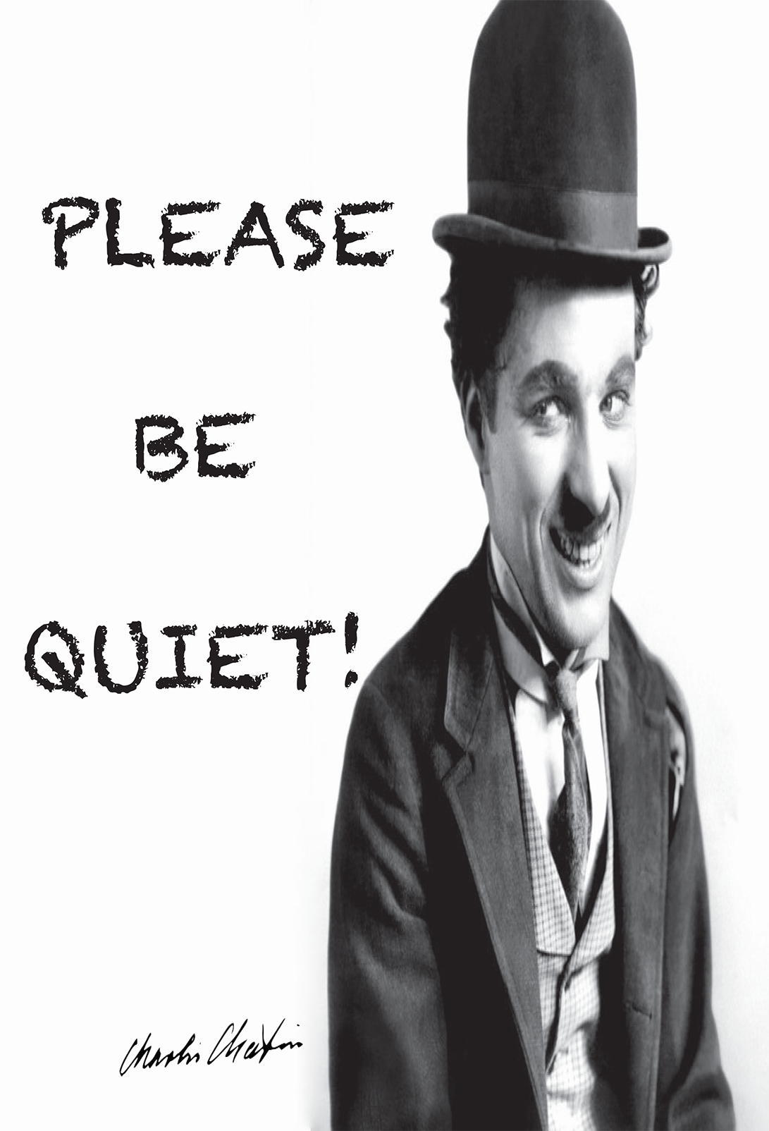
As an alternative, we have these submissions from İpek Yarar at MEF University Library in Istanbul, Turkey, which I think do a nice job of using humor to kindly relay a message for noise control. All three feature an iconic Charlie Chaplin movie still.


Do you have noise level signage at your library? What designs work best for your patrons?
You can find Michael’s original Photoshop files of his noise level signage and İpek’s printable signage (originally created with Adobe InDesign) on the Library Design Share Google Folder.
As I’ve written before, sometimes a book’s cover art is so eye-catching that it becomes the center-piece in a library-related design. Whether you’re promoting next week’s book club, a new addition to the collection or a speaker series, sometimes it helps to let the cover art take center stage.
Meggan Frost, Public Services Librarian at Paul Smith’s College took advantage of some great book art to create a set of posters that are eye-catching and make a statement.

I made these posters using a very similar template to promote some speakers (and their books) we’ve hosted recently in the library. Sometimes you just need something easy that looks great, and this template fits the bill. Book image + publisher description + date/time/place + a judicious use of nice fonts = an eye-catching poster. I like to print posters as big as I can. These are 24”x36” and 36”x48”. Because they are meant to be printed so big, the quality of the images is very important. Google image search has a filter that will allow you to limit to the largest possible image. I like to play around with fonts, but obviously readability is a big factor for a text heavy poster. I used Junction for the text and Nevis in bold for the headings, both available for free online. I think the slightly unusual fonts draw the eye while still being perfectly legible. Of course, the bright red book covers don’t hurt either!
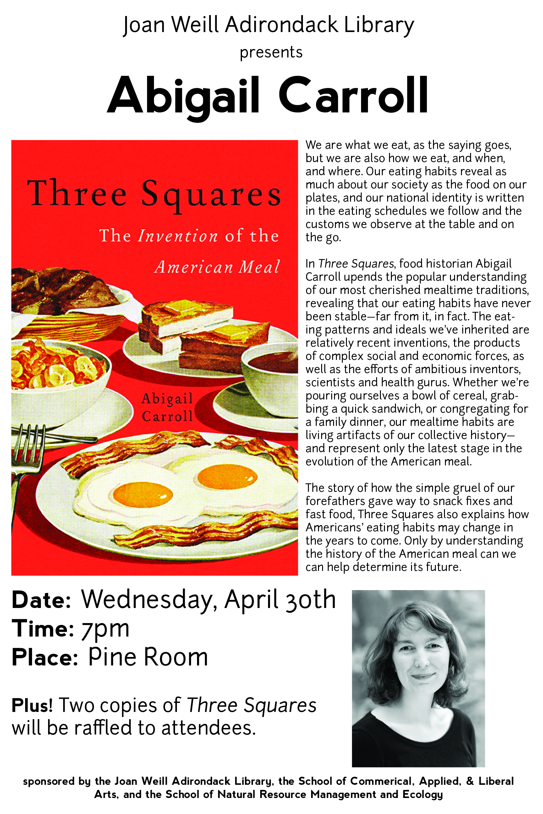
Meggan created these posters using Adobe InDesign. For the original files, email Meggan.
 So much of the information that we gather about our libraries needs to be shared with our users, but just how do we share it? Meggan Frost, Public Services Librarian at Paul Smith’s College, has given us a great example of visually representing data gathered through the formal library assessment LibQual.
Here’s Meggan in her own words:
I created this conference-sized poster (4’x3’) to publicize the findings of our LibQUAL survey. We had incredibly high participation in the survey, and we wanted to make sure that our community understood that we took their responses seriously. I created this poster using InDesign. Initially, I had a hard time conceptualizing how I wanted to present the information. Because the poster is conference-sized, I found it hard to break out of “conference poster” design mode in the beginning. Once I realized that I actually wanted to design something more like an infographic, I was able to quickly sketch out a design that turned into the one you see here. This poster was prominently displayed at the front of the library this fall.
This infographic is much more powerful than the plots, charts, and text that typically makes up a library’s LibQual report, and turning it into a poster to share with her campus community further bolster’s her library’s user-focused attitude.
For the inDesign file of this poster, email Meggan Frost.
