Search

Librarian Design Share

inspiration for library creatives

Category

General Handouts & Brochures

Need Library Volunteers?

Public libraries thrive on their volunteer base, and Olivia Allen, Library Public Assistant at McMinnville Public Library, wanted to create a brochure that would help her library recruit the best and the brightest.

I made this so we could have something to hand out to people interested in volunteering. Before we had this, we would give them the application to fill out. I wanted there to be something they could look at to get an idea of what volunteering is like instead of a big intimidating form. We really simplified all the information we could stuff onto the brochure, so this way it is easy to understand and it doesn’t feel like we expect them to make a decision right away. It also states the volunteers keep the library running, which is so true, and that is definitely the first impression we want to give. I used Canva to create this design.

You can find this brochure on the Librarian Design Share Google Drive.

Learn the Terms

When Gail Schaub, Cara Cadena, Patricia Bravender, and Christopher Kierkus, surveyed 750 students at Grand Valley State University, one thing was clear: the language of information literacy can be complex and confusing. To combat misunderstandings, Gail began a collaboration with graphic arts professor Vinicius Lima where students would create visual representations and definitions of frequently used information literacy and library terms. The resulting campaign–Learn the Terms–resulted in some beautiful work by student artists, Stephen Dobrzynski, Jacob Luettke, Micah Martin, Carissa Storms. You can read more about this amazing collaboration and view all of the resulting artwork via the Grand Valley State University’s Open Teaching Tools.

Here’s Gail describing this collaborative project:

The “Learn the Terms” campaign was the result of a study I did with colleagues. We discovered in a survey of over 750 students on campus (a representative sampling), that 50% of our students don’t know the meanings of words they hear regularly in classrooms and on syllabi, terms like scholarly, peer-review, and even journal.

 We published our findings, but I knew that  we had to let others know, and offer some kind of solution. I collaborated with Vinicius Lima, a professor of graphic arts here, and his students created these designs that we’ve since produced and are sharing in the library and beyond. The designs are in our institutional repository for sharing:http://scholarworks.gvsu.edu/oer_teaching/2/

There’s a new group of students working on designs for a new list of eight terms for creation in the coming year. It’s been an incredible experience, being part of the design thinking process with these students, and I’m so enamored by their work, I want to show everyone I possibly can.

We can’t wait to see what new designs this year’s students develop!

Colorful Student Guide

Academic and school librarians are finally beginning to settle into the fall semester, and many of us are able to relax (or just stop running in circles) due to the efforts we put in during the summer to prepare for this school year.  Joanna Hare, a Subject Librarian at the Run Run Shaw Library at the City University of Hong Kong, recently updated a guide to assist students in using the library.

Continue reading “Colorful Student Guide”

A Reading Journey

Selling adult reading programs can be a challenge. The demands of family, work, and day-to-day life can easily overpower leisure time that might be spent on reading, and finding the right marketing message to reach this busy audience can be tricky. Earlier this month we received a beautiful and thoughtful design submission from Stephanie Huff, Marketing & Communications Manager at the Wichita Public Library. Her poster and brochure designs highlight this year’s theme for WPL’s Adult Winter Reading Program, “Tour de Wichita: a reading journey,” which incorporates city sites and attractions. It’s a stellar example of community outreach and attractive design.

Continue reading “A Reading Journey”

Just the Highlights

Library informational handouts and brochures–the kind we give away at orientations, fairs, and workshops–can easily suffer from the classic librarian pitfall: TOO MUCH INFORMATION. Striking the right balance between needed information and visual interest is a challenge. Lindsay Davis, librarian at the Los Banos Campus Library at Merced College has created informational flyers for students and faculty that touch on all the library “highlights,” those crucial services and bits of information that will make the most impact with library users.

Continue reading “Just the Highlights”

Brochures for Students & Alumni

Big thanks to Rebecca Seipp, Outreach & Humanities Liaison Librarian at the Wyndham Robertson Library at Hollins University, for being one of our first Back-to-School design features. Rebecca’s sharing the “Guides to the Library” brochures for students and alumni that she recently revised. These kinds of publications are so tough to pull together. Information changes constantly, and it’s always a balancing act between including information that you think will be helpful and not bombarding people with too much text. I think Rebecca strikes a fantastic balance.

Student Guide - Front and Back - Final
Student Library Guide – Front & Back

Here’s Rebecca talking about her work on these brochures:

This summer I updated our alumnae and student guides at the library. Over the past few years information was continually added to these guides without any redesign. Predictably, that resulted in guides that were dated and dense. My goals for the new guides were twofold: to create a clean look and to include just enough information to highlight our services and keep people interested. All the images were taken by university marketing and the primary colors are from the university’s color palette. Both guides were created in Photoshop and are designed to be printed front/back and folded vertically. You’ll notice that the student guide has text on the inside middle – since it’s only one page when folded the text is still easy to read and it adds an unexpected design element.

Student Guide - Inside Final
Student Guide – Inside

You can see that the guides for alumni are targeted to their specific population and make nice use of a stunning shot of the library and a calm color palette.

Rebecca has shared the original Photoshop files for these brochures on the Librarian Design Share Google Drive Folder. She just has two notes about the files:

The Hollins University logo was removed from the back side of the alumnae guide and replaced with text that says “your logo here.”

When creating the student guide I accidentally flattened the back that has the staff pictures – oops! So what I did is created the boxes and text in the boxes as separate layers and then just have the images grouped together as one layer. So the bones will still be there, but there won’t be any guides for the size of images and text boxes for librarian info.

Thanks for the heads up, Rebecca, and thanks for sharing!

Alumnae Guide Front and Back
Alumnae Guide – Front and Back
Alumnae Guide - Inside
Alumnae Guide – Inside

A Breath of Fresh Air

We recently had some changes in our library, which precipitated a change in the General Info sheet that we have on our desk.  Originally, I was just going to update the information, but it seemed like a good time to mix up the design too, as we haven’t in over two years.

Here’s the old design, heavy with institutional colors, a traditional image, and lots of text:

3-4-2014 8-29-09 AM

And here’s the newer version with lots of white space and an image of our library that better represents our focus here (i.e., not solely books or even the physical world):

Picture1

So, yes, most of the text is still present, but I feel like it has more room to “breathe” with more white space.  I’ve retained our brand and color scheme, but simplified the design, and I’m a lot happier with the look.

Do you periodically update the look of publications in your library?  If you’ve done any of this lately, we’d love to see some before and afters!

If you are interested in the MS Publisher version of this design, contact April.

Advertising Ebooks

My library is currently taking part in a demand-driven acquisition ebook pilot project through Proquest’s EBL and our state college and university library consortia. The challenge: advertise that mouthful to our students, faculty and staff. The solution: A mix of attention getting posters, slides for our website image carousel, as well as pamphlets and an accompanying libguide that go into more detail about the program and give our users instructions on how to access and download these ebooks.

ebook dda pilot poster advertisement

After struggling to coming up with an interesting, non-cheesy way to visually represent ebooks, I found the photo above on Flicker, and thanks to its creator Johan Larsson’s generous CC 2.0 Attribution license, I was able to build a design around it. I cut out most of the background, layered it on a black background and used Cicle font to create a slogan that is (I hope) intriguing but still meaningful. I decided against including a QR code because previous efforts at including them in signs for my library showed that none of the students were using them. The posters will be placed on bulletin boards in various academic buildings around campus.

I then adapted the poster design to a smaller scale: our website’s image carousel:

ebook pilot image carousel slideThis slide links out to a libguide about the ebook pilot project. Created by my colleague, Alana Verminski, the libguide offers more detail about the program and gives detailed instructions for users to locate, access, and download or print portions of the ebooks. Alana also did a fantastic job of creating a tri-fold brochure about the ebook pilot project which we’re sharing at our library’s information desk for those who want to take away information about it.

Ebook Brochure Inside Ebook Brochure OutsideThe poster and image carousel slide were created using Photoshop and the tri-fold brochure was created using Word. For the original files of any of these designs, please email Veronica Arellano Douglas.

Branding Your Library

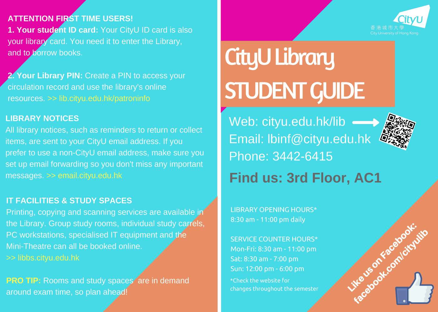
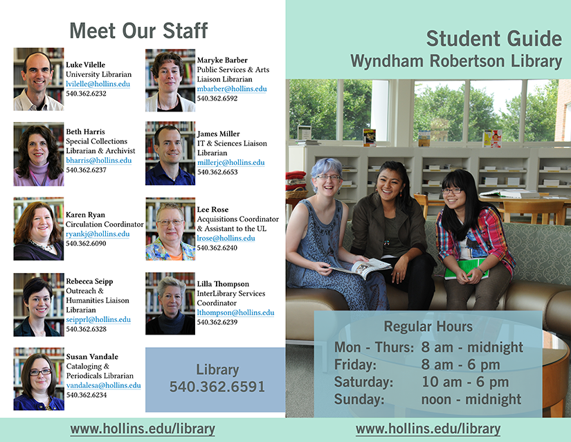
We librarians tend to make a lot of help sheets and signage to assist patrons as they use our resources.  That’s really what Librarian Design Share is about, right?  But even with best intentions, we don’t always fully think about the way our publications as a whole look and feel to our patrons.

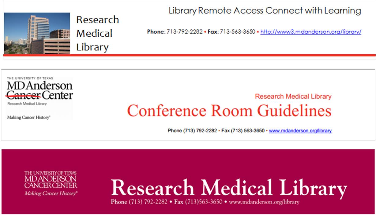
I think Librarian Design Share would be remiss if we didn’t talk standardizing the look of your library’s publications, or branding, if you will.  Brands can highlight something unique about your community (perhaps it’s near water or you’re known for an historical event), your library (maybe you have an awesome stained-glass window or a spiral staircase), or it can be based on something more abstract, like colors, shapes, or even text.  We based our library branding on the pretty rainbow of colors our bound journals make on the shelves.  Everyone has bound journals on their shelves, but there’s something about the color arrangement and the mass amount of them that make the way they look in our large, light-filled space memorable. Here’s our general publication header that can be copied to any document:

new brand

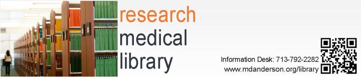
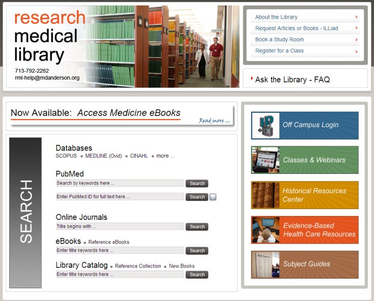
Whatever standardization you decide upon should happen across the board–from all the pieces of paper that a patron might see in your library to your web presence. This is our website’s look:

8-6-2013 12-10-59 PM

I thought my library was well on the way to doing this, but a quick audit of our documents online and on our slat wall exposed at least three previous brands that are still in use on our handouts.

old brands

Yikes, you know what my new project is…

Think about it terms of your favorite store: their shopping bags have the same look as their store signage as their website, right? So should our libraries.  It’s about making things more consistent in the minds of our users. More simply, it’s about showing our users that we care enough to keep things updated, neat, professional, and easy for them to digest.

If you have great examples of a branding campaign you’ve created and implemented at your library, we’d love to see them! Consider submitting them to our site and sharing them with your colleagues.

Blog at WordPress.com.

Up ↑