Search

Librarian Design Share

inspiration for library creatives

Category

Uncategorized

Librarian Design Share at TxLA 2021

Jess and I were delighted to present on behalf of Librarian Design Share at the Texas Library Association Annual Conference this year!

Our presentation, Creative and Inclusive Wayfinding for can be found on the Librarian Design Share Google Drive.

We talk about ways to create wayfinding material that is accessible and inclusive for all audiences, no matter the type of library you are in. We hope you enjoy it!

Call for Submissions

Hello readers, and welcome to our first post of 2021! The world sure looks different than it did a year ago, doesn’t it? Wherever the last whirlwind of a year has taken you, no doubt some adjustments to your work have been made. Many of us are working from home, teaching remotely, or having to rethink the way we approach our work. In some cases, this may mean relying more heavily on eye-catching materials in order to capture the attention of your students.

Our first call for submissions of the year is for design-centered instruction handouts and related materials. We’ll be compiling several of these into one post so if you don’t see it posted right away, don’t worry!

Since its been a while (and some of you might be new readers), here’s a refresher of what we require upon submission:

  • your name
  • your email address
  • your library
  • a photo, file or link to your work online
  • the software used to create your design (if applicable)
  • a brief description of your design (see previous posts for examples)
  • If you are submitting designs made in Canva, please note that we will follow up with you for information on additional characteristics and considerations made when creating your design. And to stay true to the spirit of Librarian Design Share, we are also requiring that you share a link to an editable copy of your design.
  • All work will be published on this site under a Creative Commons Attribution-NonCommercial-ShareAlike 3.0 Unported license.

As always, we are accepting all kinds of submissions. Find more information on our page on Submitting Your Design.

A Note to our Readers

Dear readers,

Naomi and I want to say hello and give some insight into our significant pause in sharing your work through Librarian Design Share.  

We are both located in the United States and are with you in experiencing the collective trauma of the COVID-19 pandemic and failed political leadership.  We are also mourning the death of George Floyd, Breonna Taylor, and others at the hands of the police and are using this moment to build momentum in the fight for justice for Black, Indigenous people of color.  In Allentown, Pennsylvania, my home, a man was brutalized by police just a few weeks after George Floyd was killed.  We are organizing as a community and calling for reform within our local police department – the fight is far from over.  

Librarian Design Share was created as a community resource to strengthen each of our work. This site demonstrates what we know about communities who join together in this way- we are able to amplify each other’s voices, sustain the work, and produce results more quickly.  We are temporarily turning towards other communities and hope that you are as well. 

Wishing you health, rest, and justice.

Be well,

Jess

Honoring the Class of 2020

Whew. It’s been a year, and we are only halfway through it. There is so much to say, but we’ll keep it simple: we hope you all are staying safe and being careful.

It’s been a while since we’ve received any submissions, so we were delighted to receive an email from Emily Robinson from the Trexler Library at Muhlenberg College. Acknowledging that things have changed, Emily put together a special social media campaign for her library’s senior student workers set to graduate this spring.

These posts were created and managed through Hootsuite.

Here’s what Emily had to say:

These posts were part of a small social media campaign (Instagram and Facebook) that I put together to honor our library’s senior student workers as they prepared to graduate during and into an unprecedented situation. At the end of a typical spring semester, we would be able to honor our seniors with an in-person celebration, but this semester was atypical in every sense. With that in mind, this series of posts was an effort to make sure these students still felt celebrated and connected to the library after their many semesters of dedicated hard work. Participation was completely optional and 7 of our 13 seniors excitedly submitted reflections on their time with us. Students, library staff, and the greater College community alike enjoyed reading about our seniors and helped us recognize the very unique Class of 2020 through their shares and comments!


Many thanks to Emily for sending us these beautiful posts!

Creating with Canva

Over the past couple of years, we’ve seen more designs than ever being created with Canva. The reason? Canva is easy to use and with built-in templates, it removes some of the trepidation that comes most design work. How will this look? Where do I put this text? What could I do to fill this white space? Canva answers these questions with relative ease and and all the drag-and-drop options you could hope for.

We’ve seen some great submissions that have used Canva so when Jess and I received the following from Adrienne, a reference librarian at Campbell University School of Law in North Carolina, we were glad that she addressed a commonly shared concern with Canva.

Here are Adrienne’s submissions, one that includes some eye-catching text for a legal research contest and the other, a colorful promotion for a bike sharing program that includes a quote by Albert Einstein:

Bigfoot and the Law to post

_I thought of that while riding my bike._

In her email to us, Adrienne mentioned that she usually uses Photoshop but will also use Canva when the occasion calls for it. When asked about her experience with Canva, Adrienne said

I like Canva for the free vector elements and ease of design. It’s also really useful for choosing font pairings. Canva’s drag and drop technology is so much easier than photoshop’s layers and masks. Unfortunately, like everything in this world, free Canva is getting less and less free. Once it goes completely paywalled, I’ll stop using it all together. But until then I’ll keep using it for my quick and easy projects.

While we do love a good quick and easy option, Jess and I have often talked about the complications using Canva presents, namely access.

As most of you are aware, the files of designs that are submitted to Librarian Design Share are included in our Google Drive under a Creative Commons license so that other librarians can change them up and reuse them. This is easy with designs made in Publisher, Photoshop, Word, PowerPoint and other mediums. But how to do the same with designs made in Canva? Moving forward, what we’re doing is asking that each Canva submission also include a link to an editable copy of the design. It’s very important that the link go to an editable copy, otherwise you could lose the original design. Keep in mind that you have to have a Canva account and be logged in in order to access these files, which is free for now.

Here are Adrienne’s shared copies of Bigfoot and the Law and Bike Sharing at Campbell Law.

And with fall around the corner, we’d love to see what you’ve come up with for the season. If you have any fall-themed marketing materials or seasonally appropriate signs, please visit our Submission Page for our list of requirements and submit your design to librariandesignshare@gmail.com.

Simplifying Support Services

Occasionally in my eagerness to let someone know about a resource or service, I provide way too much information. I go above and beyond what that person asked about because I want them to feel like they know all of their options. Sound familiar?

More often than not, this tendency to provide as much information as possible is also apparent in my designs. I find myself revisiting my creations periodically in an effort to pare down and streamline the information included. In my time as a librarian, I’ve learned that I am not alone in this experience.

Stephanie Warden at the Jim Dan Hill Library at the University of Wisconsin, Superior sent us a design for mental health resources that strips away the noise and provides users with the most pertinent info.

Flyer with 5 speech bubbles that have mental health resource info in each bubble

Here’s what Stephanie had to say about her design:

While our institution offers flyers advertising support for student mental health services, we found that the material was a little too text-dense and left out resources available to our community patrons. Using services gathered by the rest of the staff I put together this 8.5 x 11 flyer that we have placed strategically throughout the library.

Stephanie used Canva to create her design. And like other librarians we’ve talked to about Canva, she had good things to say about the process. When we asked why she chose to use Canva over other tools, she told us:

The free version of Canva has an amazing number of options available, especially if you aren’t afraid to get in there and experiment with colors and features. That it also allows us to upload our own pictures and pictures from other appropriate sources really makes it a favorite of mine. It also doesn’t hurt that I can peruse their library for inspiration when I find myself stumped.

Thanks for your submission Stephanie!

Seasonal Signage

It’s nearly that time of the year again! School and academic librarians, your libraries are about to get a lot busier, and filled with those beginning-of-the-semester questions (Where can I get coffee? How do I print? Do you have my textbook?). For public librarians, it’s time to wave goodbye to summer programming and embrace the fall.

Whatever type of library you are in, this is the perfect season for signage. This call for submissions is focused on designs that signal change – a new beginning and the start of something good.

So whether you’re welcoming new or returning students, or just saying hello to the fall season, send us your signs! If you haven’t made any yet, don’t worry! We’ll be featuring these posts through the end of August.

Photo of the University of Massachusetts Amherst campus in the fall

Using Piktochart for Promotional Flyers

If you’ve ever tried your hand at making an infographic, chances are you’ve run into Piktochart as an option. But what about Piktochart for flyers?

Our latest submission is from Emily Merrifield, Undergraduate Experience Librarian at California State University in Sacramento. She has this to say about her designs:

I wanted to share promotional materials I’ve created using the Piktochart site (it was easiest to combine them with pdfs but let me know if that is a problem). I subscribe to the $40/year “pro” version which includes many more templates than the free version. I have attached 3 documents with 2 flyers on each for: workshops help in the library, poetry readings in our Special Collections dept, and a stress relief table provided during finals week. All of the images were used to promote on social media, and the stress relief flyers were printed out (about 22 by 28 inches) to display near the table. Icons and pictures used were either from the Piktochart options or from Pixabay.com.

I have also used Piktochart for infographics and images that I’ve put on libguides. I’ve found that Piktochart has improved a lot since I started using it in early 2016 – and allows for using their designs or easily adapting to your own.

One thing that is stands out about Emily’s designs is the use of the library logo colors in a way that’s attention grabbing without being overstated. I’m also a big fan of the stress-inducing mess behind “Are You Stressed?” in the second flyer.two fliers for stress relief activities

research workshop promotional flyers

Emily also mentions the use of Pixabay.com, which is a fantastic resource for free images that are CC0, meaning free for commercial use & no attribution required. You can create an account for free and it even gives you the option to donate some money to the original artist if you’re so inclined.

All of Emily’s submitted flyers are available on our Google Drive. All submitted work will be published on this site under a Creative Commons Attribution-NonCommercial-ShareAlike 3.0 Unported license.

Signs About Sound

A couple of weeks ago we asked for submissions about sound, and you delivered! We received three sound-specific submissions, all of which take a different design approach. It’s worth noting that in spite of these differences, the first two of our featured submissions make use of the red, yellow, green color scheme to denote acceptable noise levels within the library. The last, designed for digital signage, uses large eye-catching text and simple icons to get the message across.

The first submission is from Brenda Sevigny-Killen at the Bennett D. Katz Library – University of Maine at Augusta.

Sign that reads "Silent Zone" in a library.

Brenda had this to say about her signs:

After our library greatly deaccessioned our reference materials, we opened up space for collaborative study areas with rolling whiteboards, chairs & tables, and comfort seating.  To encourage collaborative use of this new space, staff designed signs to promote the new area.  We also designed a sign for the quiet area since the multiple tables for 6 falsely encouraged noisy collaboration. There are times when we have to redirect groups to the collaborative zone so this space remains sacred for silent study. This project has been hugely successful and we now find we need much more collaborative space as more and more students find sanctity and camaraderie within the library walls.  Another happy side effect is getting to know more of our students and subtly infusing a atmosphere of support, care, and staff dedication which we hope contributes to their success.

IMG_2201

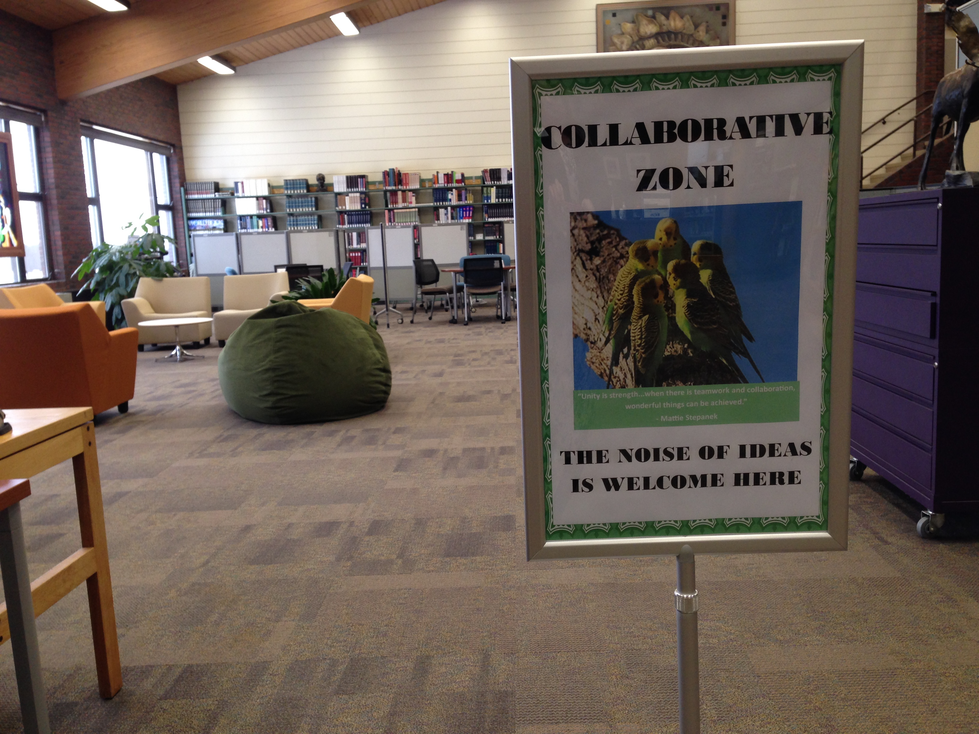
Brenda’s posters were designed in Publisher and are available in our Google Drive.

___

Erin McCoy at Massasoit Community College in Brockton, Massachusetts submitted designs that she created in Canva.

I was inspired by a recent conversation on a list serve to take a look at signs for “sound expectations” – I like the one in the google drive, so I decided to riff on it in Canva for those of us without Adobes or Publisher skills.

Our library is one big room, that is square, so it’s hard to place signage and to communicate where the different zones are, so we’ll see how this goes!


Kudos to Erin for tackling the challenge of signage for the one-room library layout! You can find the complete set of Erin’s signage on the Librarian Design Share Google Drive.

___

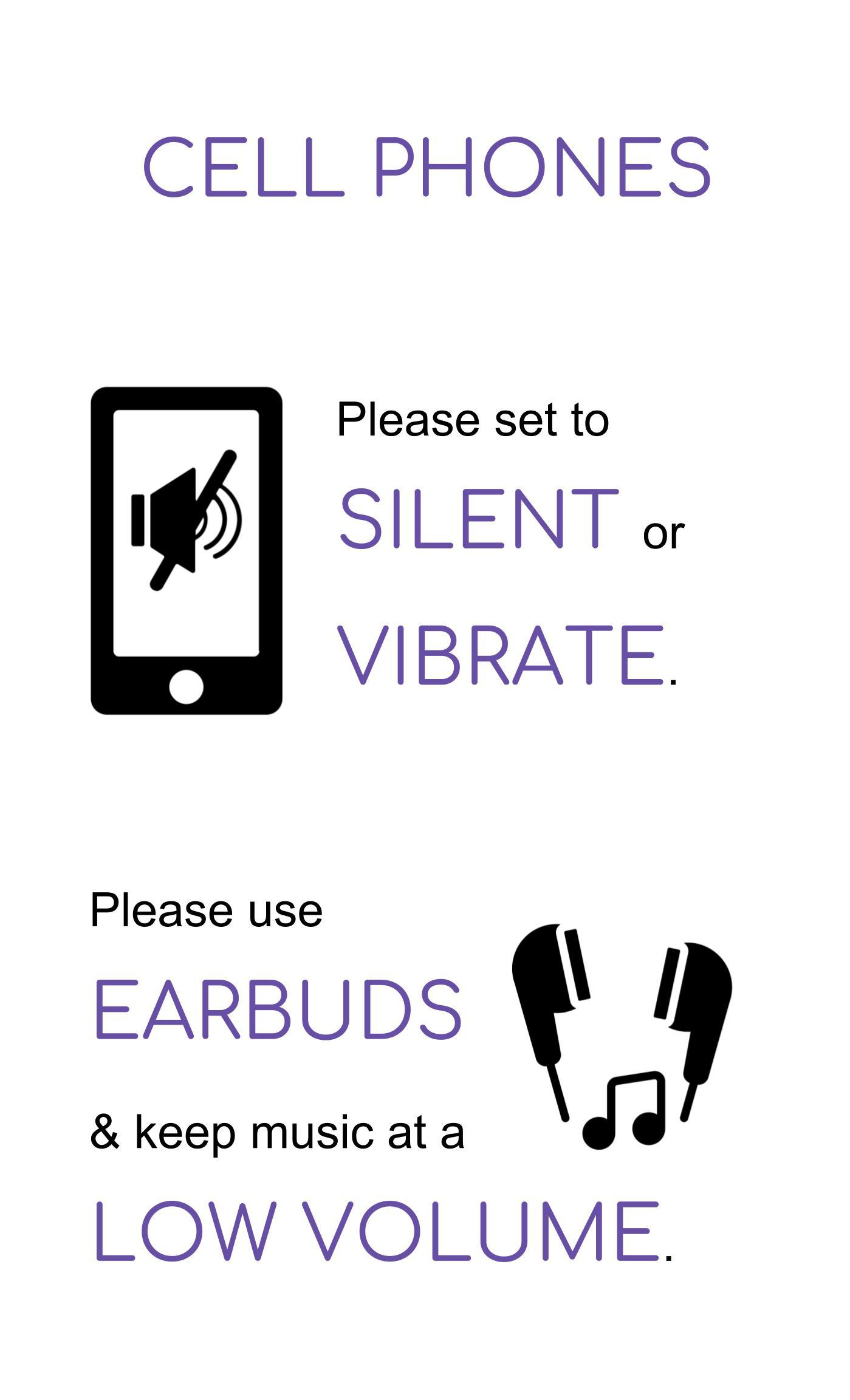
Our final submission is from Lauri Miller at the Paul & Harriett Mack Library in Bethlehem, PA. Lauri created her sign through Google Slides and used icons from one of my favorite resources, The Noun Project.

Here is my submission about sound levels in the library. I created it in Google Slides which feeds the digital sign in our lobby. The sign flips between slides, so I tried to keep it brief, understandable, and eye catching the foot traffic in and out of the library.  The cell phone icon is by Creative Stall, and the earbud icon is by Erman Tutan. Both are from nounproject.com.

cell phones on silent signage

Thanks to Brenda, Erin, and Lauri for their submissions. Remember, you can submit your own work to feature or request feedback at any time. All submitted work will be published on this site under a Creative Commons Attribution-NonCommercial-ShareAlike 3.0 Unported license.

Create a free website or blog at WordPress.com.

Up ↑