Search

Librarian Design Share

inspiration for library creatives

Category

Infographics

Upgrading the Annual Report

At the end of every year, library stakeholders expect an annual report.  This tends to be a lengthy document given to administrators and includes numbers and graphs and reflections on library success.  My question is: do they even read them?  

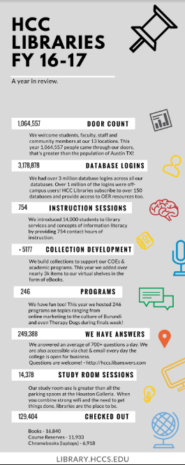
Today I’m happy to share with you a submission from Daisy Ngo, a Public Service Librarian at the Houston Community College Libraries, which creatively re-imagines the annual report.  Ngo and the Marketing & Public Relations Committee at HCC Libraries  utilized Canva to create graphics and the annual report will never be the same.  Ngo says that these graphics  “have been a hit at [their] promotional tables during faculty events such as Instructional Day and Faculty Conference.”

student success infographic.PNGyear in review.PNG


One of their most creative creations is a graphic on the cost of a research paper.

cost of report.PNG

We asked Ngo to tell us a little bit more about her experience with Canva.

The experience with Canva has been great. I’ve recommended it to colleagues, created documents for instruction, and used it in personal life. Creating in Canva has increased the Marketing & Public Relations Committee’s ability to create and communicate our vision with the institution’s communication department. HCC faulty now have access to Adobe InDesign, the learning curve is much greater so I still use Canva regularly.

In case you’re wondering about the limitations of the free version of Canva, we asked about that too.

I believe that constraints can spur creativity. That being said, I like the design options, many are free but there are a few premium options for layouts, images, and elements. The ability to manipulate templates allows for non-designers to create projects without much effort. The only downside to the freemium version is that projects cannot be resized so repurposing graphics means starting from scratch. Overall, I have been able to find both formal and fun options for various projects without having to upgrade.

Thanks to Ngo and the Marketing & Public Relations Committee!  You are able to find this design on our Google drive.  All submitted work will be published on this site under a Creative Commons Attribution-NonCommercial-ShareAlike 3.0 Unported license.

Year in Review Infographics

We have two new Year in Review infographics for you courtesy of Debbie Lind, Director of Wallowa Public Library, and Amy Kitchen, Marketing and Communications Graphic Designer for the Johnson County Public Library. Both designs do an excellent job highlighting the ins and outs of a year at a busy public library and share statistics with easy-to-read graphics and clean layouts. Continue reading “Year in Review Infographics”

Illustrating Library Usage

If you haven’t had time to look up from the frenzy, the end of the year is HERE! And with the end of another academic year, often comes the annual gathering of stats. Jess Denke, Public Services Librarian at the Trexler Library at DeSales University, has created an infographic that really illustrates how her library was used.

Jess says,

This was created using Adobe Illustrator.  The infographic of last year’s report went over very well with students, faculty, and visitors and has been up all year – so I decided it was time for another!  This one was more successful at visualizing the data versus simply presenting the information as a series of graphs.  A lot of the statistics were related to use of a particular place in the library, so I decided to set them inside the floor plan.

I think using the floor plan is so smart–it connects your patrons with the spaces they use, and it clearly demonstrates to them that you are keeping track. I’m filing away this idea for my own library as we welcome the tutoring center in our space this year and continue to tweak our arrangement.

You can find all of Jess’ beautiful designs (see this post too) on the Librarian Design Share Google Drive as both .png and adaptable Adobe Illustrator files.

Enhanced by Design – Presentation & Handouts

One-half of Librarian Design Share is headed to Knoxville, TN to present at the 2017 Library Collective Conference alongside Amanda VerMeulen (St. Mary’s College of Maryland) and Dan Vinson (Mount Mary University). I’m super excited to be presenting with these awesome folks, and wanted to be sure to share our presentation slides, handouts, and other resources with Librarian Design Share readers. The focus of the conference is “Make it Beautiful, Make it Useable” which was all the sell I needed to attend. The conference schedule looks amazing, and I’d encourage you to check it out.

Here’s the info about our session:

Enhanced by Design: Creating user-informed, aesthetically attractive projects for your library

In this session participants will learn how different visual materials can address user concerns uncovered through focus groups, surveys, and ethnographic studies. Products created from data gleaned through these methods aren’t inherently beautiful, but by applying aesthetic design principles to these projects we can create products where usability is enhanced by design.

What this session IS about: basic user research methods, applying basic aesthetic principles/theories to creating visual materials, design-decision making
What this session is NOT about: in-depth session on graphic design or aesthetic theory,
how to analyze user research data (no coding, no stats).

Some questions to think about before the session:
What is a problem you want to solve in your library?
What is a big picture question you have about your library/users/etc.?

You can check out our session slides below. It’s a mix of lightning style talks, discussion, activities, and Q&A. We hope the session will be interactive and fun, and we’re looking forward to learning from people who attend.

We also have a number of resources we’re sharing with participants, including:

You can also find all of the designs highlighted in this presentation on the Librarian Design Share Google Drive in the Enhanced by Design Presentation 2017 folder. If you’ll be at The Library Collective Conference too, stop by and say hello!

Sharing Your Results: LibQUAL+Infographic

We’ve featured LibQUAL+ related infographics on Librarian Design Share before, and want to continue sharing examples of academic libraries that are making survey results public. Transparency is important, and the more we share what we do and how our users perceive our spaces, collections, and services, the more opportunity we have to make improvements.

Continue reading “Sharing Your Results: LibQUAL+Infographic”

Year in Review

Once upon a time, libraries didn’t keep numbers and stats; or, if we did, we quietly kept them to ourselves.  However, a recent trend in libraries is to publicize our annual numbers so that stakeholders can understand the importance of a library’s existence.

Library Specialist KC Frankenburger at the Parham Road Campus Library location at Reynolds Community College explains the infographic she designed with Canva:

Continue reading “Year in Review”

Library Data

These days, most universities are moving towards learning management systems and libraries are moving towards online resources.  However, we often overlook the fact that many students don’t have a reliable internet connection at home. Librarians at the San Juan College Library recognized this major issue and took action. Librarian Kim Lowe explains:

Continue reading “Library Data”

Library Reports as Infographics

For those of us in school and academic libraries, the end of the semester and school year is a time for reflection and…reporting (womp womp). Rather than send out the same old charts, graphs, and narrative reports, why not turn a chore into an exercise in graphic design? It’s a great opportunity to learn a new graphic design tool like Canva, Publisher, or Illustrator, and may even give you a chance to think about what numbers and data mean the most to you and your library.

Continue reading “Library Reports as Infographics”

Sharing What We Do

There is no shortage of data to describe the work we do in libraries each year. The challenge is to use those numbers and statistics to paint a meaningful picture of our libraries’ values, missions, and goals, and how we work to accomplish them. Today’s post features a new academic librarian’s first attempt at making sense of data using a mashup of infographic styling and statistical charts.

Jess Burkhardt, Public Services Librarian at DeSales University’s Trexler Library created this design using Adobe Illustrator to share 2014-2015 library statistics with her campus community. Here’s Jess describing her design process:

This infographic was conceived in moment; my Director asked if I thought that students would find our annual statistics interesting in their current form on a library Libguide. “Sure, they might – if they find them at all,” I said, “but an infographic might go over better.”

And my infographic endeavors began. Though graphic design has my heart in a whole bunch of ways, I knew that there was a lot about design that I did not know. As I worked my way through an Adobe Illustrator course on Lynda.com I began considering what information to include and the design of the project. Graphical representation of our library proved difficult. I considered symbolizing each of our student workers, librarians, and databases, but each of my visualizations were unable to convey the extent of the information that we had collected. I drew many sketches on different sizes of paper and filled artboard after artboard with drawings in Illustrator just to find that my drawings of books looked exactly like Word art–a compliment that I did not readily accept.

This infographic went through many different phases. Images took a disproportionate amount of space, the message wavered between screechy and barely heard at all. After a lot of frustration and a looming deadline I decided to streamline what I had and came up with the final product. It is displayed throughout the Trexler Library, drew a lot of traffic to our Facebook page, and has been placed in our annual report.

This project excites me because it has introduced me to the world of Adobe Illustrator and Library Design Share. I’m excited to be joining your community and am already considering my next design project!

We’re excited to share Jess’ design. If you have any questions about it, you can contact her via email, or leave a comment below.

Create a free website or blog at WordPress.com.

Up ↑