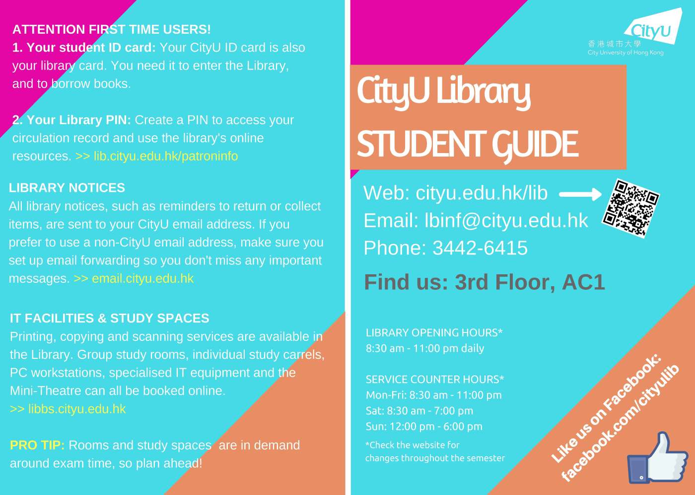
Academic and school librarians are finally beginning to settle into the fall semester, and many of us are able to relax (or just stop running in circles) due to the efforts we put in during the summer to prepare for this school year. Joanna Hare, a Subject Librarian at the Run Run Shaw Library at the City University of Hong Kong, recently updated a guide to assist students in using the library.
October was National Medical Librarians month. I realize that’s in the rear-view mirror now, but still wanted to share what we did to celebrate in my library this year.
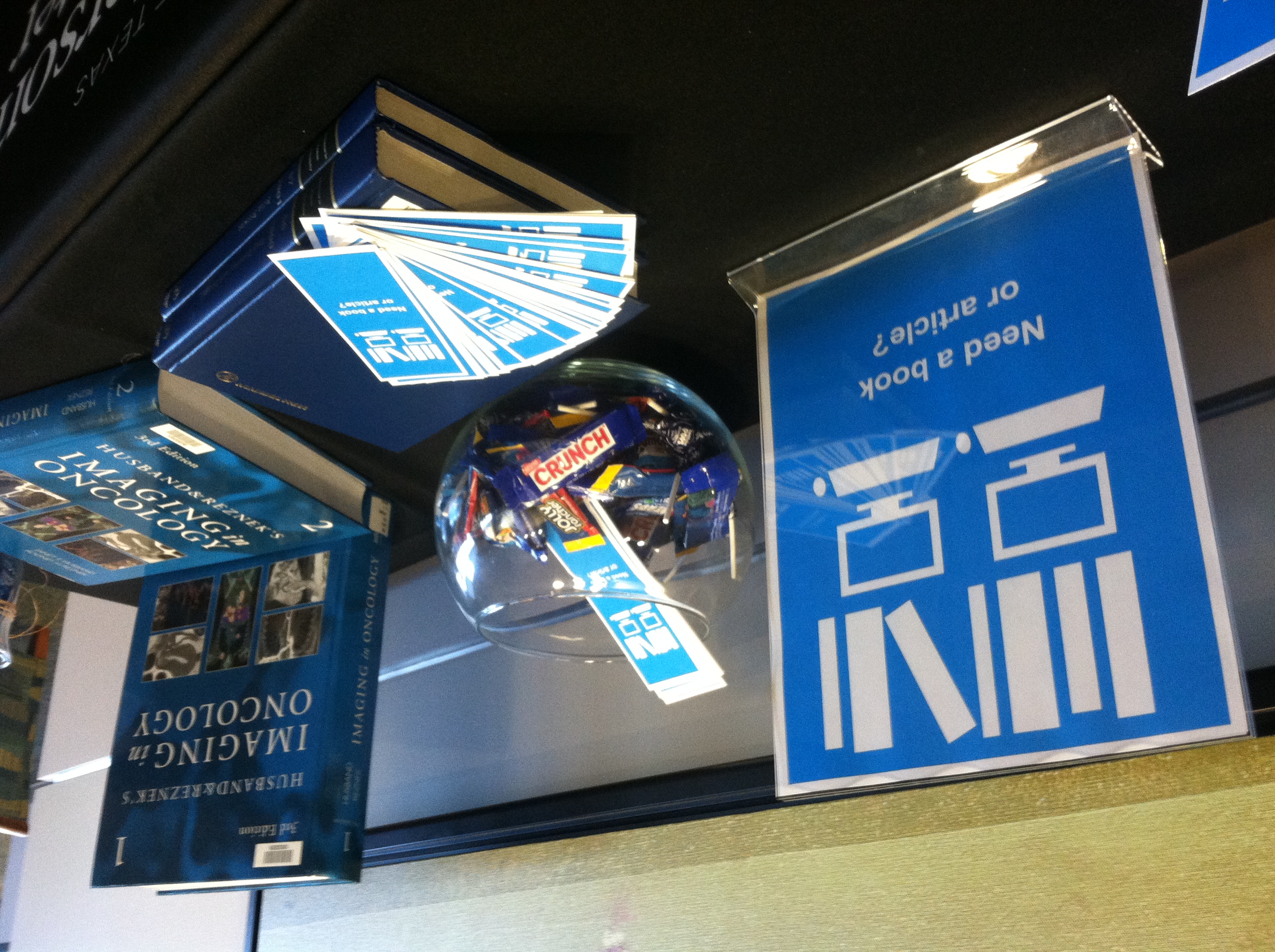
I was inspired by a trip that Veronica and I took to the local Portland library while we were there for a conference. The Multnomah County Library had a great display on their counter of colorful business cards with simple, effective icons and messages like the one below (I know, I should have collected them all!):

I liked the idea that patrons could easily pick up the card to learn more about and learn more about the library’s services. I wanted to implement this somehow at my own library. After brainstorming with staff, we decided to use the five weeks of October, which is National Medical Librarians Month, to celebrate our services. However, with our limited resources (read: me printing on cardstock on the staff machine and then using the paper cutter), we decided to make our takeaways just a bit bigger into the shape of bookmarks that we already are used to cutting and displaying.
Below are the five features we decided to highlight and the Publisher bookmarks (fronts on the top row and backs on the bottom) that I created:

We were happy with the candy-colored printed bookmarks and thought that it would be really cool if these giveaways could coordinate with colors of REAL candy. This involved a carefully planned trip to the grocery (thank goodness it was near Halloween with lots of candies to choose from), and some masterful exhibit making involving colored books, journals, and all the containers we could find in the library. Here’s how it turned out week-by-week…please excuse the amateur photography:
Our library as a physical space:

Our mobile resources:

Our collections:
Our educational offerings:

Our archives:

Our patrons loved the changing displays and anticipated the colors, candies, and services they would see the next week. Of course, more than anything, they liked the candy, but lots of good conversations were sparked in the month of October.
Do you celebrate months or certain days in your library? We’d love to see your pics and materials if you do! If you would like a PDF or the original Publisher document for the bookmarks, you can download them for adaption from the Librarian Design Share Google Drive.
 We’ve featured a few different book displays on Librarian Design Share since our blog began, and I have to admit they’re my secret favorite thing to post. I don’t really get the opportunity to create displays for my library, so I think posting other people’s displays is my way of filling a personal design void.
This fantastic display comes to us from Leanne Mobley, MLS Candidate at Indiana University and the Center Supervisor at the Willkie Library, Indiana University Residential Programs & Services Libraries.
 Here’s Leanne in her own words:
For the month of April, I put together a “Read the Rainbow” display to highlight our fiction collection. The display is an homage to the classic Pantone paint swatches. I rounded up a handful of books with vibrant covers and then used the eyedropper tool in Illustrator to select the main color featured.
I also ransacked the paint swatches at our local hardware store and covered our bulletin board. We mostly circulate DVDs and music, but our patrons are really enjoying the display and seem to be taking notice of our fiction collection.

April and I both love classic look of Pantone color swatches and can easily see this display replicated in academic, school, and public libraries. Really any library with a fiction collection would be able to do this!
If you have questions about the display, leave a comment. For the Illustrator files that accompany this display, contact Leanne directly.
At the ALA Midwinter ACRL Marketing Discussion Group, a librarian shared a great little online color palette generator with me, and I, in turn, am sharing it with everyone else.
The DeGraeve Color Palette Generator will create two color palettes based on a photo URL, one vibrant, one dull. Take a look at it in action:

It’s a great tool to use whenever you’re building a flyer, poster, or web design around an image.
Every once in a while you come across a library so truly amazing that you can picture yourself living in it. For me, that place is the Hjørring Public Library in Denmark. After you take a visual tour of this library, you won’t want live anywhere else.
Digital Librarian Martin Jørgensen is proud of his library, and for good reason! He’s shared an amazing array of display and design inspiration for libraries. So many, in fact, that it would be impossible squeeze them all into one post. Instead we’ll be featuring a different display from the Hjørring Public Library throughout the week.
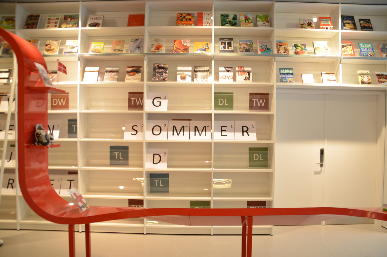
Today’s focus: The “Bookstore Wall.” From Martin:
The largest display option we have is our “bookstore wall,” a wall covered with shelves. At first we mostly had large books on it, but now we use it more deliberately.

The best example is a rainbow I made one afternoon displaying all of the books on the wall by color. It was quite the looker.

Oh, and we’ve played wordfeud on it too!
[We also created] a banner to promote a national library film streaming service “filmstriben”. The banner consisted of press photos from the films available, and had a blank, white space where we showed movietrailers via a projector.

Picking colors is hard, ya’ll. Whenever I’m creating visual materials for my library I often spend way too much time trying to find colors that are interesting but not overwhelming, and more importantly, look good together. Before I know it I’ve spent the the better part of an hour deciding on just the right shades of grey and orange. It’s a problem.
Two web-based tools I often turn to in the pursuit of color perfection are COLOURLovers and Colorzilla.

COLOURLovers is a great source for interesting palettes, patterns and just plain pretty colors. For the more design adventurous, you can also create your own patterns on this site or download shapes to create new patterns in Photoshop or Illustrator.

Colorzilla is a browser extension for Firefox and Chrome. It basically gives you a Photoshop-like color picker that you can use with anything you see online. Browsing the web and run across the perfect shade of green? Use Colorzilla and pick it! You can than use that color just about anywhere. Colorzilla also comes with a CSS generator, which I have yet to use, but seems really handy for developing gradients and color shading on websites. I use Colorzilla on an almost daily basis and it has been an invaluable tool for me as I continue to design and re-design my library’s website.
What are your favorite color-related design aids?
