Search

Librarian Design Share

inspiration for library creatives

Tag

conference poster

Think Beyond Paper: Fabric Posters

Last month we featured a series of poster presentations from ACRL 2015 that demonstrated great design and visual representations of research and ideas. One of the fantastic posters we saw at conference slipped into an email abyss and didn’t make it into those posts, but we’re remedying that now.

Today’s featured design is a poster, yes, but we’re highlighting it today because it uses a somewhat unconventional material from a website that has some definite design possibilities. Allison Carr, Social Sciences Librarian, and Talitha Matlin, STEM Librarian, both at California State University San Marcos, used Spoonflower to print their poster on fabric.

Continue reading “Think Beyond Paper: Fabric Posters”

MOAR ACRL Posters — This is the end, folks

April and I are wrapping up our series on stellar conference posters today with some wonderful submissions. We hope you’ve enjoyed it. It’s such a tricky medium, and I think the more examples we can see of good work, the better the quality of posters at professional conferences will become.

Data Management and Broader Impacts: A Holistic ApproachTitle: Data Management and Broader Impacts: A Holistic Approach
Presenter: Megan N. O’Donnell, Scholarly Communications and Science & Technology Librarian, Iowa State University Library

Megan’s poster is available via the Digital Repository at Iowa State University. Here’s what she had to share about her design process:

I wanted my poster to be bold, easy to understand, and fun. Since the topic was likely to be unfamiliar to some of the conference attendees, I also needed to accommodate some wordy bits for context. The layout was the most time consuming part – I had everything I wanted pretty early but getting it all to fit and look good took a long time. The wordy bits took up more room than expected but that’s partly because they were in 45 point font as I wanted it to be readable at a distance. This meant losing some valuable space but it was needed. I did save some time by using icons from Microsoft and Icons8.com though I did tweak, combine, and recolor everything on the poster because I was sticking to a limited color pallet. I guess the last thing I should mention is that this is a BIG poster. It measures at 7.5 by 3.5 feet. I did this on purpose. I like to maximize the space I’m given, but it also meant it was going to be expensive to print and a pain to travel with. In the end I decided to pay extra to have it printed on “polyfab” which is a thin vinyl like fabric that can be folded up and packed in a suitcase. My printing choices, while expensive, were worth it. The size of the poster was perfect –everything was readable–and the polyfab, while not without some quirks, was fantastic.

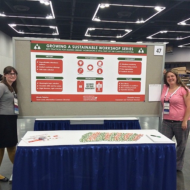
Growing a Sustainable Workshop Series

Title: Growing a Sustainable Workshop Series
Presenters: Chantelle Swaren, Assessment & Outreach Librarian and Nicole Tekulve, Team Lead, Information Commons, The University of Tennessee-Chattanooga

Chantelle and Nicole had buttons, y’all. BUTTONS!!!!! Here’s Chantelle talking about their design process:

Nicole started out sketching her idea for the poster in PowerPoint since she is most comfortable working in that program. After the design direction was established, Chantelle built the working file in Photoshop for more design flexibility and to ensure high-quality output.

We wanted to give a visual nod to the ACRL theme of sustainability while keeping the poster as crisp and readable as possible. To that end, we discarded photos and intricate images in favor of simple icons and limited text. We converted all images and other design elements to fall within our established palette: Pantone 158C, 575C, and white. Many of our images came from openclipart.org and pixabay.com which are great resources for icons and other images.

Throughout the process, we sought input from friends and colleagues, including design help  from Nicole’s partner who runs the silkscreen and design business Grand Palace. If you are working on a poster, our advice is to invite other people to critique your work; it usually improves the final product! After you’ve looked at the same design forever it helps to have a fresh set of eyes suggest minor tweaks (as an example- that’s how we ended up adding the green bar within our poster’s header, which helps to anchor the title).

We decided to print with PosterPresentations.com and chose the SuperSaver Student Special option – and we were thrilled with the quality. We resized our design to best fit the canvas-size offered;  we adjusted the content to maintain fidelity with our original design, and the new dimensions allowed us to maximize the use of white space.

ButtonsChantelle was kind enough to share the original Photoshop file of their poster, which is now available on the Librarian Design Share Google Drive folder.


dancingdogsTitle: Dancing, Dogs, and Disco Balls: Sustaining a happy library outreach community
Presenters: Kathy Anders, Graduate Studies Librarian, Stephanie Graves, Director of Learning and Outreach, Elizabeth German, Instructional Design Librarian, Texas A&M University Libraries

Elizabeth German describes how the librarians from Texas A&M created their poster (and how it almost looked like a disco floor!):

The design process really started with the content. We had a couple brainstorming meetings drawing out ideas for what we wanted and we knew that we wanted to have a “happy” poster that embodied the same spirit of our outreach program.  At one point we thought about replicating a disco floor with the different squares being different sections of our poster. But things didn’t start taking shape until we had written everything that we wanted to be on the poster and then we tried to fit it into our design ideas, the dance floor just wasn’t big enough. The idea of a dance pattern just came to me in the middle of the night and we really liked the idea of the movement it implied. Again conceptually, we thought the different points might be inside the shoes of the dance pattern but once we were working with the content, it wasn’t going to work. In the end, I kept fiddling with the content and arrived at this design.

In terms of technology, we went old school and used PowerPoint. It’s a classic and has staying power for a reason. I used Photoshop to manipulate the photos. We don’t have administrative access on our computers, so if you want to install a font you have to send in a help desk ticket every time. I’ve gotten around that (with permission!) by having them install SkyFonts. It’s software that allows you to download whichever Google Fonts you’d like and so that way I had more creative control over the look of the poster. We used Wordle.net to create the wordle. For the data illustrations, we weren’t happy with the excel charts so I created those in PowerPoint. I think if I had more time, that is the one thing I would have gone back to fuss with more.

Take-aways:

  • Don’t sacrifice your content for the design
  • Let go of great ideas when they don’t work.
  • Try creating your own illustrations for data (instead of using Excel’s).


Spotted at ACRL: Posters, Part 1

Last week April and I were lucky enough to attend and present a panel at ACRL 2015 in Portland. Creating attractive conference materials is challenging, but there were so many fantastic posters at ACRL that we knew we had to feature them on Librarian Design Share.

This is the first in a series of posts on eye-catching design we spotted at ACRL. We’ve tried to give each of the presenters/designers a chance to share their creative process with you. We hope you enjoy it!

Poster Sessions

One of the most challenging conference presentation mediums is, I think, the research poster. There is so much information to share in such a limited space. You want your poster to be attractive and engaging, but you also want it to tell a story. Finding the right balance between text and images can be difficult. The posters below are ones that caught our eye with their interesting presentation design.


2 Librarians, 2 Universities: Serving International StudentsTitle: 2 Librarians, 2 Universities: Serving International Students
Presenters: Laurie Bridges, Instruction and Emerging Technologies Librarian, Oregon State University, and Jimena Sagas, Foreign Languages & Literature Librarian, Colorado State University

Here’s Laurie discussing their design process:

Our poster was designed using Canva, after I put out a call to the Twitter-verse asking for a “better way” to design posters, and Dani Cook, a librarian at the Claremont Colleges, suggested Canva. The only drawback of Canva was that I could only make the poster a little over 4 feet wide. However, the ability to have the poster in the cloud allowed Jimena and I to work on it and make changes without having to save and email designs back-and-forth, which I loved! And Canva has templates and free clip art, which we used liberally (all of the icons and design elements in the poster came from Canva’s free clip art).

Before becoming a librarian I held a position as the Marketing Coordinator for University Housing and Dining Services at Oregon State University. I supervised a full-time graphic designer and routinely worked with student designers. Although I am not a graphic designer myself, my past experience in marketing greatly informed the design of our poster. For example, because I worked in print media, I know that posters (at least 10 years ago) always had a “call to action” somewhere along the bottom. So, somewhere along the bottom of the poster you should tell your customer what you want them to do next (in our case it was visit our bundle of bitly links). Also, when I worked in print media I learned that people view posters and one-page flyers in a Z pattern – the eye begins in the top left, moves to the right, then diagonally to the left bottom, and finally ends at the bottom right. Therefore, it is best to have your logo, or other identifying information, in the bottom right. And, finally, I knew I wanted bright colors on our poster, to attract attention, and I didn’t want too much information in the poster, because it should act as a “teaser,” prompting people to either act on our “call to action” or talk to Jimena and I at the poster.

Sowing Seeds of Success - Community Collaboration for College ReadinessTitle: Sowing Seeds of Success – Community Collaboration for College Readiness
Presenters: Lindy Scripps-Hoekstra, Area Studies & Religious Studies Librarian & Gayle Schaub, Liberal Arts Librarian, Grand Valley State University

Lindy discusses their design process a bit:

We used Canva to create our poster. It is really user-friendly and intuitive. They have some really nice fonts and allow users to upload their own images. Anyone interested in making a poster can use the custom sizing to create large-scale prints.  I’ve also used this website to create fliers for my faculty and signage with librarian profiles.

In terms of poster content, we wanted to continue with the conference theme of sustainability by using a plant growth metaphor and related imagery to help guide the eye through our information. We also wanted to include photos of our students without having this overwhelm or distract from the content so we placed those in a simple row at the bottom.

Back it Up! Data Management Practices of University Researchers

Title: Back it Up! Data Management Practices of University Researchers
Presenters: Penny Beile, Associate Director, Information Services and Scholarly Communication, University of Central Florida & Erica England, Adjunct Librarian, University of Central Florida

Here’s Penny talking about this wonderful, 4-panel design:

I usually report poster session research results in a very traditional, text heavy manner – Introduction, Methodology, Results and Discussion, with a couple of charts thrown in.  This time my colleague, Erica England, and I wanted to create an infographic that summarized the information in a visually compelling and simple way.  I often browse infographics sites to get ideas about presenting data and used easel.ly to create the poster.  There are a number of free sites for creating infographics, but easel.ly is the best I’ve found so far.  Erica and I also decided to create four 24”x31” posters instead of a larger 48”x96” poster for ease of transport.  (I only had to take a 24” mailing tube; much easier to carry around than a 48” one!)  After I created an account, I shared login information with Erica, which allowed us to work on the posters from different locations.  We were able to make charts and a wordle, then upload and use those files.  After creating a graphic you can save as a .pdf file, embed in a web site, or share via a link.

Conference Posters: They Can Be Beautiful Too

Collective Engagement Poster

At our ALA Annual Conference Poster presentation for Librarian Design Share, April and I were so lucky to have our poster stationed next to the lovely Jennifer Brown, MSI candidate and University Library Associate at the Hatcher Graduate Library at the University of Michigan. If you aren’t familiar with the University Library Associates (ULA) program at the University of Michigan, this poster will give you a great introduction or you can read more about it.

In person, this poster sings! As you can see from the image above, it really is quite striking and beautiful. Jennifer’s use of color and alignment make it easy to read and lovely to see. Here’s what Jennifer has to say about it:

At this past ALA Annual Conference, my colleague and I presented on the unique partnership that the University of Michigan School of Information has with the MLibrary system. The University Library Associates program is a great opportunity for library students (like myself) to engage with the field professionally, and in ways that are sometimes absent in our library school curriculum. Further, seasoned professionals say that they benefit from learning and growing alongside us.

In the initial design phase, I began by selecting a color palette and layout that I thought appropriate for comparing two similar, but distinct, groups. I wanted to ensure that the theme remained consistent (which meant adopting a common shape, and threading that throughout the design), and tried to express quantitative and qualitative data visually, so as to draw the eye. I also made liberal use of public domain and creative commons licensed icons at The Noun Project, and generated the word cloud using a fantastic site called Tagul. Most importantly, though, I wanted to utilize white space thoughtfully, so as not to overwhelm individuals with too much all at once. In all, I had a fantastic time presenting this poster, and look forward to designing many more materials in the future!


If you’d like to see the Adobe Illustrator version of the file, you can email Jennifer. You can also download a large PDF version of the poster.

Create a free website or blog at WordPress.com.

Up ↑