As academic and school librarians gear up for the start of another school year, we’re on the lookout for different opportunities to share library resources with our campus community. Today’s post comes to us from Crystal Boyce, Sciences Librarian at the Ames Library at Illinois Wesleyan University, who is trying to reach students in labs and classrooms around her campus.
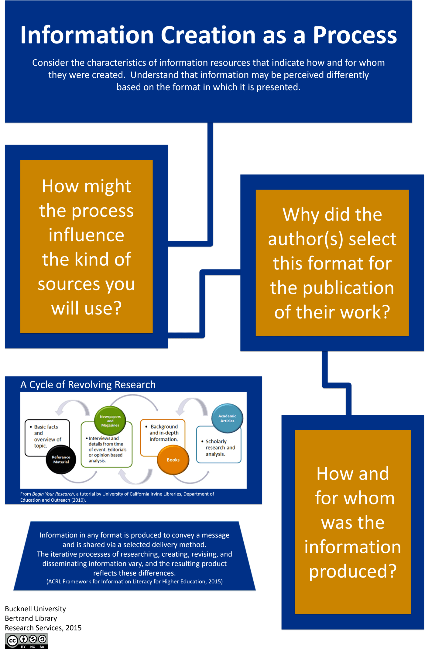
We can’t really call the ACRL Framework for Information Literacy in Higher Education new anymore, but lots of us still need help in understanding what it all means. And if we librarians need help, imagine how our students are feeling about the whole thing! The librarians at the Ellen Clarke Bertrand Library at Bucknell University are working to make this easier on all of us with a series of posters about each frame.
Continue reading “Visualizing the ACRL Framework for Students”
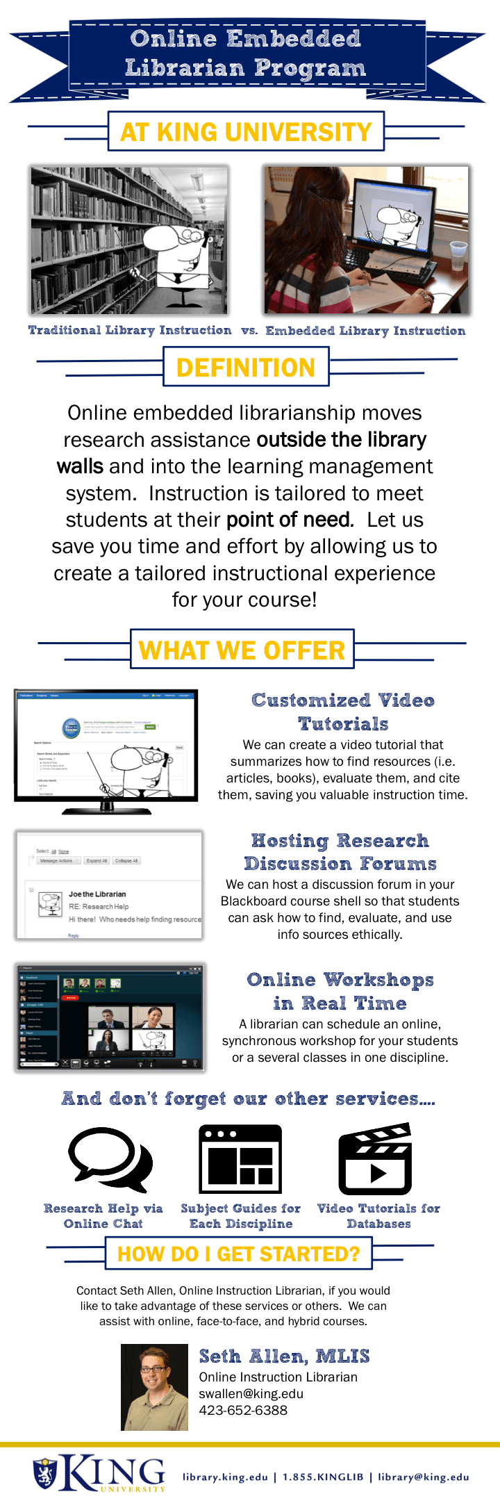
My love of Adobe Photoshop is well known at Librarian Design Share, as is April’s excitement over Microsoft Publisher. We all have our favorite design programs, and everyone from Canva-devotees to Illustrator users can agree that once you find software that works for you, it’s easy to stick with it. But sometimes it’s a nice change of pace to try a new design tool.
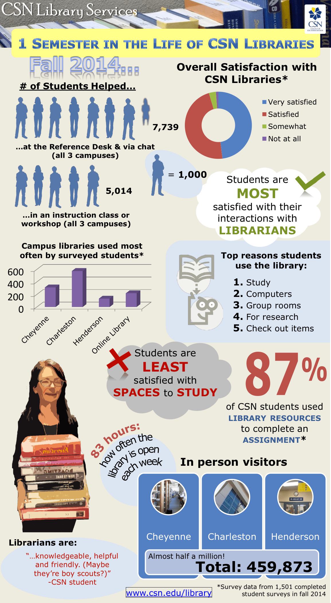
Today’s submission from Stephanie Espinoza, eLearning Librarian at the College of Southern Nevada, makes me think I haven’t been using PowerPoint to its full advantage. She’s used the standard Microsoft computing software to create everything from infographics to advertisements for her library.
Continue reading “Because Photoshop Isn’t Always the Answer”
April and I are wrapping up our series on stellar conference posters today with some wonderful submissions. We hope you’ve enjoyed it. It’s such a tricky medium, and I think the more examples we can see of good work, the better the quality of posters at professional conferences will become.
 Title: Data Management and Broader Impacts: A Holistic Approach
Presenter: Megan N. O’Donnell, Scholarly Communications and Science & Technology Librarian, Iowa State University Library
Megan’s poster is available via the Digital Repository at Iowa State University. Here’s what she had to share about her design process:
I wanted my poster to be bold, easy to understand, and fun. Since the topic was likely to be unfamiliar to some of the conference attendees, I also needed to accommodate some wordy bits for context. The layout was the most time consuming part – I had everything I wanted pretty early but getting it all to fit and look good took a long time. The wordy bits took up more room than expected but that’s partly because they were in 45 point font as I wanted it to be readable at a distance. This meant losing some valuable space but it was needed. I did save some time by using icons from Microsoft and Icons8.com though I did tweak, combine, and recolor everything on the poster because I was sticking to a limited color pallet. I guess the last thing I should mention is that this is a BIG poster. It measures at 7.5 by 3.5 feet. I did this on purpose. I like to maximize the space I’m given, but it also meant it was going to be expensive to print and a pain to travel with. In the end I decided to pay extra to have it printed on “polyfab” which is a thin vinyl like fabric that can be folded up and packed in a suitcase. My printing choices, while expensive, were worth it. The size of the poster was perfect –everything was readable–and the polyfab, while not without some quirks, was fantastic.
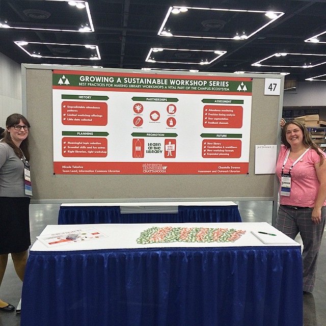
Title: Growing a Sustainable Workshop Series
Presenters: Chantelle Swaren, Assessment & Outreach Librarian and Nicole Tekulve, Team Lead, Information Commons, The University of Tennessee-Chattanooga
Chantelle and Nicole had buttons, y’all. BUTTONS!!!!! Here’s Chantelle talking about their design process:
Nicole started out sketching her idea for the poster in PowerPoint since she is most comfortable working in that program. After the design direction was established, Chantelle built the working file in Photoshop for more design flexibility and to ensure high-quality output.
We wanted to give a visual nod to the ACRL theme of sustainability while keeping the poster as crisp and readable as possible. To that end, we discarded photos and intricate images in favor of simple icons and limited text. We converted all images and other design elements to fall within our established palette: Pantone 158C, 575C, and white. Many of our images came from openclipart.org and pixabay.com which are great resources for icons and other images.
Throughout the process, we sought input from friends and colleagues, including design help from Nicole’s partner who runs the silkscreen and design business Grand Palace. If you are working on a poster, our advice is to invite other people to critique your work; it usually improves the final product! After you’ve looked at the same design forever it helps to have a fresh set of eyes suggest minor tweaks (as an example- that’s how we ended up adding the green bar within our poster’s header, which helps to anchor the title).
We decided to print with PosterPresentations.com and chose the SuperSaver Student Special option – and we were thrilled with the quality. We resized our design to best fit the canvas-size offered; we adjusted the content to maintain fidelity with our original design, and the new dimensions allowed us to maximize the use of white space.
 Chantelle was kind enough to share the original Photoshop file of their poster, which is now available on the Librarian Design Share Google Drive folder.
 Title: Dancing, Dogs, and Disco Balls: Sustaining a happy library outreach community
Presenters: Kathy Anders, Graduate Studies Librarian, Stephanie Graves, Director of Learning and Outreach, Elizabeth German, Instructional Design Librarian, Texas A&M University Libraries
Elizabeth German describes how the librarians from Texas A&M created their poster (and how it almost looked like a disco floor!):
The design process really started with the content. We had a couple brainstorming meetings drawing out ideas for what we wanted and we knew that we wanted to have a “happy” poster that embodied the same spirit of our outreach program. At one point we thought about replicating a disco floor with the different squares being different sections of our poster. But things didn’t start taking shape until we had written everything that we wanted to be on the poster and then we tried to fit it into our design ideas, the dance floor just wasn’t big enough. The idea of a dance pattern just came to me in the middle of the night and we really liked the idea of the movement it implied. Again conceptually, we thought the different points might be inside the shoes of the dance pattern but once we were working with the content, it wasn’t going to work. In the end, I kept fiddling with the content and arrived at this design.
In terms of technology, we went old school and used PowerPoint. It’s a classic and has staying power for a reason. I used Photoshop to manipulate the photos. We don’t have administrative access on our computers, so if you want to install a font you have to send in a help desk ticket every time. I’ve gotten around that (with permission!) by having them install SkyFonts. It’s software that allows you to download whichever Google Fonts you’d like and so that way I had more creative control over the look of the poster. We used Wordle.net to create the wordle. For the data illustrations, we weren’t happy with the excel charts so I created those in PowerPoint. I think if I had more time, that is the one thing I would have gone back to fuss with more.
Take-aways:
- Don’t sacrifice your content for the design
- Let go of great ideas when they don’t work.
- Try creating your own illustrations for data (instead of using Excel’s).
When looking for the latest trends in services and cutting-edge technology, you should head to the Poster Sessions of any conference. Beyond introducing you to new concepts, you get to connect with the poster creators and really hear the story behind their research. Through this series of posts, we hope to bring the virtual poster session experience to you. Here are a few more of our faves from ACRL:
Title: Support Ticket Systems and Reference: New Opportunities, New Challenges, New Service Models
Presenter: Lisa Campbell, Digital Learning Services Librarian, University of Michigan Library
Here’s Lisa discussing her design process and best practices for poster making and presenting:
I’m often facing limited time and frequent interruptions when working on conference materials. Design constraints help me to work efficiently and manage my stress. Starting work on this poster, I knew I wanted to fill the allotted space (a whopping 4×8 display board) and to use limited fonts, colors, and shapes.For the text, I picked Myriad Pro, which we use for many library communications. Sometimes I’ll seek fancier choices (I like Google Fonts, Font Squirrel, and dafont.com), but here, I wanted a font with which I was familiar. For the palette, I isolated 3-4 colors from a graphic I liked. These became swatches in Illustrator.
I took layout cues from my original poster proposal. I pulled 1-2 key points from each paragraph and pondered how to communicate them visually. I settled on a simple grid with a timeline, screenshots, and key takeaways. I sourced icons from The Noun Project and paid a licensing fee to use them without attribution. Then, I spent hours futzing with Illustrator until–voila!–the poster was done.
If you’re looking to create better posters, I encourage you to inventory your available resources (skills, support, software, printers, budget, etc.) and to let those, along with any guidelines you’ve been given, inform your design decisions. Any poster can be effective so long as its informative, organized, legible, and to-the-point.And don’t forget to figure out how you’ll transport your poster. Were it not for some very last-minute magic involving a coworker, a hacksaw, a roll of duct tape, and two poster tubes, mine would not have made it to Portland.
 Title: Write Now: Supporting Student Success by Partnering with the Writing Center
Presenter: Beth Anderson Schuck, Director, College of Southern Nevada Library Service, Nicole Sandberg, Reference & Instruction Librarian, College of Southern Nevada Library Services
Nicole discusses their design process:
We opted for a ‘flow-chart’ look because we thought that would reflect the fact that the project has been an evolutionary process and not just a static idea. We supplemented that information with the pie charts to illustrate the differences between when students visit the Writing Center versus the Writing Center in the Library.
Based on Beth’s expertise from multiple previous poster sessions, we made the text as large as possible so that it could be read from far away. For this reason, we kept the amount of text to a minimum and we also felt this encouraged people to ask us questions, which we wanted. We thought a nice background image would enhance our theme, and found a simple image related to writing from Microsoft PowerPoint templates that blended well enough into the background. Finally, the blue font and the box background (lower right corner) and the yellow box (lower left corner) closely match CSN’s school colors.
 Title: Strengthening Information Literacy Collaboration Between Library and Faculty Through a Faculty Associate Program
Presenters: Dorothy Ryan, Sarah Sagmoen, Nancy Weichert, Brookens Library, University of Illinois Springfield
Poster Librarian Designer: Janelle Gurnsey, Outreach & Communications Coordinator, Brookens Library, University of Illinois Springfield
Here’s a bit from Janelle about her process:
1. Content is King: You can design something beautiful regardless of the content. Come up with a good concept for your poster and then think about the design. The librarians created the content and I provided the design. It was in every sense a team effort.2. Consider the Source: Things I take into consideration are, What am I designing? For what purpose? For whom? The poster on the Brookens Library Faculty Associate Program needed to represent the Library and the University, be professional, clean and easy to read. I used University branding standards to drive the design. I chose bright colors from the identity stamp to give an otherwise simple design a bit of punch. I created the original file in Illustrator .Advice I would give to those with less of a design background is to use their librarian skills to look for things they know they like and then creatively emulate the principles of those designs.
Title: A Meeting of the Minds: Multi-Office Collaboration for Grant Funding and Services
Presenters: Beth Stahr, Head of Reference/Instruction and Eric Johnson, Library Director, Southeastern Louisiana University
In designing our poster, we referred back to the abstract we submitted to ACRL to make sure that we incorporated all the original ideas in our proposal. The steps for collaboration with other campus agencies were the main information points to convey on the poster, so that block of text was located in the center. However, to make the poster more visually appealing, we considered the words in our title, and sought an eye-catching graphical representation of our theme. The words in our title that mattered were: minds, collaboration, funding, and services. As librarians always do, we identified key words for these concepts: brains, money and the use of arrows to show the input of multiple agencies working together. The four color-tinted brains, each representing a different campus agency, were placed on the left side of the poster, and worked together to bring funds, represented by a pot of gold, into the institution, represented by a classical style building. To depict the library’s “services,” we placed a photo of attendees and several slides from our training sessions on the right hand side of the slide. We added the results of a survey of participants to depict the assessment of our training.
While we created this design, we are fortunate to have both artistic and technical expertise at our University’s Center for Faculty Excellence. Their staff helped with font, spacing and color selection and suggested the gradated blue background. The Center also has a large poster printer available for faculty who create posters for conferences. Our poster was created in MS PowerPoint and then re-sized for the Epson Stylus Pro 9800 44-inch roll-paper color inkjet printer. We recommend that someone with an eye for graphic design review any poster to be displayed at a conference.
Nono Burling, Online Resources Coordinator at Washington State Library and manager of the ASK WA Virtual Reference Project, first shared this amazing chalkboard-style poster design on the ACRL Library Marketing and Outreach (LMaO) Facebook group, and we are so excited to feature it here today. It’s a good example of trying something new with conference poster design and makes great use of interesting fonts. Here’s Nono talking about her design process:
I’d originally been asked to present at the College Librarians and Media Specialists of Washing State (CLAMS) 2014 fall conference, but due to time constraints my presentation turned into a poster session. I wanted something eye-catching that would draw people. I’ve always loved those chalkboard designs you see in coffee shops so decided to try one of my own. The “Sneak Peek” part of the poster is a lift-the-flap piece. The entire design goes on a 36″ by 48″ tri-fold poster board.
Here are some of the fonts I used in this design for both the text and ornamental pieces, all free to download:
You can also see more fonts that would work well on a chalkboard design at this great Font Round-Up.
Nono’s poster was created using MS Publisher and Powerpoint. You can download the original files from the Librarian Design Share Google Drive Folder and adapt to your heart’s content (just remember to give Nono a shout-out). Excuse me while I go download all these fonts…


