Search

Librarian Design Share

inspiration for library creatives

Tag

powerpoint

Infographic Love: Visually Communicating Information & Data

Librarians n infographics 4evaIf we could visually communicate the love that librarians have for infographics, I think it would look a little something like this. I’m not sure when our love affair with icons and color-matching data began, but this visual expression of data and information is now a part of our librarian sphere. Whether we’re using infographics to teach students about information evaluation, or developing our own to share LibQual results, library impact or assessment findings, this method of conveying information is quite compelling.

But creating good infographics takes time. You want them to tell a story, to build from one bit of information to the next until the people reading them get a complete sense of the narrative you’ve created. You can certainly put your knowledge of MS Publisher, Adobe Photoshop, InDesign or Illustrator to work and create your own infographic. Or you can take advantage of infographic creation sites like PiktoChart or Easel.ly. We’ve written about these easy-to-use graphic generator sites before, but I think as more librarians are compelled to share data and information visually, these image-creation sites are going to find a place in our day-to-day work toolkit.


Robin Featherstone is an embedded research health librarian for the Department of Pediatrics at the University of Alberta. Her infographic was presented at the 2014 Canadian Health Libraries Association (CHLA) Annual Conference in Montreal. In it, Robin describes two different projects used to promote research through social media. It was created using Piktochart and is an excellent example of the use of infographic presentation to convey project results.

Featherstone Infographic


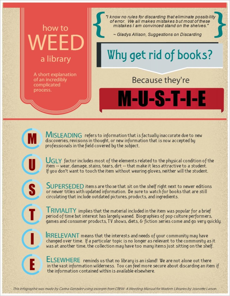
Carina Gonzalez, Library Media Specialist at Lawrence High School in Lawrenceville, New Jersey has also opted to use an infographic (created using Easel.ly) to share information about weeding with her school community. We all know that sparks can fly when non-librarians hear about weeding projects, so creating an easy-to-understand visual representation of the process is a great way to communicate the weeding process.


Weeding Infographic

Here’s Carina in her own words:

This infographic, made with excerpts from CREW:  A Weeding Manual for Modern Libraries by Jeanette Larson, helps students and teachers garner a basic understanding of how a librarian chooses what to weed and what to keep.  It specifically outlines the acronym M-U-S-T-I-E providing a concise introduction to weeding without overwhelming the reader with too much information.  As librarians, we need the input of our school community on what we should or shouldn’t weed, and this infographic will inform others so they can give us the information we need to make the right decision.

If you’d like more information about the infographics in this post, email Carina Gonzalez or Robin Featherstone.

Librarian Design Share at ALA

Going to Las Vegas for ALA Annual Conference? We are too! April and I will be presenting a poster about our work on Library Design Share on Saturday, June 28 from 12:30 – 2:00 pm in the Conference Center Exhibit Hall, poster station #17. Stop by, say hi and watch us try to color-coordinate our outfits to our poster!

If you aren’t able to come to Vegas, take a look at our poster below. If you want to reuse any design elements from the poster let us know in the comments section or send us an email.


Librarian Design Share ALA 2014 Poster

Video Slidedeck Theme

Earlier this month I presented at the Brick & Click Academic Libraries Symposium on a student-led library video project I started at St. Mary’s. This post is not about that project. But it is about slidedecks and how, when given the opportunity to make things easy, I make things more difficult for myself. BECAUSE THAT’S THE KIND OF GAL I AM.

I wanted a fun video-related theme running through my presentation slides and decided to upcycle a poster I had originally created to publicize our library’s new Films on Demand subscription. I changed around some fonts (using Arvo and Sofia Pro Light), added some movie-related icons and other graphic elements through-out and BLAM-O, a new template was born. It was really more of a time-consuming why-did-I-decide-to-do-this creation rather than a spontaneous design, but I’m happy with the final project and hoping that by sharing it I can save some people some time.

I’ll end with a brief exchange I had with my husband about this slidedeck:

ME: Check out my presentation slides!!!!!
HIM: Cool. I didn’t know Powerpoint had that theme.
ME: It doesn’t. I made my own theme.
HIM: Of course you did. *head pat*

You can check out the embedded slidedeck through Slideshare, or email me, Veronica, for the original PP slides and Photoshop layout.


Making Your Library Promotion Pop

We’re all working to make our designs pop as librarians, but it’s probably rare that we actually sit back to consider the principles behind the designs we are making. However, just a couple of months ago, I was asked by the Medical Library Association to present on this topic.  So, I am posting the presentation as both a review of basic design and also as an inspiration for design, because it was (by far) the hardest part of making this presentation!

When you make a PowerPoint presentation about design, you want it, uh, designed well. I’m tired of the themes that PowerPoint has to offer, so I usually design my own when I can. While I didn’t come up with the title for this presentation, I did want to play off of it. “Making your Library Promotion Pop” conjures up many themes–popcorn, pop art, popsicles…  I tried them all unsuccessfully, until I came across an unlikely inspiration saved on an older flashdrive: a New Year’s Eve party invitation that I admired some time back and planned to recreate for my own use.  The fireworks and the colors are modern, graphic, and exciting and the elements of the invitation just kind of created the theme for me.
Picture1
You never know where inspiration will strike…or pop!
If you are interested in the original PowerPoint file, contact me.

PowerPoint to Impress

When the Senior Vice President makes 3 hours in his schedule to tour your library and talk to each department and staff member, you have to come up with something to impress him. We originally thought he could visit departments and individuals, and they could give him handouts of their stats and information while telling him more about their day-to-day actions. And then it hit us that we’re the library; we should strive to make our presentation to him as forward-thinking and eye-catching as we can, and we should make the experience as real as possible.

So, we assigned roles and scenarios to the VP so that he could experience the library as our patrons might, and along the way we could give him the behind-the-scenes view into what we do that makes their experience here so easy.  To show off our technology skills (and our stats), we devised a PowerPoint from pictures that we’ve taken of our library. We used SkyDrive to load it to a library iPad and presented it to him when he arrived.  The VP took the iPad to each department, which kept him on track with scenarios, and it kept our numbers right in front of him.  Here it is:

We uploaded the presentation to SlideShare and sent him the link before he could even get back to his office.  Impressed does not begin to describe his reaction.

Interested in modifying this presentation for your own library? Contact me for the original file.

What Did You Do Today?

Often we create a single design to promote a library event, but every now and then an event is so important that it deserves an entire marketing campaign.  This was the case for Maryland Day.

Rebecca Hopman, Special Collections Coordinator and Instruction & Outreach Team Member at the University of Maryland, says:

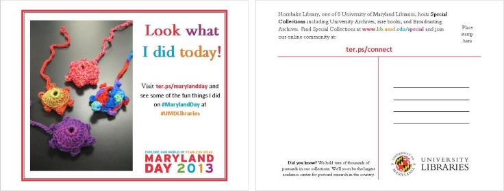
Each year our university hosts Maryland Day, an annual open house for the community, prospective students, and current students, faculty, and staff. The event is a chance for academic departments, campus offices, and local community organizations to connect with visitors. The UMD Libraries ran several events, most of which were held in Hornbake Library and McKeldin Library. Our team created promotional materials to advertise the UMD Libraries’ events and our “What did you do today?” social media campaign, including posters, a library website ad, TV monitor slides, and postcards for people to take with them or mail to a friend or family member.

poster

Poster created using Publisher

mailsign1

Mail Bin Sign created using Photoshop

Picture1

Postcard created using Publisher

slide5

TV monitor slide created using PowerPoint

We wanted to keep the design fun, simple, and colorful, so we used our official university colors (red, yellow, black, and white) as well as Maryland Day colors (bright red, green, blue, orange, and purple). For the postcards and slides we took original photos of our activities, and we used images from our digital collections to advertise the fact that we would stamp and mail postcards for people who wanted to send them to friends and family members. With each design, we tried to keep the amount of information to a minimum and emphasize the sharing/online component.

Wow, right?  Everything UMD has done here is awesome, but I especially enjoyed the social media aspect, because you can see how much the community enjoyed the event!

Rebecca and her colleagues, Laura Cleary, Special Collections Coordinator and Instruction & Outreach Team Leader, and Sarah Espinosa, Graduate Student Assistant and Instruction & Outreach Team Member, used a variety of programs to best suit their creative needs.  For the original files of any of the designs, contact Laura Cleary.

A Presentation Completed!

Last month I posted a work in progress. I was using Powerpoint for the first time in years to create slides to accompany a presentation I was giving with my colleague Abe Korah at the Texas Library Association 2013 Conference. The conference has come and gone, the presentation went well (yay!) and the slide deck is complete. I thought I’d share it with everyone here.

It obviously doesn’t make a lot of sense apart from the presentation, but that’s ok. I think a good Powerpoint should be used to enhance a presentation, not be the primary mode of information dissemination during the session. They’re listening to you, not reading!

If you have a great presentation you’d like to share, don’t forget to submit it to us here.

A Presentation in Progress

I’m presenting at the 2013 Texas Library Association at the end of this month along with my colleague, Abe Korah . I’ve been excited about this presentation for months, but have only now started to work on our Powerpoint slides for the day of the event.

It’s been years (YEARS!!!) since I’ve created any kind of Powerpoint presentation. So much has been written about PP sins and presentation skills for librarians (if you don’t know Lee Hilyer’s blog and book, get to know ’em), which makes creating a bad slide deck and even greater offense than it once was.

My slides are super simple, and this presentation is still in draft format. I’ve tried to keep things consistent, relying mostly on a fun font and bold colors, and have only used images when they could make an impact. I’m open to all comments and suggestions.

A note about the presentation: Our session is taking on the format of a mock interview, where attendees learn how to develop the skills, experience, and critical thinking necessary to taking a more thoughtful, active approach to their job search and interviewing.

Share the Printing Love this Valentine’s Day

Your Computers and Our Printers have a newfound connection. http://guprint.gonzaga.edu

Like us on Facebook. It makes cents! Like Foley Center Library on Facebook through Valentine's Day and earn 25 cents in your Pharos printing account.These cheerful Valentine’s Day themed designs come to us from Zoe Mayhook at the Foley Center Library at Gonzaga University who created these slides for her library’s digital display.

The first is a slide for our online print service. Students are now able to print from their laptops on to our computers. The concept: anything is eye-catching when you add googly eyes. The second was a slide I created for our Facebook promotion. If students liked us on Facebook, we put .25 cents on their print account.

I am a novice library ad designer (no real prior experience), so I look forward to sharing my ideas and seeing what other people are doing!

Thanks for the submission, Zoe! We totally agree about googly eyes, by the way.

For the original Powerpoint slides, email Zoe Mayhook.

Blog at WordPress.com.

Up ↑

%d bloggers like this: