Search

Librarian Design Share

inspiration for library creatives

Tag

poster

Librarian Design Share at ALA

Going to Las Vegas for ALA Annual Conference? We are too! April and I will be presenting a poster about our work on Library Design Share on Saturday, June 28 from 12:30 – 2:00 pm in the Conference Center Exhibit Hall, poster station #17. Stop by, say hi and watch us try to color-coordinate our outfits to our poster!

If you aren’t able to come to Vegas, take a look at our poster below. If you want to reuse any design elements from the poster let us know in the comments section or send us an email.


Librarian Design Share ALA 2014 Poster

Now In Concert: Advertising Events in the Library

One of the challenges of advertising library events on college campuses is the non-stop barrage of publicity emails, flyers, posters, and announcements that fly around campus. Whether it’s the ultimate frisbee team’s bake sale fundraiser or the theater department’s latest dance performance, somewhere on campus someone is holding an event. The preponderance of “stuff” going on increases the need for targeted, engaging and attractive advertising for library events.

This is where our latest submission comes in.

Brandon Scheirman, Marketing and Graphic Arts Associate at the Pepperdine University Libraries, created a series of posters using Adobe Illustrator advertising a guitar students’ concert, a part of a monthly concert series held at the library.
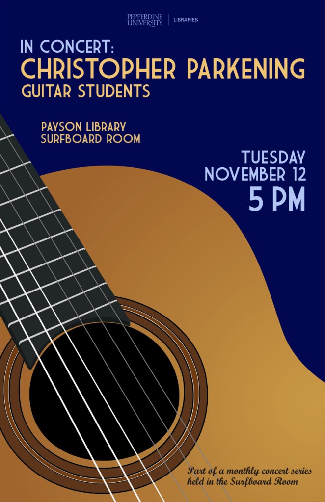
Guitar Series Poster Blue

My library holds a monthly classical guitar concert in one of its rooms and my job was to create a series of posters that advertised these concerts in a clear and classy manner. I wanted to go for a little bit of a retro feel that brought color and bold images to the library, which is something that the library has struggled with. These posters have been widely recognized across campus and brought the events together as a cohesive series.


Guitar Series Poster Green

Brandon’s posters are a beautiful example of unifying different designs through the repetition of common elements. In this case, he maintains consistent use of typography and imagery by repeating the same font in different colors as well as the same guitar from different angles. The library logo remains unobtrusive but still present, letting the fantastic, bold poster design shine through.

Guitar Series Poster RedIf you’re interested in learning more about how these posters were created or obtaining a copy of the Illustrator files, please email Brandon Scheirman.

LibQual Infographic: Data reimagined

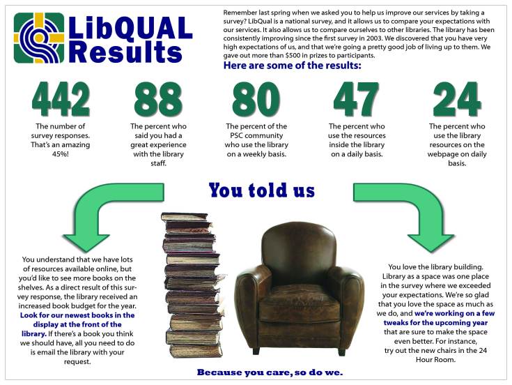
LibQual PosterSo much of the information that we gather about our libraries needs to be shared with our users, but just how do we share it? Meggan Frost, Public Services Librarian at Paul Smith’s College, has given us a great example of  visually representing data gathered through the formal library assessment LibQual.

Here’s Meggan in her own words:

I created this conference-sized poster (4’x3’) to publicize the findings of our LibQUAL survey. We had incredibly high participation in the survey, and we wanted to make sure that our community understood that we took their responses seriously. I created this poster using InDesign. Initially, I had a hard time conceptualizing how I wanted to present the information. Because the poster is conference-sized, I found it hard to break out of “conference poster” design mode in the beginning. Once I realized that I actually wanted to design something more like an infographic, I was able to quickly sketch out a design that turned into the one you see here. This poster was prominently displayed at the front of the library this fall.

This infographic is much more powerful than the plots, charts, and text that typically makes up a library’s LibQual report, and turning it into a poster to share with her campus community further bolster’s her library’s user-focused attitude.

For the inDesign file of this poster, email Meggan Frost.

Create a free website or blog at WordPress.com.

Up ↑