As I’ve written before, sometimes a book’s cover art is so eye-catching that it becomes the center-piece in a library-related design. Whether you’re promoting next week’s book club, a new addition to the collection or a speaker series, sometimes it helps to let the cover art take center stage.
Meggan Frost, Public Services Librarian at Paul Smith’s College took advantage of some great book art to create a set of posters that are eye-catching and make a statement.

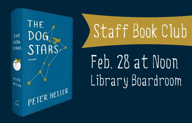
I made these posters using a very similar template to promote some speakers (and their books) we’ve hosted recently in the library. Sometimes you just need something easy that looks great, and this template fits the bill. Book image + publisher description + date/time/place + a judicious use of nice fonts = an eye-catching poster. I like to print posters as big as I can. These are 24”x36” and 36”x48”. Because they are meant to be printed so big, the quality of the images is very important. Google image search has a filter that will allow you to limit to the largest possible image. I like to play around with fonts, but obviously readability is a big factor for a text heavy poster. I used Junction for the text and Nevis in bold for the headings, both available for free online. I think the slightly unusual fonts draw the eye while still being perfectly legible. Of course, the bright red book covers don’t hurt either!

Meggan created these posters using Adobe InDesign. For the original files, email Meggan.