Search

Librarian Design Share

inspiration for library creatives

Category

Flyers & Advertisements

Surviving (and Celebrating!) Finals

I am happy to share a super fun submission, just in time for the end of the year sprint leading into finals.  Laura Sider of the Bass Library at Yale University sent us encouraging pull-tab flyers, explaining:

 I have a few standards I use semester to semester (like the school mascot) and then I try to create new ones that are a little trendier. I place them in high-traffic areas throughout the library (i.e., entrances and exits, by printers, on bathroom doors, in major study spaces). The hope is that these tabs will make students feel empowered or motivated or, at the very least, laugh. They’ve been extremely popular. We went through about 50 sheets in the first two days of exams, and a total of about 80-90 over the course of the week. The only cost is printing and the time putting them up and replacing them.

These were created in Excel and are available for you to use or modify on our Google Drive!  May you also find encouragement and inspiration as you slay all day.

 

Humanizing Outreach Services and Marketing

Every once in a while, I see a library outreach campaign that challenges the traditional boundaries of library service.  Here’s the brief summary of the reason I’m writing today:  In August 2012, Doug Campbell, University of North Texas Research and Instructional Services Librarian, moved into Kerr Hall, the largest residence hall, as Faculty-In-Residence.   Campbell provided reference services on site and took students out for coffee on Saturdays.  To read the details of the work, read Campbell’s reflection.

These services were supported by an amazing marketing campaign, complete with swag, yard signs, a video, and flyers.  Housing Marketing Coordinator Mark McLeod worked as Art Director for the project and provided feedback to student designer Eric Richter.

text is: "Doug goes where Google can't. Thousands of resources that Google won't find. Need library help? Ask Doug." with a cartoon image of a face profile with brown hair, glasses, and beard.text is: "need library help? ask Doug. It's okay to ask." with a cartoon image of a face profile with brown hair, glasses, and beard.

McLeod shared with us:

As far as the process goes, the idea was that Doug was the “face” of the library in the residence halls (dorms), and since he has (or at least had) a distinctive beard, we used a combination of his face, mostly the beard and glasses, as an icon along with text page text to convey the librarian idea.

The artwork was pencil sketched and scanned into Adobe Illustrator.

We probably spent more time concepting the idea than actually doing the artwork. There were a lot of sketches we did for ideas that didn’t really convey the meaning. The “Doug face” idea was fairly simplistic, which was a good thing since the message conveyed really fast.

I think that utilizing Doug’s distinctive beard as a prominent feature in this marketing campaign logo is a fun way to help students recognize the librarian who lives just around the corner!   Would you consider being the “face” of your library?

Simplifying Support Services

Occasionally in my eagerness to let someone know about a resource or service, I provide way too much information. I go above and beyond what that person asked about because I want them to feel like they know all of their options. Sound familiar?

More often than not, this tendency to provide as much information as possible is also apparent in my designs. I find myself revisiting my creations periodically in an effort to pare down and streamline the information included. In my time as a librarian, I’ve learned that I am not alone in this experience.

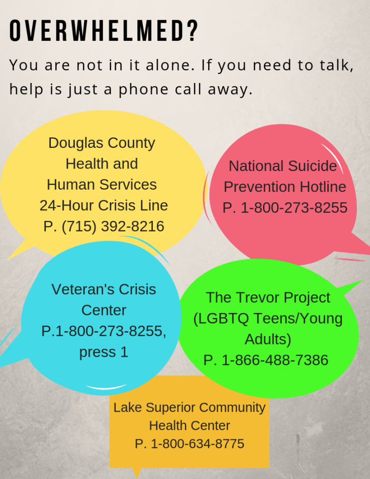
Stephanie Warden at the Jim Dan Hill Library at the University of Wisconsin, Superior sent us a design for mental health resources that strips away the noise and provides users with the most pertinent info.

Flyer with 5 speech bubbles that have mental health resource info in each bubble

Here’s what Stephanie had to say about her design:

While our institution offers flyers advertising support for student mental health services, we found that the material was a little too text-dense and left out resources available to our community patrons. Using services gathered by the rest of the staff I put together this 8.5 x 11 flyer that we have placed strategically throughout the library.

Stephanie used Canva to create her design. And like other librarians we’ve talked to about Canva, she had good things to say about the process. When we asked why she chose to use Canva over other tools, she told us:

The free version of Canva has an amazing number of options available, especially if you aren’t afraid to get in there and experiment with colors and features. That it also allows us to upload our own pictures and pictures from other appropriate sources really makes it a favorite of mine. It also doesn’t hurt that I can peruse their library for inspiration when I find myself stumped.

Thanks for your submission Stephanie!

Read the Text

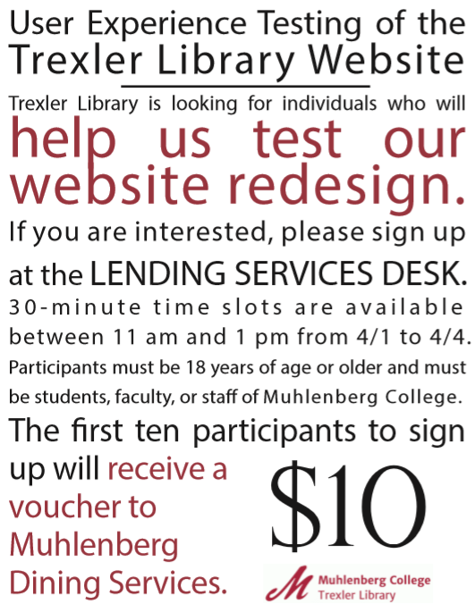
This semester has been a blur – instead of regularly posting on LDS (my apologies!), I’ve been writing, teaching, and rushing through a website user experience assessment.  We’re updating our website and need some student feedback and fast!  After completing the IRB application, I jumped on outreach in order to draw student attention, which resulted in the following poster – I love the alignment of text, emphasis, and the fact that it came together so quickly.

web ux.PNG

I used Adobe Illustrator to alter the spacing between lines of text (leading) and between characters (kerning) in order to make the text easier to read and attractive to view.  Muhlenberg College students enjoyed the opportunity and a few days later we had the feedback we needed!

As always, the original file is shared on the Librarian Design Share google drive under a Creative Commons Attribution-NonCommercial-ShareAlike 3.0 Unported license.

Opera Talks and Classic Design

While we always love receiving submissions that show off impressive feats of Photoshop prowess, we also appreciate the simple things in (library)life. Today’s post, featuring Gaetano Abbondanza from the Glendora Public Library in Glendora, California, is a digital flyer that employs a solid, classic design.

We host a program series titled “Opera Talks”, in which speakers from the Los Angeles Opera Speakers Bureau give presentations about the world of opera, as well as detailed information about whatever opera is currently on stage.

I designed this flyer to display on our LCD screen, which is positioned about the circulation desk. The screen runs a PowerPoint presentation of upcoming programs.

This program featured a talk about the opera “Nabucco”. I used a still shot from the production for the main photo. Since the scene is pretty dark, I used white lettering on a black background to create a seamless, blended feel. Publisher is my go-to program for creating flyers- it’s simple to learn and use, and provides a high degree of flexibility.

Flyer for Opera Talks Event

Creating flyers for digital display can be tricky; you want to  make something eye-catching but also easy enough to read before the screen changes. And oftentimes the color on the final product looks different on the big screen than it did when you made it. Gaetano’s flyer includes an intriguing image from the show it’s advertising and has all the need-to-know information in one spot. The contrast of white on black also eliminates most color distortion issues and ensures that any users with visual impairments will be able to read the sign.

This flyer was created with Microsoft Publisher and the file is available for download on our Google Drive. As always, all submitted work will be published on this site under a Creative Commons Attribution-NonCommercial-ShareAlike 3.0 Unported license.

Inspiration from the Public Domain

Recently my design work has been inspired by artifacts that are in the public domain.  Though I love design, I am less inclined to try my hand at drawing or painting while at work.  Thus, the great value in images that I can use, modify, and distribute without fear of copyright restrictions!

Many of the students at Muhlenberg College are also involved in creative projects with include visual elements, so I’ve been talking to them about copyright restrictions and encouraging them to take a look at items outside traditional copyright.  I’ve also created posters utilizing Adobe Illustrator and Photoshop to encourage student understanding and use of artifacts in the public domain.


These posters hang outside my office and are also included in a library subject guide that I’ve made with lists of open resources that creatives can use in their own work.  The posters both exemplify the work that can be done with images in the public domain and draw the eye.  My inspiration drawn from the public domain hasn’t ended with poster and subject guide creation.  I’ve also created a zine, which (while entertaining) I won’t share here since it doesn’t fit the Librarian Design Share mission.  However, if you’re interested, you can find it on my blog.

I am happy to share these posters on the Librarian Design Share drive.  Please distribute them as you please – the joy of these resources are they they are available to all!  And, if you find inspiration from the public domain and create a design for your library, please share you work with us!

Seasonal Signage

It’s nearly that time of the year again! School and academic librarians, your libraries are about to get a lot busier, and filled with those beginning-of-the-semester questions (Where can I get coffee? How do I print? Do you have my textbook?). For public librarians, it’s time to wave goodbye to summer programming and embrace the fall.

Whatever type of library you are in, this is the perfect season for signage. This call for submissions is focused on designs that signal change – a new beginning and the start of something good.

So whether you’re welcoming new or returning students, or just saying hello to the fall season, send us your signs! If you haven’t made any yet, don’t worry! We’ll be featuring these posts through the end of August.

Photo of the University of Massachusetts Amherst campus in the fall

Using Piktochart for Promotional Flyers

If you’ve ever tried your hand at making an infographic, chances are you’ve run into Piktochart as an option. But what about Piktochart for flyers?

Our latest submission is from Emily Merrifield, Undergraduate Experience Librarian at California State University in Sacramento. She has this to say about her designs:

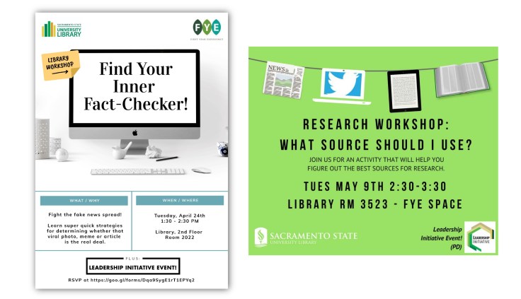
I wanted to share promotional materials I’ve created using the Piktochart site (it was easiest to combine them with pdfs but let me know if that is a problem). I subscribe to the $40/year “pro” version which includes many more templates than the free version. I have attached 3 documents with 2 flyers on each for: workshops help in the library, poetry readings in our Special Collections dept, and a stress relief table provided during finals week. All of the images were used to promote on social media, and the stress relief flyers were printed out (about 22 by 28 inches) to display near the table. Icons and pictures used were either from the Piktochart options or from Pixabay.com.

I have also used Piktochart for infographics and images that I’ve put on libguides. I’ve found that Piktochart has improved a lot since I started using it in early 2016 – and allows for using their designs or easily adapting to your own.

One thing that is stands out about Emily’s designs is the use of the library logo colors in a way that’s attention grabbing without being overstated. I’m also a big fan of the stress-inducing mess behind “Are You Stressed?” in the second flyer.two fliers for stress relief activities

research workshop promotional flyers

Emily also mentions the use of Pixabay.com, which is a fantastic resource for free images that are CC0, meaning free for commercial use & no attribution required. You can create an account for free and it even gives you the option to donate some money to the original artist if you’re so inclined.

All of Emily’s submitted flyers are available on our Google Drive. All submitted work will be published on this site under a Creative Commons Attribution-NonCommercial-ShareAlike 3.0 Unported license.

Combine Display and Flyer Design

Here is an interesting design from Rainer Rees-Mertins, who works at Lib4RI-Library for the Research Institutes within the ETH Domain: Eawag, Empa, PSI & WSL in Switzerland.

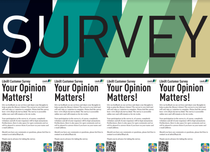
survey

Rainer created the flyer in order to get community feedback on the library’s services. The flyer contains a QR code that leads directly to a survey and survey information on the back.  Community members were encouraged to take the flyer directly from the display.  I think that this is a cool, interactive display idea!

Rainer says,

…the flyer consists in Indesign of four swatches in standard postcard format, into which the print version was then cut. We placed the four flyers next to each other so patrons could read “Survey” already from pretty far away and they could take a flyer nonetheless. However, we also used the flyer as a whole for online materials to advertise the survey.

Rainer was also intentional about the colors that they used when designing the display.

The colours in the background are an enlarged version of our logo (see back of the flyer for the logo). I try to use these colours as often as possible for designs I make, because of the recognition value. What I liked especially about the flyer was the shift in the font colour from white to black in the “U”.

Thanks to Rainer, you are able to find this design on our Google drive.  All submitted work will be published on this site under a Creative Commons Attribution-NonCommercial-ShareAlike 3.0 Unported license.


Blog at WordPress.com.

Up ↑