Search

Librarian Design Share

inspiration for library creatives

Tag

event publicity

Flyers: Our Bread and Butter

April and I started our foray into graphic design for libraries designing humble flyers. We wanted to share information with our community about library events, hours, policies, and practices. Today’s post, the final Librarian Design Share post, brings us back to where it all began. Here are some lovely flyers to close out our site.

nov holiday craft.jpg
Created by Marisol Gerena from Plattekill Public Library using Microsoft Publisher
StudyPaws
Created by Christine Seliga, Library Services Specialist at Pima Community College – West Campus using Microsoft Publisher and Canva to advertise therapy dog study break.
IT'S COSMIC.jpg
Created by Christine Seliga, Library Services Specialist at Pima Community College – West Campus Library for a book display celebrating the solar eclipse. Created using Canva, Microsoft Publisher and Microsoft Paint.

Donkeys and Elephants

The Presidential Debates may be done, but we didn’t want to miss the chance the share this fun event advertisement from Erica Street, Instruction/Serials Librarian at the Jenks Library at Gordon College. Focusing on one primary design, Erica was then able to modify it to suit different mediums.

Continue reading “Donkeys and Elephants”

Altmetrics and Chill

University of Maine Social Sciences and Humanities Librarian Jen Bonnet recently submitted designs that she and her colleagues at the Raymond H. Fogler Library created to introduce faculty and grad students to the idea of altmetrics, or non-traditional metrics usually measured by downloads, social media mentions, saves, and citations. Jen explains:

Continue reading “Altmetrics and Chill”

Coloring Our History

Houston, Texas is rich with culture, and the Houston Area Digital Archives division of the Houston Public Library works hard to capture the city’s history and make it accessible to all. In that spirit, HPL Cataloging and Metadata Services Librarian Jeanette Sewell recently submitted the digital archival coloring books designs she created.

Picture1
Jeanette describes her process in creating the covers and pages for the online books:

Continue reading “Coloring Our History”

Our Love Affair with Canva Continues…

Flood of Information

Sometimes when bad things happen, you brush them under the rug and pretend they never happened. Other times, you have to address them, embrace them, and then celebrate them. I’m so happy that our library did the latter after our leak last year. We were lucky to have the institution’s full support to repair our space. Once we did that, we decided to throw a party to recognize those who helped us and to welcome back our patrons.

rmlcelebrate

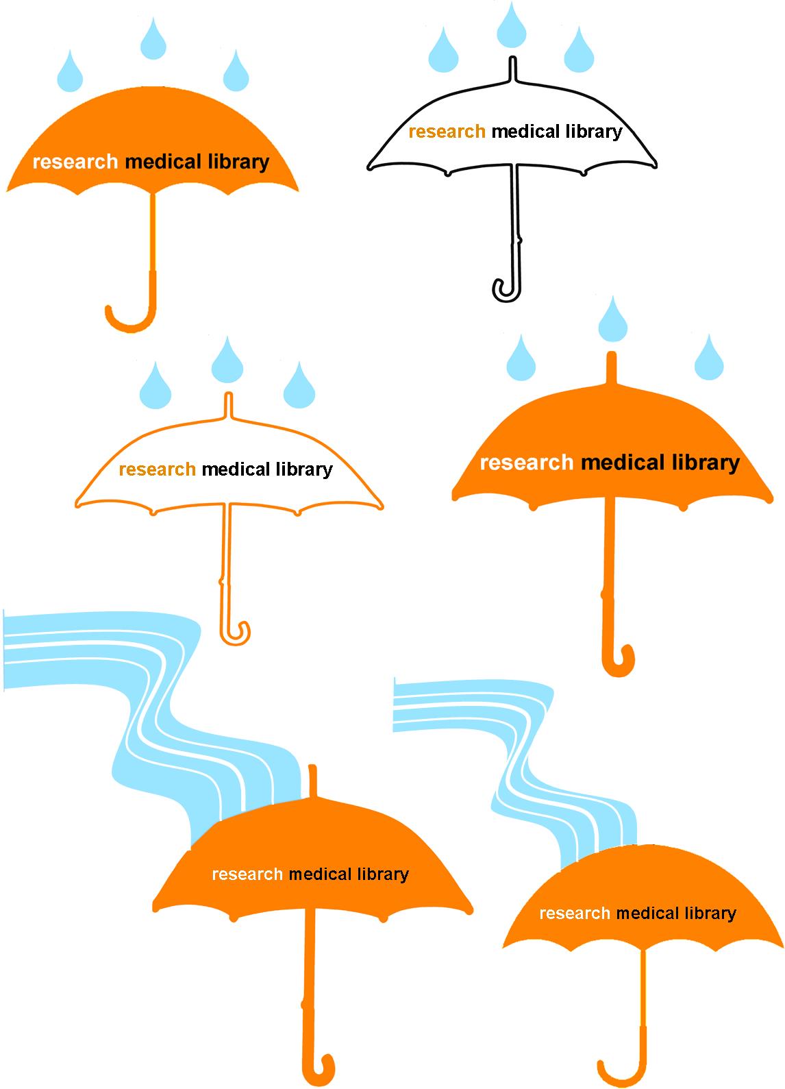
When designing the invitations (above) for our celebration, our library felt that it was important to keep the theme very similar to that of the leak communications. As a group, we brainstormed ideas that would go with the droplet, and we came up with the idea of using an umbrella. It’s a protection device, and that’s what our role was during the leak–protecting both our collection and our patrons from harm. I presented the following designs to the library to vote on:

umbrellas

I used clipart umbrellas from Microsoft Word, filling some with colors and changing the outline colors.  I combined the umbrella image with multiple clipart rain droplets that I previously used.  This design was OK, but it felt like the library had endured more of a flood than just a few drops of water…so I used the curvy line drawing feature in Publisher to insert a “flood” that runs to the umbrella.  Our staff overwhelmingly voted for the flood rather than the drops, and they liked the simpler umbrella best, so we had an icon for our party invitation and publicity efforts.

This design opened a floodgate of ideas (sorry for the pun, but get ready for a lot more to come!).  We decided our party would include a self-guided “Flood of Information” tour, which would highlight the different spots in the library that were affected, as well as connect those spots to a fact about our services.  Each station, named after songs that we thought exemplified the experience, was an exhibit: we had a tape line that showed how far the water flooded; we displayed damaged books; we had pictures and videos from the leak; and we showed a video about disaster recovery.  The five stations were easily found with a map that was coordinated to blue paper droplets taped to the floor.  Below is the two-sided map we distributed to our guests (and I won’t even go into the boring details of making the map, although it probably took longer than any other part of the design!).

floodofinfotour

To make our party even more personalized, after the tour, we invited guests to enjoy homemade cookies that all of us on staff had baked.  It was a warm welcome back for our patrons and a real celebration of our successful recovery.

If you are interested in any of the designs above to modify for your own recovery or celebration, let me know.

Library Therapy

Miyo Davis at St. Francis College Library wanted to host a Library Study Break for students during finals, but didn’t have the budget for a huge event.  Inspired by this post on Librarian Design Share and an idea she got from a talk at an ACRL conference about librarians as research therapists who are available to assist with issues patrons have while researching, Miyo demonstrates that chocolate is always the best medicine.
Miyo describes her design process below: 
We have a ton of leftover Demco® Processing Circulation Label Sets 1-5/8″ x 2-9/10 (SLB spine labels) so my first prototype was a result of just typing up our contact information into the OCLC Label Program.  It was an effective way of getting out our contact info but didn’t really have any personality.  I then downloaded a Microsoft Word template from DEMCO’s website.  Working in Microsoft Word gave me a lot more flexibility with font size, style, color and allowed me to add pictures. For my second prototype I experimented with incorporating our school logo.  This looked nice, but again, I felt like I could take the design a step further.
prototypes
 
Going with this theme [library therapy], I thought it would be funny if the labels on the candy looked like the labels on prescription bottles.  With a little personalization, I turned the library into a pharmacy and the chocolate became “Prescription Chocolate” and “Emergency Chocolate.”  They were a big hit and the students appreciated the joke.
Prescription
These are fun and very timely.  If you are interested in the original Word file to create your own library therapy chocolate, contact Miyo.

Promoting Classes

class offerings

Sometimes the most basic information can be the hardest thing to represent graphically. This flyer was created to promote our regular library class offerings.  Like a lot of the pieces I make, I utilized more than one Microsoft Office program.  I created the chart in Word because I prefer it over Excel for building charts with a bunch of text, and then I copied the chart to a Publisher document so that I could play with the colors, lines, and layer the images, which is way easier to do in Publisher than Word.  I’m not going to lie; it took me forever to decide on the colors and to fit all that I wanted to say in the limited space to make it a half-page document (color printer guilt), but now that it’s done, we can revise and reuse it each semester.

If you are interested in the Publisher file for this document, contact April Aultman Becker.

ALA Event Flyer

ALA Instruction Section's Discussion Group flyer for ALA Midwinter 2013This is a flyer I created to advertise ACRL’s Instruction Section’s Discussion Group session at the upcoming ALA Midwinter Meeting. I picked up the great image from Microsoft’s clipart/stock photo library (thanks for the tip, April!) and tried to tie in some of the colors from the image in the background areas and text.

For the original Photoshop file, email Veronica Arellano Douglas.

Blog at WordPress.com.

Up ↑