Academic and school librarians are finally beginning to settle into the fall semester, and many of us are able to relax (or just stop running in circles) due to the efforts we put in during the summer to prepare for this school year. Joanna Hare, a Subject Librarian at the Run Run Shaw Library at the City University of Hong Kong, recently updated a guide to assist students in using the library.
Joanna explains her process:
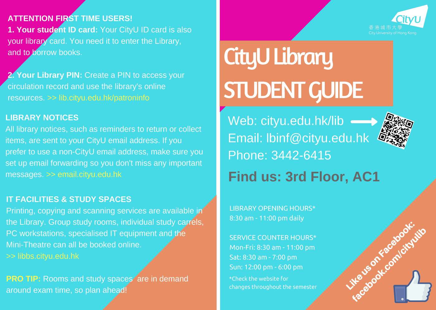
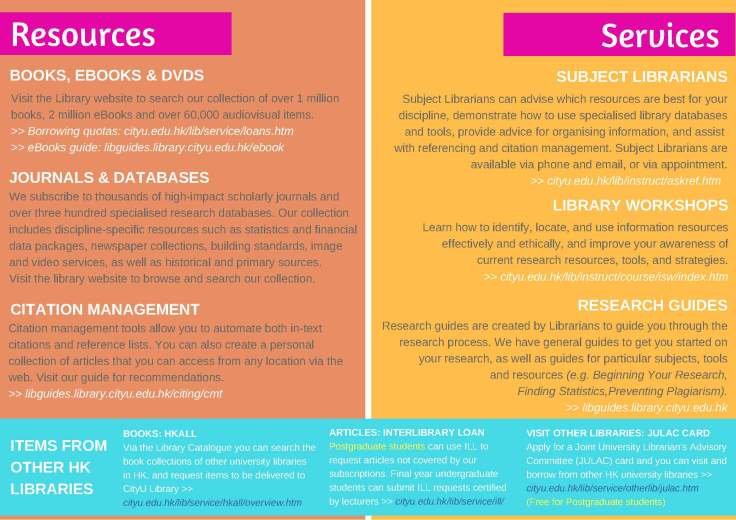
Ahead of the summer semester, it was time to update the print user guides that we distribute to new students. The guides include basic but essential information about using the library, and as is common in many libraries, the existing guides a.) included a LOT of information, and b.) had not been updated in some time.
The original guides were made in Microsoft Word, and were basically a long list of Library services and information, with few design elements. I used Canva to overhaul the design the guides, a tool I discovered via Librarian Design Share. Over the years I have taught myself to use Adobe Illustrator, but when presented with a short deadline, I find Canva easier and quicker for putting together a professional and fresh design.
I wanted the guides to be eye catching, so I kept text to a minimum on the cover, and used bright colours. I produce a lot of visual material for the Library (graphics, slide decks and so on), and I find myself relying on the same familiar colour schemes over and over. To push myself out of my comfort zone, I used the Adobe Colour Wheel. It was easy to play with and I surprised myself with the colours I chose in the end.
I tried to address the issue of too much text by using language that is more of a marketing-style. There is still a lot of text, but it is well spaced, and easier to read than dry descriptions of our services. I also removed information that can be easily found on the Library website, such as borrowing privileges and printing costs. Another reason to remove this kind of information is that it changes from time to time, meaning the guides have to be updated frequently.
A QR code was created using Google URL shortener, which when scanned directs users to the Library homepage. The Google URL shortener allows you to track how many times the QR code is scanned. If the numbers are low, the QR code will be removed in future versions.
The guide was also produced in gray-scale to reduce printing costs for when we need to print in bulk – the guide is sometimes distributed at faculty orientations, where up to 1000 students might attend. Changing the colours to various shades of grey was simple in Canva, but in the end it is unlikely we will use the gray-scale version – the colourful version is hard to resist!
Joanna is fully taking advantage of tools to make her life easier when creating guides! If you have questions about the Run Run Shaw Library’s guide, you can contact Joanna directly.

Leave a comment