Search

Librarian Design Share

inspiration for library creatives

Author

April Aultman Becker

What’s in a Name?

Do you have a complicated name? Do you have a common name? I bet all of us fall into one or the other category, and that’s a real issue when publishing our research over time. ORCID is here to help all of us with name issues due to marriage, preference, nationality, or maybe just because our parents thought it would be easy to name us something memorable. ORCID assigns researchers a unique identifying number that stays with them throughout their career, thus making it easier to follow the publications of Janie Ngata née Janet L. Ngata-Romero.

Medical librarians seem to be on the forefront of promoting ORCID, and Sarah Visintini, a librarian at the Berkman Library, University of Ottawa Heart Institute in Canada, made the following flyer to attract faculty and researcher attention to the service during her institution’s Research Day:

Sarah explains,

I was inspired by the University of Adelaide’s flyer design, another university’s flyer design that I can’t locate anymore, and the general promotional materials for ORCID, but thought it would be fun to add a bunch of common last names at the top in different fonts. I used Wikipedia’s “Most Common Surnames” lists for Asia, North America, South America, etc to generate the list. There were a lot to choose from so I specifically chose names that I knew were common at my institution.

I love that Sarah used the look and feel of ORCID’s brand, but personalized this flyer with names her researchers could relate to. Sarah submitted both the PDF flyer and a PowerPoint slide to our Librarian Design Share Google Drive, in case folks want to use her version or instead edit the names to better reflect their institution’s researchers.

Finally, Sarah used Google Slides to make this flyer, and if you don’t already love Google Slides, you should! Veronica and I use Google Slides almost exclusively to create our presentations, as you can collaborate across distances to make real time updates. Also, you can easily take Google Slides with you on your travels as long as you’ve got an internet connection; or, if you don’t have reliable internet, you can download the slides into PowerPoint format. It’s a beautiful thing.

Psst, interested in getting your own ORCID ID? It’s super simple, just go here.

Illustrating Library Usage

If you haven’t had time to look up from the frenzy, the end of the year is HERE! And with the end of another academic year, often comes the annual gathering of stats. Jess Denke, Public Services Librarian at the Trexler Library at DeSales University, has created an infographic that really illustrates how her library was used.

Jess says,

This was created using Adobe Illustrator.  The infographic of last year’s report went over very well with students, faculty, and visitors and has been up all year – so I decided it was time for another!  This one was more successful at visualizing the data versus simply presenting the information as a series of graphs.  A lot of the statistics were related to use of a particular place in the library, so I decided to set them inside the floor plan.

I think using the floor plan is so smart–it connects your patrons with the spaces they use, and it clearly demonstrates to them that you are keeping track. I’m filing away this idea for my own library as we welcome the tutoring center in our space this year and continue to tweak our arrangement.

You can find all of Jess’ beautiful designs (see this post too) on the Librarian Design Share Google Drive as both .png and adaptable Adobe Illustrator files.

Promoting Services

Librarians are always looking for creative ways to reach people and to inform our public about our services. I’m constantly changing up my brochures and handouts to look more modern and to contain more concise, relevant information.

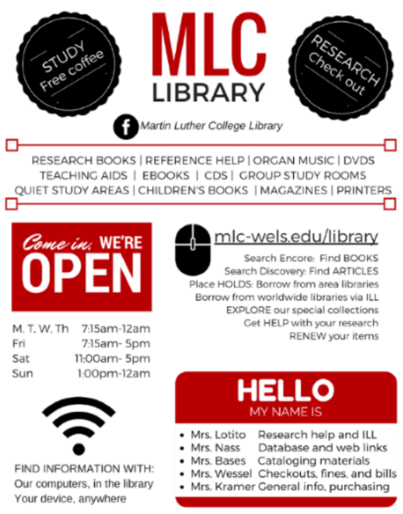
Linda Kramer, Library Director at Martin Luther College has designed a poster in Canva using simple colors and friendly, familiar graphics to attract the eye and promote her library’s services, hours, and people who can help. About this design, Linda says, “while being a resource for students, this was also handy as a basic information sheet for new faculty on campus.” Mission accomplished!

Jet Stream of Creativity

Some of us are lucky to have a library name that’s just made to aid in marketing. I work at the Bryan Wildenthal Memorial Library at Sul Ross State University, so I am not one of these people! However, Susan Bloom, Associate Librarian, Head of Instructional Services at the James E. Tobin (JET) Library at Molloy College definitely is!   Susan has made numerous marketing designs for her library, but some of the best play off the JET theme:

tour-flyer

The above services for patrons in the style of an airline departure board is immediately familiar and clever, as is the air-mail themed pizza party invitation below:

2014-pizza-party


Susan explains her process and reactions from others about her designs:

All work was created by me using Photoshop CS6. I always get some emails from people saying how much they like them. I really love creating the fliers, it is very different from the other work I do and it allows me to flex some creative muscle. I always use Photoshop. I have tried using some other programs but they don’t give me the flexibility Photoshop does.

Susan has produced lots more library-related designs, and you can view those here. If you are interested in modifying Susan’s designs for your use, contact her directly. What about you guys? Has the name or a feature of your library inspired you in creation of designs? We’d love to feature them if so

Year in Review

Once upon a time, libraries didn’t keep numbers and stats; or, if we did, we quietly kept them to ourselves.  However, a recent trend in libraries is to publicize our annual numbers so that stakeholders can understand the importance of a library’s existence.

Library Specialist KC Frankenburger at the Parham Road Campus Library location at Reynolds Community College explains the infographic she designed with Canva:

Continue reading “Year in Review”

Colorful Student Guide

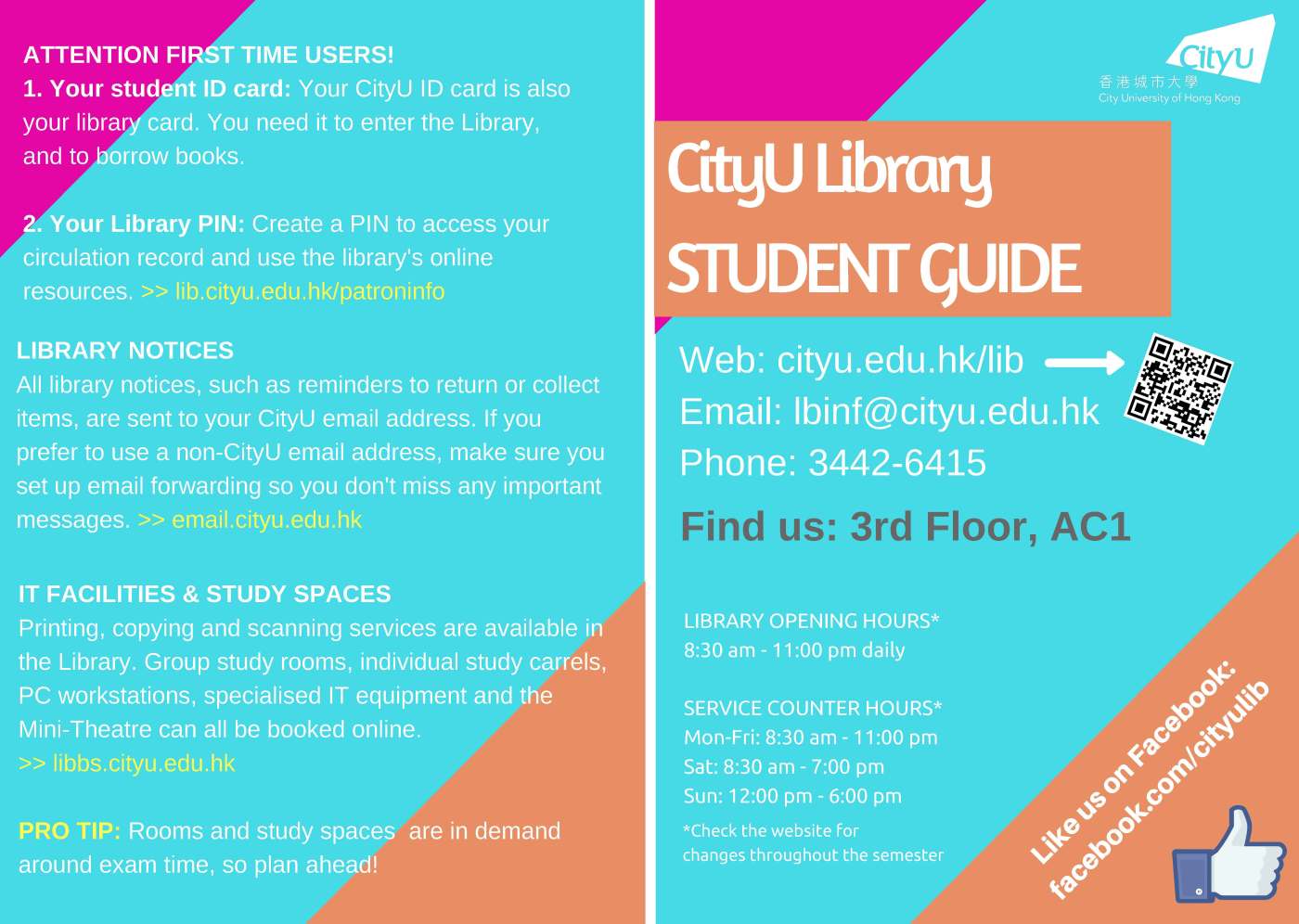
Academic and school librarians are finally beginning to settle into the fall semester, and many of us are able to relax (or just stop running in circles) due to the efforts we put in during the summer to prepare for this school year.  Joanna Hare, a Subject Librarian at the Run Run Shaw Library at the City University of Hong Kong, recently updated a guide to assist students in using the library.

Continue reading “Colorful Student Guide”

Quick Fixes

Dan Vinson, the Coordinator of User Services and Library Assessment at Haggerty Library & Learning Commons at Mount Mary University, is an expert at making clear, concise tools to help simplify library business to students.  If there is any doubt to that statement, be sure to check out his Dewey signs that he submitted to Librarian Design Share about a year ago, which he created with Easel.ly.  Dan’s most recent designs, however, make use of every librarian’s new fave: Canva.

Where to start_NEW_Page_1

Dan created these latest designs, which he plans to link to from the library’s homepage, in direct response to his latest user survey. He explains more below.

What is what ad_Page_1

We conduct a user survey every semester on rotating topics, and afterwards, we try to make “quick fixes” which we can then market. In our Spring survey, multiple students mentioned how difficult it was to figure out what tools to use when, and how to distinguish our request options.

In addition to retooling our library instruction marketing to faculty, I created this handout series from a Canva presentation template, each of which we will link directly to from our home page. I feel like they condense and organize the different points pretty well.

ILL details ad

Not only is it an awesome idea to respond to the issues students are having, it’s so great to do it so beautifully, but also so plainly.  I know you’re going to want to modify these for your own libraries, so you can find PDFs of Dan’s “quick fix” web designs on the Librarian Design Share Google Drive.  You can also check out Dan’s prolific collection of library-related Canva designs here.  And, if you have any specific design questions, drop Dan a line.

The More Frames, The Better

Cindi Tysick, Head of Educational Services in the Research, Education and Outreach Unit of the University Libraries at the University at Buffalo used Canva to create posters to visually represent each of the frames of ACRL’s Framework for Information Literacy for Higher Education.

frameworks

Cindi reveals her sneaky trick to teach the Framework and explains why you’ll find seven, rather than six, posters in her library:

By putting these posters around your library you can begin cementing the concepts into subconscious of students and faculty.  The posters can also be printed into a brochure format, which can be given to students and faculty during orientations, workshops, or library instruction.

When looking over the posters you’ll see that there is a seventh frame, “Information has Structure.”  Our Educational Services Team at the University at Buffalo Libraries felt that there were so many knowledge practices under “Searching as Strategic Exploration,” that maybe there were actually two frames hidden there.  After debating about it we thought that students needed to know that the strategy they employed should be based on the knowledge that the information sources they were exploring had a structure (i.e. controlled vocabulary, thesaurus, browsability, etc.) so we created the seventh frame.

We are finding that this simple way to define the frames are aiding us in the development of learning objectives and lesson plans.

big-poster-framework-structure

The Framework is always a hot topic, and these posters, with their eye-catching colors, images, and icons, certainly help visualize and conceptualize something that can be confusing to faculty, student, and even librarians. You can download all seven PDF posters from the Librarian Design Share Google Drive, and you can contact Cindi with any design-related questions.


Library Data

These days, most universities are moving towards learning management systems and libraries are moving towards online resources.  However, we often overlook the fact that many students don’t have a reliable internet connection at home. Librarians at the San Juan College Library recognized this major issue and took action. Librarian Kim Lowe explains:

Continue reading “Library Data”

Create a free website or blog at WordPress.com.

Up ↑

%d bloggers like this: