
For those of us in school and academic libraries, the end of the semester and school year is a time for reflection and…reporting (womp womp). Rather than send out the same old charts, graphs, and narrative reports, why not turn a chore into an exercise in graphic design? It’s a great opportunity to learn a new graphic design tool like Canva, Publisher, or Illustrator, and may even give you a chance to think about what numbers and data mean the most to you and your library.
Today’s designs are two different examples of library reports as infographics. The first comes to us all the way from New Zealand! Miriam Tuohy, Librarian at Palmerston North Girls’ High School and current President of the School Library Association of New Zealand Aotearoa, uses Canva to quickly create posters, signage, and other eye-catching designs. She decided to expand on her Canva use to include report creation. Here’s Miriam describing her design:
A school library colleague uses Easel.ly to create a monthly report for her Principal, and after seeing what she produced I had been thinking of doing the same. In the second half of last year our library was closed for a major remodelling. We re-opened at the start of this year and it seemed to me that the library has been much busier than in the past, so I decided to create a regular report to show just how busy it is.I use Canva for a lot of my library displays (posters, signs, flyers, etc). The infographic about library use is based on one of Canva’s free layouts – the Weather Forecast design by Jay Alexander Santos. I altered the colour scheme to match some of my other designs, added section headings, and replaced the icons with free objects available within Canva – the plus, minus, equals, and circulation arrow symbols. The pie chart was created with Excel and saved as an image which I uploaded to Canva and dropped onto the design. Creating this infographic did take me a couple of hours, but I’m happy with the design now and it’ll be very quick and easy to update at the end of each term.
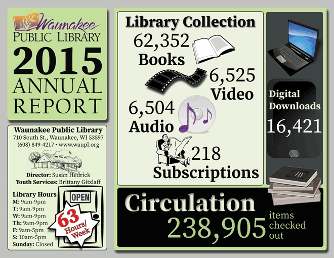
The first thing I did was watch the Create Your Own Infographics webinar presented by Kathy O’Leary for the Indianhead Federated Library System. Then I looked at the infographics created by Kathy for inspiration.The first year I actually designed it as a poster that I thought we would only make a few copies of because not many people seemed to take, but then the board decided to have it printed by a professional printer and tri-folded, despite the fact that I didn’t design it with a clear cover.For the current design I mostly used publicdomainvectors.org for the images and created charts on infogr.am.I blocked out the design on Photoshop using the previous year’s Microsoft Publisher-designed version to create the categories. Then I methodically added the data with graphics to catch the eye. I tried to keep consistent with fonts and to use some special effects like drop shadows, but not too many. I used Photoshop’s color collections to get ideas for color schemes, and once chosen, tried to stick with a few colors from the same collection. My best piece of advice is to always use .png images because of their transparent background, even for the library logo if one is available.
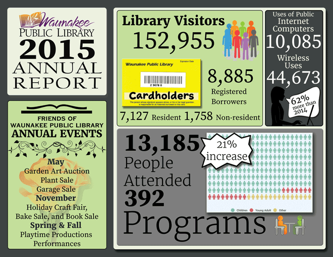
You can view and download the PDF version of Katie’s infographic on the Librarian Design Share Google Drive.

May 20, 2016 at 10:58 am
I really like the tips and resources listed in this post! I never thought about making a chart in Excel and then uploading to Canva. I’ve used publicdomainvectors.org before, but I will have to check out infogr.am. The tip about .png images was very helpful.
May 20, 2016 at 2:40 pm
I love this!
May 21, 2016 at 1:07 am
Reblogged this on serious fun and commented:
Librarian Design Share is a really useful blog where library peeps from all over (including here, now!) share their ideas and designs and even files for all manner of library materials – posters, pamphlets, event flyers etc. If you don’t follow their blog, jump over there and do it now.
May 23, 2016 at 10:20 am
Thanks so much, Miriam!