Search

Librarian Design Share

inspiration for library creatives

Category

Web Design

What’s On Your Image Carousel?

A quick scan of library websites reveals that most have embraced the image carousel as a means of communicating news and announcements with library users. It’s how we share information about new resources, special events, library collections and any bit of information we think our patrons (or students or faculty or visitors) would like to know.

Creating effective images for a library website carousel can be a challenge. There is a delicate balance of imagery and text that, if distributed too far in either direction, can make your carousel announcements fade into the website background or cause digital users to shield their eyes and exit a page faster than you can say Google Analytics.

We’ve shared examples of web slides and carousel images in previous posts, and today we bring you a few more examples courtesy of Michael Hughes, Instruction Librarian at Trinity University in San Antonio, Texas.

Two Screens Are Better Than One. Check Citations on Your Phone

Here’s what Michael has to say about creating effective web announcements:

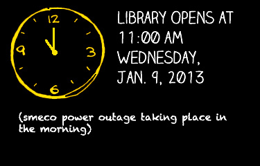
I create carousel images for our website in order to promote new acquisitions or services. Here are two banners I made, one for our site-wide New York Times subscription and another for our mobile citation tool. Heat map testing demonstrates that the carousel is one of the least-clicked parts of the library website, but my images also appear in a slideshow that plays in the library’s cafe. At any rate, the carousel is just one component of an outreach strategy and, as a bonus, the images keep the website from appearing disused.

Enjoy Full Access to NYTIMES.COM

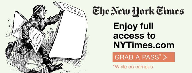
Michael’s carousel slides present a nice balance of text and images while connecting website visitors to important library resources.You can download the original, editable Photoshop files of these slides from the Librarian Design Share Google Drive folder.

Beautifying Journal Reviews

Journal reviews are serious business at academic libraries. If any of you have been through a systematic departmental or subject review of your academic journal holdings you’ll know that faculty are very protective of these materials. If you utter the word “cut” or “cancel” with no context to a room full of academics you are pretty much guaranteed loud-talking, moderate to wild gesticulation, the stink-eye, and laments about the glory of the library in graduate school. It’s a touchy topic.

Enter my colleague at St. Mary’s College of Maryland, Alana Verminski. In addition to the usual subject librarian trifecta of instruction, reference and collection development, Alana is also tasked with managing our library’s e-resources. Given rising serial costs and flat budgets, she’s recently developed a plan for us to be much more intentional and systematic about our journal subscription renewal decisions. To accompany this new review process, she created two designs for our website that will also be adapted into handouts for faculty in departments undergoing a journal review.

1. The Journal Review Process

The Journal Review Process

2. All About Usage Statistics

All About Usage StatisticsHere’s what Alana had to say about her designs:

These designs will be part of a series of web pages intended to inform faculty of the new journal review process. Unfortunately, journal usage statistics can be a dry topic for non-librarian audiences and like most statistics, can easily become overwhelming. In this design, I wanted something that was uncluttered and colorful – two ideas not usually associated with statistics. Keeping the audience and format in mind, I focused on using more images than text and for the usage statistics in particular, described each item as part of a larger process so viewers could see both the individual steps and the bigger picture. I used Google Drawings for the designs and found the icons on IconFinder.

I think this a great example of taking a complex library topic and creating a graphic that explains it well to non-librarians. You can find copies of the original Google Drawings Alana created in the Librarian Design Share Google Drive folder. If you have questions about the designs or about the journal review process we’re adopting at St. Mary’s, email Alana Verminski.

Changing it Up a Little

April and I started this blog last December, and since then, we’ve been so impressed with the designs you’ve shared with us. In an effort to better showcase new designs and mix things up a bit, we’ve given Librarian Design Share a little face lift.

New year, new theme, new layout.

You can still search the blog for design inspiration, and all of our category, tag, and archive information are available in the site footer.

Hope y’all enjoy the changes around here.

Making Sense of Databases in Libguides

We are, without a doubt, a Springshare library. Libguides? Check! Libanswers? Yes! Libchat? Yup! LibCal? You bet!

Although we’ve embraced Libguides as a platform for creating subject (and not-so-subject-based) guides, we hadn’t really been using Libguides in a way that many librarians currently do: as the main access point to the library’s online database collection. Instead we were using ResearchPort, a gateway maintained by the University of Maryland Libraries ITD center. We wanted to have more control over our database access point interface, so we decided to go with a Libguide. Here’s what I came up with: Databases Libguide (see screenshots below).

Databases Libguide

It has the same look and feel as our library site and our other libguides, but has some cool features I’m really proud of creating and adapting.

Browse Databases by Subject1. A drop-down Databases by Subject menu

The technical support at Springshare is amazing. I knew that I wanted to avoid creating separate pages/tabs for each of our subject categories, but I didn’t know enough about scripting to create collapsible menus. Enter Cindi Trainor at Springshare, who set up a great collapsible box feature for me to use. All that was left for me to do was style each of the subject boxes that that they smooshed together (yes, that’s a technical term) and looked like one giant box. Fooled you, didn’t I?I think this is a nice way to get a lot of useful content on the page without taking up a ton of room.  Bonus: Our subject librarians can reuse these database boxes on their own subject guides!


Search for a Database2. A Find a Database search box

This is an adaptation of the search created by Scott Salzman at Furman University Libraries. He recently presented this amazing solution at the 2013 Springy Camp, thereby and was kind enough to offer his code and support.

You can learn more about this search box in the Libguide Scott created for his presentation. It’s a great alternative to using the “search this guide” feature embedded in Libguides, which will only give you the name (aka the letter) of the page in which the database link appears.

3. A space for database trials and our citation linker

Database Trials and Citation Linker boxes

If you have questions about the creation of this guide, email Veronica Arellano Douglas.

What Did You Do Today?

Often we create a single design to promote a library event, but every now and then an event is so important that it deserves an entire marketing campaign.  This was the case for Maryland Day.

Rebecca Hopman, Special Collections Coordinator and Instruction & Outreach Team Member at the University of Maryland, says:

Each year our university hosts Maryland Day, an annual open house for the community, prospective students, and current students, faculty, and staff. The event is a chance for academic departments, campus offices, and local community organizations to connect with visitors. The UMD Libraries ran several events, most of which were held in Hornbake Library and McKeldin Library. Our team created promotional materials to advertise the UMD Libraries’ events and our “What did you do today?” social media campaign, including posters, a library website ad, TV monitor slides, and postcards for people to take with them or mail to a friend or family member.

poster

Poster created using Publisher

mailsign1

Mail Bin Sign created using Photoshop

Picture1

Postcard created using Publisher

slide5

TV monitor slide created using PowerPoint

We wanted to keep the design fun, simple, and colorful, so we used our official university colors (red, yellow, black, and white) as well as Maryland Day colors (bright red, green, blue, orange, and purple). For the postcards and slides we took original photos of our activities, and we used images from our digital collections to advertise the fact that we would stamp and mail postcards for people who wanted to send them to friends and family members. With each design, we tried to keep the amount of information to a minimum and emphasize the sharing/online component.

Wow, right?  Everything UMD has done here is awesome, but I especially enjoyed the social media aspect, because you can see how much the community enjoyed the event!

Rebecca and her colleagues, Laura Cleary, Special Collections Coordinator and Instruction & Outreach Team Leader, and Sarah Espinosa, Graduate Student Assistant and Instruction & Outreach Team Member, used a variety of programs to best suit their creative needs.  For the original files of any of the designs, contact Laura Cleary.

Visualizing Collections

afro-am-imprints

We’re nearing the end of the fiscal year at my library, which means we’re in a mad dash to spend our acquisitions budget. As a result we have a number of different databases on trial at the moment. Each of these slides appears on our library’s website and are meant to draw people in to the database content.

It’s a tricky thing to do. Databases are not often considered “sexy” and unless they’re archival collections with interesting images like the Afro-Americana Imprints, it can be difficult to draw users in to check them out.

latin-american-newspapers

I created each slide in hopes that they would catch the eyes of our students and faculty and introduce them to a new resource. I’ll let you know if they work!

For the original Photoshop files, email Veronica Arellano Douglas.

New Designs For an Image Carousel

REI Hiking, Gadgets, Tips, and More

Today’s designs come from Becky Schneider, Reference Librarian & Webmaster at the Morse Institute Library. After adding an image carousel to her library’s website, Becky’s been brushing up on her self-taught graphic design skills.

Magazine of the Week AdvertisementHere’s Becky’s view on her design work:

I try to keep my designs minimal but still varied in look and feel. I work in GIMP[the GNU Image Manipulation Program]. My graphics and fonts are from the Open ClipArt Library and Open Font Library. I’ve learned so many good tips from The Non-Designer’s Design & Type Books by Robin Williams (not that Robin Williams).

I’m curious about how other small to medium-sized libraries divvy up design and publicity-related duties. I do graphic design for the web, staff do flyers for their own programs and displays, and our outreach person writes for external media. Signage, other than our primary locational signage, is a bit miscellaneous. If anyone wants to share their own experiences with managing publicity and design in the comments, I’d be interested.

How do you manage design and publicity in your own libraries?

For the original GIMP files of these slides, email Becky Schneider.

An Icon for Library Mobile Apps

Library, bookstackFrom Michael Schofield, at the Alvin Sherman Library, Research, and Information Technology Center at Nova Southeastern University:

Our university has an iOS and Android app called iShark. So, the library originally had zero presence within that hub, which essentially was linked out to the websites for Athletics and Dining and Parking, etc.(even though ours was the only responsive website university-wide [but I digress …]). Eventually, things came together and I had to create a graphic that was immediately identifiable as a button smaller than the average thumb. This is what I did. I figured that since we had no need to include our library’s full name, this graphic is widely applicable and I wanted to share.

Thanks for sharing your design, Michael. This is a great graphic for anyone looking for a mobile icon for their library. For the original Photoshop file, email Michael Schofield.


Hand-lettering and Sketchy Goodness

Change in Library Hours AnnouncementAs you can tell by the header on this website, I’m a sucker for sketchy designs and hand-lettered fonts. I don’t get to use them very often when creating visual materials for the library, so I decided to sneak them into this announcement slide on our library website.

Dafont.com is a great source for free fonts, including handwritten styles. The ones used above are Claire Hand (from Dafont) and Chalkduster (which I believe comes standard with most computers). The clock is a modification of a sketch from Flickr user Xv.

For the original Photoshop file, email Veronica Arellano Douglas.

Create a free website or blog at WordPress.com.

Up ↑

%d bloggers like this: