A quick scan of library websites reveals that most have embraced the image carousel as a means of communicating news and announcements with library users. It’s how we share information about new resources, special events, library collections and any bit of information we think our patrons (or students or faculty or visitors) would like to know.
Creating effective images for a library website carousel can be a challenge. There is a delicate balance of imagery and text that, if distributed too far in either direction, can make your carousel announcements fade into the website background or cause digital users to shield their eyes and exit a page faster than you can say Google Analytics.
We’ve shared examples of web slides and carousel images in previous posts, and today we bring you a few more examples courtesy of Michael Hughes, Instruction Librarian at Trinity University in San Antonio, Texas.
Here’s what Michael has to say about creating effective web announcements:
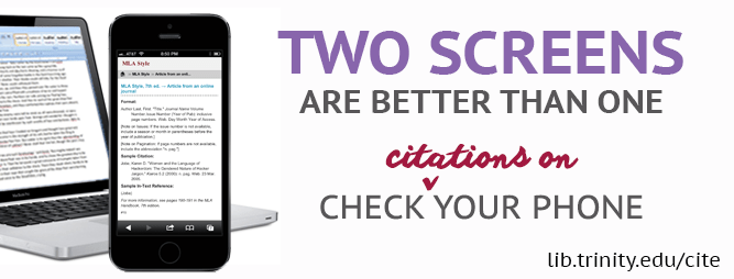
I create carousel images for our website in order to promote new acquisitions or services. Here are two banners I made, one for our site-wide New York Times subscription and another for our mobile citation tool. Heat map testing demonstrates that the carousel is one of the least-clicked parts of the library website, but my images also appear in a slideshow that plays in the library’s cafe. At any rate, the carousel is just one component of an outreach strategy and, as a bonus, the images keep the website from appearing disused.
Michael’s carousel slides present a nice balance of text and images while connecting website visitors to important library resources.You can download the original, editable Photoshop files of these slides from the Librarian Design Share Google Drive folder.


Leave a comment