Search

Librarian Design Share

inspiration for library creatives

Month

November 2018

Designing Displays on a Budget

Ah, the time honored librarian tradition of book displays. Even for a well-funded library, creating a display that’s eye-catching and well designed can be a tall order. What’s a librarian to do? Well, sometimes you just work with what you’ve got.

Ella Hassett from Arup Library has this to say about her International Women’s Day book display:

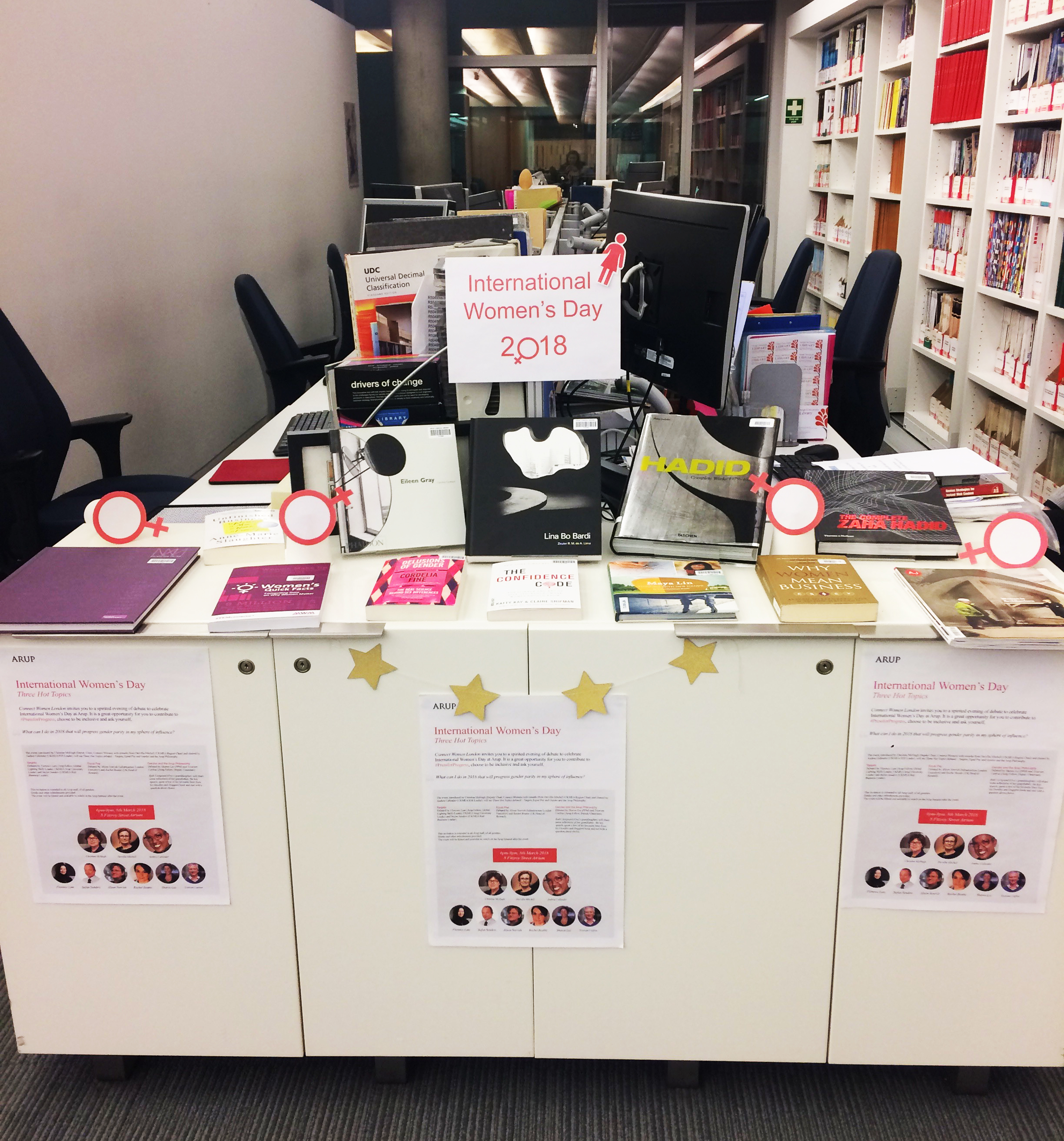
This is the International Women’s Day (IWD) book display, which was launched in our library space on 8th March 2018. As is evident from the image below, the space available for book displays is narrow and sits in front of staff desks, so it is difficult to work with, as any display cannot block the area behind. It is also restricted as there is no wall or board to display information behind the display, so this has to be done using the units underneath instead. As this was my first display, it was very much an exercise in frugal creativity.

This book display was created with zero budget and utilised whatever stationery was available from the cupboard. It shows what can be done with access to office supplies! The books on display are a collection of titles about significant women working in the built environment and books about gender equality in the workplace. The display encompassed upright Venus signs made of paper cups with the motif glued to them, which were visible when approaching the library space. Some of the books were also standing upright to attract attention, with others laid flat for people to browse. I designed a simple sign to indicate what the display was for and used the same red colour as the IWD firm campaign, of which we included some posters on the unit underneath, as this created consistency. The stars were leftover Christmas decorations that added some sparkle to the display.

Although it was a small display, I am proud of the results, as the majority of the books were checked out over the course of International Women’s Week. Going forward, I will continue to utilise this display space to promote our collections and engage with our users.

photo of an international women's day book display in an academic library

Ella used Adobe Photoshop CS5 to create the signs for the display. Nice work Ella!

Design for Accessibility: LibGuides

Library resources can be hard to locate, but all of the university libraries I have worked at have used Springshare libguides, called help or subject guides, to make resources more visible to the public.  Perhaps yours does too!  If this is true, I have one tip for great libguides:  design for accessibility.  If you design for accessibility, your guides will be better for everyone.

While the intention of libguides is to make resources more easily found, they can still be a significant hurdle to individuals with sight impairments or literacy challenges.  Thanks to Springshare, the solution is actually quite simple:  use the information structures available to you.  First, create boxes with names that help students identify what information will be found within.  Using headings like “Finding background Information” and “Finding scholarly articles” will help students identify where to find the information they need.  Then, within these boxes, choose the correct information type or structure.  If you are including a link, use the “link” structure – the same goes for “database” or “book from the catalog.”

Why is this useful?  Because assistive learning technologies, like Kurzweil, utilize the hierarchy of data structures to allow users to skip from one to the next quickly.  Therefore, if a user is interested in finding scholarly journal articles they can easily skip past the box labeled “Finding background information” and go to the box titled “Finding scholarly articles.”  If they know they want to search in Worldwide Political Science Abstracts they can easily skip through the other databases listed.  The alternative to this quick hop through information resources is a comparatively slow process of listening to a lot of text in order to find the desired resource.  I’ve seen this many times – librarians commonly select to use the “Rich Text/HTML” structure, which allows you to include text, and links, at will.  The lack of structure in this kind of content makes it inaccessible and unwieldy.

One of the nicest information types to use is “book from the catalog.”  By allowing users to paste the ISBN number for a book into the proper field, Springshare automates and standardizes the rest of the bibliographic information included in the recommendation.  This is also important for accessibility – individuals can learn a significant amount of information without having to leave the page and the standardization allows users to anticipate what information to expect on the page. Utilizing this information structure also makes your guide look nice!  The cover of the book can easily be included, and the visual element breaks up the text-heavy guide.

accessible libguides

Revising libguides to abide by this accessibility principle provides great value to the library’s user community.  If your library uses another application to direct students to resources, take a look at the structures available or be sure to utilize the correct html element in your guide creation process.  Leveraging the hierarchy of guide design and descriptive elements of html can make a huge difference for the access of individuals with differing needs.


Designing for Accessibility

As librarians and designers, our users should always be at the forefront what we create. Sometimes this means tailoring our creations to a specific audience, like students in a university setting or teens in a public library, but often our users are anyone who comes into the library space. When you create those fliers or infographics to post on your LibGuide, are you also designing for the population of users that have a vision impairment or use assistive technology? Can those users get the same information from your design as someone without a disability?

To me, that question is what is at the heart of accessibility.

I know, the A-word can be intimidating. Everyone is talking about it, and there are laws and guidelines and a lot of work goes into making something accessible and don’t we already have enough on our plates? I get it y’all, trust me. Addressing accessibility is a whole Thing, which is why Jess and I have decided to dedicate several posts specifically to the topic. Because really, accessibility* is not out of reach for any us.

It should come as no surprise that there is a panoply of online resources to help you create accessible documents and (thankfully) most of the are free! But in an effort to not overwhelm you with information, I’ll leave you with one resource that I have bookmarked and use every time I design something new: WebAIM’s Color Contrast Checker.

While all of WebAIM’s resources are great, I especially love the Color Contrast Checker because it not only tells me if the colors I’m using pass or fail Web Content Accessibility Guidelines (WCAG) standards, but it gives the ratio of how close to passing/failing I am. All you have to do is plug in a color in hexadecimal format (or hex code) for foreground and background, and voila! You have your report.

screenshot of WebAIM color contrast checker

If you don’t know the hex code for the colors you’re testing on and it’s within your browser, you can use an extension like ColorZilla to pick the color from a webpage. If it’s something you created and want to test, you can always use something like Image Color Picker to upload and grab the color.

Testing the color contrast of your text and images can help you create documents that are accessible for all sighted users, including those with vision impairments. Although it may not seem like much, it is a critical part of designing for accessibility.

Stay tuned for the next post in our Designing for Accessibility series and if you have an accessibility related topic or design you’d like to share, let us know!


*Footnote: The term accessibility can be applied to many things, but for the most part we’ll use it specifically with web and document accessibility in mind.

Opera Talks and Classic Design

While we always love receiving submissions that show off impressive feats of Photoshop prowess, we also appreciate the simple things in (library)life. Today’s post, featuring Gaetano Abbondanza from the Glendora Public Library in Glendora, California, is a digital flyer that employs a solid, classic design.

We host a program series titled “Opera Talks”, in which speakers from the Los Angeles Opera Speakers Bureau give presentations about the world of opera, as well as detailed information about whatever opera is currently on stage.

I designed this flyer to display on our LCD screen, which is positioned about the circulation desk. The screen runs a PowerPoint presentation of upcoming programs.

This program featured a talk about the opera “Nabucco”. I used a still shot from the production for the main photo. Since the scene is pretty dark, I used white lettering on a black background to create a seamless, blended feel. Publisher is my go-to program for creating flyers- it’s simple to learn and use, and provides a high degree of flexibility.

Flyer for Opera Talks Event

Creating flyers for digital display can be tricky; you want to  make something eye-catching but also easy enough to read before the screen changes. And oftentimes the color on the final product looks different on the big screen than it did when you made it. Gaetano’s flyer includes an intriguing image from the show it’s advertising and has all the need-to-know information in one spot. The contrast of white on black also eliminates most color distortion issues and ensures that any users with visual impairments will be able to read the sign.

This flyer was created with Microsoft Publisher and the file is available for download on our Google Drive. As always, all submitted work will be published on this site under a Creative Commons Attribution-NonCommercial-ShareAlike 3.0 Unported license.

Create a free website or blog at WordPress.com.

Up ↑

%d bloggers like this: