Search

Librarian Design Share

inspiration for library creatives

Refreshing Library Documents

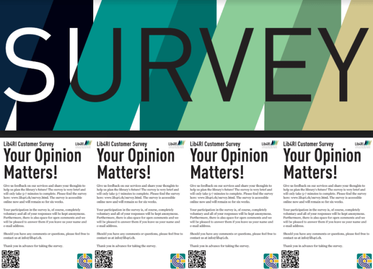
Updating document designs can be difficult – old files can be lost or saved in formats that cannot be edited.  Muhlenberg College’s Trexler Library determined that our floor plans needed a redesign, and Public Services Assistant Stephanie Hanni was up to the task.  She describes her process:

I started with updating our logo, which was long overdue. First, in order to make any changes, since I was dealing with a flattened image that someone else had created, I had to add small white squares to everything I wanted to change.This effect would give myself a clean slate. You see, with flattened images, you can not simply erase things that you want to erase. So, in Publisher I created a white square (which is located under the INSERT tab > click on SHAPES). This gave the illusion of erasing the items that I wanted to replace. Then, I just added the new image (i.e. printer) on TOP of that white square (to make sure the image comes to the front, go to the FORMAT tab > click on BRING FORWARD). This process can be painstaking, especially if there are odd shapes were a square may not cover everything. You could use a white circle or even triangle, depending on the need. To create the top and bottom parts of the maps, all I did was insert a RED and GRAY square and stretched them to fit. I created a few layers to give the top a ‘striped’ effect. Lastly, all the images I found were through Creative Commons. I made sure that they had a transparent background, and just simply inserted the images into Publisher and sized them to fit. This was a simple, easy way to give the library maps the makeover they deserved.

The floor plan directs library patrons to collections, work spaces, help desks, and offices.  It can be found on the library’s website and throughout the building.

Library Map Redesign (2018 Level A).jpg

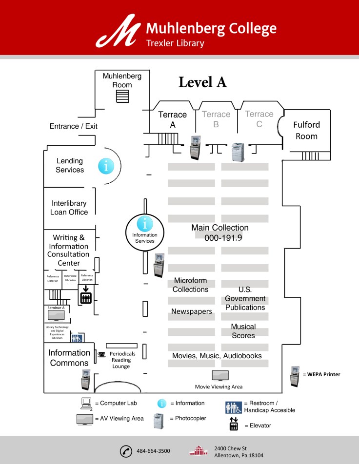
Thanks to Stephanie for sharing her process and final outcome.  Stephanie’s floor plan is available on our Google Drive. All submitted work will be published on this site under a Creative Commons Attribution-NonCommercial-ShareAlike 3.0 Unported license.

Inspiration from the Public Domain

Recently my design work has been inspired by artifacts that are in the public domain.  Though I love design, I am less inclined to try my hand at drawing or painting while at work.  Thus, the great value in images that I can use, modify, and distribute without fear of copyright restrictions!

Many of the students at Muhlenberg College are also involved in creative projects with include visual elements, so I’ve been talking to them about copyright restrictions and encouraging them to take a look at items outside traditional copyright.  I’ve also created posters utilizing Adobe Illustrator and Photoshop to encourage student understanding and use of artifacts in the public domain.


These posters hang outside my office and are also included in a library subject guide that I’ve made with lists of open resources that creatives can use in their own work.  The posters both exemplify the work that can be done with images in the public domain and draw the eye.  My inspiration drawn from the public domain hasn’t ended with poster and subject guide creation.  I’ve also created a zine, which (while entertaining) I won’t share here since it doesn’t fit the Librarian Design Share mission.  However, if you’re interested, you can find it on my blog.

I am happy to share these posters on the Librarian Design Share drive.  Please distribute them as you please – the joy of these resources are they they are available to all!  And, if you find inspiration from the public domain and create a design for your library, please share you work with us!

Upgrading the Annual Report

At the end of every year, library stakeholders expect an annual report.  This tends to be a lengthy document given to administrators and includes numbers and graphs and reflections on library success.  My question is: do they even read them?  

Today I’m happy to share with you a submission from Daisy Ngo, a Public Service Librarian at the Houston Community College Libraries, which creatively re-imagines the annual report.  Ngo and the Marketing & Public Relations Committee at HCC Libraries  utilized Canva to create graphics and the annual report will never be the same.  Ngo says that these graphics  “have been a hit at [their] promotional tables during faculty events such as Instructional Day and Faculty Conference.”

student success infographic.PNGyear in review.PNG


One of their most creative creations is a graphic on the cost of a research paper.

cost of report.PNG

We asked Ngo to tell us a little bit more about her experience with Canva.

The experience with Canva has been great. I’ve recommended it to colleagues, created documents for instruction, and used it in personal life. Creating in Canva has increased the Marketing & Public Relations Committee’s ability to create and communicate our vision with the institution’s communication department. HCC faulty now have access to Adobe InDesign, the learning curve is much greater so I still use Canva regularly.

In case you’re wondering about the limitations of the free version of Canva, we asked about that too.

I believe that constraints can spur creativity. That being said, I like the design options, many are free but there are a few premium options for layouts, images, and elements. The ability to manipulate templates allows for non-designers to create projects without much effort. The only downside to the freemium version is that projects cannot be resized so repurposing graphics means starting from scratch. Overall, I have been able to find both formal and fun options for various projects without having to upgrade.

Thanks to Ngo and the Marketing & Public Relations Committee!  You are able to find this design on our Google drive.  All submitted work will be published on this site under a Creative Commons Attribution-NonCommercial-ShareAlike 3.0 Unported license.

Seasonal Signage

It’s nearly that time of the year again! School and academic librarians, your libraries are about to get a lot busier, and filled with those beginning-of-the-semester questions (Where can I get coffee? How do I print? Do you have my textbook?). For public librarians, it’s time to wave goodbye to summer programming and embrace the fall.

Whatever type of library you are in, this is the perfect season for signage. This call for submissions is focused on designs that signal change – a new beginning and the start of something good.

So whether you’re welcoming new or returning students, or just saying hello to the fall season, send us your signs! If you haven’t made any yet, don’t worry! We’ll be featuring these posts through the end of August.

Photo of the University of Massachusetts Amherst campus in the fall

Outreach Using Buttons

A recent article in College & Research Libraries News discusses outreach opportunities through button making with students as “low-cost, high-impact,” (Lotts & Maharjan, 2018) and I couldn’t agree more.  Students love buttons!

Today’s button submission is from Leanne Gallety of the Davis Family Library at Middlebury College.  Leanne says,

Working off a limited budget and inspired by ‘So Many Buttons,’ I created a set of buttons to give out to students at the reference desk and during instruction sessions. I wanted them to be fun and something students might actually want to put on their backpacks, so I tried to stay away from our traditional branding (for example, we often direct students to the URL of the library website) and brainstormed for some puns that might work. We have a subscription to The Noun Project, so once I had a couple of ideas, I just picked some icons from their library and downloaded them as .svg. I mocked the buttons in illustrator to random dimensions and conveniently, Pure Buttons offers a free template for their buttons, so I could size up and preview at scale. With this template, I saw there was space to add some text along the rim of the button, so I decided to include the library name and a link to contact a librarian, in case anyone’s looking really close.

The text on the side of the button is a nice surprise to forward the library’s outreach mission.

side of button with text go/askus

Thanks to Leanne for sharing her tools, process, and product.  Remember that Leanne’s buttons are available on our Google Drive. All submitted work will be published on this site under a Creative Commons Attribution-NonCommercial-ShareAlike 3.0 Unported license.

Using Piktochart for Promotional Flyers

If you’ve ever tried your hand at making an infographic, chances are you’ve run into Piktochart as an option. But what about Piktochart for flyers?

Our latest submission is from Emily Merrifield, Undergraduate Experience Librarian at California State University in Sacramento. She has this to say about her designs:

I wanted to share promotional materials I’ve created using the Piktochart site (it was easiest to combine them with pdfs but let me know if that is a problem). I subscribe to the $40/year “pro” version which includes many more templates than the free version. I have attached 3 documents with 2 flyers on each for: workshops help in the library, poetry readings in our Special Collections dept, and a stress relief table provided during finals week. All of the images were used to promote on social media, and the stress relief flyers were printed out (about 22 by 28 inches) to display near the table. Icons and pictures used were either from the Piktochart options or from Pixabay.com.

I have also used Piktochart for infographics and images that I’ve put on libguides. I’ve found that Piktochart has improved a lot since I started using it in early 2016 – and allows for using their designs or easily adapting to your own.

One thing that is stands out about Emily’s designs is the use of the library logo colors in a way that’s attention grabbing without being overstated. I’m also a big fan of the stress-inducing mess behind “Are You Stressed?” in the second flyer.two fliers for stress relief activities

research workshop promotional flyers

Emily also mentions the use of Pixabay.com, which is a fantastic resource for free images that are CC0, meaning free for commercial use & no attribution required. You can create an account for free and it even gives you the option to donate some money to the original artist if you’re so inclined.

All of Emily’s submitted flyers are available on our Google Drive. All submitted work will be published on this site under a Creative Commons Attribution-NonCommercial-ShareAlike 3.0 Unported license.

Combine Display and Flyer Design

Here is an interesting design from Rainer Rees-Mertins, who works at Lib4RI-Library for the Research Institutes within the ETH Domain: Eawag, Empa, PSI & WSL in Switzerland.

survey

Rainer created the flyer in order to get community feedback on the library’s services. The flyer contains a QR code that leads directly to a survey and survey information on the back.  Community members were encouraged to take the flyer directly from the display.  I think that this is a cool, interactive display idea!

Rainer says,

…the flyer consists in Indesign of four swatches in standard postcard format, into which the print version was then cut. We placed the four flyers next to each other so patrons could read “Survey” already from pretty far away and they could take a flyer nonetheless. However, we also used the flyer as a whole for online materials to advertise the survey.

Rainer was also intentional about the colors that they used when designing the display.

The colours in the background are an enlarged version of our logo (see back of the flyer for the logo). I try to use these colours as often as possible for designs I make, because of the recognition value. What I liked especially about the flyer was the shift in the font colour from white to black in the “U”.

Thanks to Rainer, you are able to find this design on our Google drive.  All submitted work will be published on this site under a Creative Commons Attribution-NonCommercial-ShareAlike 3.0 Unported license.


Sign Design: Branding through Consistency

Determining how to attract attention to signs can be a struggle.  Each sign is carefully crafted to draw the community’s attention to a particular announcement, but when there are too many signs the effect may be the opposite.

Linda Kramer of the Martin Luther College Library in New Ulm, Minnesota navigated this predicament by varying sign messages and colors but maintaining a simple, consistent design.  She submitted a series of Canva signs that she made when she realized that students weren’t aware of the names or locations of library services.  She used anecdotal evidence to determine what to highlight.


0001-959337792

Linda says,

My goal was to allow each sign to be read in two ways: using all of the words, or using just the white words. Because one iteration of each sign was placed on digital signs around campus, the language needed to be easily read in a few seconds while students are walking past the signs. It was fun to try to come up with wording that could be read in both ways, and I think it worked well, except for a couple where the punctuation got in the way.

0001-524891325

In describing the project, Linda noted that she rotated the signs on digital displays around campus, hoping that the alternating colors would catch the eye and the consistent style would be associated with the library.

You can download all twelve PNG posters from the Librarian Design Share Google Drive, and you can contact Linda with any design-related questions.

Happy Poetry Month

Libraries have the special opportunity to generate excitement about poetry every April.

My colleague Stephanie Hanni of Muhlenberg College in Allentown, Pennsylvania made a display in the style of blackout poetry.

library display with books, poster in the style of blackout poetry

She also created buttons!


She shares her thoughts:

In my head, I envisioned an image of an older poet with a gnarly beard and was elated when I found one! I used several overlays to create the look of a picture created from words and then I created the title of the poster to mimic the “blackout poetry” using Photoshop to construct the words. It was a lot of fun to create!
Pictures used in the poster were from creativecommons.org
Fonts used in this poster: Traveling Typewriter, creator: Carl Krull. 

I work right down the hall from this display and there was a lot of buzz from our community members about these buttons.


Thanks to Stephanie for her work on the display and for sharing it with Librarian Design Share!  We would love to see your National Poetry Month displays – submit your own work to show our community how you generated excitement about sonnets, limericks, or haiku.  All submitted work will be published on this site under a Creative Commons Attribution-NonCommercial-ShareAlike 3.0 Unported license.


Blog at WordPress.com.

Up ↑

%d bloggers like this: