Like many libraries out there, my library has reduced hours during the holidays. This creates quite a bit of confusion for patrons, and it’s compounded when our signage looks like this:

Sure, all the information you need is right there, but it’s so hard to read. I made this schedule to hang outside the library, and after printing it, I realized how bad it was. I took the same information and rearranged it into a calendar format:
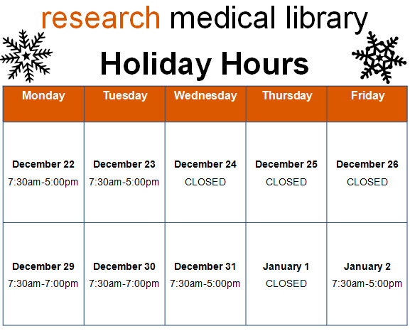
Way better, right? It’s so much clearer when we’re open and when we close early. The color and graphics make the sign just a bit friendlier too. It literally took 5 additional minutes to insert a table into Publisher and find the snowflake clip art than it did to make the block of text from the first sign. I’d say it’s worth the effort!
We’d love to see examples of revised signage you all have tackled. Submit your designs here!

Leave a comment