Search

Librarian Design Share

inspiration for library creatives

Category

Informational

Sharing What We Do

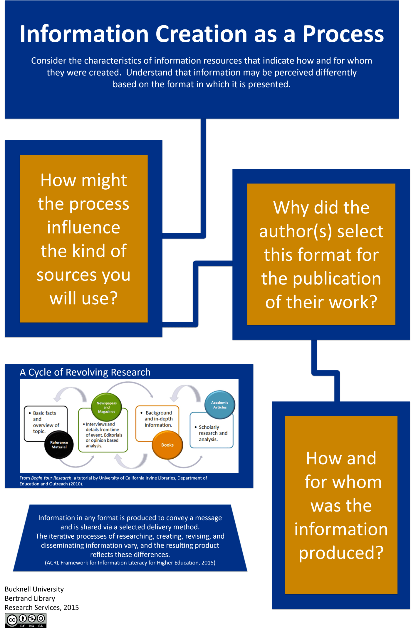
There is no shortage of data to describe the work we do in libraries each year. The challenge is to use those numbers and statistics to paint a meaningful picture of our libraries’ values, missions, and goals, and how we work to accomplish them. Today’s post features a new academic librarian’s first attempt at making sense of data using a mashup of infographic styling and statistical charts.

Jess Burkhardt, Public Services Librarian at DeSales University’s Trexler Library created this design using Adobe Illustrator to share 2014-2015 library statistics with her campus community. Here’s Jess describing her design process:

This infographic was conceived in moment; my Director asked if I thought that students would find our annual statistics interesting in their current form on a library Libguide. “Sure, they might – if they find them at all,” I said, “but an infographic might go over better.”

And my infographic endeavors began. Though graphic design has my heart in a whole bunch of ways, I knew that there was a lot about design that I did not know. As I worked my way through an Adobe Illustrator course on Lynda.com I began considering what information to include and the design of the project. Graphical representation of our library proved difficult. I considered symbolizing each of our student workers, librarians, and databases, but each of my visualizations were unable to convey the extent of the information that we had collected. I drew many sketches on different sizes of paper and filled artboard after artboard with drawings in Illustrator just to find that my drawings of books looked exactly like Word art–a compliment that I did not readily accept.

This infographic went through many different phases. Images took a disproportionate amount of space, the message wavered between screechy and barely heard at all. After a lot of frustration and a looming deadline I decided to streamline what I had and came up with the final product. It is displayed throughout the Trexler Library, drew a lot of traffic to our Facebook page, and has been placed in our annual report.

This project excites me because it has introduced me to the world of Adobe Illustrator and Library Design Share. I’m excited to be joining your community and am already considering my next design project!

We’re excited to share Jess’ design. If you have any questions about it, you can contact her via email, or leave a comment below.

Visualizing the ACRL Framework for Students

We can’t really call the ACRL Framework for Information Literacy in Higher Education new anymore, but lots of us still need help in understanding what it all means.  And if we librarians need help, imagine how our students are feeling about the whole thing! The librarians at the Ellen Clarke Bertrand Library at Bucknell University are working to make this easier on all of us with a series of posters about each frame.

Continue reading “Visualizing the ACRL Framework for Students”

Happy Medical Librarians Month (a little late)

October was National Medical Librarians month.  I realize that’s in the rear-view mirror now, but still wanted to share what we did to celebrate in my library this year.

I was inspired by a trip that Veronica and I took to the local Portland library while we were there for a conference.  The Multnomah County Library had a great display on their counter of colorful business cards with simple, effective icons and messages like the one below (I know, I should have collected them all!):

cardfront

I liked the idea that patrons could easily pick up the card to learn more about and learn more about the library’s services.  I wanted to implement this somehow at my own library. After brainstorming with staff, we decided to use the five weeks of October, which is National Medical Librarians Month, to celebrate our services. However, with our limited resources (read: me printing on cardstock on the staff machine and then using the paper cutter), we decided to make our takeaways just a bit bigger into the shape of bookmarks that we already are used to cutting and displaying.

Below are the five features we decided to highlight and the Publisher bookmarks (fronts on the top row and backs on the bottom) that I created:

bkmks

We were happy with the candy-colored printed bookmarks and thought that it would be really cool if these giveaways could coordinate with colors of REAL candy.  This involved a carefully planned trip to the grocery (thank goodness it was near Halloween with lots of candies to choose from), and some masterful exhibit making involving colored books, journals, and all the containers we could find in the library.  Here’s how it turned out week-by-week…please excuse the amateur photography:

Our library as a physical space:

orange


Our mobile resources:

IMG_1111

Our collections:

b1photo

Our educational offerings:

rml

Our archives:

photo purple2


Our patrons loved the changing displays and anticipated the colors, candies, and services they would see the next week.  Of course, more than anything, they liked the candy, but lots of good conversations were sparked in the month of October.

Do you celebrate months or certain days in your library?  We’d love to see your pics and materials if you do!  If you would like a PDF or the original Publisher document for the bookmarks, you can download them for adaption from the Librarian Design Share Google Drive.

Commercial Appeal

You know that time at the beginning of a class where students are shuffling in, uncomfortably finding seats, messing with their phones, and avoiding eye contact with the instructor? I seem to have 5-10 minutes of this time at every session, and I realized that I should take advantage of this captive audience.  Always thinking of ways to promote the library’s services, I made a library commercial.

It’s not nearly as fancy as it seems…I just made a PowerPoint (based on the format of this presentation) that is eye-catching, informative, and spurs some conversation beyond the awkward greeting that I extend to the students.  I have the presentation scrolling as students arrive and then again as they leave.  We’ve even started running the commercial at the TV near our Information Desk during the day.

I think there are lots of ways to expand on this idea.  You could add sound, market different services to different patrons, turn it into web slides, make it longer or more interactive…but this is a start.  If you are interested in modifying the original PowerPoint file for your own library, you can access it on Librarian Design Share’s Google Drive.


Blog at WordPress.com.

Up ↑

%d bloggers like this: