Search

Librarian Design Share

inspiration for library creatives

Author

Naomi Gonzales

Systems Librarian & Web Accessibility Specialist at Vaultes Enterprise Solutions

Librarian Design Share at TxLA 2021

Jess and I were delighted to present on behalf of Librarian Design Share at the Texas Library Association Annual Conference this year!

Our presentation, Creative and Inclusive Wayfinding for can be found on the Librarian Design Share Google Drive.

We talk about ways to create wayfinding material that is accessible and inclusive for all audiences, no matter the type of library you are in. We hope you enjoy it!

Call for Submissions

Hello readers, and welcome to our first post of 2021! The world sure looks different than it did a year ago, doesn’t it? Wherever the last whirlwind of a year has taken you, no doubt some adjustments to your work have been made. Many of us are working from home, teaching remotely, or having to rethink the way we approach our work. In some cases, this may mean relying more heavily on eye-catching materials in order to capture the attention of your students.

Our first call for submissions of the year is for design-centered instruction handouts and related materials. We’ll be compiling several of these into one post so if you don’t see it posted right away, don’t worry!

Since its been a while (and some of you might be new readers), here’s a refresher of what we require upon submission:

  • your name
  • your email address
  • your library
  • a photo, file or link to your work online
  • the software used to create your design (if applicable)
  • a brief description of your design (see previous posts for examples)
  • If you are submitting designs made in Canva, please note that we will follow up with you for information on additional characteristics and considerations made when creating your design. And to stay true to the spirit of Librarian Design Share, we are also requiring that you share a link to an editable copy of your design.
  • All work will be published on this site under a Creative Commons Attribution-NonCommercial-ShareAlike 3.0 Unported license.

As always, we are accepting all kinds of submissions. Find more information on our page on Submitting Your Design.

Honoring the Class of 2020

Whew. It’s been a year, and we are only halfway through it. There is so much to say, but we’ll keep it simple: we hope you all are staying safe and being careful.

It’s been a while since we’ve received any submissions, so we were delighted to receive an email from Emily Robinson from the Trexler Library at Muhlenberg College. Acknowledging that things have changed, Emily put together a special social media campaign for her library’s senior student workers set to graduate this spring.

These posts were created and managed through Hootsuite.

Here’s what Emily had to say:

These posts were part of a small social media campaign (Instagram and Facebook) that I put together to honor our library’s senior student workers as they prepared to graduate during and into an unprecedented situation. At the end of a typical spring semester, we would be able to honor our seniors with an in-person celebration, but this semester was atypical in every sense. With that in mind, this series of posts was an effort to make sure these students still felt celebrated and connected to the library after their many semesters of dedicated hard work. Participation was completely optional and 7 of our 13 seniors excitedly submitted reflections on their time with us. Students, library staff, and the greater College community alike enjoyed reading about our seniors and helped us recognize the very unique Class of 2020 through their shares and comments!


Many thanks to Emily for sending us these beautiful posts!

Creating with Canva

Over the past couple of years, we’ve seen more designs than ever being created with Canva. The reason? Canva is easy to use and with built-in templates, it removes some of the trepidation that comes most design work. How will this look? Where do I put this text? What could I do to fill this white space? Canva answers these questions with relative ease and and all the drag-and-drop options you could hope for.

We’ve seen some great submissions that have used Canva so when Jess and I received the following from Adrienne, a reference librarian at Campbell University School of Law in North Carolina, we were glad that she addressed a commonly shared concern with Canva.

Here are Adrienne’s submissions, one that includes some eye-catching text for a legal research contest and the other, a colorful promotion for a bike sharing program that includes a quote by Albert Einstein:

Bigfoot and the Law to post

_I thought of that while riding my bike._

In her email to us, Adrienne mentioned that she usually uses Photoshop but will also use Canva when the occasion calls for it. When asked about her experience with Canva, Adrienne said

I like Canva for the free vector elements and ease of design. It’s also really useful for choosing font pairings. Canva’s drag and drop technology is so much easier than photoshop’s layers and masks. Unfortunately, like everything in this world, free Canva is getting less and less free. Once it goes completely paywalled, I’ll stop using it all together. But until then I’ll keep using it for my quick and easy projects.

While we do love a good quick and easy option, Jess and I have often talked about the complications using Canva presents, namely access.

As most of you are aware, the files of designs that are submitted to Librarian Design Share are included in our Google Drive under a Creative Commons license so that other librarians can change them up and reuse them. This is easy with designs made in Publisher, Photoshop, Word, PowerPoint and other mediums. But how to do the same with designs made in Canva? Moving forward, what we’re doing is asking that each Canva submission also include a link to an editable copy of the design. It’s very important that the link go to an editable copy, otherwise you could lose the original design. Keep in mind that you have to have a Canva account and be logged in in order to access these files, which is free for now.

Here are Adrienne’s shared copies of Bigfoot and the Law and Bike Sharing at Campbell Law.

And with fall around the corner, we’d love to see what you’ve come up with for the season. If you have any fall-themed marketing materials or seasonally appropriate signs, please visit our Submission Page for our list of requirements and submit your design to librariandesignshare@gmail.com.

Simplifying Support Services

Occasionally in my eagerness to let someone know about a resource or service, I provide way too much information. I go above and beyond what that person asked about because I want them to feel like they know all of their options. Sound familiar?

More often than not, this tendency to provide as much information as possible is also apparent in my designs. I find myself revisiting my creations periodically in an effort to pare down and streamline the information included. In my time as a librarian, I’ve learned that I am not alone in this experience.

Stephanie Warden at the Jim Dan Hill Library at the University of Wisconsin, Superior sent us a design for mental health resources that strips away the noise and provides users with the most pertinent info.

Flyer with 5 speech bubbles that have mental health resource info in each bubble

Here’s what Stephanie had to say about her design:

While our institution offers flyers advertising support for student mental health services, we found that the material was a little too text-dense and left out resources available to our community patrons. Using services gathered by the rest of the staff I put together this 8.5 x 11 flyer that we have placed strategically throughout the library.

Stephanie used Canva to create her design. And like other librarians we’ve talked to about Canva, she had good things to say about the process. When we asked why she chose to use Canva over other tools, she told us:

The free version of Canva has an amazing number of options available, especially if you aren’t afraid to get in there and experiment with colors and features. That it also allows us to upload our own pictures and pictures from other appropriate sources really makes it a favorite of mine. It also doesn’t hurt that I can peruse their library for inspiration when I find myself stumped.

Thanks for your submission Stephanie!

Designing Displays on a Budget

Ah, the time honored librarian tradition of book displays. Even for a well-funded library, creating a display that’s eye-catching and well designed can be a tall order. What’s a librarian to do? Well, sometimes you just work with what you’ve got.

Ella Hassett from Arup Library has this to say about her International Women’s Day book display:

This is the International Women’s Day (IWD) book display, which was launched in our library space on 8th March 2018. As is evident from the image below, the space available for book displays is narrow and sits in front of staff desks, so it is difficult to work with, as any display cannot block the area behind. It is also restricted as there is no wall or board to display information behind the display, so this has to be done using the units underneath instead. As this was my first display, it was very much an exercise in frugal creativity.

This book display was created with zero budget and utilised whatever stationery was available from the cupboard. It shows what can be done with access to office supplies! The books on display are a collection of titles about significant women working in the built environment and books about gender equality in the workplace. The display encompassed upright Venus signs made of paper cups with the motif glued to them, which were visible when approaching the library space. Some of the books were also standing upright to attract attention, with others laid flat for people to browse. I designed a simple sign to indicate what the display was for and used the same red colour as the IWD firm campaign, of which we included some posters on the unit underneath, as this created consistency. The stars were leftover Christmas decorations that added some sparkle to the display.

Although it was a small display, I am proud of the results, as the majority of the books were checked out over the course of International Women’s Week. Going forward, I will continue to utilise this display space to promote our collections and engage with our users.

photo of an international women's day book display in an academic library

Ella used Adobe Photoshop CS5 to create the signs for the display. Nice work Ella!

Designing for Accessibility

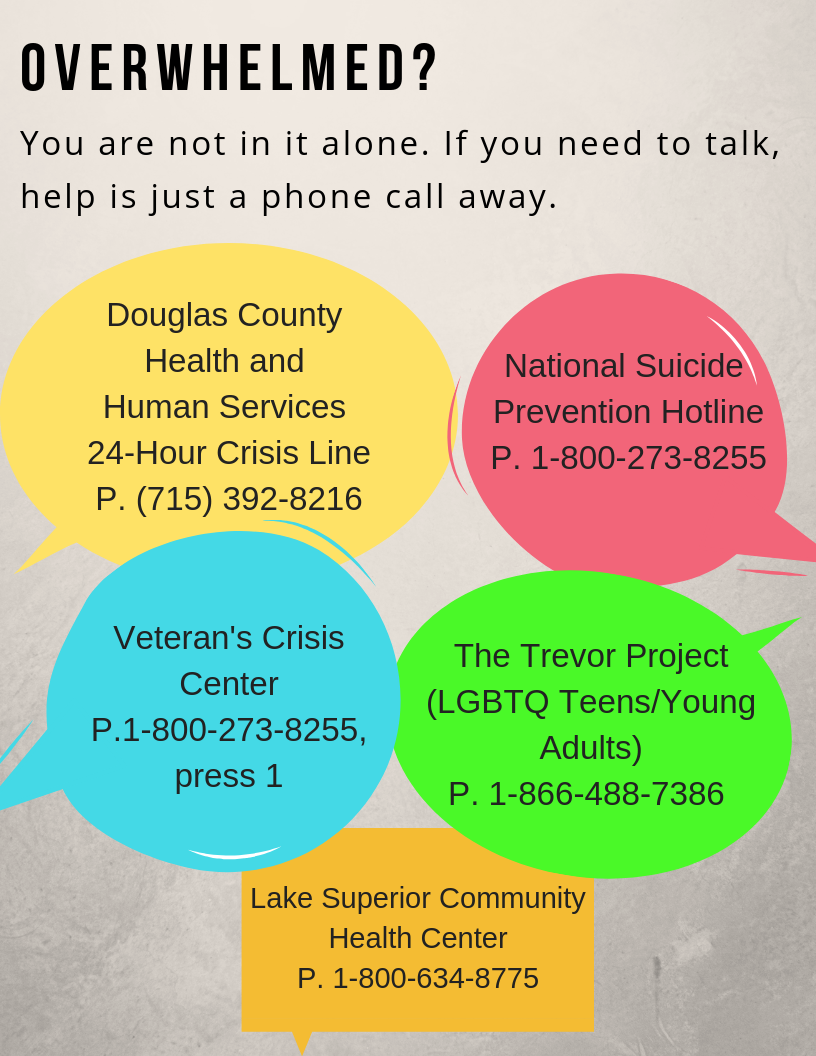
As librarians and designers, our users should always be at the forefront what we create. Sometimes this means tailoring our creations to a specific audience, like students in a university setting or teens in a public library, but often our users are anyone who comes into the library space. When you create those fliers or infographics to post on your LibGuide, are you also designing for the population of users that have a vision impairment or use assistive technology? Can those users get the same information from your design as someone without a disability?

To me, that question is what is at the heart of accessibility.

I know, the A-word can be intimidating. Everyone is talking about it, and there are laws and guidelines and a lot of work goes into making something accessible and don’t we already have enough on our plates? I get it y’all, trust me. Addressing accessibility is a whole Thing, which is why Jess and I have decided to dedicate several posts specifically to the topic. Because really, accessibility* is not out of reach for any us.

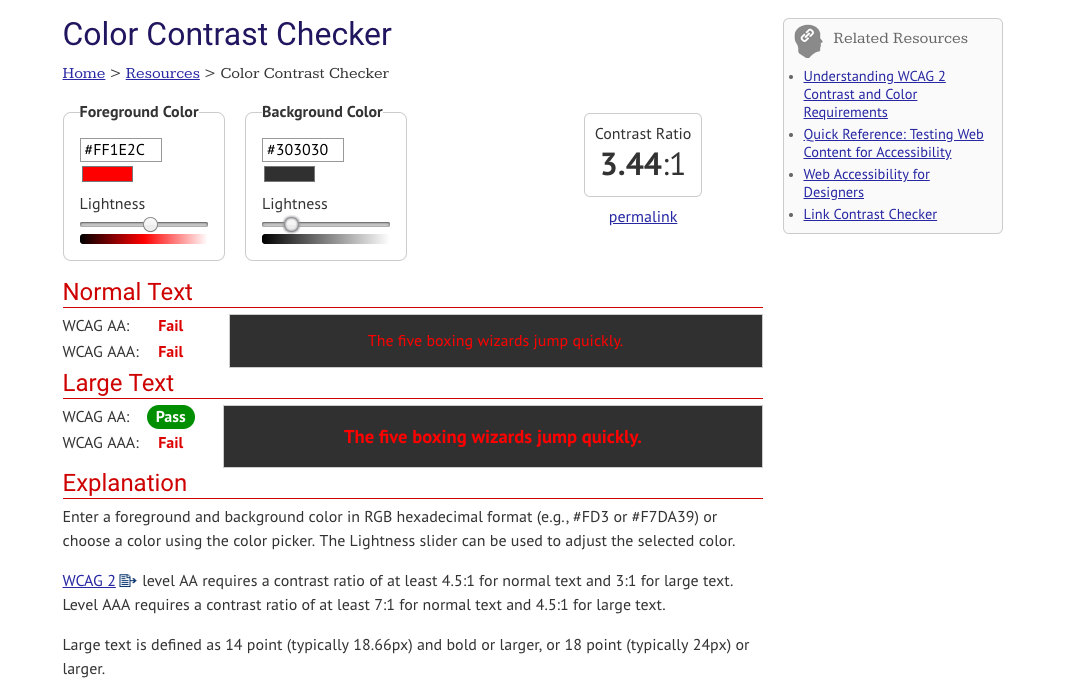
It should come as no surprise that there is a panoply of online resources to help you create accessible documents and (thankfully) most of the are free! But in an effort to not overwhelm you with information, I’ll leave you with one resource that I have bookmarked and use every time I design something new: WebAIM’s Color Contrast Checker.

While all of WebAIM’s resources are great, I especially love the Color Contrast Checker because it not only tells me if the colors I’m using pass or fail Web Content Accessibility Guidelines (WCAG) standards, but it gives the ratio of how close to passing/failing I am. All you have to do is plug in a color in hexadecimal format (or hex code) for foreground and background, and voila! You have your report.

screenshot of WebAIM color contrast checker

If you don’t know the hex code for the colors you’re testing on and it’s within your browser, you can use an extension like ColorZilla to pick the color from a webpage. If it’s something you created and want to test, you can always use something like Image Color Picker to upload and grab the color.

Testing the color contrast of your text and images can help you create documents that are accessible for all sighted users, including those with vision impairments. Although it may not seem like much, it is a critical part of designing for accessibility.

Stay tuned for the next post in our Designing for Accessibility series and if you have an accessibility related topic or design you’d like to share, let us know!


*Footnote: The term accessibility can be applied to many things, but for the most part we’ll use it specifically with web and document accessibility in mind.

Opera Talks and Classic Design

While we always love receiving submissions that show off impressive feats of Photoshop prowess, we also appreciate the simple things in (library)life. Today’s post, featuring Gaetano Abbondanza from the Glendora Public Library in Glendora, California, is a digital flyer that employs a solid, classic design.

We host a program series titled “Opera Talks”, in which speakers from the Los Angeles Opera Speakers Bureau give presentations about the world of opera, as well as detailed information about whatever opera is currently on stage.

I designed this flyer to display on our LCD screen, which is positioned about the circulation desk. The screen runs a PowerPoint presentation of upcoming programs.

This program featured a talk about the opera “Nabucco”. I used a still shot from the production for the main photo. Since the scene is pretty dark, I used white lettering on a black background to create a seamless, blended feel. Publisher is my go-to program for creating flyers- it’s simple to learn and use, and provides a high degree of flexibility.

Flyer for Opera Talks Event

Creating flyers for digital display can be tricky; you want to  make something eye-catching but also easy enough to read before the screen changes. And oftentimes the color on the final product looks different on the big screen than it did when you made it. Gaetano’s flyer includes an intriguing image from the show it’s advertising and has all the need-to-know information in one spot. The contrast of white on black also eliminates most color distortion issues and ensures that any users with visual impairments will be able to read the sign.

This flyer was created with Microsoft Publisher and the file is available for download on our Google Drive. As always, all submitted work will be published on this site under a Creative Commons Attribution-NonCommercial-ShareAlike 3.0 Unported license.

Seasonal Signage

It’s nearly that time of the year again! School and academic librarians, your libraries are about to get a lot busier, and filled with those beginning-of-the-semester questions (Where can I get coffee? How do I print? Do you have my textbook?). For public librarians, it’s time to wave goodbye to summer programming and embrace the fall.

Whatever type of library you are in, this is the perfect season for signage. This call for submissions is focused on designs that signal change – a new beginning and the start of something good.

So whether you’re welcoming new or returning students, or just saying hello to the fall season, send us your signs! If you haven’t made any yet, don’t worry! We’ll be featuring these posts through the end of August.

Photo of the University of Massachusetts Amherst campus in the fall

Blog at WordPress.com.

Up ↑

%d bloggers like this: