Search

Librarian Design Share

inspiration for library creatives

Author

Veronica Arellano Douglas

Instruction Coordinator at the University of Houston Libraries

Summer is Here

Librarian Summer MemeIt’s been awfully quiet around the blog these past few weeks, and with good reason. Those of us in academic libraries are just coming out of our recovery hibernation: that period immediately following final exams where we need to decompress, drink some wine, and try to forget about the hoards of students looking for scholarly articles the day before their final paper was due. If those of you in public libraries are anything like my awesome local public library, you’re probably taking a programming break before kicking off a jam-packed summer schedule.

Now that we’ve transitioned out of the May resting period, April and I thought it would be a great time to send out another call for submissions.

The theme: SUMMER.

The designers: YOU.

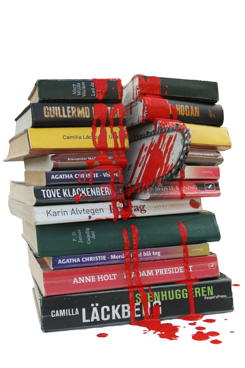
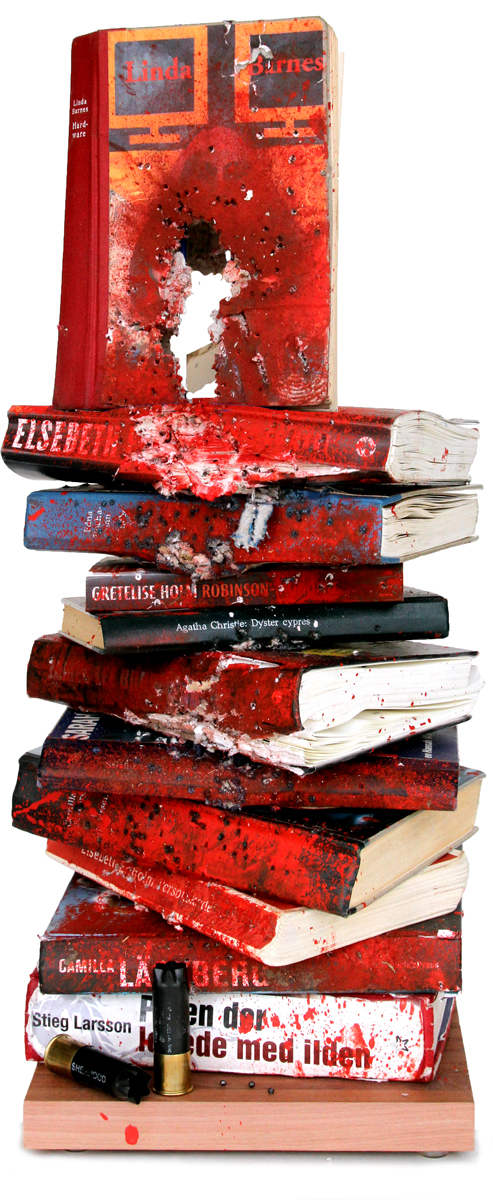
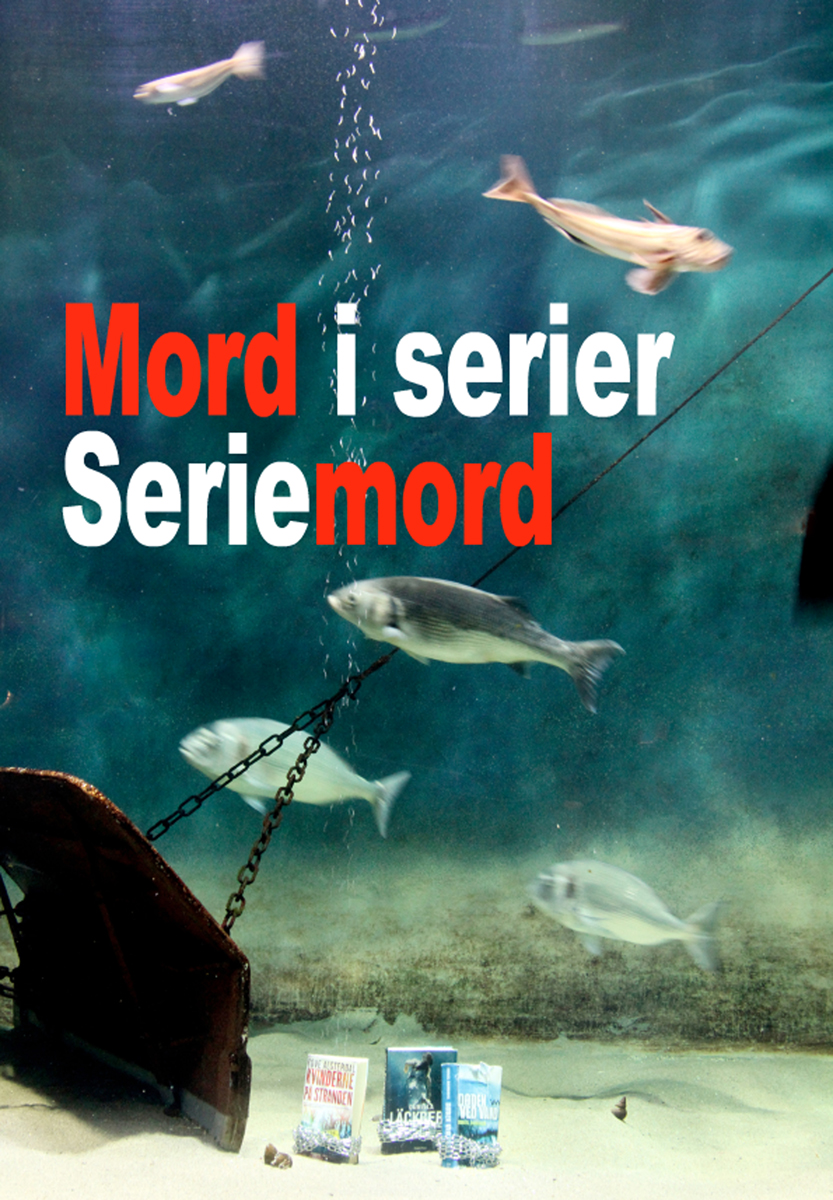
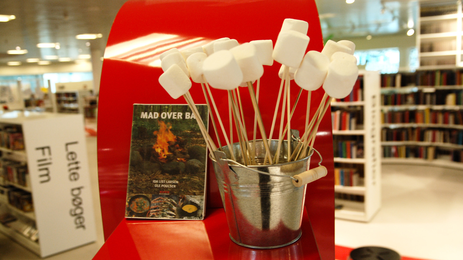
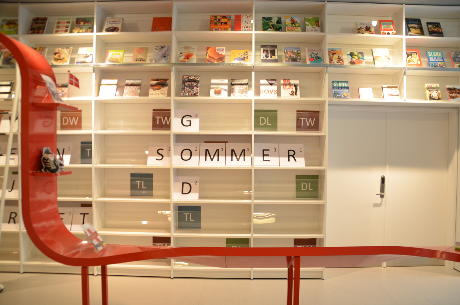
The details: We want to know how you’re promoting summer programs, including summer reading, at your library. Are you creating fantastic book displays for adults, students, or children? Do you have an eye-catching print or online campaign to publicize your library’s events this summer? Are you really proud of your summer reading advertisements?

Share them with us, and we’ll share them with everyone else. We’d love to know what you’re up to this summer.

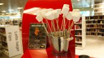
Photo credits: Top photo is Summer Fun by Ron Cogswell on Flickr. Bottom photo is 2012 Summer Reading Skit @ Millbrae Library by San Mateo County Library on Flickr.

Designing a Presentation About Design

Yesterday April and I were fortunate enough to present at the Amigos Annual Member Conference. Their theme for this year was Ingenuity, Imagination, and Innovation: Using Creative Solutions in Today’s Library, which we thought was a great opportunity to share the creativity on display on Librarian Design Share.

Here are the slides from our presentation.

Look familiar? We tried to feature different designs you’ve shared with us as well as some of our own. I used Photoshop to create all of the slides (1024 px x 768 px), then inserted them as images into a Google Presentation that April and I worked on together. It was kind of a pain, but it was the only way to use the font selection from the Librarian Design Share logo in Google Presentations. Overall, I’m pretty happy with the results.

We had a great time presenting and learned a lot from the folks that came to hear us speak. Thanks, Amigos!

If you’d like to adapt or reuse any of the Photoshop slide files, send me an email.

A Presentation Completed!

Last month I posted a work in progress. I was using Powerpoint for the first time in years to create slides to accompany a presentation I was giving with my colleague Abe Korah at the Texas Library Association 2013 Conference. The conference has come and gone, the presentation went well (yay!) and the slide deck is complete. I thought I’d share it with everyone here.

It obviously doesn’t make a lot of sense apart from the presentation, but that’s ok. I think a good Powerpoint should be used to enhance a presentation, not be the primary mode of information dissemination during the session. They’re listening to you, not reading!

If you have a great presentation you’d like to share, don’t forget to submit it to us here.

Hjørring Public Library: Sleep With the Fishes

This is the last post in our series on Hjørring Public Library in Denmark. It’s a little late (sorry, Martin!), but trust me, we saved the best for last. Here’s Martin Jørgensen, Digital Librarian, to tell you about a truly amazing library display:

Here in Scandinavia Nordic crime fiction (Nordic noir) is all the rage, and a lot of our patrons check out crime fiction. Only trouble is that there is a good deal of different crime series to keep track of, so at first we made a simple catalogue, listing the order in which the novels and series should be read. We wanted to make a cover and visual line that related to the genre of crime fiction, suspense, gore and even killing. That theme quickly developed to different ways to kill off books.

sawed books

Books were sawed in half with a chain saw.

shot books

Books were shot! A coworker is also a hunter, so he took a pile of discarded books, shot them and smeared red paint all over. (By the way, guns are strictly prohibited in all forms in Denmark except from hunters.)

book gun

Discarded books were made into bookguns with the help of power tools. Photos of all killed off books were taken for the cover of our crime fiction catalog and the shot, sawed, and cut out books were put on display in the library.

drown poster

For our most recent version we decided to drown the books mafioso-style with chains. With the help of the local Nordsøen Oceanarium we got permission to drown books in one of their huge aquariums, and photograph and film the process, which now can be seen online (the title “Mord i serier – Seriemord” roughly translates into “Murders in series – Serial murders”).

So now our Sleeps With the Fishes project is a package consists of a new cover and updated catalogue, a commercial movie, display pieces (aka. the drowned but now dry books), posters, slides for infoscreens, and roll-ups.


Hjørring Public Library Part 2: Library-Wide Display Themes

Campfire Display

Part 2 of our 3 part series on displays at Hjørring Public Library continues with a great example of designing an entire library’s worth of displays around a single theme. Again, here’s Digital Librarian Martin Jørgensen on his library’s display philosophy:

When it comes to displays we try to make a theme going through the entire library. Right now the theme is “5” because, the library was opened 5 years ago. The “5” displays are a broad range of subjects: 5 things to do in the garden, 5 philosophers, my 5 favorite comic books and so on. Other themes have been more abstract, like “Brown” which had displays about East Germany and a huge collection of gravy boats (brown gravy is pretty much a Danish national dish).

American Dining Car

Martin has shared some images from the library’s theme “Meals,” which included “ (among other things) beautiful set tables (made by a store nearby), herbs growing on the shelves and a model made by me [Martin] of an American diner.

Hjørring Public Library

Every once in a while you come across a library so truly amazing that you can picture yourself living in it. For me, that place is the Hjørring Public Library in Denmark. After you take a visual tour of this library, you won’t want live anywhere else.

Digital Librarian Martin Jørgensen is proud of his library, and for good reason! He’s shared an amazing array of display and design inspiration for libraries. So many, in fact, that it would be impossible squeeze them all into one post. Instead we’ll be featuring a different display from the Hjørring Public Library throughout the week.

Today’s focus: The “Bookstore Wall.” From Martin:

The largest display option we have is our “bookstore wall,” a wall covered with shelves. At first we mostly had large books on it, but now we use it more deliberately.

rainbow bookstore wall

The best example is a rainbow I made one afternoon displaying all of the books on the wall by color. It was quite the looker.

more rainbow wall

Oh, and we’ve played wordfeud on it too!

Word Feud

[We also created] a banner to promote a national library film streaming service “filmstriben”. The banner consisted of press photos from the films available, and had a blank, white space where we showed movietrailers via a projector.

Filmstriben Display

Origami Book Art Display

We asked for great examples of library displays, and you answered. Paula DeRoy, librarian at Northern Virginia Community College–Annandale Campus, and her colleagues created this amazing origami display to adorn one of their library walls.

rainbow origami book display

Here’s Paula in her own words:

We had a big blank wall so we took inspiration from French artist, Mademoiselle Maurice, and we created origami art. The installation is about 12 ft by 5 ft. Everyone made a couple origami items each day and eventually we had enough for the wall. Someone had saved an old origami daily calendar so we used that paper and we folded five shapes – medallions, tulips, butterflies, cranes and fan flowers. Our design represents an open book. It was a low cost, high impact project that we continue to enjoy everyday.

Paula and her team also created a great video of their design process:

For more information about this design, email Paula DeRoy.

Back from ACRL

Forgive the lack of posting on Librarian Design Share. Both April and I have been preparing for and attending the ACRL 2013 conference, leaving our design-minded readers with little to see from us in their RSS and Twitter feeds. But we’re back! Coming up this week and next: Examples of fun library display designs from community college and public libraries.

A Presentation in Progress

I’m presenting at the 2013 Texas Library Association at the end of this month along with my colleague, Abe Korah . I’ve been excited about this presentation for months, but have only now started to work on our Powerpoint slides for the day of the event.

It’s been years (YEARS!!!) since I’ve created any kind of Powerpoint presentation. So much has been written about PP sins and presentation skills for librarians (if you don’t know Lee Hilyer’s blog and book, get to know ’em), which makes creating a bad slide deck and even greater offense than it once was.

My slides are super simple, and this presentation is still in draft format. I’ve tried to keep things consistent, relying mostly on a fun font and bold colors, and have only used images when they could make an impact. I’m open to all comments and suggestions.

A note about the presentation: Our session is taking on the format of a mock interview, where attendees learn how to develop the skills, experience, and critical thinking necessary to taking a more thoughtful, active approach to their job search and interviewing.

Create a free website or blog at WordPress.com.

Up ↑