Search

Librarian Design Share

inspiration for library creatives

Author

Veronica Arellano Douglas

Instruction Coordinator at the University of Houston Libraries

What Can You Do With Canva?

We’ve seen an increase in the number of submissions we’ve received from folks using Canva, so we decided to devote a whole post to this web-based graphic design tool.

Earlier this week we featured library hours signage from Edita Sicken, Instruction and Access Services Librarian at Manchester University’s Funderburg Library, which she created using Canva. Edita’s also used Canva to create all kinds of library flyers and advertisements, like the ones below.

Chat Graphic

Edita sang Canva’s praises in our last post, but here’s a recap of what she loves about Canva:

  • templates
  • fonts
  • graphics
  • availability of a mobile version for design on the go

K-Cups at the Library

Kasia Piasecka, Reference Librarian at Falmouth Public Library, has used Canva to create fantastic advertisements for library events and programs, like the one below.

Breakfast with the authors

Here’s what Kasia has to say about using Canva for graphic design:

As a past self-professed Microsoft Publisher geek, I was really excited to start using a new (free!) web-based program to design publicity materials and advertisements for our library. I see my role as a librarian and as a designer as complimentary — by strengthening my ability to design beautiful materials, I am promoting the library as the incredible community center that it is. Although marketing the library is a challenge in many communities, I strongly believe that design matters [to your audience], and it makes a difference. It’s very important to market your library, your programs and resources; to carefully design your publicity materials with an eye for detail and a strategy for branding; to identify and choose the best software available to you. As librarians, we are hard-wired to find the best tool to help us, and I cannot recommend Canva strongly enough. I have been absolutely amazed by the variety of designs, presentation layouts, font choices, and overall, Canva’s user-friendly interface.

Long Haul Book Discussion

You can find Kasia on Canva and see all of her designs there, or you can contact her for more details about her marketing materials.

Advertising Hours

For those of us in academic libraries, it’s that time of year again: Finals Week (or impending Finals Doom, depending on who you ask). All of our laptops are checked out, extension cords line the walkways, and students begin appearing more and more disheveled as the week progresses. Our patrons are less interested in research help (all those papers were due last week!) and more interested in the amount of coffee needed to power through an all-night study session.

One thing that often changes during this time of year are our hours of operation. Extended hours during finals week, fewer open hours immediately afterward–all of these changes require eye-catching, easy-to-scan signage. Here are a few great signage submissions advertising library hours.

Edita Sicken, Instruction and Access Services Librarian at Manchester University’s Funderburg Library, used Canva to create the her library’s changing hours signage.

Extended Hours Signage

Here’s what Edita had to say about her hours signage:

I used Canva for all of these and none of them utilize any of their pay-per-use graphics. Some of the images used were our own, most of them are under creative commons licenses. I’m well-versed in Photoshop, Illustrator, and Publisher but Canva is really handy to use because of all the templates, filters, fonts, and graphic elements that are readily available. Plus there’s a mobile version available so if I’m out at a conference with my iPad and realize I forgot to get a promo image out, I can throw one together really quick!

Fall Break Hours Signage Spring Break Hours Signage

Sometimes our library’s operating schedule can get a bit complicated, which means our signage often suffers from too much information all at once.

Jonas Lamb, Public Services Librarian at the University of Alaska-Southeast’s Egan Library, recently revamped his library’s hours signage using Photoshop. Here’s the old version, which, as Jonas mentions, “often got over complicated with intersession and holiday exceptions.”

Egan Library Old Signage

You can see that the new versions follow a nice template with variations in color for different times of year. It’s a great way to highlight changes in hours while still maintaining a steady look and feel.

Egan Library Summer Hours
Here’s Jonas’ talking about this new signage:

I’d reached my wit’s end with library signage designed using Word, Publisher, PPT, etc and finally taught myself enough Photoshop to put something visually simple to refresh our existing signage.  Around the same time we began using 4×6 acrylic table top-6 sided sign holders and an 80” digital display so I had an opportunity to re-use elements of the new design into a variety of sizes and layouts, subtracting text elements where appropriate.

Egan Library Spring Hours

Egan Library Regular Hours

What are your solutions to advertising modified hours of operation? Do you have other signage you’d like to share? Or better yet, signage you want to change but aren’t sure how it can be improved? Let us know!

PDF and JPEG versions of Edita’s Canva signs are available on the Librarian Design Share Google Drive, as are Jonas’ original Photoshop files.  As always, resuse designs responsibly!

What Can You Embed in an Infographic?

Embedded Online Librarian Infographic

It can be a challenge to explain the curricular relevance of research and information literacy instruction as well as librarians’ role in higher education. Seth Allen, Online Instruction Librarian at the King University Library, has created a great-looking infographic to explain his library’s online embedded librarian program. Here’s what Seth has to say about his design:

Introducing yourself to new faculty as the Online Instruction Librarian provokes blank stares and kind but opaque replies like, “That’s nice” or “Interesting”.  Our college has been developing online degrees at a breakneck pace for the past couple of years.  We are finally ‘catching up’ in terms of infrastructure to support online students.  My position was created in the spring of 2014 to address the online needs of our students.  I was hired in the summer and I have had been busy filling in the service gaps for online students.  Despite our library’s reputation for innovation, it’s hard to break the faculty stereotypes of a staid librarian who sits at the reference desk and manages print collections.  I created an infographic to introduce faculty to my services and encourage them to partner with me in their online classes.  I think an infographic is the best medium for communicating this info, but I did not like the online infographic generators.  I could not adapt my initial sketch with a good infographic template.  I used PowerPoint instead and changed the slide size to a 1X3 width-to-length ratio.  I think the final product communicates the vision of my job nicely.

The PDF and original PowerPoint version of Seth’s infographic are available on the Librarian Design Share Google Drive for you adaptation (as always, an attribution to the original designer is needed). One thing to note: Seth used the Franklin Gothic font for the paragraph text (which comes standard on most computers) and Sketch Rockwell font for the titles (which doesn’t, but can be dowloaded from Urban Fonts).

If you have other questions about this infographic or King University’s online librarian program, you can email Seth directly or send him a tweet.

BOOlean Operators: For the Emoji Lover In Us All

BOOlean Operators

You know we love a good boolean operator graphic here at Librarian Design Share. Whether its honey badgers or grumpy cats, we’re always happy to share a nice visual that will help us teach the oh-so-useful but deadly boring concept of boolean operators. To avoid that glazed over look students get when you start talking AND/OR/NOT, why not try an emoji?

Today’s submission comes to us from Kelly Blanchat,Electronic Resources Librarian at Queens College (CUNY), whose presentation slide decks are known to impress. Here’s Kelly’s take on the graphic above, which she created using Google Draw.

In general, I try to keep my library instruction sessions relevant to students. My personal love for emoji made it an obvious choice for this graphic, but wouldn’t it also be great to use around Halloween?
Using emojis as an example can lead into a conversation about Internet resources and techniques students already use — like social media — skills that can be then adapted for library research. A good example of such a technique is to connect the idea of hyperlinked hashtags (#) on Twitter and Facebook to subject terms in the library catalog and in databases. For example, I will show students Twitter Advanced Search, as well as a few hashtags that do and do not retrieve results. From these examples I’ll discuss need for synonyms and refining search structures in library resources. Essentially the theme is, “You already know this stuff, and can apply it to your scholarly work”.

We’re working on adding a copy of Kelly’s Google Draw file to Librarian Design Share Google Drive, so until then, send Kelly an email or a tweet for the original.

MOAR ACRL Posters — This is the end, folks

April and I are wrapping up our series on stellar conference posters today with some wonderful submissions. We hope you’ve enjoyed it. It’s such a tricky medium, and I think the more examples we can see of good work, the better the quality of posters at professional conferences will become.

Data Management and Broader Impacts: A Holistic ApproachTitle: Data Management and Broader Impacts: A Holistic Approach
Presenter: Megan N. O’Donnell, Scholarly Communications and Science & Technology Librarian, Iowa State University Library

Megan’s poster is available via the Digital Repository at Iowa State University. Here’s what she had to share about her design process:

I wanted my poster to be bold, easy to understand, and fun. Since the topic was likely to be unfamiliar to some of the conference attendees, I also needed to accommodate some wordy bits for context. The layout was the most time consuming part – I had everything I wanted pretty early but getting it all to fit and look good took a long time. The wordy bits took up more room than expected but that’s partly because they were in 45 point font as I wanted it to be readable at a distance. This meant losing some valuable space but it was needed. I did save some time by using icons from Microsoft and Icons8.com though I did tweak, combine, and recolor everything on the poster because I was sticking to a limited color pallet. I guess the last thing I should mention is that this is a BIG poster. It measures at 7.5 by 3.5 feet. I did this on purpose. I like to maximize the space I’m given, but it also meant it was going to be expensive to print and a pain to travel with. In the end I decided to pay extra to have it printed on “polyfab” which is a thin vinyl like fabric that can be folded up and packed in a suitcase. My printing choices, while expensive, were worth it. The size of the poster was perfect –everything was readable–and the polyfab, while not without some quirks, was fantastic.

Growing a Sustainable Workshop Series

Title: Growing a Sustainable Workshop Series
Presenters: Chantelle Swaren, Assessment & Outreach Librarian and Nicole Tekulve, Team Lead, Information Commons, The University of Tennessee-Chattanooga

Chantelle and Nicole had buttons, y’all. BUTTONS!!!!! Here’s Chantelle talking about their design process:

Nicole started out sketching her idea for the poster in PowerPoint since she is most comfortable working in that program. After the design direction was established, Chantelle built the working file in Photoshop for more design flexibility and to ensure high-quality output.

We wanted to give a visual nod to the ACRL theme of sustainability while keeping the poster as crisp and readable as possible. To that end, we discarded photos and intricate images in favor of simple icons and limited text. We converted all images and other design elements to fall within our established palette: Pantone 158C, 575C, and white. Many of our images came from openclipart.org and pixabay.com which are great resources for icons and other images.

Throughout the process, we sought input from friends and colleagues, including design help  from Nicole’s partner who runs the silkscreen and design business Grand Palace. If you are working on a poster, our advice is to invite other people to critique your work; it usually improves the final product! After you’ve looked at the same design forever it helps to have a fresh set of eyes suggest minor tweaks (as an example- that’s how we ended up adding the green bar within our poster’s header, which helps to anchor the title).

We decided to print with PosterPresentations.com and chose the SuperSaver Student Special option – and we were thrilled with the quality. We resized our design to best fit the canvas-size offered;  we adjusted the content to maintain fidelity with our original design, and the new dimensions allowed us to maximize the use of white space.

ButtonsChantelle was kind enough to share the original Photoshop file of their poster, which is now available on the Librarian Design Share Google Drive folder.


dancingdogsTitle: Dancing, Dogs, and Disco Balls: Sustaining a happy library outreach community
Presenters: Kathy Anders, Graduate Studies Librarian, Stephanie Graves, Director of Learning and Outreach, Elizabeth German, Instructional Design Librarian, Texas A&M University Libraries

Elizabeth German describes how the librarians from Texas A&M created their poster (and how it almost looked like a disco floor!):

The design process really started with the content. We had a couple brainstorming meetings drawing out ideas for what we wanted and we knew that we wanted to have a “happy” poster that embodied the same spirit of our outreach program.  At one point we thought about replicating a disco floor with the different squares being different sections of our poster. But things didn’t start taking shape until we had written everything that we wanted to be on the poster and then we tried to fit it into our design ideas, the dance floor just wasn’t big enough. The idea of a dance pattern just came to me in the middle of the night and we really liked the idea of the movement it implied. Again conceptually, we thought the different points might be inside the shoes of the dance pattern but once we were working with the content, it wasn’t going to work. In the end, I kept fiddling with the content and arrived at this design.

In terms of technology, we went old school and used PowerPoint. It’s a classic and has staying power for a reason. I used Photoshop to manipulate the photos. We don’t have administrative access on our computers, so if you want to install a font you have to send in a help desk ticket every time. I’ve gotten around that (with permission!) by having them install SkyFonts. It’s software that allows you to download whichever Google Fonts you’d like and so that way I had more creative control over the look of the poster. We used Wordle.net to create the wordle. For the data illustrations, we weren’t happy with the excel charts so I created those in PowerPoint. I think if I had more time, that is the one thing I would have gone back to fuss with more.

Take-aways:

  • Don’t sacrifice your content for the design
  • Let go of great ideas when they don’t work.
  • Try creating your own illustrations for data (instead of using Excel’s).


Spotted at ACRL: Posters, Part 1

Last week April and I were lucky enough to attend and present a panel at ACRL 2015 in Portland. Creating attractive conference materials is challenging, but there were so many fantastic posters at ACRL that we knew we had to feature them on Librarian Design Share.

This is the first in a series of posts on eye-catching design we spotted at ACRL. We’ve tried to give each of the presenters/designers a chance to share their creative process with you. We hope you enjoy it!

Poster Sessions

One of the most challenging conference presentation mediums is, I think, the research poster. There is so much information to share in such a limited space. You want your poster to be attractive and engaging, but you also want it to tell a story. Finding the right balance between text and images can be difficult. The posters below are ones that caught our eye with their interesting presentation design.


2 Librarians, 2 Universities: Serving International StudentsTitle: 2 Librarians, 2 Universities: Serving International Students
Presenters: Laurie Bridges, Instruction and Emerging Technologies Librarian, Oregon State University, and Jimena Sagas, Foreign Languages & Literature Librarian, Colorado State University

Here’s Laurie discussing their design process:

Our poster was designed using Canva, after I put out a call to the Twitter-verse asking for a “better way” to design posters, and Dani Cook, a librarian at the Claremont Colleges, suggested Canva. The only drawback of Canva was that I could only make the poster a little over 4 feet wide. However, the ability to have the poster in the cloud allowed Jimena and I to work on it and make changes without having to save and email designs back-and-forth, which I loved! And Canva has templates and free clip art, which we used liberally (all of the icons and design elements in the poster came from Canva’s free clip art).

Before becoming a librarian I held a position as the Marketing Coordinator for University Housing and Dining Services at Oregon State University. I supervised a full-time graphic designer and routinely worked with student designers. Although I am not a graphic designer myself, my past experience in marketing greatly informed the design of our poster. For example, because I worked in print media, I know that posters (at least 10 years ago) always had a “call to action” somewhere along the bottom. So, somewhere along the bottom of the poster you should tell your customer what you want them to do next (in our case it was visit our bundle of bitly links). Also, when I worked in print media I learned that people view posters and one-page flyers in a Z pattern – the eye begins in the top left, moves to the right, then diagonally to the left bottom, and finally ends at the bottom right. Therefore, it is best to have your logo, or other identifying information, in the bottom right. And, finally, I knew I wanted bright colors on our poster, to attract attention, and I didn’t want too much information in the poster, because it should act as a “teaser,” prompting people to either act on our “call to action” or talk to Jimena and I at the poster.

Sowing Seeds of Success - Community Collaboration for College ReadinessTitle: Sowing Seeds of Success – Community Collaboration for College Readiness
Presenters: Lindy Scripps-Hoekstra, Area Studies & Religious Studies Librarian & Gayle Schaub, Liberal Arts Librarian, Grand Valley State University

Lindy discusses their design process a bit:

We used Canva to create our poster. It is really user-friendly and intuitive. They have some really nice fonts and allow users to upload their own images. Anyone interested in making a poster can use the custom sizing to create large-scale prints.  I’ve also used this website to create fliers for my faculty and signage with librarian profiles.

In terms of poster content, we wanted to continue with the conference theme of sustainability by using a plant growth metaphor and related imagery to help guide the eye through our information. We also wanted to include photos of our students without having this overwhelm or distract from the content so we placed those in a simple row at the bottom.

Back it Up! Data Management Practices of University Researchers

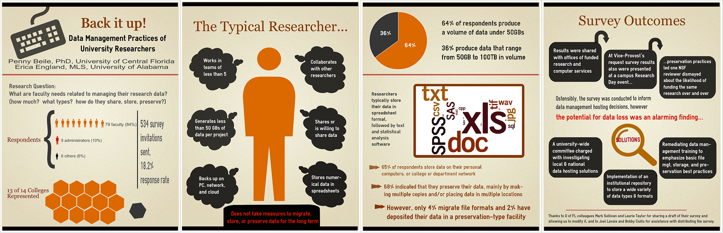
Title: Back it Up! Data Management Practices of University Researchers
Presenters: Penny Beile, Associate Director, Information Services and Scholarly Communication, University of Central Florida & Erica England, Adjunct Librarian, University of Central Florida

Here’s Penny talking about this wonderful, 4-panel design:

I usually report poster session research results in a very traditional, text heavy manner – Introduction, Methodology, Results and Discussion, with a couple of charts thrown in.  This time my colleague, Erica England, and I wanted to create an infographic that summarized the information in a visually compelling and simple way.  I often browse infographics sites to get ideas about presenting data and used easel.ly to create the poster.  There are a number of free sites for creating infographics, but easel.ly is the best I’ve found so far.  Erica and I also decided to create four 24”x31” posters instead of a larger 48”x96” poster for ease of transport.  (I only had to take a 24” mailing tube; much easier to carry around than a 48” one!)  After I created an account, I shared login information with Erica, which allowed us to work on the posters from different locations.  We were able to make charts and a wordle, then upload and use those files.  After creating a graphic you can save as a .pdf file, embed in a web site, or share via a link.

Inspired By the Movies: Wes Anderson Makes All Slides Better

ACRL 2015 was amazing, folks. There were so many brilliant, passionate, friendly librarians in one amazing city that I thought my head might explode. Two of those rad librarians were my co-presenters, April Aultman Becker (also co-creator of Librarian Design Share) and Abe Korah. On Friday afternoon we presented a panel on facilitating inquiry throughout the research process and helping students develop thoughtful questions.

These are our slides.

As we were planning our presentation, April and I joked to Abe that we were going to model our slides on a Wes Anderson movie. We’re big fans of his quirky visual style and thought it might be an appropriate look and feel for Portland.

Thanks to April’s fast-as-lightning investi-googling skills, we ran into this fantastic Wes Anderson Color Palettes Tumblr and decided to use the color scheme from Moonrise Kingdom.

Moonrise Kingdom Color PaletteWe also decided to lift an additional color from Suzy’s dress, which gave us some pink for highlights and a fun background for some of our slides.

Suzy's amazing pink dressThe fonts we used were Josefin Sans and Damion, both of which are available as Google Fonts (JS | D) as well as free desktop downloads (JS | D), which is a must if you want to coordinate your handout with your slides (which you know we did).

Our icons (credited on the last slide) come from the always amazing Noun Project, and were just modified according to our color scheme using Adobe Photoshop. The slides themselves were created in Google Slides.

You can access the published version of our Google Slides above, but if you’re interested in adapting them, download them from the Librarian Design Share Google Drive Presentation Folder.

Making an Impact with your Slide Deck

With many of us in academic libraries heading out to Portland today and tomorrow for ACRL 2015, it’s a good time to talk a little about what makes a good slide deck. Today’s submission is an example of a presentation with

  • clean lines,
  • a nice cohesive color scheme,
  • great statement photographs,
  • clear, attractive font choices, and
  • good use of text alignment for emphasis and impact.

This slide deck is courtesy of Alana Verminski, Collection Development Librarian at the University of Vermont Libraries and Kelly Blanchat, Electronic Resources Librarian at Queens College from their 2015 ER&L conference presentation:


We created the slides using Google Slides and most of the images were made using Google Draw. All the fonts are from Google Fonts. Kelly did some work in Photoshop to tweak a few of the images and the spreadsheet used in slide 10 was developed in Excel. Our presentation addressed many of the challenges (new) electronic resources librarians face when starting or transitioning into a new role. We focused on workflows and how revamping and developing new processes can facilitate the building of a new professional identity and gaining respect from colleagues.

You can contact Alana or Kelly for more information about their fantastic slides.

Keepin’ It Quiet

It’s cold in the Mid-Atlantic y’all. I’m trying to unfreeze my fingers by typing this morning, and what better way to warm up my joints than by sharing designs that tackle an issue we all wrestle with in our respective libraries: Noise. The best of libraries are filled with people reading and chatting, studying and collaborating, and this dual use can often pose a problem when some of our patrons want to converse and others want extended silence. I’ve found myself at either end of this spectrum (as I’m sure we’ve all been). I’ve been shushed and gotten the stink-eye from students for talking too loudly, and I’ve had to ask students to turn down their beats because everyone in their section of the library can hear the tunes blasting from their headphones.

Designating certain areas of the library as different noise level zones can help alleviate some of these noise conflicts, but good signage is key. Patrons need to be aware of the noise level preferred in different parts of the library, which is why I like this great submission by Michael Hughes, Instruction Librarian at the Coates Library at Trinity University.

Noise Level Signage
Noise Level Signage – Coates Library – Trinity University

Michael adapted the following graphic from the University of California, San Francisco Libraries (with permission) and incorporated a free icon into the design.

Noise Level Signage
Original Noise Level Signage – University of California, San Francisco Libraries

As an alternative, Michael also created the following sign, which, although busier, takes the same theme and adds a new twist on it.

Quit Study

What I love about all of these noise level signs and posters is the neutrality of language. Instead of “noisy” we see the terms “conversational study” or “active learning,” which I think motivates patrons to remain respectful of those around them.

As an alternative, we have these submissions from İpek Yarar at MEF University Library in Istanbul, Turkey, which I think do a nice job of using humor to kindly relay a message for noise control. All three feature an iconic Charlie Chaplin movie still.

Please be quiet

CC-Quiet-2

CC-Quiet-1

Do you have noise level signage at your library? What designs work best for your patrons?

You can find Michael’s original Photoshop files of his noise level signage and İpek’s printable signage (originally created with Adobe InDesign) on the Library Design Share Google Folder.

Create a free website or blog at WordPress.com.

Up ↑