Search

Librarian Design Share

inspiration for library creatives

Author

Veronica Arellano Douglas

Instruction Coordinator at the University of Houston Libraries

A Place for Color: Design Seeds

Design Seed Image

In my search for a nice color palette for a Library Instruction West slide deck, I came across the website Design Seeds via its amazing presence on Pinterest. The site is HEAVEN for anyone in search of color inspiration for a flyer, presentation, or larger outreach and marketing campaign. It’s the brainchild of designer Jessica Colaluca and I highly encourage you to check it out!

For the Love of Icons

Last month April and I presented at the 2014 Library Instruction West Conference in amazing Portland, Oregon. Our session was on effective methods for teaching “experienced researchers” (faculty, professionals, grad students, thesis writers, etc.), but our slide deck was ALL ABOUT THE ICONS (as you can see). We drew heavily from public domain and CC-licensed icons available from The Noun Project, a fantastic repository of “the world’s visual language” in symbols and icons.

You can access this presentation on Librarian Design Share’s Google Drive, or better yet, take a look at The Noun Project today! Trust me: You will find the icon you need.

Attention Teens!

Teen Hangs

Getting teens’ attention in the library is hard. Luckily, Maggie Block, Young Adult Librarian at the Aldine Branch of the Harris County Public Library, has a great flyer suggestion for drawing them in to library events.

I wanted something that would grab teens at my library’s attention and get them excited about Teen Hangs without bogging it down with descriptions and attempts at “hip” language. And just using bright controllers managed to do just that: let them know this event would be fun and centered around their entertainment needs.

Maggie’s made the original Photoshop file of her flyer available to download via the Librarian Design Share Google Drive. (We’re just starting it up so there isn’t much in it right now.) Thanks, Maggie!

Have You Heard About ACRL_LMAO?

ACRL-LMAOHave you heard about ACRL_LMAO? There’s a new Library Marketing and Outreach Interest Group in ACRL spearheaded by Virginia Alexander and Adam Haigh that’s all about sharing successes, failures, ideas and questions related to outreach and marketing efforts in academic libraries.

You can connect with ACRL_LMAO in three different ways:

Some fantastic conversations are already happening, and I’m eager to find out what else this group is up to in the next few months.

Infographic Love: Visually Communicating Information & Data

Librarians n infographics 4eva
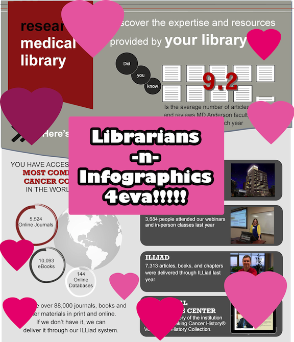
If we could visually communicate the love that librarians have for infographics, I think it would look a little something like this. I’m not sure when our love affair with icons and color-matching data began, but this visual expression of data and information is now a part of our librarian sphere. Whether we’re using infographics to teach students about information evaluation, or developing our own to share LibQual results, library impact or assessment findings, this method of conveying information is quite compelling.

But creating good infographics takes time. You want them to tell a story, to build from one bit of information to the next until the people reading them get a complete sense of the narrative you’ve created. You can certainly put your knowledge of MS Publisher, Adobe Photoshop, InDesign or Illustrator to work and create your own infographic. Or you can take advantage of infographic creation sites like PiktoChart or Easel.ly. We’ve written about these easy-to-use graphic generator sites before, but I think as more librarians are compelled to share data and information visually, these image-creation sites are going to find a place in our day-to-day work toolkit.


Robin Featherstone is an embedded research health librarian for the Department of Pediatrics at the University of Alberta. Her infographic was presented at the 2014 Canadian Health Libraries Association (CHLA) Annual Conference in Montreal. In it, Robin describes two different projects used to promote research through social media. It was created using Piktochart and is an excellent example of the use of infographic presentation to convey project results.

Featherstone Infographic


Carina Gonzalez, Library Media Specialist at Lawrence High School in Lawrenceville, New Jersey has also opted to use an infographic (created using Easel.ly) to share information about weeding with her school community. We all know that sparks can fly when non-librarians hear about weeding projects, so creating an easy-to-understand visual representation of the process is a great way to communicate the weeding process.


Weeding Infographic

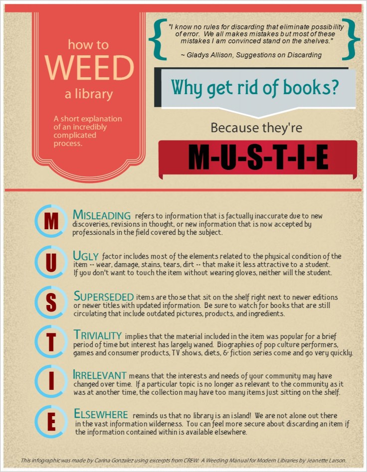
Here’s Carina in her own words:

This infographic, made with excerpts from CREW:  A Weeding Manual for Modern Libraries by Jeanette Larson, helps students and teachers garner a basic understanding of how a librarian chooses what to weed and what to keep.  It specifically outlines the acronym M-U-S-T-I-E providing a concise introduction to weeding without overwhelming the reader with too much information.  As librarians, we need the input of our school community on what we should or shouldn’t weed, and this infographic will inform others so they can give us the information we need to make the right decision.

If you’d like more information about the infographics in this post, email Carina Gonzalez or Robin Featherstone.

Designs Featuring Cover Art

As I’ve written before, sometimes a book’s cover art is so eye-catching that it becomes the center-piece in a library-related design. Whether you’re promoting next week’s book club, a new addition to the collection or a speaker series, sometimes it helps to let the cover art take center stage.

Meggan Frost, Public Services Librarian at Paul Smith’s College took advantage of some great book art to create a set of posters that are eye-catching and make a statement.

Rebuilding the Foodshed poster

I made these posters using a very similar template to promote some speakers (and their books) we’ve hosted recently in the library. Sometimes you just need something easy that looks great, and this template fits the bill. Book image + publisher description + date/time/place + a judicious use of nice fonts = an eye-catching poster. I like to print posters as big as I can. These are 24”x36” and 36”x48”. Because they are meant to be printed so big, the quality of the images is very important. Google image search has a filter that will allow you to limit to the largest possible image. I like to play around with fonts, but obviously readability is a big factor for a text heavy poster. I used Junction for the text and Nevis in bold for the headings, both available for free online. I think the slightly unusual fonts draw the eye while still being perfectly legible. Of course, the bright red book covers don’t hurt either!

Three Squares poster

Meggan created these posters using Adobe InDesign. For the original files, email Meggan.

Conference Posters: They Can Be Beautiful Too

Collective Engagement Poster

At our ALA Annual Conference Poster presentation for Librarian Design Share, April and I were so lucky to have our poster stationed next to the lovely Jennifer Brown, MSI candidate and University Library Associate at the Hatcher Graduate Library at the University of Michigan. If you aren’t familiar with the University Library Associates (ULA) program at the University of Michigan, this poster will give you a great introduction or you can read more about it.

In person, this poster sings! As you can see from the image above, it really is quite striking and beautiful. Jennifer’s use of color and alignment make it easy to read and lovely to see. Here’s what Jennifer has to say about it:

At this past ALA Annual Conference, my colleague and I presented on the unique partnership that the University of Michigan School of Information has with the MLibrary system. The University Library Associates program is a great opportunity for library students (like myself) to engage with the field professionally, and in ways that are sometimes absent in our library school curriculum. Further, seasoned professionals say that they benefit from learning and growing alongside us.

In the initial design phase, I began by selecting a color palette and layout that I thought appropriate for comparing two similar, but distinct, groups. I wanted to ensure that the theme remained consistent (which meant adopting a common shape, and threading that throughout the design), and tried to express quantitative and qualitative data visually, so as to draw the eye. I also made liberal use of public domain and creative commons licensed icons at The Noun Project, and generated the word cloud using a fantastic site called Tagul. Most importantly, though, I wanted to utilize white space thoughtfully, so as not to overwhelm individuals with too much all at once. In all, I had a fantastic time presenting this poster, and look forward to designing many more materials in the future!


If you’d like to see the Adobe Illustrator version of the file, you can email Jennifer. You can also download a large PDF version of the poster.

Readers’ Advisory in Horoscope Form

Readers' Advisory Horoscopes

Our latest design comes to us from Christina Gehring, Adult and Teen Services Librarian at the Hennepin County Library in Minneapolis, Minnesota. In it, Christina proves that the long arm of readers’ advisory knows no bounds!

I know plenty of friends and patrons who regularly read their horoscopes. As I was looking at some new astrology board books one day, it occurred to me that horoscopes might be a great place to insert some library propaganda.  I have a revolving monthly display in front of the reference desk, and it took just a few hours to make these for an astrology book display.

I used the website eAstrolog to find monthly horoscopes, and took out and rewrote some predictions that I thought might lend themselves to book recommendations.  I found the images for the bookmarks by limiting a Google search with “labeled for reuse.”  My reading suggestions only point to genres, library programs, and services rather than titles to allow the reader to tailor the suggestion to their taste. Sometimes I added that they could ask their librarian for a more specific suggestion. My coworker had the great idea of adding famous literary characters and authors at the bottom, which ended up being one of the most frequently commented on aspects of the bookmarks.

The bookmarks were put out at desks at libraries across my library system, as well as shared on social media.

You can download the original Microsoft Office document with all of Christina’s literary horoscopes or contact her for greater detail about her designs.

Librarian Design Share at ALA

Going to Las Vegas for ALA Annual Conference? We are too! April and I will be presenting a poster about our work on Library Design Share on Saturday, June 28 from 12:30 – 2:00 pm in the Conference Center Exhibit Hall, poster station #17. Stop by, say hi and watch us try to color-coordinate our outfits to our poster!

If you aren’t able to come to Vegas, take a look at our poster below. If you want to reuse any design elements from the poster let us know in the comments section or send us an email.


Librarian Design Share ALA 2014 Poster

Create a free website or blog at WordPress.com.

Up ↑