Search

Librarian Design Share

inspiration for library creatives

Category

Poster

Spotted at ACRL: Posters, Part 2

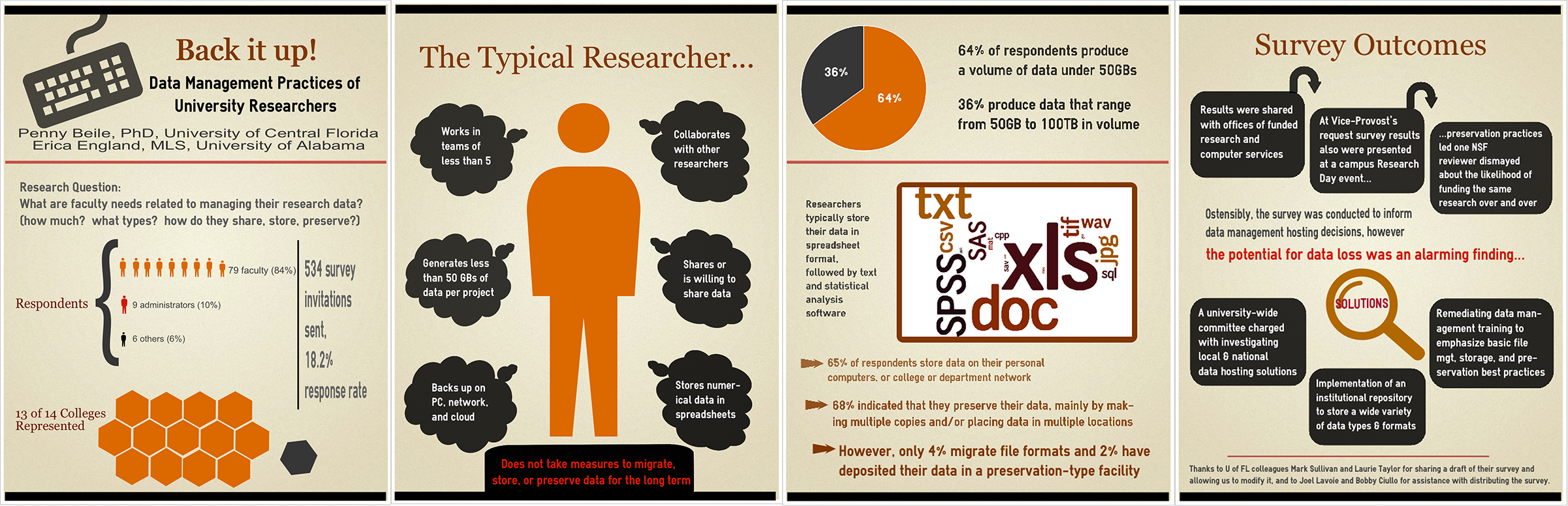
When looking for the latest trends in services and cutting-edge technology, you should head to the Poster Sessions of any conference. Beyond introducing you to new concepts, you get to connect with the poster creators and really hear the story behind their research.  Through this series of posts, we hope to bring the virtual poster session experience to you.  Here are a few more of our faves from ACRL:

lisa support tickets

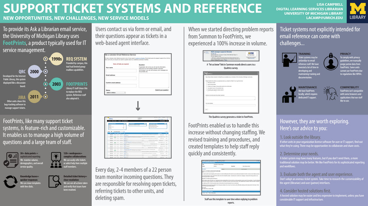
Title: Support Ticket Systems and Reference: New Opportunities, New Challenges, New Service Models
Presenter:  Lisa Campbell, Digital Learning Services Librarian, University of Michigan Library

Here’s Lisa discussing her design process and best practices for poster making and presenting:

I’m often facing limited time and frequent interruptions when working on conference materials. Design constraints help me to work efficiently and manage my stress. Starting work on this poster, I knew I wanted to fill the allotted space (a whopping 4×8 display board) and to use limited fonts, colors, and shapes.For the text, I picked Myriad Pro, which we use for many library communications. Sometimes I’ll seek fancier choices (I like Google Fonts, Font Squirrel, and dafont.com), but here, I wanted a font with which I was familiar. For the palette, I isolated 3-4 colors from a graphic I liked. These became swatches in Illustrator.

I took layout cues from my original poster proposal. I pulled 1-2 key points from each paragraph and pondered how to communicate them visually. I settled on a simple grid with a timeline, screenshots, and key takeaways. I sourced icons from The Noun Project and paid a licensing fee to use them without attribution. Then, I spent hours futzing with Illustrator until–voila!–the poster was done.

If you’re looking to create better posters, I encourage you to inventory your available resources (skills, support, software, printers, budget, etc.) and to let those, along with any guidelines you’ve been given, inform your design decisions. Any poster can be effective so long as its informative, organized, legible, and to-the-point.
And don’t forget to figure out how you’ll transport your poster. Were it not for some very last-minute magic involving a coworker, a hacksaw, a roll of duct tape, and two poster tubes, mine would not have made it to Portland.

nicole acrlTitle: Write Now: Supporting Student Success by Partnering with the Writing Center
Presenter:  Beth Anderson Schuck, Director, College of Southern Nevada Library Service, Nicole Sandberg, Reference & Instruction Librarian, College of Southern Nevada Library Services

Nicole discusses their design process:

We opted for a ‘flow-chart’ look because we thought that would reflect the fact that the project has been an evolutionary process and not just a static idea.  We supplemented that information with the pie charts to illustrate the differences between when students visit the Writing Center versus the Writing Center in the Library.

Based on Beth’s expertise from multiple previous poster sessions, we made the text as large as possible so that it could be read from far away.  For this reason, we kept the amount of text to a minimum and we also felt this encouraged people to ask us questions, which we wanted.  We thought a nice background image would enhance our theme, and found a simple image related to writing from Microsoft PowerPoint templates that blended well enough into the background.  Finally, the blue font and the box background (lower right corner) and the yellow box (lower left corner) closely match CSN’s school colors.

Strengthening Information Literacy  Collaboration 
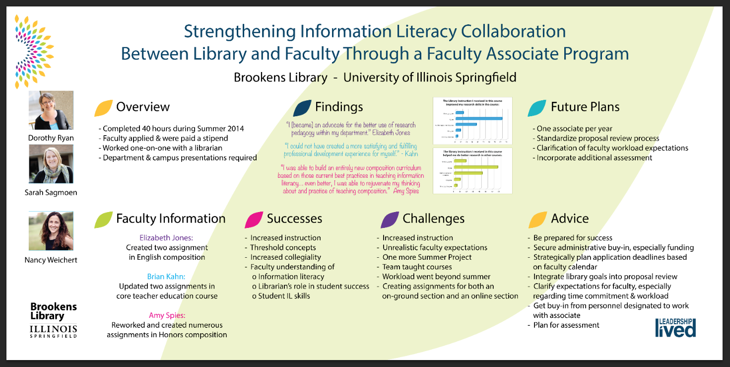
Title: Strengthening Information Literacy Collaboration Between Library and Faculty Through a Faculty Associate Program
Presenters: Dorothy Ryan, Sarah Sagmoen, Nancy Weichert, Brookens Library, University of Illinois Springfield
Poster Librarian Designer: Janelle Gurnsey, Outreach & Communications Coordinator, Brookens Library, University of Illinois Springfield

Here’s a bit from Janelle about her process:

1. Content is King: You can design something beautiful regardless of the content. Come up with a good concept for your poster and then think about the design. The librarians created the content and I provided the design. It was in every sense a team effort.
2. Consider the Source: Things I take into consideration are, What am I designing? For what purpose? For whom? The poster on the Brookens Library Faculty Associate Program needed to represent the Library and the University, be professional, clean and easy to read. I used University branding standards to drive the design. I chose bright colors from the identity stamp to give an otherwise simple design a bit of punch. I created the original file in Illustrator .
Advice I would give to those with less of a design background is to use their librarian skills to look for things they know they like and then creatively emulate the principles of those designs.

A Meeting of the Minds

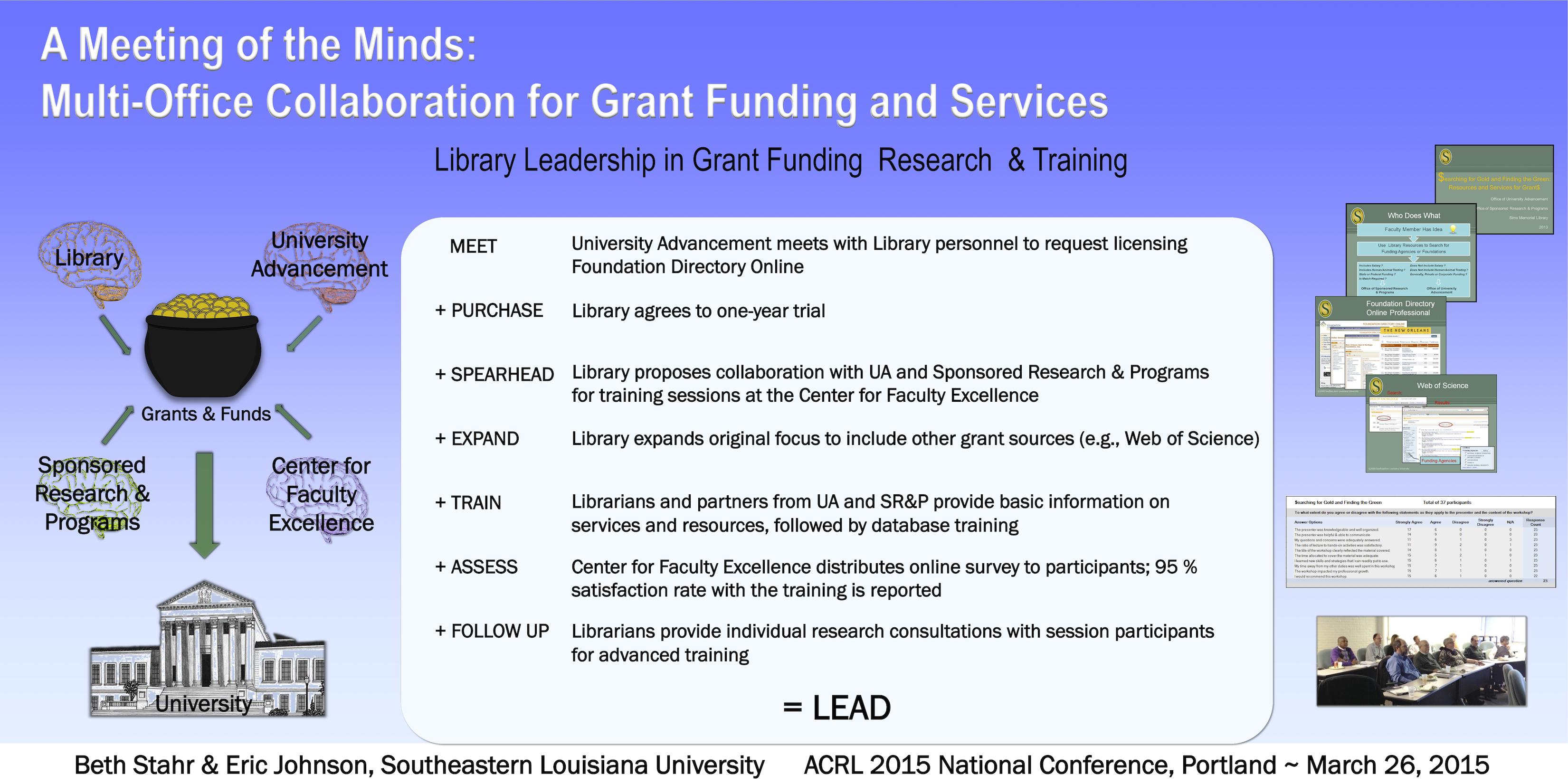
Title: A Meeting of the Minds: Multi-Office Collaboration for Grant Funding and Services
Presenters: Beth Stahr, Head of Reference/Instruction and Eric Johnson, Library Director, Southeastern Louisiana University

In designing our poster, we referred back to the abstract we submitted to ACRL to make sure that we incorporated all the original ideas in our proposal. The steps for collaboration with other campus agencies were the main information points to convey on the poster, so that block of text was located in the center. However, to make the poster more visually appealing, we considered the words in our title, and sought an eye-catching graphical representation of our theme. The words in our title that mattered were: minds, collaboration, funding, and services. As librarians always do, we identified key words for these concepts: brains, money and the use of arrows to show the input of multiple agencies working together. The four color-tinted brains, each representing a different campus agency, were placed on the left side of the poster, and worked together to bring funds, represented by a pot of gold, into the institution, represented by a classical style building. To depict the library’s “services,” we placed a photo of attendees and several slides from our training sessions on the right hand side of the slide. We added the results of a survey of participants to depict the assessment of our training.

While we created this design, we are fortunate to have both artistic and technical expertise at our University’s Center for Faculty Excellence. Their staff helped with font, spacing and color selection and suggested the gradated blue background. The Center also has a large poster printer available for faculty who create posters for conferences. Our poster was created in MS PowerPoint and then re-sized for the Epson Stylus Pro 9800 44-inch roll-paper color inkjet printer. We recommend that someone with an eye for graphic design review any poster to be displayed at a conference.

Spotted at ACRL: Posters, Part 1

Last week April and I were lucky enough to attend and present a panel at ACRL 2015 in Portland. Creating attractive conference materials is challenging, but there were so many fantastic posters at ACRL that we knew we had to feature them on Librarian Design Share.

This is the first in a series of posts on eye-catching design we spotted at ACRL. We’ve tried to give each of the presenters/designers a chance to share their creative process with you. We hope you enjoy it!

Poster Sessions

One of the most challenging conference presentation mediums is, I think, the research poster. There is so much information to share in such a limited space. You want your poster to be attractive and engaging, but you also want it to tell a story. Finding the right balance between text and images can be difficult. The posters below are ones that caught our eye with their interesting presentation design.


2 Librarians, 2 Universities: Serving International StudentsTitle: 2 Librarians, 2 Universities: Serving International Students
Presenters: Laurie Bridges, Instruction and Emerging Technologies Librarian, Oregon State University, and Jimena Sagas, Foreign Languages & Literature Librarian, Colorado State University

Here’s Laurie discussing their design process:

Our poster was designed using Canva, after I put out a call to the Twitter-verse asking for a “better way” to design posters, and Dani Cook, a librarian at the Claremont Colleges, suggested Canva. The only drawback of Canva was that I could only make the poster a little over 4 feet wide. However, the ability to have the poster in the cloud allowed Jimena and I to work on it and make changes without having to save and email designs back-and-forth, which I loved! And Canva has templates and free clip art, which we used liberally (all of the icons and design elements in the poster came from Canva’s free clip art).

Before becoming a librarian I held a position as the Marketing Coordinator for University Housing and Dining Services at Oregon State University. I supervised a full-time graphic designer and routinely worked with student designers. Although I am not a graphic designer myself, my past experience in marketing greatly informed the design of our poster. For example, because I worked in print media, I know that posters (at least 10 years ago) always had a “call to action” somewhere along the bottom. So, somewhere along the bottom of the poster you should tell your customer what you want them to do next (in our case it was visit our bundle of bitly links). Also, when I worked in print media I learned that people view posters and one-page flyers in a Z pattern – the eye begins in the top left, moves to the right, then diagonally to the left bottom, and finally ends at the bottom right. Therefore, it is best to have your logo, or other identifying information, in the bottom right. And, finally, I knew I wanted bright colors on our poster, to attract attention, and I didn’t want too much information in the poster, because it should act as a “teaser,” prompting people to either act on our “call to action” or talk to Jimena and I at the poster.

Sowing Seeds of Success - Community Collaboration for College ReadinessTitle: Sowing Seeds of Success – Community Collaboration for College Readiness
Presenters: Lindy Scripps-Hoekstra, Area Studies & Religious Studies Librarian & Gayle Schaub, Liberal Arts Librarian, Grand Valley State University

Lindy discusses their design process a bit:

We used Canva to create our poster. It is really user-friendly and intuitive. They have some really nice fonts and allow users to upload their own images. Anyone interested in making a poster can use the custom sizing to create large-scale prints.  I’ve also used this website to create fliers for my faculty and signage with librarian profiles.

In terms of poster content, we wanted to continue with the conference theme of sustainability by using a plant growth metaphor and related imagery to help guide the eye through our information. We also wanted to include photos of our students without having this overwhelm or distract from the content so we placed those in a simple row at the bottom.

Back it Up! Data Management Practices of University Researchers

Title: Back it Up! Data Management Practices of University Researchers
Presenters: Penny Beile, Associate Director, Information Services and Scholarly Communication, University of Central Florida & Erica England, Adjunct Librarian, University of Central Florida

Here’s Penny talking about this wonderful, 4-panel design:

I usually report poster session research results in a very traditional, text heavy manner – Introduction, Methodology, Results and Discussion, with a couple of charts thrown in.  This time my colleague, Erica England, and I wanted to create an infographic that summarized the information in a visually compelling and simple way.  I often browse infographics sites to get ideas about presenting data and used easel.ly to create the poster.  There are a number of free sites for creating infographics, but easel.ly is the best I’ve found so far.  Erica and I also decided to create four 24”x31” posters instead of a larger 48”x96” poster for ease of transport.  (I only had to take a 24” mailing tube; much easier to carry around than a 48” one!)  After I created an account, I shared login information with Erica, which allowed us to work on the posters from different locations.  We were able to make charts and a wordle, then upload and use those files.  After creating a graphic you can save as a .pdf file, embed in a web site, or share via a link.

Hand Lettering on Sidewalk Chalkboard Signs

I almost ate it and went with a pun for this blog post. Thankfully, I decided to bury “Chalk it up to good design” and focus on the great hand-lettering-style fonts on this poster. Like Nono’s chalkboard-style conference poster, today’s featured design makes good use of old school chalkboard cool to create a poster that’s sure to catch students’ attention.

Remember to Return Your Books to the Carl B.

Solveig Lund, Instruction and Reference Librarian at the Carl B. Ylvisaker Library at Concordia College created this poster using Microsoft Publisher.

The circulation manager asked me to create a 24×36 poster to place outside on a main campus sidewalk at the end of the semester to remind students to return their books to the library.  There are many collections of chalkboard fonts and sample designs available on Pinterest that I used for inspiration. I used Microsoft Publisher to create the sign and downloaded free fonts/wingdings from dafont, including:

I don’t know about you, but I’m a little bit obsessed with the Chalk Hand Lettering pack right now. You can download and adapt Solveig’s original Microsoft Publisher file, which is available on the Librarian Design Share Google Drive folder.

Chalkboard-Style Poster Design (with Fonts to Love)

Chalkboard Poster by Nono Burling

Nono Burling, Online Resources Coordinator at Washington State Library and manager of the ASK WA Virtual Reference Project, first shared this amazing chalkboard-style poster design on the ACRL Library Marketing and Outreach (LMaO) Facebook group, and we are so excited to feature it here today. It’s a good example of trying something new with conference poster design and makes great use of interesting fonts. Here’s Nono talking about her design process:

I’d originally been asked to present at the College Librarians and Media Specialists of Washing State (CLAMS) 2014 fall conference, but due to time constraints my presentation turned into a poster session. I wanted something eye-catching that would draw people. I’ve always loved those chalkboard designs you see in coffee shops so decided to try one of my own. The “Sneak Peek” part of the poster is a lift-the-flap piece. The entire design goes on a 36″ by 48″ tri-fold poster board.

Here are some of the fonts I used in this design for both the text and ornamental pieces, all free to download:

You can also see more fonts that would work well on a chalkboard design at this great Font Round-Up.

Nono’s poster was created using MS Publisher and Powerpoint. You can download the original files from the Librarian Design Share Google Drive Folder and adapt to your heart’s content (just remember to give Nono a shout-out). Excuse me while I go download all these fonts…

Get Infected With Knowledge

Get Infected With Knowledge - Zombie Library Promo Video Poster


We are loving this fantastic promotional poster created by Natalie Manke from the Metro Campus Library at Tulsa Community College to advertise their zombie-themed library promotional video, Get Infected with Knowledge.

Several of my coworkers and I, along with Tulsa Community College’s video production department, recently created a zombie-themed promotional video for our library (I would be remiss if I didn’t include a link to it), and I designed the poster we’re using to advertise it.


I created the poster in Photoshop. Since our video is zombie themed, I used classic horror movie posters as inspiration for the design I created. I was able to find some tutorials online that helped me give the poster a vintage feel to it. I used textures to make the paper appear aged and creased.  I also found some really great free fonts online from dafont.com. We were somehow able to convince our student activities department to make us a fake student ID for our zombie, so I used that as the main image on the poster. I am really thrilled with how the poster turned out in the end, and it was so much fun to design.

You can download a PDF copy of the poster from the Librarian Design Share Google Drive or you can email Natalie Manke for the original Photoshop file. You can also watch Get Infected with Knowledge on YouTube!

Odds and Ends Need Publicity Too

If a student has thought to ask for it, chances are it’s available to borrow at an academic library’s circulation desk. My own library loans dry erase markers, color pencils, laptop chargers, extension cords and floppy disc drives (YES, REALLY), among so many other miscellaneous items. They aren’t expensive and the students are so appreciative to borrow them when we have them.

Stephanie Davidson, Interim Director of the Library at the University of Illinois College of Law, created two fun signs to tell students about all of the different things her library has available to loan.

Forgot Something? Charging Cables

Forgot Something? UmbrellasThese posters/signs were created using MS Word. You can download them for adaption from the Librarian Design Share Google Drive.

Designs Featuring Cover Art

As I’ve written before, sometimes a book’s cover art is so eye-catching that it becomes the center-piece in a library-related design. Whether you’re promoting next week’s book club, a new addition to the collection or a speaker series, sometimes it helps to let the cover art take center stage.

Meggan Frost, Public Services Librarian at Paul Smith’s College took advantage of some great book art to create a set of posters that are eye-catching and make a statement.

Rebuilding the Foodshed poster

I made these posters using a very similar template to promote some speakers (and their books) we’ve hosted recently in the library. Sometimes you just need something easy that looks great, and this template fits the bill. Book image + publisher description + date/time/place + a judicious use of nice fonts = an eye-catching poster. I like to print posters as big as I can. These are 24”x36” and 36”x48”. Because they are meant to be printed so big, the quality of the images is very important. Google image search has a filter that will allow you to limit to the largest possible image. I like to play around with fonts, but obviously readability is a big factor for a text heavy poster. I used Junction for the text and Nevis in bold for the headings, both available for free online. I think the slightly unusual fonts draw the eye while still being perfectly legible. Of course, the bright red book covers don’t hurt either!

Three Squares poster

Meggan created these posters using Adobe InDesign. For the original files, email Meggan.

Conference Posters: They Can Be Beautiful Too

Collective Engagement Poster

At our ALA Annual Conference Poster presentation for Librarian Design Share, April and I were so lucky to have our poster stationed next to the lovely Jennifer Brown, MSI candidate and University Library Associate at the Hatcher Graduate Library at the University of Michigan. If you aren’t familiar with the University Library Associates (ULA) program at the University of Michigan, this poster will give you a great introduction or you can read more about it.

In person, this poster sings! As you can see from the image above, it really is quite striking and beautiful. Jennifer’s use of color and alignment make it easy to read and lovely to see. Here’s what Jennifer has to say about it:

At this past ALA Annual Conference, my colleague and I presented on the unique partnership that the University of Michigan School of Information has with the MLibrary system. The University Library Associates program is a great opportunity for library students (like myself) to engage with the field professionally, and in ways that are sometimes absent in our library school curriculum. Further, seasoned professionals say that they benefit from learning and growing alongside us.

In the initial design phase, I began by selecting a color palette and layout that I thought appropriate for comparing two similar, but distinct, groups. I wanted to ensure that the theme remained consistent (which meant adopting a common shape, and threading that throughout the design), and tried to express quantitative and qualitative data visually, so as to draw the eye. I also made liberal use of public domain and creative commons licensed icons at The Noun Project, and generated the word cloud using a fantastic site called Tagul. Most importantly, though, I wanted to utilize white space thoughtfully, so as not to overwhelm individuals with too much all at once. In all, I had a fantastic time presenting this poster, and look forward to designing many more materials in the future!


If you’d like to see the Adobe Illustrator version of the file, you can email Jennifer. You can also download a large PDF version of the poster.

Visualizing Research is Hard

I’ve been working on a poster for my institution’s ACRL Assessment in Action project for the past month or so and it’s easily been one one of the toughest things I’ve had to design EVER. With ALA and other summer conferences around the corner, I’m willing to bet there are plenty of librarians and library students in epic-poster-design-battle-mode at the moment. So let’s talk posters, research and pictures.

To sum up our AiA Project: The St. Mary’s College of Maryland team was interested in learning if faculty-librarian collaboration had an impact on students’ information literacy (IL) skill development in the First Year Seminar (FYS: a required course for all first year students). It was a multi-method assessment: student surveys, faculty surveys, librarian surveys, rubric-based assessment of student essays and faculty interviews. This made coming up with a poster design particularly challenging since there was simply SO MUCH INFORMATION to share.

After hearing from an AiA cohort member who was taking a really simple, conversational approach to designing her project poster, I knew that I wanted to try to replicate that approach as much as possible. There is only so much information you can take in from a poster, and I would much rather be talking to people about different aspects of my project than having them squinting at the text above my shoulder.

AiA-Poster-Draft-small

I still think the poster is kind of busy, but to be honest, I’m so tired of it right now that I’m willing to let it go through the AiA peer review process and worry about it next week. It still needs alignment adjustments, and I’m not totally sold on the white font on the blue background, but it’s something!

Here are the pieces I like best:

Methods: All of our assessment pieces were part of a greater whole, and took place at various points throughout the semester. I was inspired by other AiA colleagues who took a timeline approach to their methods section and thought this was a nice compromise.

methods

Research Question & Background: This was originally a long paragraph with background information about our First Year Seminar, our IL outcomes, and our assessment project. I decided that if someone really wanted the long story, they could visit our project website (which I’m in the process of developing) or just ask me more about it. I paired down the research description to the just the essential question and basic facts about the FYS and our involvement with it.

question

Results: This is just a portion of the results section, which was easily the most difficult section to develop. I’m still not totally pleased with it, but I wanted to try something other than bullet points and graphs. I don’t know if I did the right thing leaving out numbers and I may go back and change that, but again, I think if people want the finer details I can refer them to the project website with averages, t-test scores and correlation scores, right (I hope)?

results

What kind of posters are you working on for conferences this summer? What’s your approach to visualizing your research?


Create a free website or blog at WordPress.com.

Up ↑

%d bloggers like this: