Search

Librarian Design Share

inspiration for library creatives

Book Club Displays in a School Library

Full disclosure: I think Mary Chance is a display genius.  I had the pleasure of working with her and creating displays with her years back at a high school library, and she taught me everything I know about Microsoft Publisher and crafting with paper!

Mary has since moved on to be the solo librarian at Alvin Junior High in Alvin, TX.  She told me that she no longer has time to develop and design all that she wants to in her library, so she is training students to help her.  Mary says the students come up with the design, and she just makes it possible for them to execute it.  Her only rule with the revolving display is that the existing one cannot be taken down until there is a replacement.

The library hosts many book clubs each year, and often well-known authors make an appearance (Eoin Colfer is scheduled for next month). The students design a mobile poster to promote the book club, and Mary rolls it through the school during lunch periods to attract interest and talk to students about the featured book.

Below are Mary’s latest book club displays for Beastly, Unwind, and The Adoration of Jenna Fox, and you can see that she has taught her students well.

photo (50)

DSC03663

DSC03664 (1)

Contact Mary Chance if you’d like to know more information about her displays.  Parental permission was obtained before posting these pictures.

Hjørring Public Library Part 2: Library-Wide Display Themes

Campfire Display

Part 2 of our 3 part series on displays at Hjørring Public Library continues with a great example of designing an entire library’s worth of displays around a single theme. Again, here’s Digital Librarian Martin Jørgensen on his library’s display philosophy:

When it comes to displays we try to make a theme going through the entire library. Right now the theme is “5” because, the library was opened 5 years ago. The “5” displays are a broad range of subjects: 5 things to do in the garden, 5 philosophers, my 5 favorite comic books and so on. Other themes have been more abstract, like “Brown” which had displays about East Germany and a huge collection of gravy boats (brown gravy is pretty much a Danish national dish).

American Dining Car

Martin has shared some images from the library’s theme “Meals,” which included “ (among other things) beautiful set tables (made by a store nearby), herbs growing on the shelves and a model made by me [Martin] of an American diner.

Hjørring Public Library

Every once in a while you come across a library so truly amazing that you can picture yourself living in it. For me, that place is the Hjørring Public Library in Denmark. After you take a visual tour of this library, you won’t want live anywhere else.

Digital Librarian Martin Jørgensen is proud of his library, and for good reason! He’s shared an amazing array of display and design inspiration for libraries. So many, in fact, that it would be impossible squeeze them all into one post. Instead we’ll be featuring a different display from the Hjørring Public Library throughout the week.

Today’s focus: The “Bookstore Wall.” From Martin:

The largest display option we have is our “bookstore wall,” a wall covered with shelves. At first we mostly had large books on it, but now we use it more deliberately.

rainbow bookstore wall

The best example is a rainbow I made one afternoon displaying all of the books on the wall by color. It was quite the looker.

more rainbow wall

Oh, and we’ve played wordfeud on it too!

Word Feud

[We also created] a banner to promote a national library film streaming service “filmstriben”. The banner consisted of press photos from the films available, and had a blank, white space where we showed movietrailers via a projector.

Filmstriben Display

Advertising New Services

Libraries are adopting new technologies all the time.  But how do you get the word out about the new services to patrons?

Ernesto Hernandez, the Emerging Technologies Librarian at Marydean Martin Library at Nevada State College shared two recent designs he created to advertise new services.  About the iPad circulation sign below, Ernesto says, “although it is simple in design, I took an original picture of the iPad with my phone camera along with inserting a QR Code to our iPad LibGuide.”

iPad sign e hernandez

The second design Ernesto shared is a bookmark to promote his library’s newly created social media sites.  The library intends on inserting one into each book they check out.  Ernesto says, “we added our library symbol and phrase ‘Get Social with the Marydean Martin Library’ along with shortened URLs to each page.”

socialmediabookmark e hernandez

Using original designs, uniquely branding them to your own library, and placing them where patrons can’t help but notice them is a great way to promote services to patrons.

Want the original Publisher files of either of these documents?  Contact Ernesto Hernandez.

Origami Book Art Display

We asked for great examples of library displays, and you answered. Paula DeRoy, librarian at Northern Virginia Community College–Annandale Campus, and her colleagues created this amazing origami display to adorn one of their library walls.

rainbow origami book display

Here’s Paula in her own words:

We had a big blank wall so we took inspiration from French artist, Mademoiselle Maurice, and we created origami art. The installation is about 12 ft by 5 ft. Everyone made a couple origami items each day and eventually we had enough for the wall. Someone had saved an old origami daily calendar so we used that paper and we folded five shapes – medallions, tulips, butterflies, cranes and fan flowers. Our design represents an open book. It was a low cost, high impact project that we continue to enjoy everyday.

Paula and her team also created a great video of their design process:

For more information about this design, email Paula DeRoy.

Back from ACRL

Forgive the lack of posting on Librarian Design Share. Both April and I have been preparing for and attending the ACRL 2013 conference, leaving our design-minded readers with little to see from us in their RSS and Twitter feeds. But we’re back! Coming up this week and next: Examples of fun library display designs from community college and public libraries.

A Presentation in Progress

I’m presenting at the 2013 Texas Library Association at the end of this month along with my colleague, Abe Korah . I’ve been excited about this presentation for months, but have only now started to work on our Powerpoint slides for the day of the event.

It’s been years (YEARS!!!) since I’ve created any kind of Powerpoint presentation. So much has been written about PP sins and presentation skills for librarians (if you don’t know Lee Hilyer’s blog and book, get to know ’em), which makes creating a bad slide deck and even greater offense than it once was.

My slides are super simple, and this presentation is still in draft format. I’ve tried to keep things consistent, relying mostly on a fun font and bold colors, and have only used images when they could make an impact. I’m open to all comments and suggestions.

A note about the presentation: Our session is taking on the format of a mock interview, where attendees learn how to develop the skills, experience, and critical thinking necessary to taking a more thoughtful, active approach to their job search and interviewing.

In Need of Library Display Inspiration

After reviewing our past posts, April and I realized that Librarian Design Share is seriously lacking in the book/library resource display category. As medical and academic librarians, we don’t often get the chance to create fun, interesting displays for our students and faculty, but we know that so many of you do!

Want to share your latest book display? Here’s your chance! Email us photos of your latest and greatest work, and we’ll feature your amazing display here on Librarian Design Share. We’re looking forward to seeing what you’ve designed!

Look and Feel Constraints

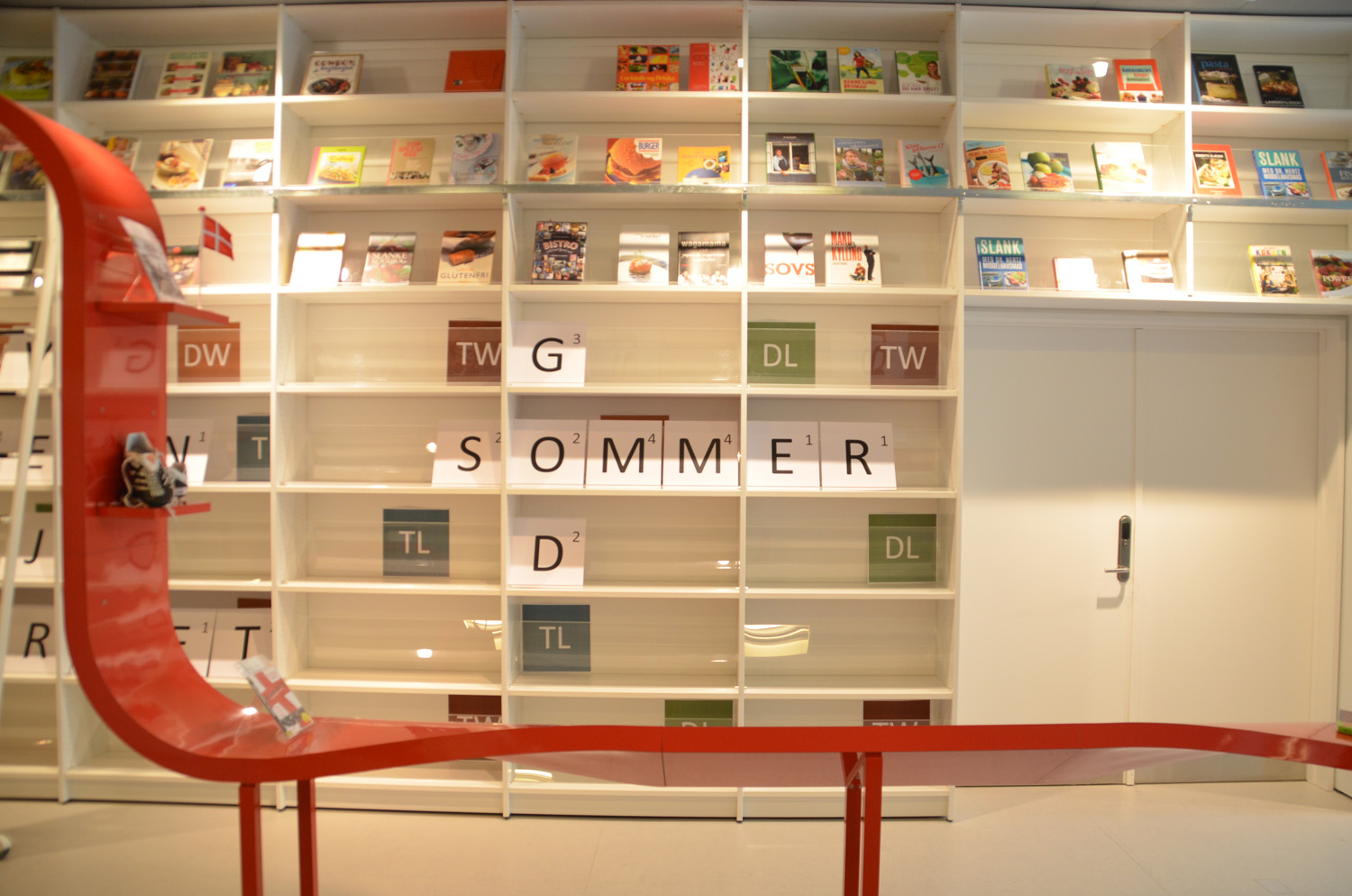
As librarians we’re often designing websites, handouts, and publicity materials that have to conform to certain institutional design standards. Whether you’re in a library that requires its logo on every brochure or at a university with very specific font and color branding, you’ve no doubt felt the constraints that an established look and feel can have on your design creation. Here are the boundaries we work within:

Veronica

The college I work for is in the midst of a branding evaluation, meaning that at some point in the next few years we’ll likely have a revised logo, colors, and font that will be standard on all of our print and web publications. For the time being, here’s what we use:

homepage-screenshot

  • A fixed-width web template
  • Variations of gold and two types of blue to match our college colors
  • A very intricate logo
  • A standard header that takes up a good portion of the screen

Our web team is working hard to prepare for the changes that this branding evaluation will likely bring to the college’s virtual presence. Like me, the web developers hope that our new university template will be responsive, rather than fixed width, and that the college header will be much smaller. My hope is that we modify or eliminate the standard logo in favor of a simplified text-based brand. I understand the need for color constraints, so I’ve tried my best to work within the colors of the college.

To make up for the space taken by the college header, I’ve tried to keep the library header small, although I’m planning to revise it to take advantage of some of the wasted space in the middle and make the header menu more visible. I’ve also tried to make the search area and announcement slider the main focus of the page. I’m not sure how successful I’ve been, but it’s a start.

How do you work within web template constraints?

April

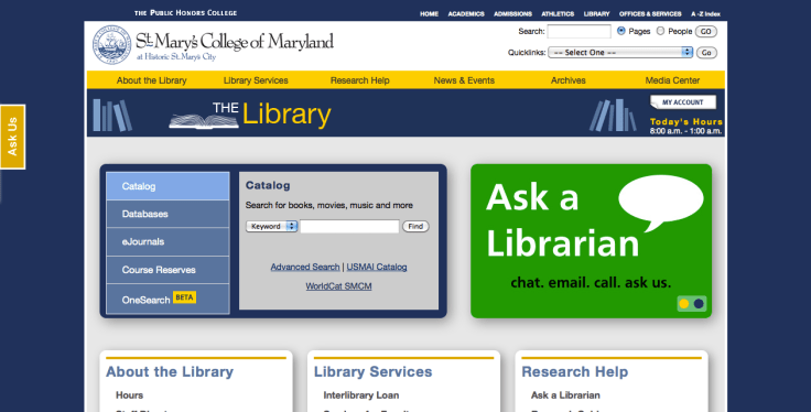
I work at a large university hospital with a specific department that concentrates on maintaining our brand so that it is not diluted or misconstrued among our thousands of employees and our international audience. Our brand standards call for a certain set of colors and fonts that should be adhered to when creating designs, even those that are used in-house.  Complying with these standards (see below) has been my biggest challenge when designing publications.

3-26-2013 1-40-10 PM

One of my first charges as a new hire was to redesign our General Info page (that you’ve seen here).  My first draft looked pretty similar in design to what you’ve seen, but the colors were my favorite lime green, grey, and orange, the fonts didn’t conform, and I neglected to add the institutional logo.  My supervisor quickly showed me the brand standards on our intranet, and I modified my design to incorporate theirs by carefully replicating the CMYK numbers and adding in other elements.

It’s not always easy, as I find the standards limit my creativity at times, but because I now understand and respect the reasoning behind the standards, I’m trying to follow them more closely in everything that I create.

Create a free website or blog at WordPress.com.

Up ↑