Search

Librarian Design Share

inspiration for library creatives

Tag

photoshop

Attention Teens!

Teen Hangs

Getting teens’ attention in the library is hard. Luckily, Maggie Block, Young Adult Librarian at the Aldine Branch of the Harris County Public Library, has a great flyer suggestion for drawing them in to library events.

I wanted something that would grab teens at my library’s attention and get them excited about Teen Hangs without bogging it down with descriptions and attempts at “hip” language. And just using bright controllers managed to do just that: let them know this event would be fun and centered around their entertainment needs.

Maggie’s made the original Photoshop file of her flyer available to download via the Librarian Design Share Google Drive. (We’re just starting it up so there isn’t much in it right now.) Thanks, Maggie!

Librarian Design Share at ALA

Going to Las Vegas for ALA Annual Conference? We are too! April and I will be presenting a poster about our work on Library Design Share on Saturday, June 28 from 12:30 – 2:00 pm in the Conference Center Exhibit Hall, poster station #17. Stop by, say hi and watch us try to color-coordinate our outfits to our poster!

If you aren’t able to come to Vegas, take a look at our poster below. If you want to reuse any design elements from the poster let us know in the comments section or send us an email.


Librarian Design Share ALA 2014 Poster

Visualizing Research is Hard

I’ve been working on a poster for my institution’s ACRL Assessment in Action project for the past month or so and it’s easily been one one of the toughest things I’ve had to design EVER. With ALA and other summer conferences around the corner, I’m willing to bet there are plenty of librarians and library students in epic-poster-design-battle-mode at the moment. So let’s talk posters, research and pictures.

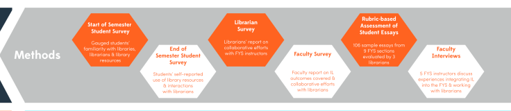
To sum up our AiA Project: The St. Mary’s College of Maryland team was interested in learning if faculty-librarian collaboration had an impact on students’ information literacy (IL) skill development in the First Year Seminar (FYS: a required course for all first year students). It was a multi-method assessment: student surveys, faculty surveys, librarian surveys, rubric-based assessment of student essays and faculty interviews. This made coming up with a poster design particularly challenging since there was simply SO MUCH INFORMATION to share.

After hearing from an AiA cohort member who was taking a really simple, conversational approach to designing her project poster, I knew that I wanted to try to replicate that approach as much as possible. There is only so much information you can take in from a poster, and I would much rather be talking to people about different aspects of my project than having them squinting at the text above my shoulder.

AiA-Poster-Draft-small

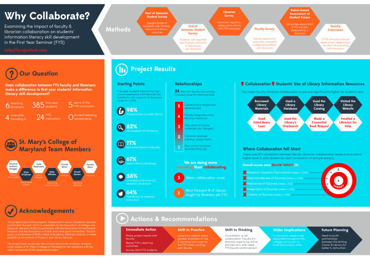
I still think the poster is kind of busy, but to be honest, I’m so tired of it right now that I’m willing to let it go through the AiA peer review process and worry about it next week. It still needs alignment adjustments, and I’m not totally sold on the white font on the blue background, but it’s something!

Here are the pieces I like best:

Methods: All of our assessment pieces were part of a greater whole, and took place at various points throughout the semester. I was inspired by other AiA colleagues who took a timeline approach to their methods section and thought this was a nice compromise.

methods

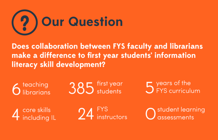
Research Question & Background: This was originally a long paragraph with background information about our First Year Seminar, our IL outcomes, and our assessment project. I decided that if someone really wanted the long story, they could visit our project website (which I’m in the process of developing) or just ask me more about it. I paired down the research description to the just the essential question and basic facts about the FYS and our involvement with it.

question

Results: This is just a portion of the results section, which was easily the most difficult section to develop. I’m still not totally pleased with it, but I wanted to try something other than bullet points and graphs. I don’t know if I did the right thing leaving out numbers and I may go back and change that, but again, I think if people want the finer details I can refer them to the project website with averages, t-test scores and correlation scores, right (I hope)?

results

What kind of posters are you working on for conferences this summer? What’s your approach to visualizing your research?


Good Design Doesn’t Happen Alone


On Saturday I gave a short talk at the ACRL Marketing Discussion Forum at ALA Midwinter. The whole presentation, as you can tell from the title slide, was about using the people and communities around you to help you create better, more engaging visual materials for library marketing and outreach efforts. It may have been cold enough in Philly to make me wish I was in Texas in July, but the conversation at our discussion was lively and warm! I had a blast. Big thanks to Katy Kelly and Jessica Hagman for inviting me to participate, and I hope y’all enjoy the slides.

This presentation was created using Photoshop. Images were saved as PNG files and layered onto a Google Slideshow. For any of the original Photoshop files, email me, Veronica.

Video Slidedeck Theme

Earlier this month I presented at the Brick & Click Academic Libraries Symposium on a student-led library video project I started at St. Mary’s. This post is not about that project. But it is about slidedecks and how, when given the opportunity to make things easy, I make things more difficult for myself. BECAUSE THAT’S THE KIND OF GAL I AM.

I wanted a fun video-related theme running through my presentation slides and decided to upcycle a poster I had originally created to publicize our library’s new Films on Demand subscription. I changed around some fonts (using Arvo and Sofia Pro Light), added some movie-related icons and other graphic elements through-out and BLAM-O, a new template was born. It was really more of a time-consuming why-did-I-decide-to-do-this creation rather than a spontaneous design, but I’m happy with the final project and hoping that by sharing it I can save some people some time.

I’ll end with a brief exchange I had with my husband about this slidedeck:

ME: Check out my presentation slides!!!!!
HIM: Cool. I didn’t know Powerpoint had that theme.
ME: It doesn’t. I made my own theme.
HIM: Of course you did. *head pat*

You can check out the embedded slidedeck through Slideshare, or email me, Veronica, for the original PP slides and Photoshop layout.


Advertising Ebooks

My library is currently taking part in a demand-driven acquisition ebook pilot project through Proquest’s EBL and our state college and university library consortia. The challenge: advertise that mouthful to our students, faculty and staff. The solution: A mix of attention getting posters, slides for our website image carousel, as well as pamphlets and an accompanying libguide that go into more detail about the program and give our users instructions on how to access and download these ebooks.

ebook dda pilot poster advertisement

After struggling to coming up with an interesting, non-cheesy way to visually represent ebooks, I found the photo above on Flicker, and thanks to its creator Johan Larsson’s generous CC 2.0 Attribution license, I was able to build a design around it. I cut out most of the background, layered it on a black background and used Cicle font to create a slogan that is (I hope) intriguing but still meaningful. I decided against including a QR code because previous efforts at including them in signs for my library showed that none of the students were using them. The posters will be placed on bulletin boards in various academic buildings around campus.

I then adapted the poster design to a smaller scale: our website’s image carousel:

ebook pilot image carousel slideThis slide links out to a libguide about the ebook pilot project. Created by my colleague, Alana Verminski, the libguide offers more detail about the program and gives detailed instructions for users to locate, access, and download or print portions of the ebooks. Alana also did a fantastic job of creating a tri-fold brochure about the ebook pilot project which we’re sharing at our library’s information desk for those who want to take away information about it.

Ebook Brochure Inside Ebook Brochure OutsideThe poster and image carousel slide were created using Photoshop and the tri-fold brochure was created using Word. For the original files of any of these designs, please email Veronica Arellano Douglas.

Remixing Old Designs

Last December I shared a sign I created for our reference desk advertising our library’s chat reference service and LibAnswers Knowledgebase. I love it when designs on our site get remixed and re-purposed. Erica DeFrain of Honey-Badger-Boolean fame switched up the sign’s layout, “fussed with the text,” and of course, changed colors to match her home institution. The result is below:

Ask us sign for the U of VTAwesome, Erica! If you’ve adapted any of the designs on our blog, let us know! We’d love to feature them here.

Grab Some Popcorn

We recently moved our entire DVD collection out to the open stacks in our library. They used to be behind the circulation desk, and anyone who wanted to check out a movie had to look up a title and request it or browse through pages and pages of our DVD listings in a printed binder.

To celebrate our new browsable DVD collection, we toyed around with featuring librarian and library staff movie recommendations on the tops of the shelves and via social media. I came up with the posters below. They’re my less creative, i-can’t-use-illustrator-so-photoshop-will-suffice versions of these minimalist children’s book covers and re-imagined movie posters. I also threw in an advertisement for our library’s new Films on Demand Subscription, to go along with our movie emphasis.

Citizen KaneFilms on Demand Poster

I didn’t get a chance to brand the posters for our library, and ultimately, our library decided to go in a different direction with the publicity efforts. Even though these posters didn’t get used I thought they were still worth sharing in the event that someone else might use them or be inspired to great better versions!

Muriel's WeddingEternal Sunshine of the Spotless Mind

If you’re interested in the Photoshop files of these posters, email Veronica Arellano Douglas.

Connecting with Freshman

iphone bookmark frontiphone bookmark back

If you’re an academic librarian, late summer is (among other things) the time for Fall Semester prep. Lindsey Gumb, Web & Digital Services Specialist at Roger Williams University Library has created these cute bookmarks to give away to freshman and new students in the fall. Here’s Lindsey in her own words:

I recently designed a “bookmark” to be passed out to incoming freshmen to promote our social media and to give them a quick “cheat sheet” link to all the ways to connect with us. We’re new to really using social media to connect with our students, so we want to make sure we promote as much as we can. This bookmark is just one way we’re doing that! It was designed using Photoshop CS5, and I have the psd files for anyone that’s interested in seeing them. I’m not a graphic designer by any means, so the design is simple, but it works for us, and I’m happy to share!

Lindsey’s bookmarks also include a great adaptation of Michael Schofield’s mobile app icon for libraries, which was featured on the blog in February. It’s nice to see designs shared here reused and adapted!

For the original Photoshop files, email Lindsey.

Create a free website or blog at WordPress.com.

Up ↑