Search

Librarian Design Share

inspiration for library creatives

Month

January 2013

A Little Help from Stormtroopers

Internet Service Disruptions AdvertisementI love building on fun photos to convey information that would otherwise be dry and boring. This little announcement ended up on our library’s website after our IT department warned us about upcoming internet service upgrades that would impact students’ access to the network and the library’s resources.

For the original Photoshop file, email Veronica Arellano Douglas. The photo is available online through Flickr and can be reused and adapted.

Advertising a Tablet Page

ipad front

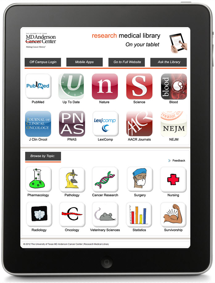
When our staff developed a tablet page to highlight our mobile resources, we wondered how we would advertise it.  It finally became apparent that the very best way to advertise an iPad or other device was by using the image of the device itself.  What’s more eye-catching than a tablet?

I made a handout that is two sided: the front is an image of our actual tablet page as if you were holding and viewing it (I just layered a screen shot of the page over an iPad image–that’s what you see above), and a little more information and QR code on the back side (see the image below).  I print four of these per page to save some trees, and they are always popular at our Information Desk.

ipad back

The topic buttons on the handout were created by Laurissa Gann, Outreach Librarian at MD Anderson Research Medical Library.  If you would like the Publisher document for this handout, contact April Aultman Becker.
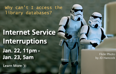
ALA Event Flyer

ALA Instruction Section's Discussion Group flyer for ALA Midwinter 2013This is a flyer I created to advertise ACRL’s Instruction Section’s Discussion Group session at the upcoming ALA Midwinter Meeting. I picked up the great image from Microsoft’s clipart/stock photo library (thanks for the tip, April!) and tried to tie in some of the colors from the image in the background areas and text.

For the original Photoshop file, email Veronica Arellano Douglas.

Image Out

This gives you a good idea about how I approach designing flyers…from the image out.  
flyer1

flyer2

flyer3

All of these images are Microsoft clip art that I inserted into a Publisher document, and then just started working around with colors, boxes, and fonts, while keeping my audience in mind.  I usually make at least three prototypes and then ask for input from colleagues before making a final decision.

So you guys tell me, which of these designs works better?  Don’t pay too much attention to the text just yet, nothing is final.

For the original Publisher files of any of the above, email April Aultman Becker.

Hand-lettering and Sketchy Goodness

Change in Library Hours AnnouncementAs you can tell by the header on this website, I’m a sucker for sketchy designs and hand-lettered fonts. I don’t get to use them very often when creating visual materials for the library, so I decided to sneak them into this announcement slide on our library website.

Dafont.com is a great source for free fonts, including handwritten styles. The ones used above are Claire Hand (from Dafont) and Chalkduster (which I believe comes standard with most computers). The clock is a modification of a sketch from Flickr user Xv.

For the original Photoshop file, email Veronica Arellano Douglas.

Holiday Hiatus Over

…and we’re back! After a lovely few weeks off many of us are back in the library (and yes, some of us never left) getting ready for our next big program/class/event. What kinds of publications, displays, designs or visual materials are you working on at the moment? We’d love to hear from you.


Blog at WordPress.com.

Up ↑

%d bloggers like this: