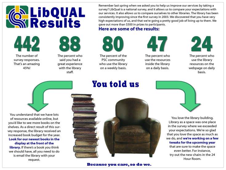
 So much of the information that we gather about our libraries needs to be shared with our users, but just how do we share it? Meggan Frost, Public Services Librarian at Paul Smith’s College, has given us a great example of visually representing data gathered through the formal library assessment LibQual.
Here’s Meggan in her own words:
I created this conference-sized poster (4’x3’) to publicize the findings of our LibQUAL survey. We had incredibly high participation in the survey, and we wanted to make sure that our community understood that we took their responses seriously. I created this poster using InDesign. Initially, I had a hard time conceptualizing how I wanted to present the information. Because the poster is conference-sized, I found it hard to break out of “conference poster” design mode in the beginning. Once I realized that I actually wanted to design something more like an infographic, I was able to quickly sketch out a design that turned into the one you see here. This poster was prominently displayed at the front of the library this fall.
This infographic is much more powerful than the plots, charts, and text that typically makes up a library’s LibQual report, and turning it into a poster to share with her campus community further bolster’s her library’s user-focused attitude.
For the inDesign file of this poster, email Meggan Frost.
