As librarians we’re often designing websites, handouts, and publicity materials that have to conform to certain institutional design standards. Whether you’re in a library that requires its logo on every brochure or at a university with very specific font and color branding, you’ve no doubt felt the constraints that an established look and feel can have on your design creation. Here are the boundaries we work within:
Veronica
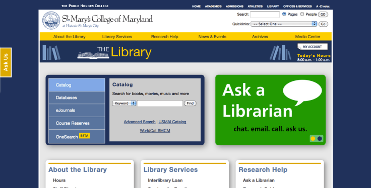
The college I work for is in the midst of a branding evaluation, meaning that at some point in the next few years we’ll likely have a revised logo, colors, and font that will be standard on all of our print and web publications. For the time being, here’s what we use:
- A fixed-width web template
- Variations of gold and two types of blue to match our college colors
- A very intricate logo
- A standard header that takes up a good portion of the screen
Our web team is working hard to prepare for the changes that this branding evaluation will likely bring to the college’s virtual presence. Like me, the web developers hope that our new university template will be responsive, rather than fixed width, and that the college header will be much smaller. My hope is that we modify or eliminate the standard logo in favor of a simplified text-based brand. I understand the need for color constraints, so I’ve tried my best to work within the colors of the college.
To make up for the space taken by the college header, I’ve tried to keep the library header small, although I’m planning to revise it to take advantage of some of the wasted space in the middle and make the header menu more visible. I’ve also tried to make the search area and announcement slider the main focus of the page. I’m not sure how successful I’ve been, but it’s a start.
How do you work within web template constraints?
April
I work at a large university hospital with a specific department that concentrates on maintaining our brand so that it is not diluted or misconstrued among our thousands of employees and our international audience. Our brand standards call for a certain set of colors and fonts that should be adhered to when creating designs, even those that are used in-house. Complying with these standards (see below) has been my biggest challenge when designing publications.
One of my first charges as a new hire was to redesign our General Info page (that you’ve seen here). My first draft looked pretty similar in design to what you’ve seen, but the colors were my favorite lime green, grey, and orange, the fonts didn’t conform, and I neglected to add the institutional logo. My supervisor quickly showed me the brand standards on our intranet, and I modified my design to incorporate theirs by carefully replicating the CMYK numbers and adding in other elements.
It’s not always easy, as I find the standards limit my creativity at times, but because I now understand and respect the reasoning behind the standards, I’m trying to follow them more closely in everything that I create.


