Search

Librarian Design Share

inspiration for library creatives

Month

October 2013

When Bad Things Happen

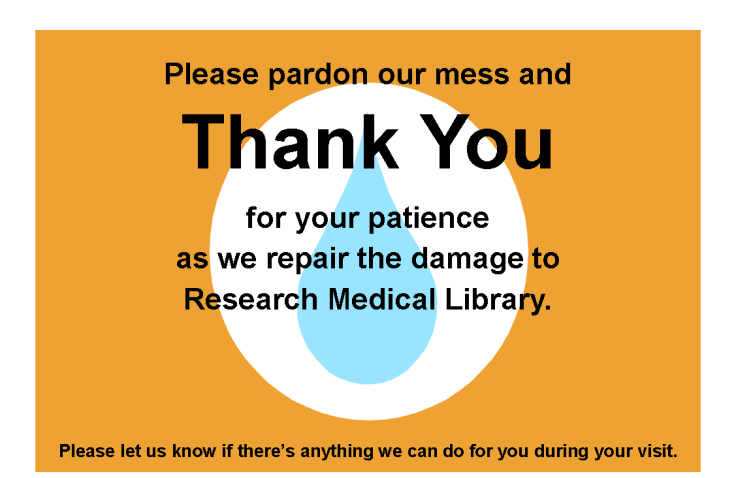
There aren’t many things more tragic in a library than a flood.  When our ceiling gave way last week to a giant black waterfall over our bound journals and public area, we could hardly believe our eyes.  We’re still assessing the damage, but in the meantime, we have plastic sheeting hiding more than half of the library, loud noises, and confused patrons.  It was time to present a unified message to ease the communication about what happened.

I wanted to keep the feeling of these signs in tune with our overall aesthetic and color scheme, and I wanted every person who enters the library to see them.  I used the water droplet for the obvious reason that it graphically represents the gallons of water that flooded us, but I can also see it as a tear, and there were certainly a few of those as we sloshed through the mess last week.

I placed these half-sheet signs on all of the tables we have available.  The message is light, helpful, and thankful.

flood2

On the front desk, I placed this larger sign to explain things a little more in details and to help our staff with the right words to say to patrons.

flood1

Finally, we are because we quickly realized that our limited space is not enough to fill the needs of our patrons (a nice problem because it illustrates our usefulness),  I created this quick half-page handout to point out other computer areas nearby:

flood3

Of course this design doesn’t do much to make us feel better about what is happening in our library, but it does serve an important role, and does it better than a hastily printed sign might.

I hope you don’t ever have a need for these signs, but if you do, email me for the original files.

Advertising Ebooks

My library is currently taking part in a demand-driven acquisition ebook pilot project through Proquest’s EBL and our state college and university library consortia. The challenge: advertise that mouthful to our students, faculty and staff. The solution: A mix of attention getting posters, slides for our website image carousel, as well as pamphlets and an accompanying libguide that go into more detail about the program and give our users instructions on how to access and download these ebooks.

ebook dda pilot poster advertisement

After struggling to coming up with an interesting, non-cheesy way to visually represent ebooks, I found the photo above on Flicker, and thanks to its creator Johan Larsson’s generous CC 2.0 Attribution license, I was able to build a design around it. I cut out most of the background, layered it on a black background and used Cicle font to create a slogan that is (I hope) intriguing but still meaningful. I decided against including a QR code because previous efforts at including them in signs for my library showed that none of the students were using them. The posters will be placed on bulletin boards in various academic buildings around campus.

I then adapted the poster design to a smaller scale: our website’s image carousel:

ebook pilot image carousel slideThis slide links out to a libguide about the ebook pilot project. Created by my colleague, Alana Verminski, the libguide offers more detail about the program and gives detailed instructions for users to locate, access, and download or print portions of the ebooks. Alana also did a fantastic job of creating a tri-fold brochure about the ebook pilot project which we’re sharing at our library’s information desk for those who want to take away information about it.

Ebook Brochure Inside Ebook Brochure OutsideThe poster and image carousel slide were created using Photoshop and the tri-fold brochure was created using Word. For the original files of any of these designs, please email Veronica Arellano Douglas.

Remixing Old Designs

Last December I shared a sign I created for our reference desk advertising our library’s chat reference service and LibAnswers Knowledgebase. I love it when designs on our site get remixed and re-purposed. Erica DeFrain of Honey-Badger-Boolean fame switched up the sign’s layout, “fussed with the text,” and of course, changed colors to match her home institution. The result is below:

Ask us sign for the U of VTAwesome, Erica! If you’ve adapted any of the designs on our blog, let us know! We’d love to feature them here.

Tackling Ugly, One Food-and-Drink Policy Sign at a Time

If your library is anything like every library I’ve ever worked in or visited, you have at least one hastily created 8.5″ x 11″ flyer meant to disseminate some bit of library policy or rule. More often than not there are collection of these flyers in mis-matched fonts and color schemes across the library, devoid of any branding or cohesive theme, and let’s be honest, just plain UGLY. My library has ’em. Your library has ’em. We all have at least one example of a sign we pass on a daily basis that just makes us cringe.

Melinda Roberts, Business Librarian at the Lippincott Library of the Wharton School at the University of Pennsylvania is tackling ugly in her library, one sign at a time. Her first target was this ancient Food & Drink Policy Sign:Old Food and Drink Policy Sign

Not good. Here’s Melinda’s take on things:

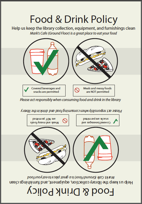
I’ve become the unofficial designer here at my library.  I’ve had no official design training other than attending workshops on several Adobe products. I’ve been trying to update some of our outdated signage around the library. One of the signs we’ve had for a long time is the Food & Drink Policy. The old sign is so full of text that I am sure no one is reading it! I designed a new one that is more visual.

New Food & Drink Policy Sign

We have small plastic sign holders that are 5×7, so I made my sign so that it can be printed, then folded in half. I try to save prep time in the design.

2-sided new food and drink policy design

For the original Adobe Illustrator file of this design, please email Melinda Roberts.


Know Your Meme AND Boolean, too

Boolean Logic, honey badger styleInstruction librarians are no strangers to explaining Boolean operators. The trick is to never mention the words “Boolean operators” to students, lest their eyes begin to glaze over and drool begin trickling from the corners of their slightly open jaws. So we try everything we can to make it entertaining, from sit down/stand up exercises (e.g. “everyone wearing blue jeans AND glasses stay standing”) to amazingly hilarious images like the one above, created by Erica DeFrain from the Bailey/Howe Library at the University of Vermont.

I’m actually married to a graphic designer…but I think (I hope) the ugliness contributes to the humor of the whole thing. Talking about Boolean search logic can be a little challenging, especially in late-afternoon classes. I wanted to give a nod to a cultural phenomenon while also perhaps getting a laugh from those in the audience who know and love the infamous honey badger.

For the layered Pixlr file, email Erica DeFrain.

Blog at WordPress.com.

Up ↑

%d bloggers like this: