If your library is anything like every library I’ve ever worked in or visited, you have at least one hastily created 8.5″ x 11″ flyer meant to disseminate some bit of library policy or rule. More often than not there are collection of these flyers in mis-matched fonts and color schemes across the library, devoid of any branding or cohesive theme, and let’s be honest, just plain UGLY. My library has ’em. Your library has ’em. We all have at least one example of a sign we pass on a daily basis that just makes us cringe.
Melinda Roberts, Business Librarian at the Lippincott Library of the Wharton School at the University of Pennsylvania is tackling ugly in her library, one sign at a time. Her first target was this ancient Food & Drink Policy Sign: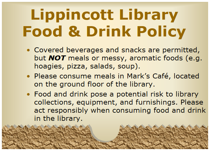
Not good. Here’s Melinda’s take on things:
I’ve become the unofficial designer here at my library. I’ve had no official design training other than attending workshops on several Adobe products. I’ve been trying to update some of our outdated signage around the library. One of the signs we’ve had for a long time is the Food & Drink Policy. The old sign is so full of text that I am sure no one is reading it! I designed a new one that is more visual.

We have small plastic sign holders that are 5×7, so I made my sign so that it can be printed, then folded in half. I try to save prep time in the design.

For the original Adobe Illustrator file of this design, please email Melinda Roberts.

1 Pingback