Search

Librarian Design Share

inspiration for library creatives

Month

February 2015

Keepin’ It Quiet

It’s cold in the Mid-Atlantic y’all. I’m trying to unfreeze my fingers by typing this morning, and what better way to warm up my joints than by sharing designs that tackle an issue we all wrestle with in our respective libraries: Noise. The best of libraries are filled with people reading and chatting, studying and collaborating, and this dual use can often pose a problem when some of our patrons want to converse and others want extended silence. I’ve found myself at either end of this spectrum (as I’m sure we’ve all been). I’ve been shushed and gotten the stink-eye from students for talking too loudly, and I’ve had to ask students to turn down their beats because everyone in their section of the library can hear the tunes blasting from their headphones.

Designating certain areas of the library as different noise level zones can help alleviate some of these noise conflicts, but good signage is key. Patrons need to be aware of the noise level preferred in different parts of the library, which is why I like this great submission by Michael Hughes, Instruction Librarian at the Coates Library at Trinity University.

Noise Level Signage
Noise Level Signage – Coates Library – Trinity University

Michael adapted the following graphic from the University of California, San Francisco Libraries (with permission) and incorporated a free icon into the design.

Noise Level Signage
Original Noise Level Signage – University of California, San Francisco Libraries

As an alternative, Michael also created the following sign, which, although busier, takes the same theme and adds a new twist on it.

Quit Study

What I love about all of these noise level signs and posters is the neutrality of language. Instead of “noisy” we see the terms “conversational study” or “active learning,” which I think motivates patrons to remain respectful of those around them.

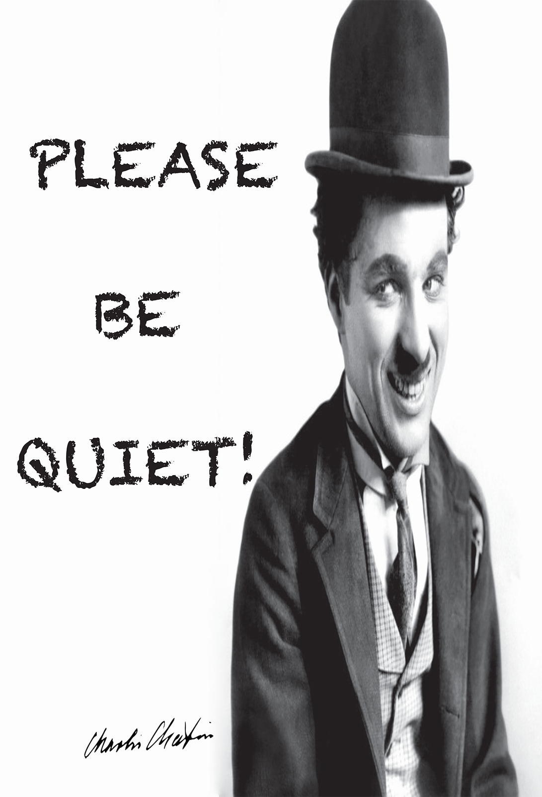
As an alternative, we have these submissions from İpek Yarar at MEF University Library in Istanbul, Turkey, which I think do a nice job of using humor to kindly relay a message for noise control. All three feature an iconic Charlie Chaplin movie still.

Please be quiet

CC-Quiet-2

CC-Quiet-1

Do you have noise level signage at your library? What designs work best for your patrons?

You can find Michael’s original Photoshop files of his noise level signage and İpek’s printable signage (originally created with Adobe InDesign) on the Library Design Share Google Folder.

What’s On Your Image Carousel?

A quick scan of library websites reveals that most have embraced the image carousel as a means of communicating news and announcements with library users. It’s how we share information about new resources, special events, library collections and any bit of information we think our patrons (or students or faculty or visitors) would like to know.

Creating effective images for a library website carousel can be a challenge. There is a delicate balance of imagery and text that, if distributed too far in either direction, can make your carousel announcements fade into the website background or cause digital users to shield their eyes and exit a page faster than you can say Google Analytics.

We’ve shared examples of web slides and carousel images in previous posts, and today we bring you a few more examples courtesy of Michael Hughes, Instruction Librarian at Trinity University in San Antonio, Texas.

Two Screens Are Better Than One. Check Citations on Your Phone

Here’s what Michael has to say about creating effective web announcements:

I create carousel images for our website in order to promote new acquisitions or services. Here are two banners I made, one for our site-wide New York Times subscription and another for our mobile citation tool. Heat map testing demonstrates that the carousel is one of the least-clicked parts of the library website, but my images also appear in a slideshow that plays in the library’s cafe. At any rate, the carousel is just one component of an outreach strategy and, as a bonus, the images keep the website from appearing disused.

Enjoy Full Access to NYTIMES.COM

Michael’s carousel slides present a nice balance of text and images while connecting website visitors to important library resources.You can download the original, editable Photoshop files of these slides from the Librarian Design Share Google Drive folder.

Create a free website or blog at WordPress.com.

Up ↑

%d bloggers like this: