Search

Librarian Design Share

inspiration for library creatives

Author

April Aultman Becker

Library Therapy

Miyo Davis at St. Francis College Library wanted to host a Library Study Break for students during finals, but didn’t have the budget for a huge event.  Inspired by this post on Librarian Design Share and an idea she got from a talk at an ACRL conference about librarians as research therapists who are available to assist with issues patrons have while researching, Miyo demonstrates that chocolate is always the best medicine.
Miyo describes her design process below: 
We have a ton of leftover Demco® Processing Circulation Label Sets 1-5/8″ x 2-9/10 (SLB spine labels) so my first prototype was a result of just typing up our contact information into the OCLC Label Program.  It was an effective way of getting out our contact info but didn’t really have any personality.  I then downloaded a Microsoft Word template from DEMCO’s website.  Working in Microsoft Word gave me a lot more flexibility with font size, style, color and allowed me to add pictures. For my second prototype I experimented with incorporating our school logo.  This looked nice, but again, I felt like I could take the design a step further.
prototypes
 
Going with this theme [library therapy], I thought it would be funny if the labels on the candy looked like the labels on prescription bottles.  With a little personalization, I turned the library into a pharmacy and the chocolate became “Prescription Chocolate” and “Emergency Chocolate.”  They were a big hit and the students appreciated the joke.
Prescription
These are fun and very timely.  If you are interested in the original Word file to create your own library therapy chocolate, contact Miyo.

Making Your Library Promotion Pop

We’re all working to make our designs pop as librarians, but it’s probably rare that we actually sit back to consider the principles behind the designs we are making. However, just a couple of months ago, I was asked by the Medical Library Association to present on this topic.  So, I am posting the presentation as both a review of basic design and also as an inspiration for design, because it was (by far) the hardest part of making this presentation!

When you make a PowerPoint presentation about design, you want it, uh, designed well. I’m tired of the themes that PowerPoint has to offer, so I usually design my own when I can. While I didn’t come up with the title for this presentation, I did want to play off of it. “Making your Library Promotion Pop” conjures up many themes–popcorn, pop art, popsicles…  I tried them all unsuccessfully, until I came across an unlikely inspiration saved on an older flashdrive: a New Year’s Eve party invitation that I admired some time back and planned to recreate for my own use.  The fireworks and the colors are modern, graphic, and exciting and the elements of the invitation just kind of created the theme for me.
Picture1
You never know where inspiration will strike…or pop!
If you are interested in the original PowerPoint file, contact me.

When Bad Things Happen

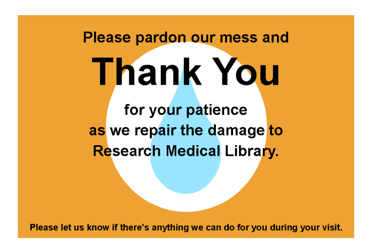
There aren’t many things more tragic in a library than a flood.  When our ceiling gave way last week to a giant black waterfall over our bound journals and public area, we could hardly believe our eyes.  We’re still assessing the damage, but in the meantime, we have plastic sheeting hiding more than half of the library, loud noises, and confused patrons.  It was time to present a unified message to ease the communication about what happened.

I wanted to keep the feeling of these signs in tune with our overall aesthetic and color scheme, and I wanted every person who enters the library to see them.  I used the water droplet for the obvious reason that it graphically represents the gallons of water that flooded us, but I can also see it as a tear, and there were certainly a few of those as we sloshed through the mess last week.

I placed these half-sheet signs on all of the tables we have available.  The message is light, helpful, and thankful.

flood2

On the front desk, I placed this larger sign to explain things a little more in details and to help our staff with the right words to say to patrons.

flood1

Finally, we are because we quickly realized that our limited space is not enough to fill the needs of our patrons (a nice problem because it illustrates our usefulness),  I created this quick half-page handout to point out other computer areas nearby:

flood3

Of course this design doesn’t do much to make us feel better about what is happening in our library, but it does serve an important role, and does it better than a hastily printed sign might.

I hope you don’t ever have a need for these signs, but if you do, email me for the original files.

Branding Your Library

We librarians tend to make a lot of help sheets and signage to assist patrons as they use our resources.  That’s really what Librarian Design Share is about, right?  But even with best intentions, we don’t always fully think about the way our publications as a whole look and feel to our patrons.

I think Librarian Design Share would be remiss if we didn’t talk standardizing the look of your library’s publications, or branding, if you will.  Brands can highlight something unique about your community (perhaps it’s near water or you’re known for an historical event), your library (maybe you have an awesome stained-glass window or a spiral staircase), or it can be based on something more abstract, like colors, shapes, or even text.  We based our library branding on the pretty rainbow of colors our bound journals make on the shelves.  Everyone has bound journals on their shelves, but there’s something about the color arrangement and the mass amount of them that make the way they look in our large, light-filled space memorable. Here’s our general publication header that can be copied to any document:

new brand

Whatever standardization you decide upon should happen across the board–from all the pieces of paper that a patron might see in your library to your web presence. This is our website’s look:
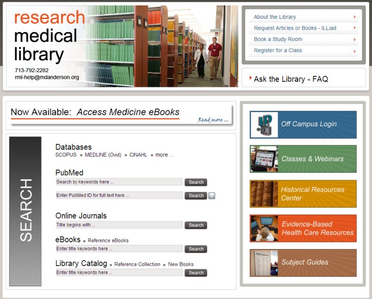
8-6-2013 12-10-59 PM

I thought my library was well on the way to doing this, but a quick audit of our documents online and on our slat wall exposed at least three previous brands that are still in use on our handouts.

old brands

Yikes, you know what my new project is…

Think about it terms of your favorite store: their shopping bags have the same look as their store signage as their website, right? So should our libraries.  It’s about making things more consistent in the minds of our users. More simply, it’s about showing our users that we care enough to keep things updated, neat, professional, and easy for them to digest.

If you have great examples of a branding campaign you’ve created and implemented at your library, we’d love to see them! Consider submitting them to our site and sharing them with your colleagues.

PowerPoint to Impress

When the Senior Vice President makes 3 hours in his schedule to tour your library and talk to each department and staff member, you have to come up with something to impress him. We originally thought he could visit departments and individuals, and they could give him handouts of their stats and information while telling him more about their day-to-day actions. And then it hit us that we’re the library; we should strive to make our presentation to him as forward-thinking and eye-catching as we can, and we should make the experience as real as possible.

So, we assigned roles and scenarios to the VP so that he could experience the library as our patrons might, and along the way we could give him the behind-the-scenes view into what we do that makes their experience here so easy.  To show off our technology skills (and our stats), we devised a PowerPoint from pictures that we’ve taken of our library. We used SkyDrive to load it to a library iPad and presented it to him when he arrived.  The VP took the iPad to each department, which kept him on track with scenarios, and it kept our numbers right in front of him.  Here it is:

We uploaded the presentation to SlideShare and sent him the link before he could even get back to his office.  Impressed does not begin to describe his reaction.

Interested in modifying this presentation for your own library? Contact me for the original file.

Same Design, New Use

A few months back, I went to a resource fair in my institution, and another department had an interesting giveaway that I hadn’t seen before: an iPad cleaner.  Of course, this is really nothing more than a large eyeglasses shammy, but by putting it into the trendy context of an iPad or a tablet cleaner, it became THE swag to snag.

So, of course, I decided that my library needed to get in on this and make our own cleaner for the next opportunity we have to give things away.  I started with a simple, basic design, like the one that I picked up, but before long, I realized that we could use a design that was already in circulation…our tablet handout.  The iPad layout fits perfectly to the 5 1/2 x 7″ size of cloth.  The only change I needed to make to the design was to include our tablet site’s web address and QR code at the bottom so that patrons could find the site we were advertising (the tablet handout was two-sided with that information on the back, and the cleaning cloth can only be printed on one side).

iPad cleaner

You may notice that our tablet site’s image changed a bit since the last post, but we have committed to keeping this design for at least a year, so we ordered 500 of these babies at about $1.50 a piece through our institution’s vendor, and we think they’ll be a big hit!

What are you guys giving out to patrons this fall?

Contact me if you want the original Publisher file for this design.

Simplifying the Copy Machine

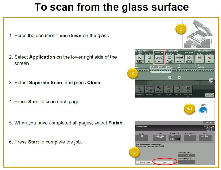
Why are copy machines so hard to use?  It seems like the basic functions haven’t changed in years, yet every machine is different, and every one is overly complicated.  The relatively new machine at my library used to take 6 pages of directions to operate!  Even something as simple as placing the document on the glass surface to copy took this much direction:  scan from top glass

Because we apparently have no control over how difficult the machine is to use (press “finish” then “start”?!?), I attempted to at least simplify the directions.  Here is the same procedure as above, hopefully improved:

toscan

I used numbers (rather than Roman numerals) that correspond to the pictures on the side because I find that the images integrated into the directions are distracting. I also used simple colors and clearer images that I found from the online copier manual.  These directions are posted on the wall near our copier, so to improve the user experience from afar, I enlarged the text from the nearly-impossible-to-see 12-point font to an-easier-on-the-eyes 18-point and surrounded the words with a lot of white space.  It’s not the perfect solution (that would be magically making the copier more intuitive), but it works a little better than it did.

If you are interested in seeing more of these directions, email me for the Word document.

Pop Up Herb Truck

Library displays are often planned out laboriously, but other times they happen organically (pun intended), as the case with the Pop Up Herb Truck at Northern Virginia Community College, Annandale Campus.  Librarian Paula DeRoy–you may remember her from this post–explains:

You know how it is with creativity… and gardeners…and librarians.   It all started when one of the staff offered to bring in some lavender from his garden.  We got to talking about the herbs we have flourishing right now.  So we decided to bring in herbs and why not pull some books from the collection?

The herb display is kind of symbolic of our “lifelong learning” philosophy.  We aren’t just here to teach “to the class,” we are here to promote lifelong learning and information literacy.  With herbs, we could look at the senses, aromatherapy, art, cooking, historic and medicinal uses, etc. etc.  We just keep trying to connect with our students and make them feel comfortable using the library and our services.

What are you guys doing out there with your book trucks when they aren’t full of books to shelve?

Miniature Marketing

medical librarian's month candy2

For Medical Librarian’s Month last year, I created labels to put on Hershey’s Miniatures.  I originally got the idea after receiving a box full of treats from Amigos Library Services for their online conference.  Amigos had affixed a sponsoring vendor sticker on each snack pack. I figured it would be pretty easy to recreate something like this for our library giveaways and special occasions, and that it would be an easy marketing opportunity.

I used Hershey’s Miniatures because they are fairly inexpensive and I knew they’d be about the same size as an Avery 5160 label (1″ x 2 5/8″, 30 labels per page).  Plus, everyone loves chocolate, right?  I used the labels feature in Word (under the Mailings tab) to create a tiny design that included our name, picture, and a tagline.  I did have to trim about 1/4″ off the edge of the labels to fit them length-wise on the little chocolate bars, but this was easily done with a paper cutter.  I stuck the labels on the flat side of the candy so that patrons would have to notice our message when unwrapping each piece.

I ended up creating three similar designs, and because I couldn’t choose which one that I liked best, I used them all.  Patrons commented about the slight difference in the designs as they were picking through the candy bowl, which meant that they had read the message…mission accomplished.  I’ve modified the design for other events since.

Contact me for the Word Avery label template.

Blog at WordPress.com.

Up ↑