Search

Librarian Design Share

inspiration for library creatives

Author

April Aultman Becker

What Did You Do Today?

Often we create a single design to promote a library event, but every now and then an event is so important that it deserves an entire marketing campaign.  This was the case for Maryland Day.

Rebecca Hopman, Special Collections Coordinator and Instruction & Outreach Team Member at the University of Maryland, says:

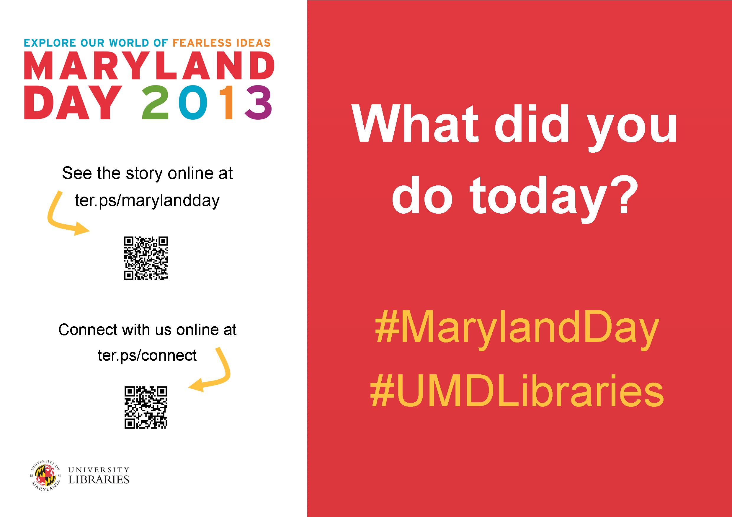
Each year our university hosts Maryland Day, an annual open house for the community, prospective students, and current students, faculty, and staff. The event is a chance for academic departments, campus offices, and local community organizations to connect with visitors. The UMD Libraries ran several events, most of which were held in Hornbake Library and McKeldin Library. Our team created promotional materials to advertise the UMD Libraries’ events and our “What did you do today?” social media campaign, including posters, a library website ad, TV monitor slides, and postcards for people to take with them or mail to a friend or family member.

poster

Poster created using Publisher

mailsign1

Mail Bin Sign created using Photoshop

Picture1

Postcard created using Publisher

slide5

TV monitor slide created using PowerPoint

We wanted to keep the design fun, simple, and colorful, so we used our official university colors (red, yellow, black, and white) as well as Maryland Day colors (bright red, green, blue, orange, and purple). For the postcards and slides we took original photos of our activities, and we used images from our digital collections to advertise the fact that we would stamp and mail postcards for people who wanted to send them to friends and family members. With each design, we tried to keep the amount of information to a minimum and emphasize the sharing/online component.

Wow, right?  Everything UMD has done here is awesome, but I especially enjoyed the social media aspect, because you can see how much the community enjoyed the event!

Rebecca and her colleagues, Laura Cleary, Special Collections Coordinator and Instruction & Outreach Team Leader, and Sarah Espinosa, Graduate Student Assistant and Instruction & Outreach Team Member, used a variety of programs to best suit their creative needs.  For the original files of any of the designs, contact Laura Cleary.

Legal Research on the Go

Our goal here at Librarian Design Share is to be able to inspire you with creative ideas so that you can take them back and modify them for your own use in your library.  David McClure, Head of Research and Curriculum Services at the Wiener-Rogers Law Library at the William S. Boyd School of Law at the University of Nevada, Las Vegas, had done just this, and we’re so impressed with the results.

unlvs1

unlvs2

Here is David’s description of the design process:

For some time, our library had considered various ways to share information on legal research apps with our students and faculty.  While reviewing the ALL-SIS Task Force on Library Marketing & Outreach’s Academic Law Library Marketing & Outreach Toolkit, I ran across a reference to the Librarian Design Share blog.  The January 23, 2013, post on “Advertising a Tablet Page” provided the creative spark (and the template) to make the handout a reality.  We converted the template from Publisher to Pages format, and we increased the image size to create a full-page handout.   

Special thanks to April Aultman Becker and the Librarian Design Share blog for sharing the Publisher template with us.  Library research assistants Jessica Perlick, Elizabeth Ellison, and Andrew Stagg also contributed their excellent research and design skills, along with their creativity and enthusiasm, to the project.   

A PDF version of the handout is available for download through the Scholarly Commons @ UNLV Law at http://scholars.law.unlv.edu/refdeskguides/8.  For the Pages version, please contact David McClure (david.mcclure@unlv.edu).

David mentioned that this was his first project with Pages and that he enjoyed the program’s flexibility when it came to manipulating images.  Anyone else out there using Pages?  We’d love to see!

Democratizing Design

What do you do if you’ve labored for hours (or days or weeks) over a design and your coworkers just don’t like it?

When I create something new, I always show the prototype to a few key people as I’m in process.  I can get their early opinions and shift my design if it’s necessary before spending too much time and energy on it.  In my dream world, I would use 5 or 10 minutes of our monthly staff meeting to project my designs on the big screen, and everyone would care as much as I do about colors, images, and spacing, and readily and openly share their thoughts on each element of the publication.

But this doesn’t actually happen in real life…you’re lucky if you get someone to say “yeah, I like it,” right?  And if they say something negative, like your design is too simple, or that it misses the point, or that –gasp– it’s unprofessional, it almost becomes a personal affront. This is because design often feels very personal after you’ve poured your time and energy into it.  However, it’s important to remember that when someone contests your handout, infographic, or web slides, they really aren’t attacking you.  It’s likely that the person is just coming from a different perspective, and it’s worth hearing them out and considering revising because design, in essence, is not personal at all.  Design is for the public, so it is of the utmost importance to consider the public’s reaction to a design.

A situation like this recently happened in my library, and the solution was to have our staff vote in an anonymous survey (we used SurveyMonkey) on their top choice between two designs.  Be prepared, though, in a democracy, your choice doesn’t always win!

Book Club Displays in a School Library

Full disclosure: I think Mary Chance is a display genius.  I had the pleasure of working with her and creating displays with her years back at a high school library, and she taught me everything I know about Microsoft Publisher and crafting with paper!

Mary has since moved on to be the solo librarian at Alvin Junior High in Alvin, TX.  She told me that she no longer has time to develop and design all that she wants to in her library, so she is training students to help her.  Mary says the students come up with the design, and she just makes it possible for them to execute it.  Her only rule with the revolving display is that the existing one cannot be taken down until there is a replacement.

The library hosts many book clubs each year, and often well-known authors make an appearance (Eoin Colfer is scheduled for next month). The students design a mobile poster to promote the book club, and Mary rolls it through the school during lunch periods to attract interest and talk to students about the featured book.

Below are Mary’s latest book club displays for Beastly, Unwind, and The Adoration of Jenna Fox, and you can see that she has taught her students well.

photo (50)

DSC03663

DSC03664 (1)

Contact Mary Chance if you’d like to know more information about her displays.  Parental permission was obtained before posting these pictures.

Advertising New Services

Libraries are adopting new technologies all the time.  But how do you get the word out about the new services to patrons?

Ernesto Hernandez, the Emerging Technologies Librarian at Marydean Martin Library at Nevada State College shared two recent designs he created to advertise new services.  About the iPad circulation sign below, Ernesto says, “although it is simple in design, I took an original picture of the iPad with my phone camera along with inserting a QR Code to our iPad LibGuide.”

iPad sign e hernandez

The second design Ernesto shared is a bookmark to promote his library’s newly created social media sites.  The library intends on inserting one into each book they check out.  Ernesto says, “we added our library symbol and phrase ‘Get Social with the Marydean Martin Library’ along with shortened URLs to each page.”

socialmediabookmark e hernandez

Using original designs, uniquely branding them to your own library, and placing them where patrons can’t help but notice them is a great way to promote services to patrons.

Want the original Publisher files of either of these documents?  Contact Ernesto Hernandez.

Evolution of a Handout

Recently a coworker asked if I could help revise a handout she made.  Her handout was fine and the information was good, but she was looking for a more graphical representation.  She also didn’t like that the handout spanned two pages:

notetaking1

While we were discussing the updates needed, she mentioned that she really likes the way that Consumer Reports formats their product comparisons.  Since this is a handout comparing different tools for note taking, I tried to mimic their style and came up with this:

tools for notetaking2

I pared down some of the information to fit it to one page and kept the logos.  But it still wasn’t quite right.  I couldn’t get the chart to size like I wanted it to in Word, so I copied it to Publisher, which allowed me to customize my colors and stretch the margins for spacing so that the chart was more eye-catching and easier to read:

tools for notetaking3

How do you guys feel about handouts–should they be one-page only?

For the Publisher file of this document, contact April Aultman Becker.

Promoting Classes

class offerings

Sometimes the most basic information can be the hardest thing to represent graphically. This flyer was created to promote our regular library class offerings.  Like a lot of the pieces I make, I utilized more than one Microsoft Office program.  I created the chart in Word because I prefer it over Excel for building charts with a bunch of text, and then I copied the chart to a Publisher document so that I could play with the colors, lines, and layer the images, which is way easier to do in Publisher than Word.  I’m not going to lie; it took me forever to decide on the colors and to fit all that I wanted to say in the limited space to make it a half-page document (color printer guilt), but now that it’s done, we can revise and reuse it each semester.

If you are interested in the Publisher file for this document, contact April Aultman Becker.

Advertising a Tablet Page

ipad front

When our staff developed a tablet page to highlight our mobile resources, we wondered how we would advertise it.  It finally became apparent that the very best way to advertise an iPad or other device was by using the image of the device itself.  What’s more eye-catching than a tablet?

I made a handout that is two sided: the front is an image of our actual tablet page as if you were holding and viewing it (I just layered a screen shot of the page over an iPad image–that’s what you see above), and a little more information and QR code on the back side (see the image below).  I print four of these per page to save some trees, and they are always popular at our Information Desk.

ipad back

The topic buttons on the handout were created by Laurissa Gann, Outreach Librarian at MD Anderson Research Medical Library.  If you would like the Publisher document for this handout, contact April Aultman Becker.

Image Out

This gives you a good idea about how I approach designing flyers…from the image out.  
flyer1

flyer2

flyer3

All of these images are Microsoft clip art that I inserted into a Publisher document, and then just started working around with colors, boxes, and fonts, while keeping my audience in mind.  I usually make at least three prototypes and then ask for input from colleagues before making a final decision.

So you guys tell me, which of these designs works better?  Don’t pay too much attention to the text just yet, nothing is final.

For the original Publisher files of any of the above, email April Aultman Becker.

Blog at WordPress.com.

Up ↑