Recently a coworker asked if I could help revise a handout she made. Her handout was fine and the information was good, but she was looking for a more graphical representation. She also didn’t like that the handout spanned two pages:
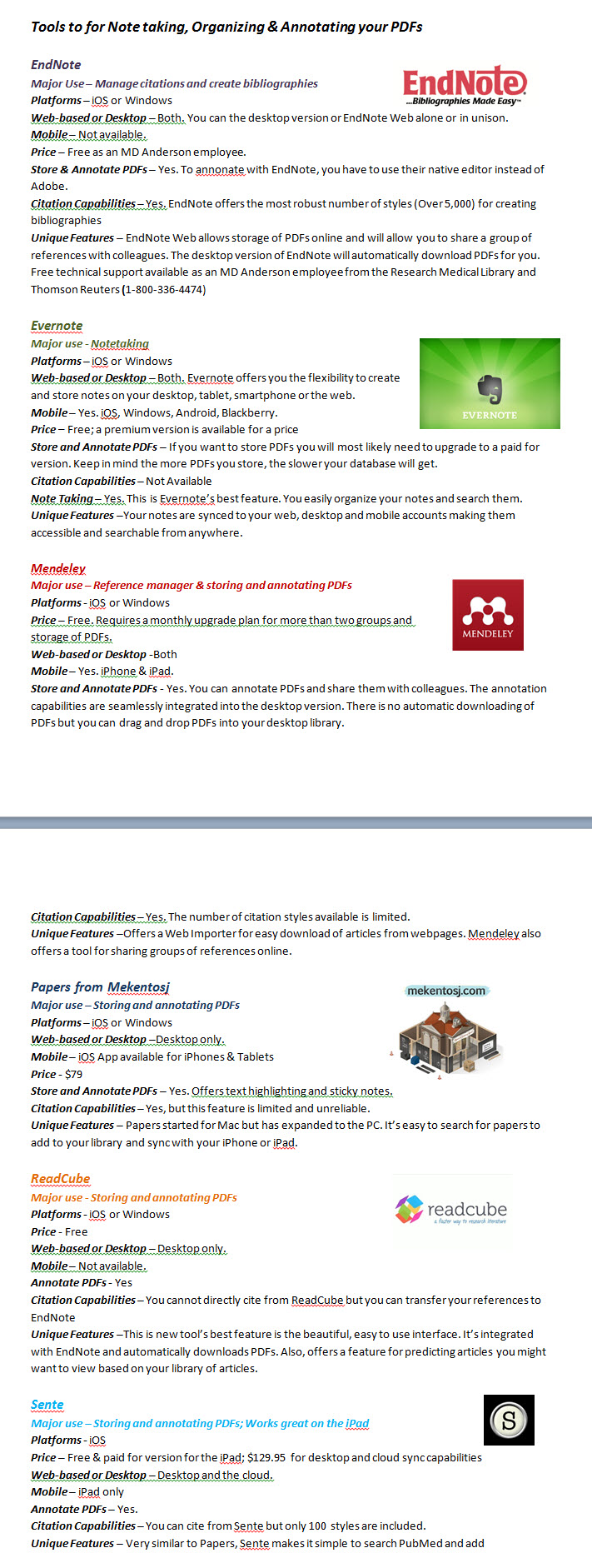
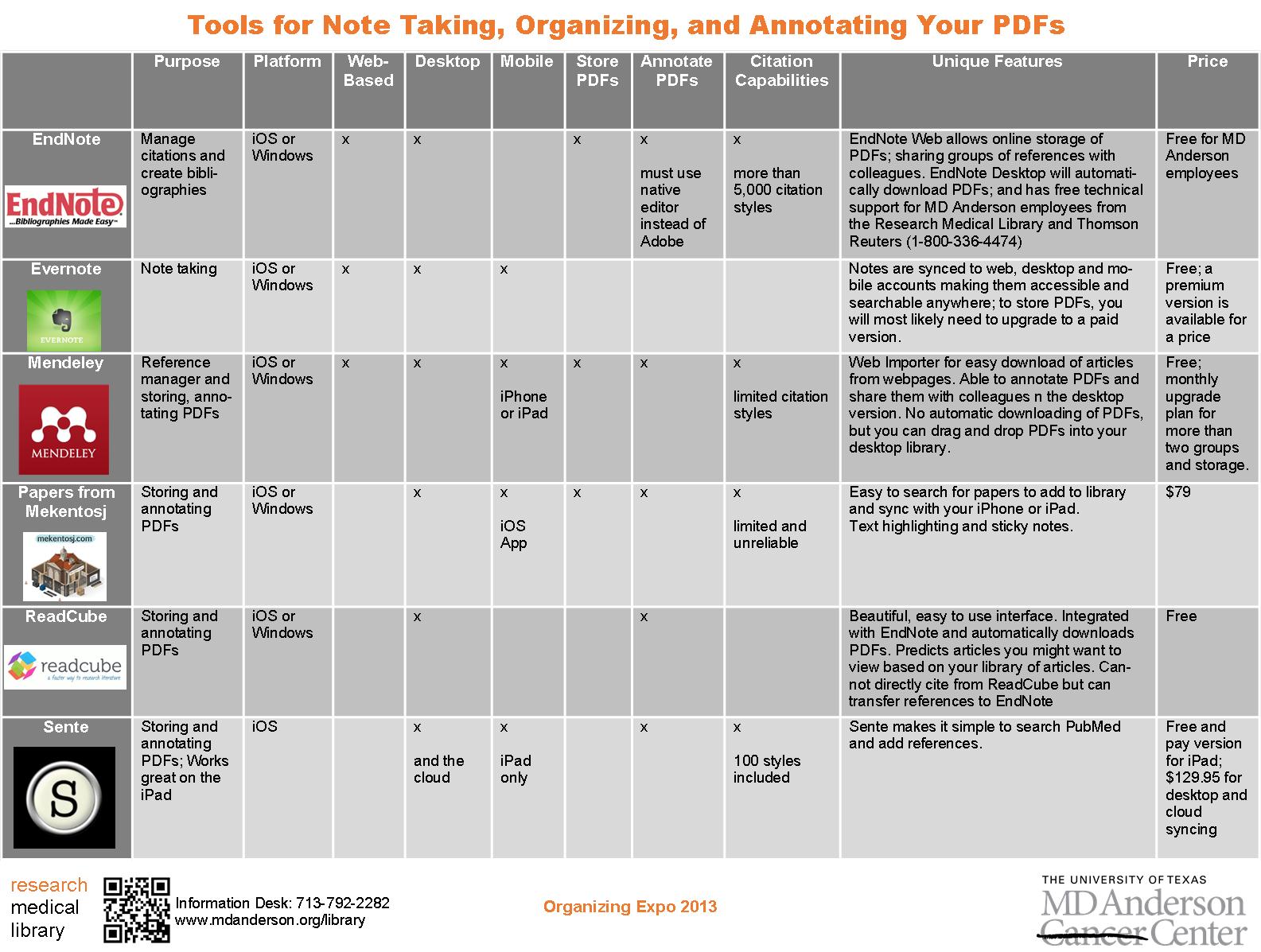
While we were discussing the updates needed, she mentioned that she really likes the way that Consumer Reports formats their product comparisons. Since this is a handout comparing different tools for note taking, I tried to mimic their style and came up with this:

I pared down some of the information to fit it to one page and kept the logos. But it still wasn’t quite right. I couldn’t get the chart to size like I wanted it to in Word, so I copied it to Publisher, which allowed me to customize my colors and stretch the margins for spacing so that the chart was more eye-catching and easier to read:
How do you guys feel about handouts–should they be one-page only?
For the Publisher file of this document, contact April Aultman Becker.

February 27, 2013 at 7:48 pm
What a great progression you’ve shown here. I love the final product and I agree with the one page guideline. Any more than that and the purpose becomes muddled and you risk losing your audience.
March 4, 2013 at 8:36 pm
Great idea about using a chart format. I would next look at the content–I notice unnecessary words and I would experiment with centering the information in the cells vertically.
March 8, 2013 at 7:01 pm
I agree! One page is enough. What a wonderful metamorphosis! I think having the color changes from light grey to dark grey also allow the reader focus on the text one line at a time. Fantastic! IThis inspires me to give Publisher another try!